Menu

Show posts

This section allows you to view all posts made by this member. Note that you can only see posts made in areas you currently have access to.

Show posts Menu

Messages - Sektor 13

#361
Quote from: big brother on Tue 10/01/2006 23:08:55
It's an interesting approach... the brown looks good against the pale ground color, but I don't know if it'll have enough contrast against every background. The same issue is present with the bag, which might appear to be an object lying on the ground.

In the original GUI, I intended that when you click on the bag (which will have a bigger arrow to the side) that the items will scroll out along the bottom edge of the screen. Likewise, when you click on the options button, Save, Load, and Quit buttons (perhaps even a score or chapter title) will scroll out along the top edge of the screen.

Having the O for options is a bit confusing, since it uses the same shape as the inventory items (people may think it's a collar when the inventory is fuller). As far as a logical hierarchy, the options command should be a bit more important.

I appreciate the paintover though.

All gui object could be encircled (i found this word in the dictionayr- i hope it sounds right :) ) with yellow colour, i used black with the bag, but yellow could do the trick to clearly state that this is and gui, as for big O for options, i was only try to show how would i move OPTIONS button down, i agree that that O is not usefull for the game.

a little more repainting: 
#362
Well, the picture is fine, although i would change gui, i know you wanted to make more newspaper-brochure kind of a way, but this white-pale blue is kind a strong, here is my paintover

-i removed options sign too, and add it to the lower right as it looks much better in my opinion, original one takes too much space - this option button could be removed too, so only F1 or something can be used for options


#363
About sound and music, you should read few posts up, and you can skip walking with ESC key.
#364
I tried other programs to add 256 color icon to the EXE file, thez all faild. exe became corrupted.
#365
Yo.

Thanks.

When a released the game a set resolution to 640x480, as it work fine on my comp. (1500mhz), and music should me set on DirectX. Strange..

I will release new, spell error free, version - 1.2 , and try to set the thing right . :)
#366
Hints & Tips / Re: Stargate Adventure
Mon 09/01/2006 08:54:29
By the way, I was wondering if anybody found  TONGS in the first planet !?
#367
Hints & Tips / Re: Stargate Adventure
Mon 09/01/2006 08:50:19
Quote from: voh on Mon 09/01/2006 03:59:18
Also, Sektor 13, if you ever want to fix the English in SGA, or need some proofreading for anything else (like future games), I'd be more than willing to do it, do it well, and do it fast.

I study English because I love the language - working with it makes me happy :)

Hey , thanks, I have somebody working on "translation" of the game and it should be done in about 1 or 2 week (i hope :) ). But for my future projects, you are more than welcome to help :), still I only began to work on my next project, so it should take a couple of months before it is done.
#368
Hints & Tips / Re: Stargate Adventure
Sat 07/01/2006 23:42:32
Spoiler
Go to level 9 and use the handgun on the light above the force field-you must turn off the main fuse
[close]
#369
Critics' Lounge / Re: Background - Jungle
Sat 07/01/2006 10:02:26
Quote from: Rap4Life42o on Fri 06/01/2006 20:45:33
You are definately the coolest person ever. Your BG is AMAZING!! Do you like to drink?
I don't drink much alcohol :D

Quote from: Geoffkhan on Sat 07/01/2006 06:59:20
I like the style of the background. Good technique, and a nice old-school feel to it with the contrast.

Here's my try on a paint-over. I'm really color-blind, so... bear with me. :)

Old:


New:


- Made the colors less saturated
- Attempted to make composition more understandable by shadowing the right part of the arch
- Made walkable area on left side of the screen more obvious
- Few other little things

Again, I'm colorblind, so if the ground is a strange color, at least you know the amount of saturation I was going for. :P

EDIT: Actually, sorry about blurring the sky a little. It doesn't go with the style.

I belive you about your color-blindnes :) jungle has a more brownish-older look, it is cool is that kind of way, i see the saturation point, and darken right part of the arch, i will change my BG a bit..
#370
Adventure Related Talk & Chat / Re: New Banner
Fri 06/01/2006 14:44:47
Quote from: ManicMatt on Thu 05/01/2006 21:19:25
I like that! Stargate screenshot? Cheeky!

and the second right picture, while well drawn, isn't exactly enthralling is it?
These are all backgrounds from various games, i think second right picture is good too.
#371
Critics' Lounge / Re: Background - Jungle
Fri 06/01/2006 14:41:26
Quote from: LilBlueSmurf on Thu 05/01/2006 21:08:21
Quote from: esper on Thu 05/01/2006 07:12:04
I've always wondered exactly how people get such details into their work, especially not-terribly-hi-res art like this. It's fantastic.

Most common way: Work at high resolution then resize smaller.  Not a bad thing.
Less common, but probably not by much: The 'details' are actually left over from sketching, color washing, or 'scribbling'.  Bad thing.
Least common: Experience.  The more you work with low res, and changing high res into low res, the more you learn how details are reduced electronically, and can reproduce the effect.  Eventually you'll be able to actually improve on it because you know what you want to show up, not just an 'average' of pixels as is done mostly for electronically reducing.

Best thing (imo) is to work at larger resolutions, rescale to the correct size, then tweek the things that you think need tweeking.  If you ask, you will likely find that many people on sites like Deviant Art do it this way.  In the end though, natural ability always helps.  Some people can just do some really amazing things and you can't learn instinct.

On that note, and to be at least a little on topic, I am looking forward to seeing more artwork that you produce for this game, it's looking very good so far :)

Well, i don not agree with option to resize larger images, as they become very blurry. It is easier to draw picture in low res. It is much easier to draw detailed low res, as you can draw a few pixel and achive better look. OR to say with another words, you need much more time to make detailed HIGH res screen as detailed low res. background because you must draw much more pixels.
#372
Adventure Related Talk & Chat / Re: New Banner
Thu 05/01/2006 21:02:38
Here is contribution !?

#373
Hints & Tips / Re: Stargate Adventure
Thu 05/01/2006 20:21:49
hehe you managed to download the game :)

so:
Spoiler
Combine the accesory with green power module and use in on the stone table
[close]

#374
Critics' Lounge / Re: Background - Jungle
Thu 05/01/2006 14:34:06
Quote from: Zooty on Wed 04/01/2006 22:47:06
you got it much better in the last edit, but you still need to  get rid of those horizontals in the top left, see progs edit for what i mean.
Will do !

Quote from: Igor on Wed 04/01/2006 22:23:55
I think you nailed it with this last edit.. fantastic!
Thanks.

Quote from: esper on Thu 05/01/2006 07:12:04
I've always wondered exactly how people get such details into their work, especially not-terribly-hi-res art like this. It's fantastic.

I wondered that too, but figured out that even thou resolution is low, you can make wonders with appropriate colors and lines, look "the Dig" game, it has incredible graphics !

Quote from: Mordalles on Wed 04/01/2006 22:05:18
yeah, i also downloaded stargate after ive seen ure bgs here. i have dial-up, and so i downloaded it over a few internet sessions. thats why i didnt download it previously, since it was bit big. but now i have, and gonna play right away. it seems you use a sort of matte-painting technique for ure bgs. but not quite.
love the latest version.
Quote from: buloght on Wed 04/01/2006 21:53:14
heya sektor. Your bg rocks. I finally downloaded stargate. Can't wait to play after i saw this bg. "The String" - sounds cool :)

Hope you like it. :)
Quote from: big brother on Thu 05/01/2006 00:49:14
Sorry to post this publicly...but, I did insult you publicly, LBS.

I was an ass. Hope all can be forgiven. I have a quick fuse when general dismissal statements are used without any kind of supporting info.

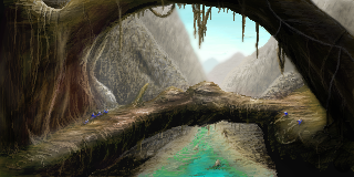
The river in the new edit looks nicer, it blends well. The purple spots are hard to read, there's still a bit of the prob with the exit being blocked from the view, and the bridge still looks twisted. As for the upper arch, I think if the highlights on the right side were darker (perhaps a tinge of a darker, cooler color) it would help portray that side as being closer to the foreground. If you moved that side of the arch further right, it might solve the exit issue, too.
Bridge should be a bit twisted, as for arch (which is a tree - not an alien form, thou interesting idea as this is an alien planet:) ) maybe I will add a bit more "dark" colors.. i will see.
#375
Critics' Lounge / Re: Background - Jungle
Wed 04/01/2006 17:33:33
Hehe, this debate really got hot !

Well, i fixed water couple of days ago, but i didn't yet uploaded my picture, i added some "yellowish" shine on the grass and darken some parts as the Big Brother suggested,Ã,  but that is all, and i will not fix the background anymore. for now :)

By the way, there is a part of the sky above the river, so it can be a blue with a bit of a green.

EDIT:

here is new pic:


x2


Edit by Andail: Displayed resized version. It's not an official rule, but magnifying low-resolution art will make it easier to see. Great background by the way!
#376
Critics' Lounge / Re: Background - Jungle
Mon 02/01/2006 10:22:44
Actually I do not :)
#377
I don't know what's the thingy with alpha channels, i think easiest thing is to draw anything semi-transparent on the "transparent" background and save it as PNG, i do it with Paint Shop Pro 10 and it works normaly...
#378
Critics' Lounge / Re: Background - Jungle
Sun 01/01/2006 23:12:48
it is? I tried different kind of ways to start a background, this one looks to be the best for the moment :) .
Say, nice technique you have there :)
#379
Critics' Lounge / Re: Background - Jungle
Sun 01/01/2006 22:54:16
this was a reference, a bit i just needed an idea and some kind of position..


so i first draw this:


-> then i used a lot of LIGHTEN AND DARKEN TOOL !!!


---------------------------------------------------------------------------------
I drawed this today:


::)

#380
Critics' Lounge / Re: Background - Jungle
Sun 01/01/2006 10:19:40
Paint Shop Pro 10
SMF spam blocked by CleanTalk