Menu

Show posts

This section allows you to view all posts made by this member. Note that you can only see posts made in areas you currently have access to.

Show posts Menu

Messages - SpacePirateCaine

#61
Welcome to the forums, Bodzio, and I hope you have a good time in the AGS community.

In regards to the collage background creation technique that you linked above, there's no major problems with it, as long as it's done well enough. The most important thing about a background in a game is that it's useable in the game. The techniques employed in making that background are a lot less important. To answer your question, though, I haven't seen it used so much, so I wouldn't say it's a very popular technique here.

Going from a purely aesthetic standpoint, I'd say that the collage has a lot of potential to look good, but due to its being somewhat realistic, it'd be difficult to maintain graphical consistency (realistic characters for realistic backgrounds, backgrounds that work with one another). It might end up being a lot of hard work, but if you're willing to put in the time into making some good collage backgrounds, I say go for it!

Good luck with your projects!
#62
Khris did a great job with the palette stuff, so I didn't bother playing around with that much at all. Instead, I thought I'd give you another possible idea for shading:


The only larger issue I was seeing with your image is that it seems a bit pillow-shaded at the moment. Some of the picture, like the face and the doublet are shaded with a top-down light source, but your boots and pants seemed to be being lit more from the front. I understand that the cloak was helping in shading those particular points, but I thought that the pants in particular could use a little more solid shading.

I also went ahead and played around with the cloth folds a bit as well - particularly in the crotch area of the pants, and around the cloak. Where it's clasped together, the cloth will naturally want to pull away from that area, leading to cinched bits.

The design itself looks great. If anything, it might be just a tiny bit too parallel? The pose is very stiff, though perhaps that's what you were going for, in which case, no problem.
#63
For what it's worth, I spent an hour, roughly, troubleshooting an issue I was having with Nimbus, wherein the library window displayed nothing but a blank white box. After uninstalling and reinstalling a few times and even a system restart, I realized that my firewall (ZoneAlarm) was interfering with Nimbus accessing its database. If anyone else is having an issue where they are unable to view the library and install/view game content, you may need to manually configure your firewall to accept incoming and possibly outgoing connections from Nimbus.

Just FYI. Great product Calin, I'm having a blast. Just to mention - though I'm not sure if anyone is really downloading in the first place - the version of Kuma Story available to download via Nimbus is an older version, using 'borrowed' music. I have no idea who should be informed about it, so I apologize if this is the wrong place for it. As a semi-related question, is Nimbus going to be able to keep download statistics: number of downloads, etc. for individual titles, so that the developers can keep track? By that right, will developers somehow have a way to upload and manage their content for the Nimbus platform at some point? I imagine that may be a tall order, but it would be great to know.
#64
Great examples Ascovel. As I mentioned before, the shortcuts by and large are reliant on single static images rotated around at joints in the 'paper doll' style that I had mentioned before. Animations are a lot more jerky and can appear a bit 'cheap' - I had noticed this in Limbo as well - though at the end of the day, most people don't have a problem with these slight graphical idiosyncrasies.

This is definitely a good way to cut back on your animation budget, however. If you want the animation to appear smoother or more 'realistic', it requires redrawing more frames, which quickly will eat away at costs, so it's a matter of finding the middle ground that works best for you. Some studios are also embracing the technique and designing their games visually in a similar way to accomodate these issues, such as Grasshopper's Black Knight Sword.
#65
Absolutely right on that one - I was speaking primarily from the big business standpoint, since that is almost definitely the context from which Rainkaimaramon was speaking (Developers discussing the benefits/drawbacks of 2/3D in professional development). Working on the independent level, or on mobile/small-scale platforms leaves a lot more room for choice in the matter - you should consider what your project really is, and whether it would benefit from 3D or 2D more. Most adventure games, particularly on the scale that we as a community work on, on average are at the scope that 3D or 2D wouldn't change much at all, cost-wise, if 2D wasn't drastically cheaper.

Now, for a first-person or over-the-shoulder third-person game, 3D is almost a necessity. But that's sort of a moot point in this conversation, I would imagine. For the sake of this argument, we should probably stick to games that can be done in 2D as well as 3D, like adventure/puzzle games. Ascovel, do you have any good examples of games that use 2D vector graphics that are still as richly animated/maintain the visual quality of a hand-animated 2D game? I'd like to take a look, and I imagine the OP would enjoy some context as well.
#66
The issue is measures of quality, reusability, scale and workload. 3D takes a lot of time on the front end of the job in the actual creation of individual models, drawing textures and what-have-you, but once a single 3D model is created, the same model can be used for all individual animations. If the team involved knows their stuff, they'll be able to rig a set of animations that apply to all individual models, so each animation also only needs to be created once.

If the engine is designed for it, it's even easy enough to make all character faces generate procedurally from a set number of variables, creating a huge (Nearly unlimited, for the purposes of game creation) variety of character heads, usually on a relatively limited set of bodies (BioWare and Bethesda make prodigious use of this). This further reduces the cost in man-hours.

Once you have a mo-cap studio it also becomes somewhat easy to animate - and at least in my current company, we have people whose specific job it is to be able to act out most necessary movements for any given game, as well as understand animation rigging and implementation of animation format within a game. At the end of the day, assuming that a studio is using animation economically, you can have hundreds of characters animating in hundreds of different ways and the workload is much smaller than, in the case of a 2D game, where each 2D frame must be created newly.

There are a lot of shortcuts, of course, as Ascovel pointed out. Vector graphics, and the huge trend lately in 'paper doll' animation (Individual parts pinned at joints) has helped to keep 2D viable, but in today's game market where the average consumer in the more profitable demographics expect fully-interactive environments with working physics and the illusion of variety, 3D is the go-to solution.

2D of course has its benefits - I prefer it far more than 3D when I'm developing on my own time and dime, but from a business standpoint, if you want to go big, you're usually best off going 3D.
#67
Critics' Lounge / Re: Speech Icons[art]
Sat 20/08/2011 11:12:49
Bogdan, well done! Good progress in only a few days. Keep practicing at this and you'll see your work getting better and better.

I'd suggest looking at some basic cartooning tutorials if you want to improve your anatomy, and study some pictures of peoples' faces with dramatic lighting to get a good idea of proper human facial shading, but I think you've made some good progress with contrast and color selection.

I'm actually not seeing any selout on this image - I also realized that I may be using the wrong term for what I'm trying to teach you as well. Essentially what I'm suggesting is the use of multiple colors on your outlines, varying them to create a smoother-looking single-pixel line. It looks fine without even so, and varied-color outlining is just one technique of coloring your image.

You said you did focus on shading, though, so I think you definitely accomplished what you were trying to. And don't worry about using every technique every time!
#68
Critics' Lounge / Re: Speech Icons[art]
Fri 19/08/2011 19:30:06
It's all a matter of finding the art style that you like the most and practicing it a lot. I've been doing pixel art for about 10 years now, and though I'm by no means a professional pixel artist, it's the one hobby aside from playing games that I actually have the time, energy and inspiration to put the effort into. Certainly when you're doing art you should follow "the rules" as fits the piece of art that you're working on, but you have to understand the rules as well in order to create the results you're looking for.

As you said you'd like to start with the more standard cartoon-shading type art, I'd be happy to give you some pointers in that area.

As far as art programs, it's all a matter of preference. My weapon of choice is GraphicsGale, by Human Balance. Best 20 dollars I ever spent, hands-down. Of course, just use whatever art program you're most comfortable with. The main tools you need when doing Pixeel art, in my opinion, is a precision 'pencil' tool, layers, easy-to-navigate frames for animation purposes and a persistent Preview window, so that even when you're zoomed to 1000%, you can still see the image as it will look without magnification.

There's a pretty comprehensive list of good paint programs stickied at the top of the critic's lounge.
#69
Critics' Lounge / Re: Speech Icons[art]
Fri 19/08/2011 16:55:07
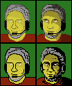
Okay, a little more about Selective Outlining, then. The ideas in the newest edit were not completely off base, but you did get a bit carried away. In this case, there are three things that you want to keep in mind. You have attempted to apply the selout technique on every section of every line, which has lead to a lot of long lines with little dots at either end. The concept is there, but the execution needs a little work. Also, in your implementation of the selout, you've created a lot of double pixels - the idea with selout is to keep your lines nice and thin, so a diagonal doesn't need a pixel joining their edges.

The other issue is, once again, contrast. You've got a whole lot of colors that are very, very similar. After reducing your palette to 256 colors, I noticed that you have four skintone colors, when you only visibly have three (Light, shaded, outline), and you have five shades of gray for the hair, when you probably once again only need three. We can work on palette economy later on, but I've made one minor change with contrast: making your second shade much, much darker so that it's visible. I was very conservative about contrast on my first few sprites as well, but I learned to start getting comfortable with high-contrast images and feel a lot better about the quality of my sprites now because of it.


I've made a few minor adjustments to your sprite - which, incidentally, is a great start on human anatomy, and I think one of your better portraits - in two ways: one using the selout techniques I mentioned previously, and another using line thickness instead (Sloppy at the moment, but I only spent an hour on it, sorry). Let me know which one feels better to you, and which you want to cultivate as your spriting style, and I'll be happy to lend a hand on either.
#70
Generally speaking, it's usually a safe bet that if you design a game with some peripheral in mind as a necessity, someone that wants to play your game isn't going to be able to. It is entirely up to you, however, to decide whether the improved functionality or features created by requiring the peripheral is worth losing their support.

The best way to work around it has been said above: design for it, but make it an extra feature, not a necessity. If you can scroll with a mouse wheel, also make it possible to scroll with a bar on the side, or with other shortcut keys. In the case of point 'n click adventure games, where speed and precision are less of a big deal, it should be much easier to implement some sort of alternative. It's always nice to program in something that allows people who have the extra input device to use it, though.

Not entirely unlike gamepad support on modern PC games. If you design for it centrally, a lot of people are likely to rage, but if you simply allow it, or even make it beneficial (but not crucial) to have it, it's good business.
#71
That's awesome. In the US, this is what we call "Dickbags"
#72
Critics' Lounge / Re: Speech Icons[art]
Thu 18/08/2011 17:08:52
Okay Bogdan, now I have an idea what it is you're trying to accomplish. As in any project, it's always best to establish what you're trying to do with it before you start, or you can get lost along the way.

It seems to me that what you want is flat coloring, so the shading really wouldn't be necessary in this case. There's plenty of art that is flat shaded and looks awesome, like the Clone Wars picture that you showed previously. I'm not familiar with Alan Ford, but I'm looking at some of it, and I think that it's also accomplishable, though you may need to sacrifice some of the more detailed hatching and other black line techniques if translating down to a smaller resolution.

Edit: Couldn't get to sleep, so decided to put together a quick sprite to demonstrate how you can achieve detail with pixel thickness. Used Alan Ford art as reference


Note - This will require a lot of trial and error, but if you stick to it, it doesn't actually take that long. If you do want to work on art of this type, however, the most important thing will be to think about your shadows and not be afraid to do some messy pixeling.

But I digress. I'll take your Count Dooku sprites as an example. The first thing that happened once I opened up your sprites in my art program of choice is that I noticed that you saved your picture as a JPG. This will mess up your color palette a lot - Despite the colors of his skin and beard being essentially all one tone to the naked eye, you actually have a ton of separate colors that are one or two points away on the RGB scale. Since you're likely to be working in 16-bit color, this isn't really that much of an issue, but it's inconvenient. Believe me, when you start animating, this is going to save you hours of work. I suggest GIF or PNG files. You can also save as BMPs, but they have no compression, so the files are much larger than they need to be and though I haven't seen it recently, I seem to recall the AGS forums killing BMPs completely back when I joined.

Now, back to the picture itself. The art is simple and very expressive. You've translated it well to a small scale, too. With black on light colors, the pixels tend to stand out very prominently, leading the picture to look somewhat blocky. If you are being very generous with the black pixels, setting varying thickness, etc., this isn't necessarily a bad thing but since your lines are thin (as per the subject material), there's a technique that some pixel artists like myself employ called "Selective Outlining" or "Selout", which uses varying degrees of darkness on your outlines in order to create the illusion of smoothness.

For reference:


I apologize, I was a little sloppy with my selective outlining, to be honest, but I was rushing a bit and there was an earthquake right around when I finished, so I thought I'd just get it done and send it along for you to take a look.

I also have a 'shaded' version, which just adds some basic shading to the flat colors. Your original shaded image's contrast is way too low to be immediately noticeable. A lot of pixel artists, including myself, will tell you that contrast is your best friend. If it's not noticeable, it's often considered a waste of color count (and we love to keep the color count low). Note how the shaded version I threw together has only one tone, which is arguably much darker than the original skintone, but when applied doesn't seem that different? When two colors that are of relatively high contrast are put together, it helps to emphasize the transition from light to dark, and with a small-scale image like this, you ought to make every pixel count.

I apologize, the palette on much of the beard and the flat skintone is broken due to the original JPG, but I hope that this at least gives you an idea. The tutorial that Darius linked jumps right into the thick of it and is a bit technical - I'd suggest something a little more 'friendly', like this one. I also learned a lot when I was just starting out from Mr. Colossal's site, Kafka's Koffee, though he seems to have changed the format.

Just don't rush, I guess is the best advice I can offer. Spend hours on a single sprite until it feels just right. Unless you have a strict deadline, there's nothing wrong with fine-tuning a piece of pixel art until it's ready.

Sorry if this is a little hard to follow, I may re-read and edit this later.
#73
I love how it's coming along - I did notice that the steep angle of the vanishing point on the pier creates a weird optical illusion of it being tilted toward the camera a bit. You could probably fix that easily by having the VP for the pier's boards further off to the right. Not a huge issue, however, so if it's likely to mess up the composition of your image, it isn't necessary to fix.

Funny, these remind me of a much more serious take on Red Flagg: Don't call me Blue. If I had the time and energy to do a shack in the woods, it probably would've looked like your first picture as well. Spooky.
#74
Earthquakes happen because the earth's crust is very thin and the major landmasses that once made up Pangaea are on free-floating chunks of rock that are constantly moving due to the flow of our consistently spinning molten core. The spinning is caused by angular momentum caused by the Earth's orbit around our sun, which is a matter of gravity, physics and all sorts of very complex mathematical stuff that is way over my head. The simplest explanation is it's all gravity's fault, though I'm sure someone with a more scientific background could discredit that statement easily enough.

Einstein's theory of general relativity gives some pretty decent reasons for these phenomena - mostly the interaction of massive objects upon one another in the "fabric of space-time".

Now, on the subject of Earthquakes - whatever the reason, they certainly happen, and can suck quite a bit. Even so, it's quite the sight to behold when you get to be one of the few that can experience something that awe-inspiringly destructive firsthand.

I think I got a little off-topic, or just explained something that didn't really need explanation. Were we talking about creationism here? I'm a little out of touch. Carry on.
#75
Critics' Lounge / Re: Speech Icons[art]
Wed 17/08/2011 14:13:33
Hey Bogdan - I'd be glad to give some advice, but I'd have to know just what you want to accomplish. How cartoony/realistic/stylized do you want your art to look? There are a lot of different ways to go about pixel art. At the moment you have some character portraits that are mostly flat colors with black lines to show features, sort of like the work of Matt Groening (The Simpsons, Futurama, Life in Hell). If this is the type of style you want, I would suggest mostly just deciding where you can leave lines out and let the human mind do the rest of the work in filling in the picture for you.

If you're looking for help with shading, that's a completely different set of skills. Let us know what you want to do with it, and I'm sure you'll get a lot of useful pointers.
#76
The picture's coming along very nicely. This main issue that I can see that's causing the issues with the foreground and background seeming disconnected comes from the ground, or lack thereof, directly off the rear edge of the cabin. There is a lack of detail to the ground, it seems to kind of 'turn to mist' just off the edge of the house, where the depth of field would suggest that it should take a bit longer for the ground to disappear completely like that.

The detail in everything else is awesome. Aside from the above point, I can see nothing wrong with it. Great stuff.
#77
Critics' Lounge / Re: Animation Critique
Thu 30/06/2011 18:45:12
I'd say there are two issues that could be addressed if you're going to be a perfectionist on this one. The largest one, and I think the one that's probably bugging you the most without you really seeing it is that his legs are only bending at the knees, including bending backwards on his forward step. It essentially leads to looking like his torso is extremely long and his waist starts at his knees, or that he's actually two people, one standing on the other's shoulders.

You could likely pull out a few extra pixels on the forward step from within his trenchcoat, showing his thigh, to fix this problem. Reference Khris's genericman for a better idea of what I'm talking about.

The other issue is that his toward-camera turn is very well pronounced, but he only turns sidelong in the other direction. This is what is causing the swagger that everyone is noticing. If you like the swagger, then by all means keep it - it definitely adds character to your sprite.
#78
Critics' Lounge / Re: Game Background
Mon 20/06/2011 03:38:20
Three colors are a fine choice - four is the standard for ultra-low-res graphics. The one thing I would suggest in this case is that you raise the level of contrast between your colors. The problem with it right now is that your light orange and slightly darker orange are so similar that it's difficult to tell them apart without really examining the picture.

If you're going to stick to a super-minimalist palette like this, you also may want to make a lot more use of your darker shade to create shadows and texture. I'd suggest looking at some two-tone lithographs or scratch art for inspiration. At the moment with predominantly light tone with dark only for outlines, nothing comes across as having any real depth. Look into some dithering and line weight techniques and this has a lot of potential!

Good luck!
#79
Critics' Lounge / Re: Guess her job...
Sun 19/06/2011 12:42:48
Since the art style is particularly caricaturized and Technocrat obviously wants to draw attention to his prostitute character's breasts, I think that the jiggling works. Of course it isn't realistic - neither are her proportions. Otherwise her head would crush her shoulders.

I think it really depends on what Technocrat's trying to accomplish with this character. If it's comedy, jiggle away! If it's more serious, Tabata's edit works really well.
#80
General Discussion / Re: GTD: DLC
Sun 19/06/2011 12:31:16
You seem to be under the impression that the people making games are only motivated by money and don't wish to communicate with the gaming population at large whatsoever.

I think that your analogy of a thief stealing from someone else is deeply flawed - a thief takes something that they have no right to, without consulting the owner of the items that they are stealing. It's a one-sided transaction and the victim of the theft receives nothing in return. A business offers products and services and generally requires compensation. Even if you are adamantly against downloadable content, there is nothing stating that you are required to purchase anything beyond the initial finished product and if you do, you get something in return. As mentioned in my first post, critical content is not withheld from the final product, only additional, peripheral content. Doomsayers that believe that one day you'll have to pay an extra fee just to fight the last boss are fooling themselves.

I'll openly admit: Businesses within the gaming industry are exactly that - businesses, and without charging for their product, they go out of business, but they (we) still listen to their audience and are consistently evaluating risk versus return and trying to offer the best content for the best value. If we didn't want to make something the users would enjoy, why would we work in an industry with such a low return?

"But games make millions of dollars!" I can hear you cry out. That they do - at least the huge-scale AAA titles that get all of the press nowadays - but they also require millions of dollars to make in the first place when it comes to anything larger than a one-to-five-man indie studio. A 20% profit margin is considered a big success for a non-MMO title in my experience. We hear about the unfoundedly enormous successes like the Call of Duty or Half-Life games; even Minecraft, but for every one product that sees a notable profit, there are 20 that don't even hit their recoup line. If we were just looking for money, we would be building commercial applications like Adobe or Autodesk, where the companies are free to release a product and charge based on its production cost.

It seems that the moment you create a luxury item (i.e. anything with no practical merit, only entertainment), people completely change their perception of the product. Hell, I've heard people complain when DLC is released for free, especially in the case of day-one DLC.

To continue my posting of educational content related to this argument, if I may, I'd also like to link to a video series on the escapist (That site with Yahtzee's Zero Punctuation videos) that I'm very fond of, which also goes into discussion about DLC.

Extra Credits: Project Ten Dollar
SMF spam blocked by CleanTalk