I've never bitched about signature size but Fluke, that's a hyperbolic amount of irritatingly ridiculous.
- Welcome to Adventure Game Studio.
This section allows you to view all posts made by this member. Note that you can only see posts made in areas you currently have access to.
#502
Critics' Lounge / Re: Practice Background
Thu 09/06/2005 09:03:19
I think I said it poorly the first time but, yeah, because of the perceived direction of the light source, I would expect the shadows somewhere between -30 and -45 degrees from their current position.
Overall, I like the recent edit. Like is a bit weak as I was beaming a bit having seen something impressive become more-so. Other than the shadow-position thing, my only other problem is one that was introduced between the 2nd and 3rd edit. The hill is shadowed some, but it seems to have blurred the outline and details a bit. Maybe it's an unfortunate side-effect of the shading but I liked it better with the foreground in focus and the comparitively hazy background. I've also been looking at it like an adventure game screen, though. The loss of focus due to lighting conditions might be more correct for this scene but if it were a game-screen, it would detract from character blending and player focus. (Sorry, far too wordy for simple comments).
Overall, I like the recent edit. Like is a bit weak as I was beaming a bit having seen something impressive become more-so. Other than the shadow-position thing, my only other problem is one that was introduced between the 2nd and 3rd edit. The hill is shadowed some, but it seems to have blurred the outline and details a bit. Maybe it's an unfortunate side-effect of the shading but I liked it better with the foreground in focus and the comparitively hazy background. I've also been looking at it like an adventure game screen, though. The loss of focus due to lighting conditions might be more correct for this scene but if it were a game-screen, it would detract from character blending and player focus. (Sorry, far too wordy for simple comments).
#503
Critics' Lounge / Re: Practice Background
Wed 08/06/2005 10:31:38
Near perfection. Agreed that the sky looks a bit empty but it might not be a bad thing. It has a bleak and lonely feel to it now. The picture's coloring is superb with everything complimenting everything else rather well.
The skyline appears hazy and the gradient leads me to believe that the sun is setting (or has just set) somewhere in the upper portion of the picture. The shadows seem very hard-edged and a bit contradictory to the sun's position. It would also seem that with shadows that straight and long, and the time of day being rather late, that the hill's shadow would over-shadow the objects a bit.
The skyline appears hazy and the gradient leads me to believe that the sun is setting (or has just set) somewhere in the upper portion of the picture. The shadows seem very hard-edged and a bit contradictory to the sun's position. It would also seem that with shadows that straight and long, and the time of day being rather late, that the hill's shadow would over-shadow the objects a bit.
#504
General Discussion / Re: ASCII table help
Tue 07/06/2005 12:46:04
What a confusing question. Less on the ASCII end and more on the question end. I know jack about Japanese except for the triple alphabet thing. Since there are more than 26 letters, you're trying to find out how to use ASCII codes and extended ascii to input text? You're replacing "A" with <Japanese letter here> and "Ç" with another, for example?
If a translation program's been made, it would seem the most efficient method aside from learning how to enter alt-codes or use Windoze character mapper. You could use Windoze customized character creator to make a TTF but that sounds awfully time-consuming (especially considering the fonts like Kanji that exist).
If a translation program's been made, it would seem the most efficient method aside from learning how to enter alt-codes or use Windoze character mapper. You could use Windoze customized character creator to make a TTF but that sounds awfully time-consuming (especially considering the fonts like Kanji that exist).
#505
General Discussion / Re: Why is this age limit set dammit!?
Sun 05/06/2005 13:30:32Quote from: Ishmael on Sun 05/06/2005 11:55:48Quote from: YakSpit on Sat 04/06/2005 13:26:38
Just the fact that a 12 year-old knows what that is, is disturbing.Ã, I think I was still obsessed with Transformers at that age.Ã, Then again, we didn't have Teh IntorNet(TM).
I don't know what it is... And I've been told I have a twisted mind :

<sigh> You're better off not knowing this, I think.
#506
Critics' Lounge / Re: Sitting Shaman
Sun 05/06/2005 11:01:20
Part of the reason the arms look strange is that the hands in the original version have 5 fingers with an absent thumb. Since they're all the same length and we can't see a thumb, the perceptive assumption is that the thumb is pointed away from us, meaning his arms are on backwards. I like the character other than that.. some more contrast for the mask would be nice. I can see the details but just barely.. enough that it's distracting because I'm straining to see the lines.
I can see what kind of pose you're going for. My suggestion would be to have the elbows on the outside but for minimal change to the drawing and slight improvement (IMO), try a line from just below the bicep, showing the outer 'wall' of the forearms extended towards the joint.
I'm not a big fan of critique by paint-overs but I did such a poor job at explaining myself that:
Also added a couple pixels to shirt-sleeve.. adjusted hand shape somewhat, lightened mask to up contrast slightly -- tried for overall minimal change to illustrate what I meant.
#507
General Discussion / Re: Why is this age limit set dammit!?
Sat 04/06/2005 13:26:38
Just the fact that a 12 year-old knows what that is, is disturbing. I think I was still obsessed with Transformers at that age. Then again, we didn't have Teh IntorNet(TM).
And Farl, don't worry about it. From what I hear, all Spanish males are a bit perverse.. muttering phrases like 'Deseo cogerse para conches en la playa.'
And Farl, don't worry about it. From what I hear, all Spanish males are a bit perverse.. muttering phrases like 'Deseo cogerse para conches en la playa.'
#508
General Discussion / Re: Why is this age limit set dammit!?
Sat 04/06/2005 11:12:48Quote from: Farlander on Fri 03/06/2005 19:05:35
I don't know if Fluebakake (sp?)
FlueBukake? Is that some sort of new chimney-decorating technique?Ã, Silly spaniard.
Quote from: DGMacphee on Sat 04/06/2005 06:04:58You're trying to proffer the idea that surrealism is a legitimate form of exhibiting one's own perceptions? Your juevos surely must have enough mass to have their own gravity wells by now.Ã,Â
... except that they're criticising legitimate exhibition art and I'm criticising a crudely-drawn Sonic posted on a forum for adventure game design. There's a big difference.
Edit: Oops.. This was the maturity thread, wasn't it?
#509
General Discussion / Re: Wine for Windows? - SOLVED!!
Sat 04/06/2005 10:54:33
I doubt it would work for Black & White, but there is an option to allow you to run 16-bit apps in a dedicated (pseudo-protected) memory space. I can't remember where I found it... registry somewhere originally then in FreshUI, a Windows settings tweaker. It gives a check-box to the Run Program box for the dedicated space. Other than the compatibility wizard or exploring properties to try more conducive settings, I haven't seen any decent tweaks that work reliably.
I'm thinking more and more about building a DOS/Win98SE box.
I'm thinking more and more about building a DOS/Win98SE box.
#510
General Discussion / Re: My Salty Vernacular
Fri 03/06/2005 13:51:37
This discussion seems to come up a couple times a year and, usually, the conclusion is the same: Try to avoid adult language in a forum that's frequented by younger people and sometimes seen over the should of adults by children. If it happens out of habit or as vigorous emphasism for something then so be it. At least, that was my understanding. I personally, see no harm in it when there's actual content around it. If swear words aren't used as the most meaningful words in a sentence, then at least it retains some merit.
And, I'd much rather see 'offensive' text on a page than questionable pictures - it's less embarassing and a bit more safe-for-work.
And, I'd much rather see 'offensive' text on a page than questionable pictures - it's less embarassing and a bit more safe-for-work.
#511
General Discussion / Re: Why is this age limit set dammit!?
Fri 03/06/2005 11:09:19
My only real problem with the moderative response in Critics was that it didn't have much in the way of tact. I don't disagree with the decision as I'm sure if he'd refined the picture himself, it would've improved greatly. I'm just wondering why he didn't get a more appropriate response like the ones given in this thread: "The critic's lounge is for improving your creative works after you've made every effort to perfect it yourself (or are stumped as to how to improve it). Here are a couple links to some Loomis lessons or a couple tutorials, or remember that it's meant to be a sprite, meaning ______." If that's too verbose, a simple "I think you're better than the time it seems you put into this, read the forum stickies, refine, repost. Fin."
Everyone's got their own moderation style, but I think that you tend to lose a touch of your patience after dealing with the same phenomenon month in and month out. And while FB dominated the General forum, he was new to the realm of Critics.
Everyone's got their own moderation style, but I think that you tend to lose a touch of your patience after dealing with the same phenomenon month in and month out. And while FB dominated the General forum, he was new to the realm of Critics.
#512
General Discussion / Re: Why is this age limit set dammit!?
Thu 02/06/2005 13:26:43
I disagree with the decision to lock the picture thread. Yes, the picture was pretty bad but he did say that he was better at drawing on paper. The posting of a second picture looked to be a revision of sorts.
I could understand if he started a new thread in critic's every day or every week and never took advice given him but there was hardly time to act upon said advice before that thread was locked.
I find this thread quite immature and some of his reacts doubly so, but I think a little more opportunity and advice could've been given him concerning his picture. If he didn't make improvements to it, people would lose interest, the thread would fade away. If harsh criticism didn't stop him from continuing, let him give it a shot. The picture looked quite poorly drawn but in a way that someone drawing with a mouse for the first time might've done. Some general practical advice (like basing body parts on shapes and how to use the line tool well) could've improved it, if he were willing to give it a shot.
However, the decision was made. It was made by a moderator. The thread was locked. I, personally, would've just dealt with it and either decided I didn't want to participate in the Critic's Lounge or I would've improved it and posted the results. Can't we just make reasonable attempts not to hold a grudge and let the guy give a shot at redeeming himself (numerous others have needed/taken that opportunity)? If he's still deemed obnoxious, then harsher judgements might be called for. He's nowhere near as bad as some that've come (and gone) in the past couple of years. And there's DG.. DG for Christ-on-Toast's sake! You let him post...
#513
Critics' Lounge / Re: new style for my second room!
Mon 30/05/2005 08:32:33
He's not posting .bmp's as images but URLs.. still preferred to avoid .bmps but people at least have a choice about loading it up. It's right in the link-line so it's quite optional.
#514
General Discussion / Re: my friendz lesbian
Sun 29/05/2005 16:51:17
<summary in the name of efficiency>
Bah, more or less a lengthy post somewhere in between the two warring factions.
Bah, more or less a lengthy post somewhere in between the two warring factions.
#515
General Discussion / Re: my friendz lesbian
Sun 29/05/2005 10:04:14
I was figuring the best thing to do with this thread was just to let it go. Ã, With the amount of thought, coherency, and subject matter put into this one, I don't know what kind of response you could get aside from, "That sucks.. Lesbians suck," or, "Tsk. Tsk. There, there." Ã,Â
Your phrasing/spelling would've been fine if it'd been a subject about a new movie, game idea or something where excitability comes across equally well despite it being chock full of "da's" and far too many Z's. Ã, The points already been made but the crux of it is the proof-reading icon under your name.
Anyone with anything useful to add has gone out on a limb and made assumptions about what you were communicating. Ã, Hardly efficient communication. Ã, What I gather is that she's a very good friend of yours but you would've liked there to be more to the relationship. Ã, At this point, she could be certain she's Female-Female, could still be Male-Female, or might be M/F-Female. Ã, Biding your time is about the best you can do at this point. Coupled with the goth bit, could be trying to find her identity or might've actually figured out what it is. Ã, If you're really her friend, you won't act as though the only possibility is identity-crisis. Ã, There's nothing wrong with thinking about that chance, but being supportive of your friends, even if you think they're wrong, is sometimes a necessary evil.
(Also, I'm not sure why you'd have to remove the moderators suck bit. If I were one, I'd find it about as offensive as being told that I suck, by a total stranger. Now, if it said I were a poopy-head that'd be different.)
#516
Critics' Lounge / Re: Yay! I got a tablet!
Sun 29/05/2005 08:22:03Quote from: big brother on Sun 29/05/2005 04:41:30Come on, it's artisitc nudity! Even the most philistine boss or parent couldn't have a problem with Stefano's picture.
You live in a very different world, my friend. My parents (and some various bosses) would have a problem with that, artistic photography, statue of David (uncensored), etc.
It's got a very comic-booky, pretty organic feel to it. It is a sketch, so there's no point mentioning feet. The pose is a good one for concept art. It gives a straight-shot but still shows open palm and fingers for reference. The neck bugs me a bit. In order for collar to incline from shoulder to base of the skull like that, his neck must be very pitched forward or non-existant (Or he's tensing his tendons with superhuman strength). If the angles met about halfway down the neck portion, I think it'd make him look a touch less stressed.
#517
The Rumpus Room / Re: The MSPaint game
Sat 28/05/2005 14:17:00
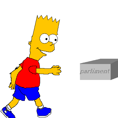
I wasn't sure what "parliment" was but figured it was time to move on.
Next: Any creature/character from The Dark Crystal
Next: Any creature/character from The Dark Crystal
#518
Critics' Lounge / Re: Spaceship Bridge: Crit and Color Help
Sat 28/05/2005 14:00:03
Ah, good observations.
I second the changing of the floor color.. maybe more metallic for it and beige or blue for walls?
Didn't even notice the left/right chairs (But Khrismuc did, but Darth didn't read all the posts ). One could assume that they swivel and are facing away from the console, but two is just too coincidental. 35° (or thereabouts) rotations for the both of 'em would add quite a bit of perspective/depth.
I second the changing of the floor color.. maybe more metallic for it and beige or blue for walls?
Didn't even notice the left/right chairs (But Khrismuc did, but Darth didn't read all the posts
). One could assume that they swivel and are facing away from the console, but two is just too coincidental. 35° (or thereabouts) rotations for the both of 'em would add quite a bit of perspective/depth. #519
Critics' Lounge / Re: Spaceship Bridge: Crit and Color Help
Sat 28/05/2005 09:36:00
I like the first one. Ã, In low-color screens, you often have to make compromises in order to keep things clear and identifiable. Ã, One of these compromises is using stereotypical coloring. Ã, A broom, for example, in a 16-32 color/low-res game will often be yellow-bristled and brown-handled. Ã,Â
No real crits as I like it as-is. Ã, However, if the panels with the green screens stuck out a bit (or were sunken in) it'd make the walls look a lot less 2D. Ã, The patterns on the walls, also, could use a mid-grey shade to make them sunken in or standing out. Ã, As it stands now, it looks a bit like an amateur attempt at brick-work. Ã, I'd almost rather see them go away entirely than provide a generic "Tech Pattern" that doesn't show any extra depth or seem to provide any real purpose. Ã, If they were connected in some way across the panels or to equipment, it might be different.
I'm hoping that didn't come across the wrong way because I love the BG.. that and the character - very SQIII (Maybe how SQIV would've looked if it'd been AGI on the Amiga). Ã,Â
#520
General Discussion / Re: Star Wars: EPISODE III Thread
Sat 28/05/2005 01:30:50
I imagine they don't have light-bombs because they wouldn't have any explosive power. They'd merely wipe out everything in a certain radius. Even a thermal detonator probably has a very small explosive radius but a much larger concussive wave, meaning more splash damage. They'd probably also be expensive to make. Light sabers take a length of time, effort, and special crystals from remote locations. The blasters probably have a focusing crystal of some sort but use charges of energy for ammunition. So, I'd say it's impractical to have a theoretically minor explosion for the expense. A light-bomb meant for blinding (with perhaps a certain damage radius) now that's an idea.
Don't know why I found that post so damn interesting. I'm going for more coffee.
Don't know why I found that post so damn interesting. I'm going for more coffee.
SMF spam blocked by CleanTalk