Menu

Show posts

This section allows you to view all posts made by this member. Note that you can only see posts made in areas you currently have access to.

Show posts Menu

Topics - Uhfgood

#21
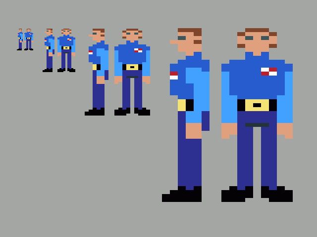
This kind of sucks -- the front view isn't really good because of the low res and double wide pictures... any suggestions would be helpful... He's supposed to be a bit barrel chested -- (ie a bit muscley)

#22
Let me know what you think.


#24
Just wanted to let you know that my review site is now at http://indieflux.com - so update your bookmarks.

The site has a somewhat new design, and new logo to go along with the new domain.

All the previous reviews are still there, Limey Lizard, the Ben Jordan Series, the couple of Ben304's games I've reviewed.
#25
General Discussion / My new review blog
Sat 28/02/2009 09:04:27
Hey, my name is Keith, and you all know me by Uhfgood, or at least some of you might.  I started a games review blog, and I'm intending to get a few indie adventures in there.  I don't know what one i'll do yet but I'll probably do an ags one for Monday.  
Here's the link - Indie Flux

I don't know if I'll do one a week or not, but I might.  I've decided to use Limey Lizard as my first adventure (and ags) game review.  On the whole I've decided not to review games that have explicit sex/nudity, violence or harsh language.  Not to say I won't review stuff with those in it, just on the whole I'm staying away from anything that would technically be considered "R" rated (or whatever the equivalent mature movie rating is in the UK)

Thanks,
Keith
#26
I'm just curious as to how you guys build your games.  Do you start with a story first, then build some puzzles/locations.  Do you start with just a setting, then build puzzles based on the setting, and then write a story around it?  When you write the story what form is it in? (ie Present tense, plot points, summary, etc).  Basically just curious about what process everyone goes through to put together their adventure games.

Currently I have a story (or stories as the case may be) in the works.  What I did was write out the specific plot points... (ie Iniciting incident, plot point 1, mid point, pp2, climax resolution), and built what would happen at those points.  I figured these would be in the form of cut scenes.  I intentionally left holes from one plot point to the next because I figured that's what the player will "play" to get to the next bit of story.  Next based on the story, I started working on locations, and puzzles to fill them in.  Does this sound like a valid way to go about it? 

Other options would be to write a virtual walkthrough, where essentially it's how the story would go, if you were playing it, and were successful (as if you were writing a walk through for a game that's already been made) in present tense...  Other would be similar to that, except in a narrative form, ie a story, novella or some such, and then build the game based off of it.  Another option could be to essentially build it in "choose your own adventure" form, and then based off of it, make the real adventure game.  (Note I'm not saying to build a choose your own adventure type game, where it plays animations based on what path you took... i'm just saying the initial story-writing process would be in this format, then of course you would build the game as normal, adding puzzles and things to conform to the multi-branching story you made.)

I'm considering rewriting my story stuff as a full story, with no blank spots... and then fashioning the game around it, instead of filling up the holes.

Your thoughts?
#27
I stopped working on my background for a while to start in on some animation.  A brief explanation here before I present the image.  This is intended to be generic (probably male generic), which I would use as a template for any other actual animation.  I want you to keep in mind that the drawings weren't precisely aligned and that may diminish the smoothness of the animation a bit.  Mostly i'm wondering if I should attempt to perfect it by doing it over, or if I should move to the next rotation.

Suggestions?  Is it really terrible?

Thanks, Keith.

#28
well it's been awhile, and after reading the excellent tutorial by mashpotato i started this -

Okay I started a basic paintover, using the technique of putting the sketch on a layer above the painting using multiply which basically means the white shows through and i can paint under the sketch lines.

I just decided to do it to show a friend, but if you're curious -- this part isn't even finished yet...  But I will work on it until it's perfect.

WIP 1


WIP 2


WIP 3


Actually the basic color blocking is generally complete until I get some feed back suggesting I change it before starting to apply shadows and so forth.

To make it less confusing, on the left side beside the computer desk is the dresser (it's the sort of light brown one).  Notice how it's shelves are more holes than shelves, they come to the edge and are seperated by the front of the dresser.  on the right side the gray thing is the bookcase, notice how the shelves are set in the case back from the edge.  Someone in the ags forums critic's lounge suggested I do this (maybe because of bad tangents or something) in any case I like it, it actually makes it look like a book case.

Basically this is the empty room before it gets all messy and the main character has to clean it up.  that's why there are no drawers in the dresser or books on the shelf.

The color choices are abit based on experience.  the dresser is a lighter wood, to contrast with the dark wood of the door and the trim, the bookcase is gray just to make it a bit different.  I made the desk something like mahogony or cherry, by adding a reddish tint, so that way it wasn't completely brown.  At one point in my life my walls were light blue with a light brown or tan floor (well the floor doesn't look tan exactly but close enough).  On the hole I think it's decent.  Note the dresser, bookcase, and door all have lighter tint on their sides, whereas the bed and the hamper and desk are darker on the sides facing the camera, not really sure if this is a good idea, but it makes me think that the foreground objects are closer to the camera, you can let me know if it isn't right.

Let's see... the hallway is on a single layer, the door is on it's own layer, the trim around door and closet are in it's own layer, trim around the bottom and outlet and switch are on it's own (same) layer... I basically put alot of things in their own layers, such as the insides of the bookcase, dresser, and desk... and then some of the sides.  the walls and the floor are the same as well... not really experienced with this software, using the gimp with a mouse but it seems to work.  at one time i thought of actually putting every white/negative space (any space bordered with lines to form a shape) on a seperate layer, but that may be overkill.
In fact this may be overkill.

I'll probably start working on the actual shading in a bit, the light is pretty much coming from the light bulb, that you can't see in the picture...  Any thoughts are appreciated, thanks!

Keith
#29
Okay this is just bugging me.  After saving Ambassador Wankmeister you're supposed to catch up to the Goliath (now manned by a mutated Captain Quirk) -- only, there's no clue as to where i'm supposed to go to find the goliath.  (This is after you've been through the genetix labs) -- So I look online, and I look at every single hint and walkthrough I can find, which tells you the exact coordinates but not how you get this information.  How does the player find out what planet to go to next?

Anyone who can figure this out will get my congratulations ;-)


#30
Hello my name is Keith, and some of you might have seen me as Uhfgood in irc --  I guess in a way i'm new, but more like i'm a long time lurker.  I might have posted here a couple of times, but not that much.  In any case i'm working on my first background, and have just started some sketches... Just wanted to get people's opinion.  These aren't in any way finished, but I'm wondering if anyone could give me an idea if the layout or composition is ok (or the scale).  Instead of posting a picture here i'll post a link to my blog, as I use that to document my progress... the top 4 posts have my progress thus far.  Here's the link - http://www.gamesafoot.com

If i'm out of line in anyway please be gentle, I will try to correct myself in the future.

Thanks
Keith

Edit: Decided to attempt to add in the images directly --

latest version -


previous (second) note: no room for the door to open -


first try -- perspective is way off


original concept -- I was attempting to make this and then realized that in each version I didn't have enough floor space for the character to walk around -- i still may go back to something like this though


Please note, i'm not attempting to emulate a cartoony style.  My backgrounds for this project I want to be somewhat realistic and of course pleasing to the eye (but the pleasing part is later when i paint it ;-)

Please read the blog posts for a more in depth description of what I was attempting.
Thanks.
SMF spam blocked by CleanTalk