Before thinking about what to put in this room, I'd suggest to fix the perspective of it, because right now it looks very odd. Therefore you have to set a vanishing point (aka. VP). I have done a little paintover of your room to show you one possibility for a VP and how the room should look like then:
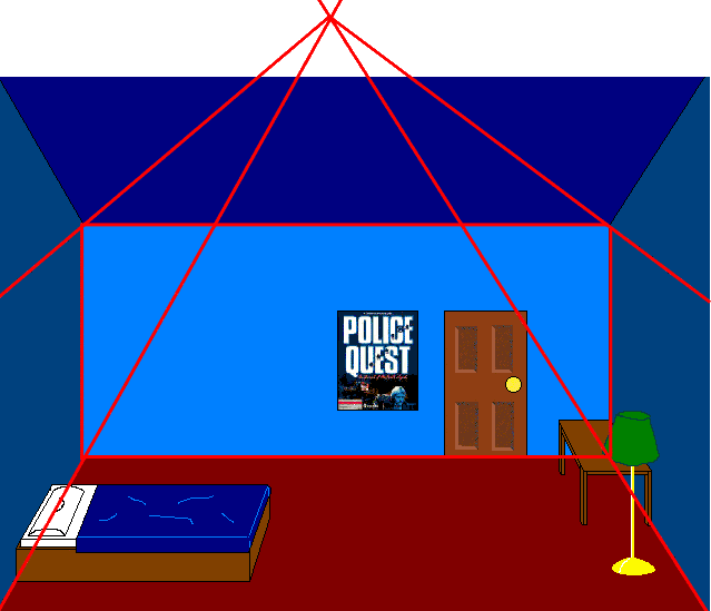
I chose the VP according to your two lines on the floor and kept the size of the square as big as in your original. The red lines show where your room lines should be according to the VP. Of course all the lines of the objects should point to the VP as well, but I wastoo lazy too busy to do them as well.
As this is a rather strange perspective for a game (the horizon is very high) I'd suggest to lower the VP and thereby make the floor more flat.
Furthermore, I think your door should be higher. A normal room is about 2.50m high and a standard door 2m, so there shouldn't be more than a fifth of empty space above the door. If it's supposed to be a room in a very old house, your height could be correct, as the ceilings where higher back then...
Now to the question what to put in this room. As this looks like an ordinary bedroom to me, why don't you take a look at your own bedroom and look what's in there. I really hope you have more in it than a poster, a table and a bed. Looking at my own bedroom, I'd suggest to put in a wardrobe, maybe a carpet, something to put on the table (lamp, computer, some pencils etc.), a chair to sit on in front of the table, maybe a stereo, a shelf with some books or CDs and stuff like that. If this is not supposed to be an ordinary bedroom, I'd definitely put something in to show what this room actually is for. After putting in all the objects, I'd sugest to add some texture and shading.
Other than the lack of perspective and the current emptyness, it's a nice bg.
Hope that helped. Good luck.
I chose the VP according to your two lines on the floor and kept the size of the square as big as in your original. The red lines show where your room lines should be according to the VP. Of course all the lines of the objects should point to the VP as well, but I was
As this is a rather strange perspective for a game (the horizon is very high) I'd suggest to lower the VP and thereby make the floor more flat.
Furthermore, I think your door should be higher. A normal room is about 2.50m high and a standard door 2m, so there shouldn't be more than a fifth of empty space above the door. If it's supposed to be a room in a very old house, your height could be correct, as the ceilings where higher back then...
Now to the question what to put in this room. As this looks like an ordinary bedroom to me, why don't you take a look at your own bedroom and look what's in there. I really hope you have more in it than a poster, a table and a bed. Looking at my own bedroom, I'd suggest to put in a wardrobe, maybe a carpet, something to put on the table (lamp, computer, some pencils etc.), a chair to sit on in front of the table, maybe a stereo, a shelf with some books or CDs and stuff like that. If this is not supposed to be an ordinary bedroom, I'd definitely put something in to show what this room actually is for. After putting in all the objects, I'd sugest to add some texture and shading.
Other than the lack of perspective and the current emptyness, it's a nice bg.
Hope that helped. Good luck.


 Why would anyone want the Michelin Man in a tight bikini? Gah!
 . Anyway, translated our slogan means wo different things: