Menu

Show posts

This section allows you to view all posts made by this member. Note that you can only see posts made in areas you currently have access to.

Show posts Menu

Messages - Vukul

#1
Just downloaded and played it in a single sitting. Loved it!)
The art is clean, the writing is evocative enough, with some interesting twists around the old space-colony narrative. Loved the personal and emotional vibe as well.
I'd agree with Potajito above, sometimes there were too many text choices, almost all of which, however, just give you more background. It might be better to split them into groups that are given when you re-visit the character (like you say in the tips section, it pays off to talk with people more than once--I really didn't feel the need to). And I always feel strange when I have to "ask the name" of a person you already know) But I see it was a conscious design choice, anyway.

P.S. If the font you are using in the game supports Cyrillic characters, I could do a Russian rendition of it. There's not so much text, and I think I'd be able to find some time to work on it)
#2
Hope it's not too late for me to join in the activity. Certainly, there are a lot of people to learn something from - and also the opportunity to show that you've learnt something. But enough blabbering :)

After some consideration and seeing the really great variety of interpretations of the subject, I decided to give a little revamp to one idea that has been haunting me for some time (of course, it was a kind of monster, why else would it haunt me). I'd call it Guardian of the Veil. So...

Guardian of the Veil, Step 1. Concept
First of all, I need to pin up the idea of the monster in question - of course, it can change over the course of working, but still there should be some starting point.
So, as I see it, the Guardian is a cross between the Death-like figure (with maybe some attributes like scythe, cloak, bones and such) to deter travellers from crossing the Veil and the Cerberus to fight them back (hence I could need some canine features added as well)... Originally, the Guardian was a masked floating figure with a weapon and armor, which existed partially in physical plane and partially in the ghostly realm. But in order to make it more 'monstrous' I decided to re-work it and try to combine with a Cerberus.
Thus, the keywords for reference should be 'death', 'cerberus', 'scythe' (or maybe some other weapon), 'mask'.

Now let's start looking for and gathering references (the thing I never did before, but I'll give it a try - why not?). To be continued...
#3
Anian
Ah, now I get this. Strange, it hadn't struck me so much - that is, until you mentioned it.

Adam H
Thanks for the advice about cobblestones.

Selmiak
Hm... That was my initial thought: sketch was originally made for an illustration, hence it is more dynamic. I figured that won't turn into a good BG.

Thanks everybody, I'll address the art tomorrow, may be give it a complete revamp to make closer to the sketch. Let's see what happens.
#4
Anian
Thanks for the input and pointers. Completely forgot about framing of windows and the main door - a silly mistake. Will supply them into a new version.
I get your criticism of the tree; though to me it looked quite natural. I'll try to remove or somehow replace those lower branches.
But also the thing I don't think I've understood: about the grass. What do you mean by 'sharp'? Is it because the one to the right of the stairs seems kind of blurry? Could you please point it out in a bit more detail?
#5
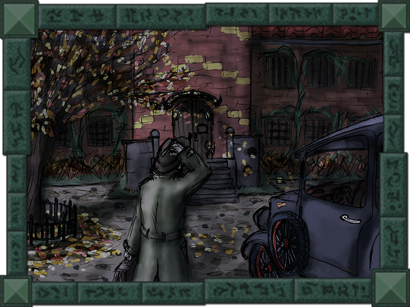
A bit of - rather irrelevant - preface. Being a fan of Cthulhu Mythos and Lovecraftian fiction in particular, I've been translating one of FFG Arkham Horror novels into Russian for my friends, and started to make illustrations for it just to feel some change of activity. And having some time ahead which I could invest into actual game-making, I decided to stretch my drawing muscles by turning one of the illustrations into a pixelated background.

Here it is (the illustration itself):


The sketch it's based upon:
[imgzoom]http://cave-progz.narod.ru/asylum_sketch.png[/imgzoom]

And now the background itself (black silhouette featuring in all the pictures has been added as the character base for reference - and for general creepiness as well :) ):
[imgzoom]http://cave-progz.narod.ru/asylum01.png[/imgzoom]
flat colours
[imgzoom]http://cave-progz.narod.ru/asylum02.png[/imgzoom]
textures and basic shading
[imgzoom]http://cave-progz.narod.ru/asylum03.png[/imgzoom]
global lighting

I do not consider the piece finished (only half-way, may be), so, I included earlier stages just to be able to return back to them in order to correct any issue. So, please. any pointers regarding what could be improved? Or just a direction?
#6
Sorry for double-post.

Based on your advice, I've redid something in the original image and tweaked animation a bit. Also, there's the latest attempt on shading (I'm quite satisfied with it at the point).

Here's what I've got now (the size is final, so no more awkward upscaling and/or AA borders):

Original size:        2x:

And, as I promised, the frame layout:


Looking forward to your criticism and/or suggestions.
#7
@ anian

Good point, I'll look into it.

@ Matti

Yes, I know about it. I'm working now at some other image based on your corrections so far. I'll provide both animation and original frames, and without any AA.
#8
Thanks for your responses, they've been helpful.

Yes, actually, AA appears because of quick upscale in PS (I'm not still sure about the final sprite size I need), but still it shows up like this ugly white board only in GIF, otherwise it will merge smoothly with background.

I'm happy you mostly like the animation flow; now there's a need to 'repair' shading. Yes, now it is way too strong on the hair, I'll try to go with less contrast, let's see what happens...
#9
Critics' Lounge / Top-down animation issues
Fri 22/07/2011 11:47:10
I've got some idea for a technical demo (who knows, maybe some day it will result in a viable game), which demands a top-down view.
Here's my attempt on making a generic animation, a base for other walking animations:

Original size:        2x:

And somewhat slower:

Original size:        2x:

Has anyone ever concerned themselves with this kind of animation? Any tips on making it better and - frankly speaking - more natural-looking?

And how'd you go with shading with this kind of animation. I tried something on the hair, but I'm not pleased with how it has turned out.

P.S. White borders are GIF imperfections.
#10
On the similar note, I'd say it's not only the matter of TTF/not TTF. For example, those TTFs that I have are good at displaying Russian characters, but fail to produce German and French ones. The best way out is to ask somebody who make games in languages other than English to supply you with fonts they use, for instance, in MS Word. Usually, they work very well.

P.S. Could anyone share (or PM) Arial TTFs with German and French characters? (Hopefully, I don't go off-topic)
#11
Idea - WHAM
Atmosphere - oraxon
Design - zyndikate
Composition - zyndikate
Functionality - WHAM
Technique - zyndikate
#12
@ Alan v.Drake
Well, until this moment there's been only serial killings of animals (modus operandi fits perfectly, btw - the same way of killing, the choice of victims, etc.)
...and who is a man if not an animal?
#13
I think, hunters can still be counted as serial killers? :-)


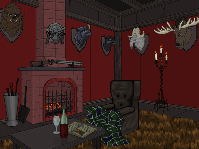
Catch a glimpse of his abode, while the master is away... hopefully...
There're still empty places for throphies.

I might have poorly arranged the lighting, so here's the version without any to pronounce details better

#14
If I'll feel like this, I'll certainly do.
#15
I'm working on something and trying to be ready for the deadline.
#16
Creed, yes, essentially you're right. But for the sake of the background drawing competition I've put the light around a, so to say, 'natural' lightsource (the lamp in this case).
#17
Idea - Alan V. Drake
Atmosphere - Alan V. Drake
Design - Alan V. Drake
Composition - WHAM
Functionality - Creed Malay
Technique - Alan V. Drake
#18
Posted a mockup. See original post.
#19


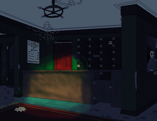
Haunted Hotel, the true nature of which only shows itself in complete darkness...
(unfortunately, didn't have enough time and/or skill to portray it just as it should look like)

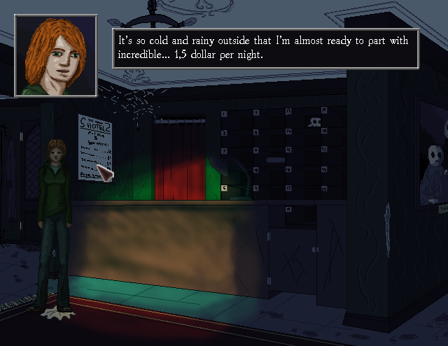
Mockup: Jane entering the hotel out from the street, soaked by the rain... (examines 'prices & services' poster)

#20
Idea - Snath3000 (I found this cryptozoologist's room quite interesting - because it's a rare thing to meet in an adventure game)
Atmosphere - oraxon (The light in the centre and the angle of view just bought me - something sinister is going on there)
Design - oraxon (Just like the work on the details and all those things like sink, radiator etc.)
Composition - oraxon (The composition is just great - clear focal point of the background in the middle, and everything you'll need is also clearly seen)
Functionality - Snath3000 (Because it's rather simple, it could already go into a game)
Technique - oraxon (As it has already been mentioned above - just like the colours and lines)
SMF spam blocked by CleanTalk