Menu

Show posts

This section allows you to view all posts made by this member. Note that you can only see posts made in areas you currently have access to.

Show posts Menu

Messages - dsg_charly

#41
Critics' Lounge / Re: please critic this crew.
Tue 30/05/2006 08:49:57
MrColossal has done a great job.

Just one thing, the blonde guy right arm must be visible, even a little part.
#42
Critics' Lounge / Re: making a dome look curvy
Tue 30/05/2006 08:42:57
Base of the dome (I mean the gray squares) doesn't match with the overall style.

Maybe removing some stone outline will give the picture more homogeneity.
#43
Critics' Lounge / Re: C&C on girl sprite
Mon 29/05/2006 16:42:40
Well, looks very good.

Now the crits  ;).

- Her eyes make her like a "cat". Maybe a little less make-up.
- Her left arm seems weird, maybe drawing the ankle (the opposite of the ankle of course).
- Her right hand is too small, even if the fist is closed.
- Maybe moving her legs from 1 pixel to the left.

Hope it helps.
#44
Me was "The Apprentice". Good immersion, good graphics, good ideas. A pro game. Was really impressed. :o

#45
IMO the grass seems like a stamp, not a solid floor but liquid. Try to add some "not as visible" edge lines to match perspective.

The car will be fine if you make the color balance more simple, the style is too realistic compared to the other BG elements.

Of course as you said, roof needs some shadowing.

Out of that the style is good, very polished and neat.

Good job KhrisMUC.
#46
Critics' Lounge / Re: please critic this crew.
Mon 29/05/2006 14:59:09
Apart of the "very nice" it deserves (because I think it's very nice  :)) same crits as yodaman11111 and Drawken:

Bearded needs some arm operations (Biceps bigger and shoulder displacement toward the right) and his feet angle needs to be increased (they are like this // || and they need to be like this \\ //). Same remark regarding blonde guy feet.

Hope it helps.
#47
He seems to be falling with his armor (too heavy ?  :)). Try making his legs more perpendicular to the ground.  :)

Hope it helps.
#48
The legs movement is very good, but the shoulder and arm not.
I've found this[url] Hope it helps.  :)
#49
Critics' Lounge / Re: The Misshapen Tree
Wed 24/05/2006 12:00:27
Seems good to me, gives depth to the BG. Congrats, I like your style. Curious to see some characters now.
#50
Great ! Great !

I love your style. Tell me, are you developping/drawing all alone ?
#51
Critics' Lounge / Re: The Misshapen Tree
Wed 24/05/2006 09:15:59
Considering the two BGs, the gas station style is better.

It's question of perspective:
In the house BG, everything is flat. You'd better change the angle, I've made a MSPAINTover (it's a paintover using MSPAINT  :)), look at the van (the perspective isn't perfect but it's to give an idea):
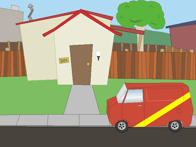
#52
I voted Finland, and, in a certain way, I won.  ;D

It was my first Eurovision, only to watch Lordi performance. They were good, but a darkest song would have been much appreciated.

Regarding the other countries, except of Bosnia which gave me a good laugh, to my mind, everything was more or less shit. I thought:
"But how that crap can be the representation of the european music  ??? ??? ??? Is this the better we can get  ??? ??? ???"
#53
Perhaps making to different kind of ceiling lights. Apart of this, it's good to me, and moreover I think the transparent TV screen is good idea.
#54
Quote from: seaduck on Sun 21/05/2006 18:17:02
...
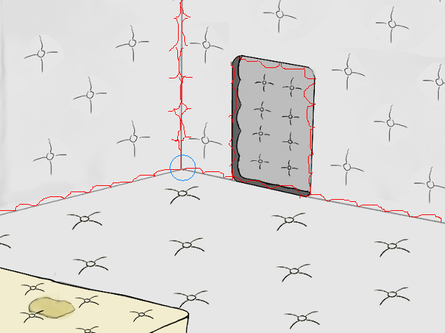
- it will look hideous when scaled down
...

Not necessarely, if it's drawn with a vectorial tool.
#55
Quote from: Saberteeth on Fri 19/05/2006 17:03:01
Is it just me or does the pink line seem...weird. It's probably because it doesn't have an outline... Like the camera though. :)

Same thing, the pink is something strange.

Regarding the camera, looking good.
#56
Apart of some incorrets vanashing points, everything seems good to my mind.
#58
Hi,

I think the Front Light (the one up the "RECEPTION" sign) is misplaced, comparing to the others one in the corridor which are centered and aligned. I hope it's understandable.

Try to add some shadowing.

Even though great style, it's very well drawn.
#59
Hey, not bad at all.  :)

Just one question, backgrounds are ripped or created from scratch ? (let's get clear, not meaning insulting, just curious).
#60
First of all:
Very nice!  :)

Second:
The two doors looks geat, but the padded one fits better.

Third:
Well I made a (REALLY) quick paintover with PAINT at work (so don't blame  :'()). I think the straight lines of the walls and floor must show some tap as well. And you could ajdust the merging point (blue circle on my paintover).

Hope it helps.
SMF spam blocked by CleanTalk