Menu

Show posts

This section allows you to view all posts made by this member. Note that you can only see posts made in areas you currently have access to.

Show posts Menu

Messages - loominous

#101
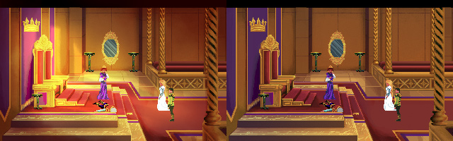
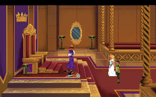
Not much room for walking, but there ought to be quite a few puzzle opportunities.


#102
Critics' Lounge / Re: Tree Painting
Wed 23/02/2011 19:33:53
Is there a reason why there's such a large rather empty area on the right?

As it is, composition wise, all the interesting stuff is on the left side, and the right appears to be filler.

So I'd experiment with a composition which focuses on the main subject/s, and where the background helps frame and draw attention to it/them.

For example, it took me quite a while to notice the guy's tree arm, because it gets muddled against the background (thought the tree belonged to the mountain.

An easy way to make things pop is to place them against a large plain surface, such as the sky, preferably bright if they're dark, and against some dark background area, if they're bright.

So I'd start experimenting with it on a very abstract level, before proceeding with any details, and once everything works on that level, start going into refinement.
#103
Having taken the long "learn the rules" route, I've come to appreciate the fresh naive outlook of people unfamiliar with them. In many ways, I find that: 'You musn't know the rules, if you want to break them' to be equally true. (It's like listening to a language; once you know it, you can't objectively hear how it sounds anymore)

So when I hear people categorically declare that the first thing to do as a beginner artist is sit down and learn the rules, it strikes me both as a dull and crude welcoming to the supposedly free and imaginative world of art, as well as a way of killing this untainted perspective.

Or to continue a train of thought from a previous poster:

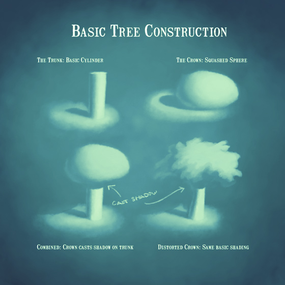
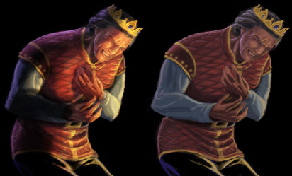
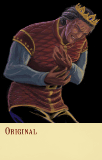
QuoteBad art & wrong perspective is horrible to look at, bad art with good perspective is still bad art but not that bad
.. while Good art with Bad perspective is still good art.
#104
Idea - Oraxon
Atmosphere - Mordellas   
Design - Mordellas
Composition - Mordellas
Technique - Mordellas
( Functionality - Mordellas )

Good to see your stuff again Mordellas, looks really good, and the crispiness and contrast sure makes mine look bleak and blurry (though it's somewhat intentional).
#105
Whatever happened to the functionality category? Feels kinda important.
#106


Bit of a stretch, though most kids will use any excuse, how ever far fetched, to avoid cleaning up their rooms.
#107
Have an entry cooking as well, will try to get it finished today (just started).
#108
Idea - DuncanFx - really neat.
Atmosphere - Zyndikate.
Design - Misj, for the interesting lamp design among other things. DuncanFx's whole design is nice as well, and Zyndikate's scene is filled to the brim with brilliantly executed elements, though most of them on the generic side (that gargoyle is terrific though).
Composition - Zyndikate. Just excellent.
Technique - Zyndikate. Again, simply excellent.

I worked a bit more on my would-be entry, though it has yet to reach a finished stage, but here it is, with a generic Disney-esque character added:
#109
I got an entry half finished, but will be knee deep in work for the next few days, so I hope the deadline could be extended a day or so.

Re: workshop

Zyndikate and I talked about it some week ago, and we thought around mid January would be a good time for a new workshop.

We're hoping to get people to contribute mini tutorials about stuff they think is important (hopefully in addition to participation), so if you have something cooking, or got some idea for a tiny to large tutorial, all would be welcome.
#110
If it's from the same scene then that would seem like a good idea for consistency.

One point I forgot to make, which I think is very overlooked generally, is that when you're designing a location, you're also designing a light setup.

Atm that throne room is pretty much an ambiently lit gold coloured box. You can break it up by introducing cast shadows from objects within or outside the scene, but those are still rather limited options.

So when you sketch down your location, ideally you'd be considering where the light will be coming from, whether it will create focus on the right spots, and if there will be differently coloured light coming from opposing directions, such as warm light from the sun through an opening, and cool light from a window.

This adds a level of complexity to designing these things, but will ideally yield handsome returns, through image "impact".

Zyndikate's latest background blitz entry is a prime example, where you have a clear division from the cool greenish light from the right, and the warm light on the left, creating focus on the relevant areas, and a nice diagonal division.


So the idea is to have interesting light for portraits or whatnot derive naturally from the scene design, rather than having to force it.
#111
Adjustment layers are simply tools to modify existing graphics, so in ideal cases they aren't needed, as things would be perfectly painted already, so they're more like training wheels than a mark of skill. (I tend to rely on them mostly for colours, as I work in greyscale, or rather, a tinted orangish greyscale, and apply colours afterwards).

Anyway, she looks nice and dramatic, though those pixelated areas pop out quite a bit, but I'm guessing they'll be cleaned up.

As you mention, the background doesn't fit her light setup very well, and could do with some excitement, either by more interesting lighting, or by adding some interesting elements, or perhaps both.

You seem to be mixing pixelated and regular brushes quite heavily, would you mind sharing your approach? Are you using some underlying reference material? (the lower part of the background wall looks like something from a treated photo for instance.)

In any case, there's certainly a lot more punch!
#112
Ah, I see what you mean - that black portrait background threw me off.

The neat thing though with adjustment layers is that you can simply alter the settings at any time to fit new conditions such as this, so with a few adjustments he can fit more nicely into this rather well lit surrounding:


(Animated)

-

That background, while very charming, could use a bit of focus as well, as what makes backgrounds visually interesting is the same as portraits or anything else.

So, giving it a quick and rough similar treatment, I got:


Bit too gradienty and generally crappy, but the visual impact is more interesting, which you can check by zooming out real far, like this:


where the left one has some kind of general dynamics going on, while the right one looks stale and dull in comparison.

This also goes for the portrait, and is a nice device for keeping a fairly objective perspective of your work:


Oh, and here are the psds: new portrait - background

Btw, when doing shadows, it's good to avoid using black, as it kills the colour saturation, and makes them bleak and unrealistic, and you can spot the effect in your darkened bg version, where the corners get gloomy.

In a candle environment, brights become yellow, mids become orange, and darks become red, and if you "shade" yellows or oranges with black, you instead get muddy desaturated yellows or oranges as darks, instead of red, which basically look fake and crap.

You can observe this colour temperature phenomenon in other places such as in skies, where they go from violet darks to cyan brights, and where, again, you get washed out crappy colours if you simply shade with black, for the same reason, and is another area when experimenting with adjustment layers will let you easily play around with these things. And yes, I'm quite obsessed with adjustment layers.
#113
I think what the image needs as a whole is "punch".

How much depends on the style and atmosphere, but right now there's a quite strong blandness, due to limited contrast, where nothing stands out.

Here's a Gabriel Knightish edit where I have simply suppressed some light, and added some by the use of adjustment layers. It's a quite crude procedure, but hopefully illustrates the idea well enough, and is a great quick way of experimenting with these things.


(Animated)

Here's the photoshop file (cs5) with the adjustment layers, in case anyone is interested.

I can't recommend experimenting with those highly enough, since you'll gain the experience of countless repaints in the fraction of the time.

(Should point out that adjustment layers, as well as any other method, relies on the knowledge of shape volume, so there's are no magic tricks, just quicker n slower procedures of selectively altering data).
#114
Quote from: Snarky on Thu 25/11/2010 22:09:08
Means-tested tuition grants can prevent or even reverse a decrease in social mobility

Could you elaborate?

If your point is that "taxing" well off students would allow institutions to accept more, potentially poor, students, why not simply raise the tax rate for those income brackets? Seems like a potentially messy way to start demanding tuition payments only from certain students. Are there any examples of this model being used in some countries?

As far as I know, there is a quite clear correlation between free education and social mobility.

And while it's true that countries like the US are able to offer rather unique first class educational opportunities for those with the means (or the scholarships), the downside is relatively low social mobility.
#115
Tuition fees only seem to lead to lower social mobility.

Higher education students are already disproportionately from middle and upper class backgrounds, and this would simply make matters worse.

Unless you have a flat tax system, "free" education doesn't really exist, since you'll be paying it back with future taxes. Long expensive educations lead to high paying jobs, which will be heavily taxed.

Course, you could always go through a long expensive free education and then not use it, which would be the closest thing to "theft". A most brilliant scheme.
#116
Critics' Lounge / Re: Main character portrait
Thu 25/11/2010 13:05:18
Her semi closed eyelids and slight cross-eyedness gives her a bit of a stoned look.

By opening up the eyelids a bit more and offsetting one of the eyes, as well as adding a pixel or two at the corners of the month, she becomes a bit more natural, though also more generic.


x2

Nice retro style!
#117
I suspect one reason for the slow votes is that it's hard to pick a "winner".

It's a bit like ranking your kids: if you have to pick the "best child" you're sure to have a hard time, but if you instead rank them by more objective qualities such as: "intelligence", "punctuality", "athleticism", etc, it gets a bit easier.

So perhaps it would be easier with some voting categories, such as: Idea/Originality, Personality/Character, Technique, etc, along the lines of the Background Blitz categories.

An additional benefit would be that you'd get multiple "winners", as you may not have gotten the most votes in total, but most in the 'Personality/Character' category, which can be potentially encouraging.

Just a thought!
#118
So, any ideas on what a game design writing activity could look like?

I'm guessing that the most appealing aspects to writers would probably be stuff like: character backgrounds, dialogues, cutscenes, or similar, so it should probably incorporate some of those.

To avoid being limited to mere framework design, I guess something like the game's first cutscene could be included, kinda like a trailer, where you'd get the taste of the general atmosphere.

So for instance, with a theme like: 'The Kite Flying Society', the activity could include:

I) Designing the world
II) Designing the main story
III) Designing the (main) characters and their backgrounds
IV) Writing the intro

As a complete novice when it comes to writing, I'm just tossing out ideas.

This activity could work as a standalone one, or be part of a general game design activity.
#119
That's a neat paintover for sure.

Regarding painting trees, I had this old mini tutorial lying around that might be of some help:


Should make one regarding simplified leaves n grass, though I'm not very good at either.
#120
I kinda enjoyed it. It had you figuring out the story, rather than some puzzles.

In any case you have to give the creator kudos for experimenting. Need more of that.
SMF spam blocked by CleanTalk