Menu

Show posts

This section allows you to view all posts made by this member. Note that you can only see posts made in areas you currently have access to.

Show posts Menu

Messages - loominous

#141
Critics' Lounge / Re: Portrait seems boring
Fri 10/09/2010 14:02:55
A common tip when dealing with values from a reference is to squint your eyes, which enables you to look past distracting details and get a good general impression of the value distribution.

Values don't only convey the form and material of the object, but also set the overall mood to a great extent, so it's a very delicate affair, that is easily messed up.

Like with everything else, it's usually good to start with the big picture, and work down to details. Blurring the image, equivalent of squinting your eyes, shows that due to a strong light source on the right, and a non-glossy skin, you find the main value difference on the left of her face, where the head is in shadow from the light source.
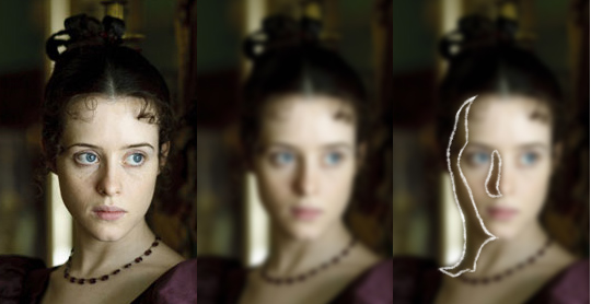


This is usually the case, unless you have very shiny objects, so it's good to remember, as people tend to instead focus and exaggerate minute highlights/shadow lines, which create weird and often mildly freakish results.

So by observing the object in this manner, you can begin with the vital areas, and work your way down to the details, confident that it'll probably turn out fine in the end, or at least that you've used a method that gives you a good chance at it.
#143
Quote from: abstauber on Tue 07/09/2010 07:43:24
I would go for Loominous as well, but it's way to blurry for a real game.

I tend to get a lot of comments of this kind, and I'd appreciate it if these weren't stated as facts, especially since they're often given by people with dubious credibility in hi-res art.

Express doubts by all means, but stating that something isn't viable as a background or sprite is a bold claim, unless you're intimately familiar with the technique in question.

-

That said, nice entries all around, and I'll have the next round up shortly.
#144
Idea: abstauber - Really like his expression.

Design: Mad - Nice colours and values.

Technique: Mad - Nice strokes.

Functionality: Mad - Pretty good angle, and clear limits.
#145


Ugh, these outdoor pics never cease having areas to refine, so scaled it down to 480xsomething, to conceal some roughness, which I don't think is supported by AGS, but 320x just lost too much detail.
#146
Have an entry cooking, so if you could delay the deadline a few hours, that would be appreciated.
#147


Never got around to finishing it, but here it is.

That's supposed to be smoke coming out of his ears.
#148


Another annoyance about to be turned into a feather ball.
#149
Got a bit carried away with the background, but here it is:


#150
I like the curvy pose, but his high shoulders make him look tense. His left arm could be more loose as well (the looser the arms hang from the body, the less feminine the pose).

Rough liquify edit:

#151
Considering the lack of voting activity, and it being five days already, it might be time to conclude this one.
#152
All for the democratic process, so here's a vote for SpacePaw, and his nifty take on the theme.
#153


Another one heading for the clink.
#154
Ok, vote roundup:

Overall: tie between Kelma and Sookiesock

-

Idea: tie between Kelma and Sookiesock

Design: tie between Kelma and Sookiesock

Technique: Sookiesock

Functionality: Kelma

So, about as tied as you can get.

To determine the host for the next round I did a coin toss, which fell on Kelma.

Nice work everyone!
#155
Ok, time for voting then.

Categories:

Idea -
Design - The design of stuff, regardless of the drawing/painting technique
Technique - The drawing/painting technique, regardless of the design.
Functionality -

For your voting convenience:
Code: ags

[b]Idea - [/b]
[b]Design - [/b]
[b]Technique - [/b]
[b]Functionality - [/b]
#156
THE TREEHOUSE

Can be everything from a kid's simple
construction, to an elaborate structure.

Hope you'll have fun!
#157


My initial intention was to make some scary voodoo hut, but since I don't really like unpleasant places, it ended up a rather cozy environment.
#158
Not sure I understood Flibble correctly, but I would agree with the sentiment that approaching hi-res in a pixelart kind of fashion is risky.

If you look at popular "analog" animation, many use very simple, and resolution independant styles, such as:

Futurama / Simpsons / Family Guy:


South Park


Despite an almost complete lack of shading, they work very well, at least in my opinion, and the resolution doesn't really matter since they consist of only lines and fill colours.

However, if you look in the CL, people will often insist on adding more or less elaborate shading to everything, in a lo-res kind of fashion, even when dealing with hi-res, or medium-res.

So, I guess my point is that if you want to go hi-res/med-res, have a look at ordinary animation to see how it's usually solved, instead of immediately resorting to some augmented lo-res approach.
#159
And noone has referred to the 'Offer your services thread' so far because?
#160
I think Andail's pose alteration makes an enormous difference, but think the lighting could be taken further, along the lines of Drew's reference image. Also find Drew's colour conformation important. Ali's suggestion of working from dark to light really helps in these cases.

Also pushed his head features more towards ideal proportions, which makes it rather generic, though less like that obnoxious guy in CSI miami.

Here's a slightly exhaggerated version:


For reference:


SMF spam blocked by CleanTalk