Menu

Show posts

This section allows you to view all posts made by this member. Note that you can only see posts made in areas you currently have access to.

Show posts Menu

Messages - loominous

#161
Critics' Lounge / Re: Sprite
Fri 19/03/2010 18:55:49
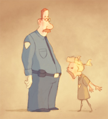
Suppose I could do an edit when I get some free time, but "my" approach is really just the ordinary way you'd learn this kind of stuff, you simply practice and experiment until it looks right, kinda like you learn colours by using them, instead of resorting to black and white.

So basically it would be like if you had made your own edit with a non pixel brush, though I wouldn't have included all of those charming, but, in regards to realism, unmotivated highlights on the clothes.

-

For the record: I do appreciate the look that limited colours provide in pixel art, and if I dabbled in it I would probably go with very few shades myself. I just think it's important not to skimp on the basics.
#162
Critics' Lounge / Re: Sprite
Thu 18/03/2010 22:53:34
Quote from: Lufia on Wed 17/03/2010 23:47:28
loominous: Which parts still look bad?

Since it's art, what's good or bad is really up to you. My comment was directed at the frequent sweeping advice to "reduce the colours!".

If you were aiming for realism, then most surfaces in the current version reflect the lightsource/s in an unconvincing way.

But for all I know you may have gone for a stylistic approach, in which case realism is irrelevant, and your taste everything.

-

In regards to different approaches to improve shading:

While I do see benefits with both approaches, I think the low colour route brushes the problem under the carpet to a large extent.

I have yet to see a single beginner artist who doesn't resort to overly soft, gradient style shading, when dealing with realism/semi realism, whether on paper or computer.

They look at objects and notice that most have soft shades, and replicate this to the best of their knowledge.

Sure, at this point you could restrict their palette, and the softness will be gone, but if you'd lift the restriction, and have them utilize a full palette again, the problem would still be there, because they still don't know what's wrong with their soft shades. And there isn't anything wrong with soft shades, only misplaced soft shades, and after some practice they'll be gone.

To be clear, I should point out that I don't consider limiting the palette pointless by any means. For instance, when studying light, it is common to limit the value scale to a certain amount of shades, ten for instance, which aids in gauging the distribution of shades in a reference, which can otherwise be very difficult.

At the end of the day, it's all about gaining knowledge. You can circumvent certain areas to a degree, but in the end it will always show to a trained eye, and while ordinary observers won't be able to spot what's wrong, they will feel it.
#163
Critics' Lounge / Re: Sprite
Wed 17/03/2010 23:10:08
Due to the frequency of these pillow/colour amount comments, I feel an urge to weigh in.

In my experience, unattractive shading has nothing to do with colour amounts.

However, reducing the colour numbers does often improve the looks of poorly shaded surfaces, in kinda the same way that applying grain can turn a boring surface into something passable.

So while it works as a quick cosmetic fix, it doesn't tackle the underlying problem, which is a lack of understanding of how light works.

Working in large resolutions/colour amounts exposes artistic weaknesses like this, so I would suggest that you stick to your large amount of colours for the time being, get those to work properly, and then reduce them according to taste, and in order to make the sprite more easy to animate.

Working in smaller sizes/colour amounts will often help you feel more content with your abilities, which is important to keep up the morale, but going hi-colour/res at least once in a while is a good way to keep track of your current weak spots, and help you improve your understanding in many areas.
#164
Sorry about the delay.

As Exsecratus' entry was left in a very unfinished (though promising) state, and considering the delay, I hand over the next round to Tier.

Nice entries!
#165
A Christmas Tale

Depict a scene from your favourite christmas story, or make one up!

Happy painting/pixelating!

(Restrictions: AGS compatible)
#166
As far as I got:

(much to touch up, particularly the right tree crown)


Not sure the idea got through, was supposed to be a sweet dream of a gourmand rabbit.

Edit: With a boring character, for reference.

#167
Haven't started on anything yet, but would like to give it a shot tomorrow, so it would be nice if the voting could start monday.
#168
Albert R. Murrows in yet another successful interaction with a visitor.

#169
The commitee is smart enough to have anticipated the reaction, which suggests that it was designed more as an attempt to pin Obama to his rhetoric, rather than a pat on his back.

#170
Idea: Xenophone (I liked the design idea of the pumpkin tree thingy, and since there was no design category to vote in, it something of a merger)

Atmosphere: Ben304 (While sci-fi atmospheres isn't my cup of tea, I think the style and palette works very well together to form a strong atmosphere/mood)

Composition: Ben304 (Though the pretty symmetrical composition is kinda dull (though tricky to avoid in these cases), the diagonals introduced mainly by the hole helped compensate.)

Functionality: Misj' (Flat styles like Ben's have a clear advantage in this category, so I tend to weigh the style trickiness against the outcome, and Misj's piece manages to feature three vertically varying but still well functioning action areas.)
#171
Crimson Wizard's entry gave me a last minute idea:


Having had his most priced possession stolen by some young jerk on a flying carpet, Uz, the jawadin merchant, scours the deserts in relentless pursuit to get his revenge, which, due to the pacifistic nature of most jawadin cultures, usually ends up just being a stern lecture on property rights. As he's always enjoyed riding his trusty camel, and since the chances of finding the culprit has gone dim, the trip has evolved into a longer vacation trip, and while he would never admit it, he often finds himself hoping that the scoundrel and magic lamp is long gone.
#172


Didn't have time to finish it up, so here it is in 320xsomething.

Might be a bit hard to see in this resolution, but there's an island in the center, featuring a weird tower.

Edit: With a character, for reference:


640xsomething version, hopefully making the island more visible, though I'm not sure the refinement level supports the resolution:

#173
Critics' Lounge / Re: Little Miss Mushroom
Tue 29/09/2009 18:32:46
Nice character!

Regarding the skin colour and shading, I think it all depends on the style and colour schemes of the intended backgrounds.

I'd suggest developing the character and background style simultaneously, creating "concept screenshots" where you get an overview of the entire graphical setup, as the only thing that really matters in the end is how these things work together.

Course, you might already have done something similar, and in that case it would be nice to have a look at a background to be able to give helpful advice.
#174
Quote from: Intense Degree on Tue 29/09/2009 12:22:05
Confused...

So... notwithstanding that the next host is chosen at random, was there a ... winner? ???


As I find the idea of "winners" when dealing with art pretty perverse, I personally never give away such titles, but since Misj' was declared a winner by ProgZmax, I guess we ended up with one after all.
#175
Fair enough, Misj' it is.

(I understand that there is little prestige in being arbitrarily chosen, but it seems like a fair system that will rotate the hosting duty rather than mainly recycle a few people. I'm of course up for a discussion on the subject if people find this upsetting, as I have probably overlooked a few aspects.)
#176
Okie dokie.

Harvesting the awesome power of wolframalpha's randomizer function, ProgZmax, has been ordained to be the next host.

Great bunch of entries everyone!
#177
To my knowledge you have fairly free rein, as long as the activity revolves around backgrounds, and is of customary duration.

Could probably enter yourself, though to avoid a situation where the host keeps getting repicked, you could either exclude yourself from voting process, or choose a another host selection system (a randomizer based one for instance).
#178


SPIES

Anything from a suave agent to a kid gathering intel on his neighbor.

Restrictions:

Lo-res: 8 colours, 40x40
Hi-res: 8 colours *, 400x400
(* Excluding anti-aliasing and shading.)

If you go hi-res, please make sure that the sprite is reasonably easy to animate.

Good luck, and hope you have fun!
#179
Critics' Lounge / Re: Griffin - Photoshop
Mon 14/09/2009 22:50:17
Think the texture is working pretty well, but think it's quite lacking in volume, particularly the far legs, which looks lit by a special light source under the stomach.

Even if you don't use shapes to construct the image, it might be a good idea to project a sort of wire frame model onto it in your mind.


Once you know the surfaces, lighting it is merely a matter of judging the how well their angles would reflect the light source.


Getting the values down in a rough state before you begin any detail work has a few benefits: first off, it allows you to design a pleasing light setup, one that pulls the focus to the areas you want (and subdues areas of less importance),  sets the proper mood, and brings out the best in the subject. This is a crucial but unfortunately often neglected step. It's the difference between party photos taken with a crappy camera vs studio photos. Secondly, it saves you a lot of rework, as you make the decisions with the greatest impact early on, basically giving you a blueprint to follow, instead of adlibbing it and having to ditch precious parts that turns out to not fit the rest.

Anyway, regardless of what approach you pick, good luck!
#180
Critics' Lounge / Re: critic on webpage
Fri 11/09/2009 23:34:21
I ventured into web design a while ago and found myself doing these crappy scattered layouts until it dawned on me that my aim was basically that of a painting: creating a focal area/areas, and making the rest support it/them rather than compete.

So I started scribbling down the composition in thumbnail form, just as I would with a painting, and went from there.

Not sure how much of a helpful advice this was for you, but I could've used it.
SMF spam blocked by CleanTalk