Ok then, time for voting, which will last roughly a day.
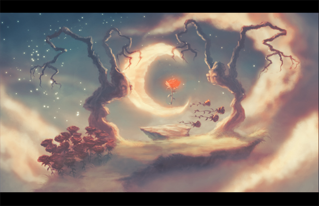
Categories:
Idea:
Atmosphere:
Design: How well the elements are designed, from clouds to doorknobs.
Composition: How well the elements are combined to create a pleasing whole, and lead the viewer to the points of interest.
Functionality: How well it would work as a background, with clearly defined entries and walkable areas, as well as a good viewing angle.
Technique: How well it's rendered, in no way meaning the more elaborate the better.
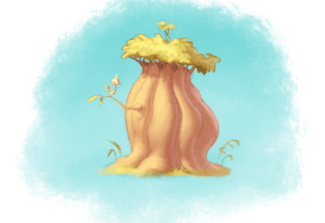