Menu

Show posts

This section allows you to view all posts made by this member. Note that you can only see posts made in areas you currently have access to.

Show posts Menu

Messages - loominous

#221
Quote from: jerakeen on Sun 17/05/2009 12:50:41
I thinkI'm late to present my picture, isn't it?
Forgot to start the voting, but if you post it within an hour or two it's fine. Voting will commence at 4 PM GMT (greenwich).
#222
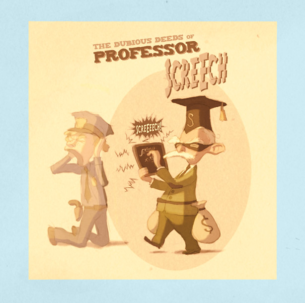
Excuse the plain stupid last minute idea:


Abilities: Exceptional tolerance for shrill noises, and the skill to produce
deafening sound waves with his trusty black board

Background: After fracturing the eardrums of the entire university council during a presentation,
professor Shriller was forced to find alternate means of financing his research,
and thus Professor Screech was born.

#223
THE ACADEMY


An interior or exterior of anything from a space fleet academy to a wizard university.

Good luck!
#224
Not as refined as I would've liked, but I ran out of time:


Those things on the right are supposed to be warriors turned into stone.
#225
Quote from: Misj' on Mon 27/04/2009 21:58:23
Quote from: loominous on Mon 27/04/2009 21:38:24
If money is an issue, I'd go with a used but large wacom tablet of an older model (art pad, intous 1/2). A4 is a nice size, and should be cheap at this point.
Actually...in most cases I would suggest A5 rather than A4. Particularly for a 'training' tablet;

The reason why I usually suggest large tablets is that the large surfaces help activating the whole arm when drawing, where just moving your fingers won't be enough to reach areas. Relying exclusively on the fingers when drawing is extremely common particularly among beginners, which severely limits the looseness of lines, and smaller tablets encourage these small motions.

You can draw with tablets of any size of course, but to get nice flowy lines, which I think in many ways is the foundation for good drawings, a large surface is pretty much the only way to go.
#226
If money is an issue, I'd go with a used but large wacom tablet of an older model (art pad, intous 1/2). A4 is a nice size, and should be cheap at this point.

Newer models are a bit more fancy, but the additions usually have little or no actual impact on your drawing/painting performance. Some programs like Painter have features that require newer models, which are able to detect the tilt of the stylus for instance, but very few people I know actually use these features.

So a large, used and old wacom would be my budget recommendation.
#227
Critics' Lounge / Re: Background depth
Wed 22/04/2009 16:41:49
Think you should keep them as is if you're happy with them. Perhaps they're really huge, perhaps the trees are really small.

One thing that bugs me, apart from the foreground, is that the trees don't feel like larger masses, but like separated individuals. Trees tend to form pretty much indistinguishable (at least at these distances) groups, and this is actually very handy when you paint them, as you can get away with scribbles.

Having them separated gives them a bit of the same feel as a kid drawing each individual hair on a character, making it feel sparse and odd, though of course at the same time nicely naive, so in the end it's a style choice.

Anyway, cool background!
#228
Looks like Kastchey got the most votes - take it away!
#229
Whoops, forgot mentioning the categories. Single votes this time around then.
#230
Ok, time to vote!

(Ends in 24 hours)
#231
Quote from: Ben304 on Sat 18/04/2009 04:03:53
I really had a hard time convincing myself it is ok to let things overlap, so perhaps my head is stuck in some stupid place where everything must be 100% visible.

As long as the important stuff is readable, I don't see any real reason for not overlapping, unless it's a style choice.

In my version I had some unhappy tangents, such as the chair n center ladder, and those things can arise when you overlap, but can be fixed.

QuoteSame for the low vanishing point, even though I really like the way it looks.

While a low vanishing point will demand more scaling when the character moves closer and away from us compared to an overhead angle, the gain is that you show less ground (due to the perspective), so you can limit the walkable area quite heavily. Many of your exterior backgrounds have had very low angles, some even a frog perspective, and it doesn't seem to have caused any actual problems.

-

Regarding values:

I don't know how much light you're planning to add to the background, but I'd suggest that you'd work out the main lighting first - as if the house was empty - then darken/lighten areas to distiguish objects. This way you'll be able to quickly lay down the main light, get the overall lighting set, and then start with the "details" such as the table n shelves.

Glad you liked the layout!
#232
Think the last one looks better, though I feel you went a bit overboard with the depth thing (though always good to try out the extremes to find a happy middle).

Here's a quick layout idea just to illustrate a few points:


Should first off point out that there are many perspective and scaling issues in the edit above. I tend to ignore these until I start to refine things, as I want to maintain a flow/looseness, and worrying about whether things are in perspective etc is quite a shackle.

Focal point: Having a high window being the focal point is tricky, but luckily it can provide some light that can place another focal point elsewhere. So I added some light falling onto the floor, pulling the attention to somewhere around the golden ratio, where the table details will hold the viewer for a sec, and then lead the rest of the area, and most likely lastly lead to the door part, where I added a few details as a small treat.

Horizon: I placed the horizon line (which you can see faintly) quite low - atm it's at the character's eye level - which gives you less of a detached surveillance camera feel and more of a "being there" feel.

Depth: I limited the depth quite much as you didn't want any scaling, but there are still things overlapping. We get a bit of zig zagginess with the oven thingy closest on our left, then the table on our right, and the next being the character in the center, and then back to the wall/window.

Composition: The round nature of the house makes an asymmetrical composition trickier, so in this case I offset it mostly by having the window light onto center/right side
creating a bit of unbalance.

Design: The main thing imo is getting rid of large dull surfaces, so I eliminated most of this by placing the different areas quite close together, and by filling out empty spaces with smaller details. Didn't really spend any time on the design of things, but sketching quickly/loosely will often give you these curvy lines that can break up much of the boxiness, and which you can then build upon or keep.

Values: I think some lighter values will help keep it friendly, so unless the house is supposed to be spooky, I'd try to light it up more, to fit your friendly style.
#233
Critics' Lounge / Re: Works of Sparky
Thu 16/04/2009 21:53:02
Looks great!

The rocks look really nice, did you create them from scratch or from a photo? The reason I ask is that there's quite much light inconsistency, where the rocks on the right are lit from the right, and the light on the center left one is from the front/left, while the left is kinda hard to tell but leftish, almost from behind, so it kinda suggests a photo montage, but it could very well be a creative decision.

It's the same thing with the grass/plants on the right side, which would be in shadow from a lightsource from the left. I think placing them in shadow would make that area a bit less monotone and make the whole thing more dynamic (though it's a very interesting scene as is).

A few small things:


#1 The light seems to be coming from a strange direction on this object, making it feel a bit pasted in. It's a tricky angle though, but there's something not right.

#2 The ground tiles/bricks (or whatever they're called) seem to correspond to a higher horizon (a bit too little X rotation) - we seem to be looking "down" on them too much for our perspective. They seem a bit too uniform as well, making them seem almost like polished bricks.

#3 The light in the cave seems rather tame and uniformly lit (there doesn't seem to be any real light strength fall off)

#4 The tree crowns don't strike me as very natural, more like trimmed trees/bushes you'd find around a castle. I don't really get a sense of regular leaves either, more like large bushes with tiny leaves.

But all in all a really nice scene!
#234
Cool entries!

Just wanted to point out the short deadline (1 1/2 weeks), so to all my fellow procrastinators: don't delay, join today!
#235
Funny, it kinda feels like we're back at the first posts in regards to design and composition.

Interiors are basically man made landscapes, so the same ideas apply when it comes to composition and design.

The current composition is basically symmetrical, the horizon line very low with large dull walls taking up most space, the design of most of the things is uninteresting, there are no layers/overlapping elements, and the focal point is a fairly uninteresting window with nothing important around it.

So basically I'd try out everything that makes your exteriors exciting and apply it here. Go wild with the shapes (goes for all objects - try to get contrasting shapes next to another for extra effect), get a nice angle, make the composition assymetrical, get a few depth layers in there, and get the focal point at a nice interesting spot.

I struggle with interiors myself and find them more constraining and less fun than exteriors, but I think that's much due to the boxy/cliche kind of thinking that's so easy to fall into when dealing with man made objects, and as soon as you break free from it, things start to get fun.
#236
Streptococcus mutans henchman supervising the attack on yet another innocent tooth:

#237
Great design in the last two!

One thing you could try out is to avoid shading with black, or any other unsaturated colour, as you'll lose any intensity of the light, and also get dull shadow sides. Basically you get a "dead" look.


So basically it's about maintaining saturation, and shifting the hue as areas get darker, which shading with black or similar won't produce, and you instead end up with lifeless, pale colours.

This works in muted palettes as well, where you can still inject life into the colours, without going saturated.

-

Another thing to try out with direct sunlight is creating shadow regions, to avoid these large uniform lit areas. A common thing is to place foreground elements in shadow, to at the same time boost the sense of depth, and you can also "mask out" light with shadows, to get rid of these large plain surfaces, and add some interesting light shapes.

-

Misj: Cool tutorial - the use of a greyscale image set to multiply is really handy, though the backside is that it kinda works against what I described above, if one strives for colours full of life, as the result is close to that of shading with black.
#238
Looks like layer folders aren't supported, but the screenshot does suggest that you can access at least some adjustment layers:


In the full version, there should be a heap of adjustment layers when you press that button, but I suspect you're down to a few.

Here's the photoshop file without the folders, curious to see what you get

For reference, this is how it ought to look:


#239
Quote from: Ben304 on Sat 11/04/2009 10:39:54
I tried looking at the psd you uploaded earlier, unfortunately I couldn't seem to view the adjustment layers. I'm curious as to whether this is because of something I have missed or whether because I am using a limited version of Photoshop, but I'd really love to be able to use curve layers, so I'm hoping it is just something I have missed.

Could you take a screenshot of your layer list when you open the document?
#240
Critics' Lounge / Re: WiP female warrior
Sun 12/04/2009 10:43:26
Aw, think the boldness of the original is slipping away with the loss of the greens, and now it starts to look like a studio shot with a backdrop, due to the colour/lighting setup which is rather odd to begin with.

Instead of conforming it to the "studio setup", you could add more greens to other shadow areas, if you want it to make more sense. Incidentally this kind of palette is pretty common these days in tv shows, where darks are pushed towards greens, contrasting against the reds in skins.

Don't lose the boldness!
SMF spam blocked by CleanTalk