Menu

Show posts

This section allows you to view all posts made by this member. Note that you can only see posts made in areas you currently have access to.

Show posts Menu

Messages - loominous

#241
Critics' Lounge / Re: A drawing! (WIP)
Sun 12/04/2009 10:29:33
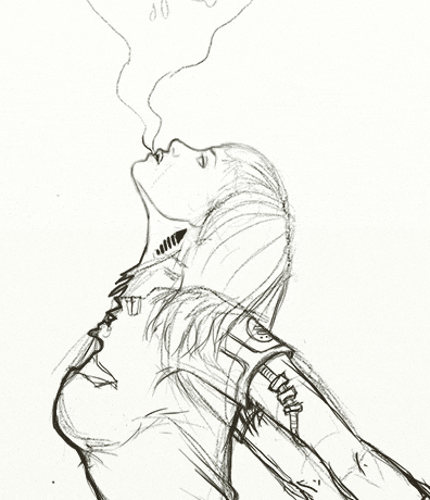
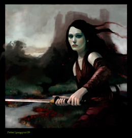
Not sure if you're going for a beauty - the body sort of suggests it - but if you are, you might wanna change some of the facial features more along these lines:


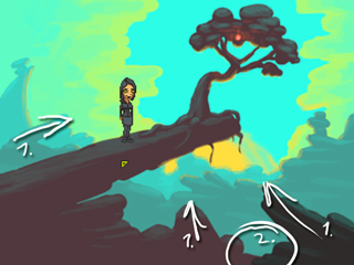
Btw, what's she doing?
#242
Think the lighting works quite well, but the low intensity and colour doesn't really suggest sunlight but rather dirt lit up by an overclouded sky.

As the only time when sunlight isn't very strong is when the sun sets, and then the hue goes towards red, the current setup is pretty confusing to the viewer, as the intensity is that of the very last stage of a setting sun, but the colour of the light as well as the angle is that of late afternoon.

This of course falls under creative decisions, so I'm not proposing that you change it to fit realism, just that if you want it sunny, then the intensity probably needs to be increased.

If you have the psd for one of the bgs, I could add an adjustment layer that punches up the sunlight.
#243
I think the aa works pretty well at integrating the sprite -- at this point the dark outline is probably the bigger culprit, since the contrast is otherwise very limited.

Exaggerated version:


-

About the sunlight dealy:

The colours are indeed a bit dark for strong sunlight.

Another thing is that the saturation decreases with darker values in your version, which is why shading with black rarely works well, when it, like in a candle, should stay pretty much intact, just change hue. So the brightest parts are yellow, the less bright, orange, then red. This constant saturation is really important in getting things to look warm, just cramming on yellows will look harsh n fake.

This is where adjustment layers come in, as you're able to basically say: make all bright values in the layers below yellow, these values orange, and then just paint with whatever colour you want, and they will take care of the colour/hue/saturation.

So I start out with a black n white value pic that get coloured warm by two adjustment layers, first one that resets the colours, and makes everything orange, so that I can work with any colours below (hue/saturation adjustment layer), then one that pushes bright values towards yellow, and darks toward red (curves).


The important thing with the values is that they separate areas lit up by the sun, and those that aren't. The areas lit up by the sun will remain unaffected, but those that are in shadow will have the sky colour added to them.


Then it's a matter of applying colour, which I do with curves adjustment layers, where I push the colours towards their local colours.

The sky is basically another lightsource, so it has to be pushed quite heavily, whereas areas like grass n similar require smaller pushes, though this is all up to your taste.

As mentioned, adding the sky colour to areas in shadow from the sun will create contrast and make the sunlit areas pop out.

Here's the photoshop file, where I added a few descriptions in the folder names.

-

The above mentioned approach is bit backwards, as you start with light, when by default things are dark. You can take another route, which is a bit more logical, and more in the style I did earlier in the thread, where I added sunlight to a background. Don't recall which thread I posted these in, and I'm too lazy to rewrite the descriptions so I'll just post the images:


These images sure make the length of these posts rather impressive, so I'll stop now.

Cool background btw, and I agree about the curve lines!
#244
Welcome to
STAN'S USED [?]


Guidelines:

Can be anything from used rollercoasters to pepper mints.

Stan doesn't have to be featured inside the background,
and the style doesn't have to fit any of the MI games.

Resolution and colours should work inside AGS.

~~~~

Good luck!

#245
Critics' Lounge / Re: WiP female warrior
Thu 09/04/2009 21:23:03
Think the background looks a bit better, but the generic mountain thing feels needlessly dull.

I was thinking more along these lines, where you catch a glimpse of "another section" of the world.

2 min crude edit:


So instead of these layers of mountains that hold no interest, you get more of a sneak peak into in this case a lake environment, which I made quite warm, just for contrast/seperation, which doesn't really work with the current palette, but could be made to work.

The new hill messes with the composition a bit, and I prefer the old diagonal running from the ground up to the castle on the left, but I just wanted to illustrate the depth idea.

Quote from: Evil on Thu 09/04/2009 19:53:03
Her face is very pretty. Something about her mouth doesn't look right, though.

Think it's the highlight/specular which is placed too high for the light angle, giving the lips a very flat look. (there are other highlight issues in the face, but they seem rather unimportant at this stage in the process).
#246
Last one looks great!

Think the composition/focal point/framing works, the colours are really cool, and the design of everything is really nice.

Looking at the other backgrounds in the game, the last one (featured below) has one strength that I haven't mentioned yet, and has to do with "arrows".

"Arrows" marked with #1:


So basically these are objects pointing towards the/a focal point. We follow objects with our eyes, and in the best cases, the "arrows" leads the eye towards the/a focal point or another point leading to the/a focal point. The other backgrounds in the game lacked these, which makes them a bit more "scattered".

The area marked with #2 is an unfortunate tangent, which makes the objects merge which confuses the viewer. When I first looked at the image, I didn't actually catch that the right rock wasn't part of the left rock area due to this.

Looking forward to your progress!
#247
Critics' Lounge / Re: WiP female warrior
Thu 09/04/2009 13:33:28
Looks great!

Are you planning on taking it towards refined realism like the face or keep it sort of collage like/stylized? I personally really like the contrast between the refined face and that scribbly hair, but it's good to know the direction when providing ideas/comments.

Beside smaller things that might be taken care of when you refine it, I guess what feels less good is the background design, which feels unexciting with the symmetry and design of the castle n hills.

I sense that you probably don't want to attract attention to the background, but it just feels needlessly unimaginative and makes the overall impression of the upper region/composition quite dull. Perhaps by adding some more space for the valley thingy on the right (basically enlargen it towards the center), we could get a better climpse of the landscape, which would provide a bit more depth (though I'm a fan of limited depth), reveal what kind of landscape/world we're in as it's a bit hard to tell atm, lessen the overall symmetry, and finally would also provide a sort of triangular composition where we'd move between the face -> hands/sword -> distant hills. Atm the sword kinda leads us straight off the image, the only thing sort of picking it up being the rightmost distant hill. I guess this could be replaced by some attention grabbing details on the right side of the castle though.

And of course, the camera has to be dramatically lowered!
#248
'Local colours' is a term often used for the colours objects have when reflecting neutral light (not tinted), and they sure can be tricky to work with without getting a bland impression. In environments they don't actually exist, as as soon as you place objects in an environment, theyt start reflecting everything else, like a muddy mirrors, and thus the local colours get distorted.

It's funny how you're coming from this direction though, as most start out working solely with local colours, then progress to "enviromental colours" (just a term I made up), which is pretty much what you're using, though in a rather extreme way.

They way I approach local colours is kind of backwards, where I start out without them, having everything reflect the sunlight without absorbing any colours (giving everything the same colour as the sunlight), and then basically tint stuff with adjustment layers.

I find this a quick way of working and gives full control of all individual colours at any time, which makes it fantastic for experimentation. It can give a fake/dead look if you're not careful though, so it's hardly fool proof.

-

When going with more local colours, you'll probably want to introduce a direct lightsource, or you're it's likely that you'll end up with a rather unexciting image.

Crude edit:


Here I simply added some warm sunlight coming in from the back right, which contrasts against the ambient cools from the sky.

Apart from making providing more dynamic values and colours, this kind of light allows you to place things in focus, and create additional interesting shapes (light shapes). When people introduce this kind of light, they're often very careful with the placement, wanting everything to be very realistic when it comes to shadows and whatnot, but this is really just another tool which you can play around with in whatever way you like, so while I recommend trying to make it seem fairly logical and consistent, as light is the method we use to make sense of object's volumes, you can still mould it heavily to fit your design ideas, and as long as it looks good, people won't care.

-

Regard composition: I think the last two are a bit of a step back, in that you're sort of back to a flat two layer look, and without any real zig zaggy path for the eye to take.

One thing to try out is to lower the horizon a bit, and by that I don't mean placing the horizon lower in the image, like those early pics, but placing the viewpoint lower, as if we were looking at it through a grown man's eyes. High viewpoints tends to detach us from scenes, but they're practical for large areas. You find out the viewpoint's vertical position by looking where the horizon line crosses objects:


In the left one, the horizon line crosses house middle section, which is pretty high up, and in the right one at the man's chest, which is pretty low.

-

Regarding the pixel char: I think it fits ok, perhaps some anti aliasing on the outer edge:


and you could also add some dithering as Prog suggested (though here crudely done, so it's not really representative):


You can do dithering in Save for Web and Devices, in the File menu (below the regular Save, Save as), provided that your photoshop version supports it:


Select gif (or png), then reduce the colour amount, and it'll apply default dithering, which you can modify the style and pattern of, and also edit the palette directly. Think it allows you pretty good control of things, but I haven't really used it much so I can't really say.

-

Got pretty lengthy, so I'll stop now.

Edit: improved one of many crappy sentences.
#249
Think it's progressing great!

One reason why the tank doesn't get much focus is that we're attracted to detailed areas, so the rather plain silhouette of the tank won't pull much attention, or it might, but we'll leave it immediately to explore more exciting areas.

Another thing is framing of elements. As opposed to the tank, the farm is nicely framed by the landscape, clouds and tank, which form a rectangle of sorts around it.

So by contrast, the farm is nicely framed, has interesting details, and with the bright background spot placed right behind, has enough contrast to pull most attention and keep the viewer there.


One thing I'm noticing is that the horizon line is really low in all pics, and since the skies so far haven't been terribly exciting, it might be good idea to reframe the pics to show more ground and less sky, or possibly go with a more widescreeny format, where you'd simply crop out the upper regions.


But I think the last one looks really great, particularly considering the pretty rough state it's in! (when going with painterly approaches, the image often looks quite crap before refinement is begun, which can be discouraging, but something you just have to ignore)
#250
Looking nice!

One thing you could try out is to offset the composition to one side. Right now they're quite symmetrical in that everything sort of balances in the center.

Assymmetry is a nice tool to create additional interest, and an compositional offset like this is a nice foundation for a more dynamic pic.

Another thing that you could try is to place the most interesting elements at the focal point. In the latest one you have a few cool rocks at the focal point (the lower center bright spot), but the most interesting spots are probably the lamp n the tunnel, so I'd try getting the focus around areas like that.

With a composition like the current one, you sort of even out the interest, sort of saying: "look here, here, n here, these parts are equally important/cool", which is fair, but it usually pays off to focus on a particular element and build the whole thing around it, which usually leads to a more "powerful" image.

Anyway, it's looking much more "painterly", so I guess you're on the right track!
#251
They're definately getting more interesting!

It might be worth trying to get more layers in there, not as in photoshop layers, but image elements, and position them in a zig zaggy pattern, where the eye is lead back n forth going back through the image.

Here's a crude edit of the first image:


Old one for comparison


With more depth you start losing the nice naive feeling of the original, but if you want to take it more towards normal paintings this is probably the way to go, and you can still incorporate it in flatter stylized styles, but then limit the depth between the layers.


I also added some extra light in the centerish area, to get a focal point in the center area of the image. In this case it leads the eye to the back of the image, as the contrast is boosted in the center mountain area, which is kinda crap, as there's not much there to look at, but it was more done to make a point and make the values more dynamic.


About brushes: I think the most important thing is consistency. In the first image in the thread, you had the soft brush vs hard, and in the last one you have these sharp edges vs the brushy textury.

There's of course nothing wrong with using different brushes in a piece, but keeping the silhouette edges consistent helps make it feel like one piece instead of a collage. If you're using a textured brush, you will always have some jitter in the edges, even if you're doing something smooth like a ball (unless you reduce the size of the brush to a single pixel), and while having this jitter may seem unmotivated, it will look natural in a pic where everything has these edges.

Oh, and using a textured brush takes a bit of practice -- it's easy to get the impression that you can let the brush do all the work and get discouraged when things don't immediately look good -- but it mostly helps you in breaking up clean edges and surfaces, so you'll still have to create the actual texture of the surfaces yourself.
#252
I suggest that you try to design the landscape and building as you would a spaceship or whatnot - forget references and just go with some shapes that look cool and exciting, and focus on getting the silhouettes interesting, as they have the greatest impact on us.

Learning from references isn't of course bad, but the main thing in my opinion is simply to learn to create interesting shapes that composed together form a pleasing whole, and which guides the viewer to the focal points of your choice. This often starts by very loose sketching, where you create flowy shapes that you then later refine into whatever you want it to be.

I personally almost always use a textured brush, which has a watercolory look to it, to get rid of plain surfaces, and also to add some details, kinda akin to the "details" you get for free in lo-res with dithering. Not sure how recent this file is, but I think it's the brush I use 99% of the time (photoshop).

Good luck with your hi-res experiments!
#253
Boring idea that didn't turn out as planned, but I like the sunny atmosphere:

#254
Righty then, time to choose the next host.

They all struck me as well thought out and nicely carried out ideas, so more as a formality I choose:

Bog

for his nicely designed and handy addition to Annie Android.
#255
Site & Forum Reports / Re: New AGS Website
Sat 28/03/2009 21:36:33
I picked those screens mainly because:

I) They represent pixel art and hi-res art.

II) They have strong warm colours that compensate for all the cool blues.

III) They're both nice looking (the right one is from Ignac II)


My initial idea was to have them show the progress of a game, as GarageGothic suggested, but then I was faced with the problems:

I) Should it be pixel or hi-res? I'd have to pick one, and if I picked pixel, it would misrepresent the capacity of the engine, or if I picked hi-res, it wouldn't be as welcoming to pixel-art/nostalgic visitors.

II) As the images (especially in the first version they were featured) took up so much space, there would be an issue of unexciting repetition of the same image/colours.


So that was the reasoning.
#256
Site & Forum Reports / Re: New AGS Website
Sat 28/03/2009 17:33:44
Quote from: Pumaman on Sat 28/03/2009 14:58:27
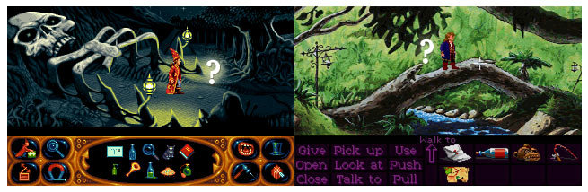
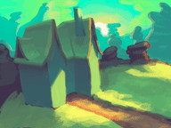
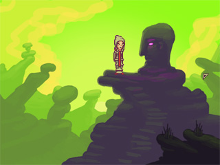
but again the characters stand out too much I think. Perhaps we could try de-saturating the colours of the characters to make them seem more part of the background?

Perhaps something like this to detract some attention:


I actually made Larry more saturated, as I liked the colour contrast it created, but that could be muted if it's too attention grabbing.

Edit: Upon looking at it with fresh eyes, the characters looked really washed out, so here's another version with a less bland effect, but where I crunched up the contrast of the logo instead, to retake some of the attention:

#257
Site & Forum Reports / Re: New AGS Website
Sat 28/03/2009 12:44:48
Quote from: GarageGothic on Sat 28/03/2009 12:25:14
If, instead of redrawing the characters entirely, it would be possible to keep their individual styles and yet make it a bit more dynamic that just standing around facing the same direction

I suppose it could be done by either manual edits (as I suggested Prog would take a crack at, as it seems right up his alley) or by finding/taking screenshots from these (or other games) where the characters are interacting, like talking, pushing, picking something up, or whathaveyou, to remove the stiffness.

This is one of those areas where people who consider themselves without any artistic skills could make a nice contribution, either by just finding screenshots or also compiling them into a neat montage.
#258
Site & Forum Reports / Re: New AGS Website
Sat 28/03/2009 11:23:55
A crude anti aliased version of the pre-ProgZ sprites version (lost in the old thread), with sprites simply nicked from screenshots, and Vales from the forum smiley):


-

Prog:

I think you should try a new version, as people obviously liked the idea but the execution wasn't perceived as fitting the current layout.

Edit: Or perhaps have a go at a separate side collage, like in the version above, where the characters are interacting, instead of just stiffly standing there.
#259
Site & Forum Reports / Re: New AGS Website
Fri 27/03/2009 23:51:41
Here are some combos with Darth's logo, my larry/cup and Prog's characters:


-


-


--

Sorry about the size, but I felt it was important to see everything properly in context.
#260
Competitions & Activities / Sprite Jam - Ended
Sat 14/03/2009 11:58:01

THE SIDEKICK
~~~~~~~~~~~~~~


~~~~~~~~~~~~~~


Ever wished that Lucasarts had given Guybrush a schizophrenic parrot sidekick?

Well, now's your chance to fix these design blunders!

Find a screenshot and improve history!

~~~~

Guidelines:

Adhere to the resolution and palette of the game in question.

The screenshot can be from any adventure game, commercial or not.
If it's fairly unknown, please name the game in the post.

Feel free to add dialog to establish their relationship.

~~~~

Good luck!

Edit: Extended it one day, to include the weekend.
SMF spam blocked by CleanTalk