Menu

Show posts

This section allows you to view all posts made by this member. Note that you can only see posts made in areas you currently have access to.

Show posts Menu

Messages - loominous

#281
QuoteThis bickering is totally spoiling my impression and experience of the AGS forums.

Oh, this idea was put forth with the intention of actually ending this argument. I totally agree that it spoils the mood, and is bringing out really ugly sides of this community. So I thought this would be a nice compromise, where pixel enthusiasts can enjoy limitations, while allowing everyone to participate in a character competition.

I really thought this was a question about unreflectively following traditions, which you can't blame people for, which is why I've tried to appealed to the participants to break with it.

It turns out people really don't care how hi-res enthusiasts are treated, so here I tried appealing to the objectivity of the moderators, who are supposed to have the good of the entire community in mind.

QuoteHowever there is no doubt we are biased with low res, and this is no surprise since that the majorty of adventure games are in low res.

Sure, and I don't of course blame people for their preferences and hope that the pixel community prospers in this day and age.

The curious thing is how you go from "I like lo-res" to "let's not allow anything that's not lo-res". This would make total sense if you wanted to shake things up - kinda like throwing a costume party every once in a while - but as the majority is already using lo-res, why would you to deliberately exclude hi-res entries? I prefer hi-res myself, but why on earth would I want to exclude lo-res?

Somebody's now going: 'yea, yea, but it's the right of the host'. Sure, it's within the rights of the host, but even if it was within the rights of a public bar owner to ban black people simply because he prefers whites, he would still be a immoral jerk for doing so. Just because something is within your rights doesn't make it moral.

Secondly, and to adress:
QuoteI disagree the suggestion to make another extra competition, unless it can be proven to be vastly popular.

We don't actually know how many hi-res people are out there as they're rarely allowed to participate. The sprite jam is by all measures a pixel activity, so just like myself, people might not even bother checking whether they can submit a regular entry. To make sure I wasn't basing this on a false impression, I checked the introduction of the last 50 pixel jams to check with reality:

50 rounds - 6 allowed hi-res/hi-colour entries.

The Sprite Jam is for all intents and purposes a pixel art activity; I'm just asking for a character activity where everyone is allowed to join the fun.
#282
You don't see the catch 22 in this system? Seriously?
#283
Quote from: Gilbet V7000a on Sun 18/01/2009 11:19:51
The bottom line is, whether an entry qualifies as a sprite for the expected purpose of the round, so it doesn't rule out any possibilities of character art.
I don't understand this line, perhaps you could rephrase it?

And it seems like you have misinterpreted the point of the Character Competition: the aim would be to create sprites, and not concept art involving characters.
#284
I propose that the Sprite Jam is officially turned into a pixel art competition - something which would neccessitate little or no change - and that a Character Competition is started.

At the moment there is no regular activity involving character art where people of all styles are allowed to participate. As character art is perhaps the most important graphical element in a game, it would seem like a dedicated activity where everyone is allowed to enter would be highly called for.

As there is an obvious craving for pixel art activities with technical restrictions, a dedicated activity also seems called for.

This would most likely divide up some interest, and they would probably at least initially get relatively fewer participants, but as they would attract a wider range of participants, it would most likely balance out in the long term. And even if it doesn't, I suspect everyone would agree that it's the fair way to go.
#285
Quote from: SpacePirateCaine on Sat 17/01/2009 18:34:48
sort of imply that you don't like being limited by an anachronistic style.
Oh, that's very much true. I rarely enjoy pixeling, just like I don't like oil painting either. But that's completely separate from my affection for the results of these processes.

QuoteHonestly, I'm happy to hear if it's not the case - I always got that vibe since your general attitude towards the whole low-res scene seems a little standoffish, generally speaking
I think your first words in this thread sums up quite nicely why I do have a problem with elements of the low-res scene in this community: Being greeted by "Ahoy there, fellow pixel art enthusiasts" in a public general art activity is kind of like nation leaders in a world summit meeting being greeted by a "Welcome Europeans!" banner.

I'm beginning to realize you guys simply don't care how you treat hi-res enthusiasts, so I'm gonna propose a dedicated pixel art activity, and hopefully this will all be in the past (guess the Suggestions thread would be the place).
#286
Quotebut I know that you dislike low resolution sprites

Where does this silly notion come from? Have heard it several times before and I have no idea what it's based on.

-

Oh, and great entries everyone! I particularly like:

Ben's - the style is just magnificent
Bulought's -  annoyingly skilled execution
IndieBoy's - simple and really cool design
#287
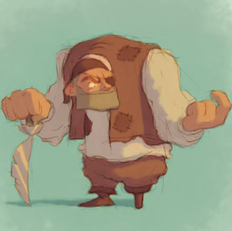
A quick entry:

Prior to being mutilated by the technical standards of the early 90s:


Post:


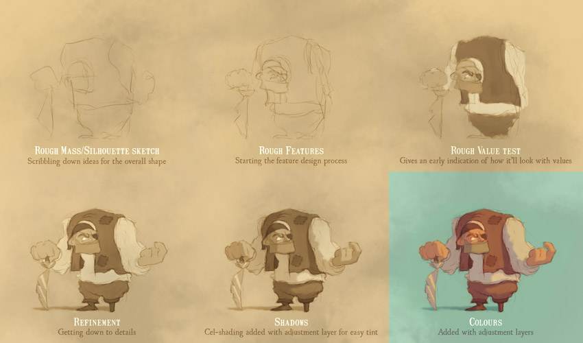
Edit: Some progress pics:


Edit 2: The photoshop file (cs3) in case someone's interested (~500 kb)
#288
Quote from: ProgZmax on Sat 10/01/2009 19:41:47
This is a fallacy because you are attempting a comparison between two dissimilar things, a bum and animals we use as a food source, and you do not need to believe in religion to place Man at the peak of Earth's evolutionary scale.
So being higher on the evolutionary scale gives a being it the moral right to treat lower in whatever way they wish?

Is it right for a genius to mistreat/kill an extremely retarded homeless person without any social ties then? What about people who become "vegetables" after accidents, or are born that way?

This sounds awfully much like the way that both slavekeepers justified keeping slaves - the blacks were after all a lower race, almost animals - or, to go there, Hitler deeming arians to be a super race, which gave them their moral authority.

QuoteIf your sole use as an organism is to be food to another

So what's our use as humans?

It seems to me that your line of reasoning sooner or later comes down to the fact that humans are special creatures with a purpose given by god, but I could be mistaken.
#289
Voh:

Quote from: voh on Sat 10/01/2009 17:40:32
If, however, the majority of people don't really care enough about what the bio industry is doing (as seems to be the case right now), the majority of people don't have to change their ways and equally hopefully, nothing changes.

So, everything is moral as long as the majority condones it? Blacks being mistreated in the US south was fine and should have stayed that way? Gays being executed in Iran is something that "hopefully" never change?

All significant human rights movement have started as minority movements which annoyed the establishment, but was later adopted.

Putting up with annoying idealists seems like a small price to pay.


KhrisMUC:

Quote from: KhrisMUC on Sat 10/01/2009 17:24:37
My point being: if I stopped eating intensively farmed animal products today, nothing would change except the amount of money I personally can spend on other things. Sure, I'd have a less guilty conscience, but frankly, what is the actual benefit of that (except maybe being able to brag about what a moral person I am)?

I understand your reasoning, but it's not an election, where one vote more or less truly doesn't matter except in rare cases. Your local store stocks up as much meat as they think they can sell. If you stop buying regular meat, and ask for FR, then particularly in smaller stores, they'll sooner or later retune their supply. It's a small difference but it's a difference.


ProgZmax:

Quote from: ProgZmax on Sat 10/01/2009 17:10:05
Quotebut of course it matters what their quality of life is like prior to that!
To whom is the issue here.  To whom does it matter when a person dies and is buried?  Their family?  Their friends and colleagues?  People who reflect (both internally and externally) about their memories with the deceased, good and bad?

So the immorality of taking a life or mistreating someone is based on the anguish it causes to their near and dear of the deceased?

Wouldn't that make killing or mistreating a traveling bum without any social ties fine? Or does your argument rely on the concept of an anthropocentric, punishing god?
#290
General Discussion / Re: Skepticism
Thu 27/11/2008 16:34:34
Quote from: Nacho on Thu 27/11/2008 13:55:56
The system brain uses for taking decissions is still very unknown and I can't really give an appropiate answer... I basically think that we have free will just in a degree...
So, to summarize... I don' t know how people thinks.

What I am not going to do is to take the first pilgrim answerI can figure, and, without any evidence, believe on it for all my life.

To contribute with an attack of my own on poor ol Nacho: Shouldn't a skeptic dismiss the concept of free will until it's been proven?
As far as I know, there's no scientific basis for it, even "just in a degree".

Someone may want to invoke quantum mechanics into it, saying that this can break up the causal chain, that would otherwise lead to determinism, but if our free will then consists of random activities in the brain that we're not in control over, the label 'free will' would be pretty strange.

You can of course just say that while determinism may be true, as long as we're the cause for our actions - even though they're predetermined - this is enough to labeled acts of free will ('soft determinism' (can't have too many terms introduced in this thread)).

Quote from: Snarky on Wed 26/11/2008 18:27:27
Loominous, I think the point about how the world began is a good one, but I would reorder the argument a little bit, saying that:

1. Absent any evidence, we should assume the non-existence of God.
2. Thomas Aquinas presents the existence of the world as evidence for God.
3. Debate about whether this is valid evidence that overrules the initial skeptical stance.

Oh, I'm not saying that the fact that it attempt to answer a question makes it a legit answer, it's just that I don't like lumping poor answers together with awful ones.

Which brings up another complicating factor:

You can be both a weak and strong atheist at the same time, but in regards to seperate gods, as they're not all the same.

So you can be a weak atheist in regards to for instance the christian god, as it's hard/impossible to disprove, but a strong atheist in regards to for instance Thor, or some god that you can actually disprove.

Again, just want to bring in some nuance. God can be scientifically disproven, if his attributes are of the right kind.

Edit: Bummer, SSH introduced the same argument (though more extensive) a few seconds earlier.
#291
General Discussion / Re: Skepticism
Wed 26/11/2008 17:43:05
Quote from: Snarky on Wed 26/11/2008 17:19:25
SSH, you're assuming that the two positions are symmetrical, that believing there is not a God should require the same amount of evidence as believing there is a God.

But usually, people do not assume the existence of things there is no evidence for, even if there is no evidence against either.

I've always thought the flying spaghetti analogy was rather unfair. God, as it's generally understood, is after all intended to answer legit questions, such as, how did the world begin.

Granted, you quickly get into the whole who created god regression, but you can argue along the lines of d'Souza that god operates outside our universe, in a place without causality, so while everything needs a cause in our world, god might not need one. Or something.

My point is just that god is actually presented as an answer to a real question, while the flying spaghetti monster, as far as I know, isn't. So while I don't claim there's symmetry, it's at least not completely assymetrical.

Quote from: Snarky on Wed 26/11/2008 17:19:25
We should keep in mind, however, that the terms are also used in a different sense, as synonymous with "negative atheism" and "positive atheism", respectively; where negative atheism means not having beliefs in god(s), and positive atheism means actively believing that there is no god.

Oh, and then there's 'explicit' and 'implicit' atheism. It's just a swamp.
#292
General Discussion / Re: Skepticism
Wed 26/11/2008 17:11:50
Quote from: Snarky on Wed 26/11/2008 16:43:51
People do use the words differently, however, probably partly because they have different assumptions about what belief is, what knowledge is, and what people's "default position" (as if there was such a thing) is.

Yea, I'm not happy about the way I presented the definitions, as my intention was to present them as "simplified, generally accepted definitions used at least in swedish academia" and not as universally accepted definitions set in stone.

My intention with the definitions above was to let people distinguish themselves, as, at least to me, it's a huge difference between being a "fundamentalist" type who claims: "There is no god. This I know", to someone just saying: "I don't believe there is a god. But I don't know".

Being lumped together with more extreme views due to lack of nuance in the terminology is just needlessly frustrating and confusing.

From my limited insight into his mind, Nacho would be a weak atheist - as he doesn't believe in god, but doesn't claim there is no god (which would make him a strong atheist), and rejects 'strong agnosticism', since he believes there can be evidence for god's existence (which would make knowledge about god's existence possible).

Edit: Fixed a corrupt sentence
#293
General Discussion / Re: Skepticism
Wed 26/11/2008 16:24:41
It's a shame that the terminology is really muddy, as the subject matter is tricky enough as is.

Agnosticism in particular is very misunderstood, and is often thought of as a safe middleground between believers and atheists. I'm afraid Misj's explanation, well intentioned as it was, supported this misconception.

Agnosticism and atheism actually deal with seperate areas, so as Snarky pointed out, you can for instance be an agnostic who believes in god - an agnostic theist - which may sound surprising.

Agnosticism

Agnosticism deals with gnosis, knowledge, and is about whether we can have knowledge about godlike things, and not about whether god actually exists or not.

- All agnostics believe that they personally don't have any knowledge about whether god exists or not. This stance is known as 'weak agnosticism'.

- Some agnostics go one step further and claim that noone can know whether god exists. This stance is known as 'strong agnosticism'.

I would suspect most people in this thread, believers or not, would agree with the first stance, and can label themselves 'weak agnostics'.

Atheism

- All atheists agree that they don't believe there is a god. This stance is known as 'weak atheism'.

- Some go one step further and claim that there is no god. This stance is known as 'strong atheism'.

---

Quote from: Snarky on Wed 26/11/2008 06:11:13
Yeah, but Dawkins has an active belief that God doesn't exist, so he's a strong atheist. A weak atheist is someone who has no faith, but who has not actively concluded that God does not, or probably does not, exist. So that would include people who have never really thought about the question, as well as people who have never been exposed to the idea, and many agnostics (as that term is commonly understood).

By the above definition, which is used at least in swedish academia, and which I suspect mirrors the usage in most other countries, Dawkins, a self labeled 'weak atheist', is indeed a 'weak atheist', as he merely claims that god is very unlikely.
#294
I also always get the urge to give one of these vast scenes a go when I see them in a movie. Must get around to it some day.

Anyway, I think the biggest things I'd try out would be:

I) Rotating stuff. Atm we're lookin at everything straight on, from the spaceship to the buildings. This gives the image a flat look, and is a pretty unexciting solution.

II)  Offsetting the composition. Right now you've offset individual elements, but if you look at the big picture, everything is centered, and the image is more or less symmetrical. Again, not the most exciting solution.

For instance, you could place the city a bit to the left, with the brightest part of the sky even more to the left, and have the ship closer - but still on the right - to balance it out (as you'd get a pretty heavy left side). Or some other solution.

III) Right now there's no real main lightsource. Overclouded can be nice and atmospheric, but it does rob the image of:

i) additional colours - as introducing an, let's say, orange main lightsource, from the back left would create a richer palette.
ii) some sharper contrast and definition - as that lightsource would lit up sides of the buildings, giving them depth and definition.
iii) additional atmospheric effect of the non lit areas, as these will look soft and misty in contrast to the lit up parts.
iv) haze effects, which are not uncommon in these paintings, as far as I know.

Btw, this main lightsource doesn't have to be strong, and can be very limited. It could be blocked out partically by clouds or mountains, and only light up a couple of selected nice building's upper side areas. Or something.


About thumbnails:

Working with thumbnails just mean that you start off with a small size, then go larger. The small size forces you to ignore details n focus on the big picture, so as long as your thumbnail size does this, it's working as intended. Also, the small size and roughness allow you to try out a heap of solutions before running out of steam, which just one or two elaborate sketches will achieve.

Small size doesn't necessarily mean that your resolution must be low however. I usually start off with the final size and simply zoom out to achieve the thumbnail size, which allows me to just keep refining throughout the process, without having to resize. The problem with resizing is that it creates these ugly blurry artifacts, which you'll have to paint over. By contrast, if you work in full size, you'll end up with a bunch of brushy (good) artifacts from the thumbnail sketches, which are a really great resource for coming up with ideas n textures.

Take your first sketch, and all those weird strokes at the bottom. All those can be interpreted as recesses in the landscape, weird buildings etc, that you can start refining, or simply paint over. They're there in either case, and have the sort of randomness that's really hard to achieve consciously.

Anyway, looking forward to seeing the progress!
#295
Nice!

Cool to see some hi-res experimentation, think it looks great.

While I think it works really well on a detail level, I think the overall impression could be improved.

This is most easily spotted if you look at the image at a really small size:


In this size it looks kinda crap to be honest, and I think it's due to a lack of focus. There are these big dull areas of grey n brown that don't do much except steal focus. Some objects pop out due to their colour, like the door, but no areas are really pulling our attention.

This larger impression is lost on us when we look at the image up close, as we're distracted by all these nice details, but it has a huge impact.

A very simple way of creating focus and soft contrast is by darkening the edges of the image (mostly the ceiling), make the center area the brightest, and give this area a tint of some kind.

Here's a slightly over the top quick example, just by adding two adjumentlayers: (the photoshop (cs3) file)

(animated gif)


You can see the overall effect once again more clearly when zoomed out:


While we don t really have a particular object in focus now, at least we have an area of interest, where the viewer is lead. Creating contrast like this is like putting in a huge arrow pointing toward the center saying 'Look here!'. The tint and values also create a significant contrast, while avoiding the harsh look that upping the overall contrast would've created.

Anyway, this edit changed much of the mood/look of the background, and it might not be even close to what you were going for, but it's more meant as an attempt at making a point rather than delivering an improved version.

Hope to see more from you!
#296
Critics' Lounge / Re: Outdoor scene WIP
Sun 28/09/2008 10:57:19
Looks like a nice little scene, though a bit dull atm.

The major thing I'd try would be to try varying the landscape. Right now a very large part (if you take depth into account) of it is just flat grass, stretching to the horizon (which is too low btw, according to the house perspective).

Instead of trying to fill a vast landscape with individual (though bundled) trees like you have, you can try to see them as large masses. The forest to the left can be reduced to a hill like shape, with some jiggly lines to indicate that they're actually trees.

Something like this:


It's not pretty, but it does the job of a sketch - to visualize your ideas.

So I'd stay away from time consuming sketching methods, as you'll just run out of steam long before you've had time to try out different of solutions. As long as your scribbles are intelligible to yourself, they're fine.

Another benefit from rough early sketches is that you'll get a feel for the larger masses in the image. These large shapes is our main impression of the pic, but are easily missed when you start fiddling with details.

I gotta say that using 3d to make up for a poor understanding of perspective seems like a very bad idea. Perspective is a simple set of rules, and the sooner you start using them, the sooner you'll be able to sketch roughly in perspective by freehand.

Having to rely on references is really like working with shackles on - it's just constraining and cumbersome.

Anyway, good to see some WIP pics, and hope you'll keep us updated!
#297
Nice!

Finding a brush you like sure can be frustrating. After a lot of fruitless searching I ended up creating "my own", which is actually just a modification of one of photoshop's artist brushes, but it's now pretty much the only brush I ever use.


The distinct texture on the edges leave nice watercolourish artifacts, while the blurred center takes it more towards oil, and allows for smooth surfaces. So it's something between the two, and it fits me perfectly.

Here's the brush file if anyone is interested

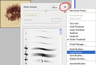
To import a brush:


Select the brush tool, right click on the canvas, click on the upper right playbuttonlike button, then choose 'load brushes'.

There's other stuff in that menu that should be of interest. The 'preset manager' allows you to organize your brushes, like deleting, reordering, etc. Further down in the menu are other brush sets that you can choose. Don't forget to save your current brushes before you do though, as they will be replaced when you choose another brush set.

-

Anyway, regarding the pic:

I think the colours could use some variation. Right now it looks like it's the same hue all over, which is kinda unexciting. A simple way of addressing this would be to make the colours go more towards one colour the brighter they get (for instance more towards orange), and more towards another colour the darker they get (for instance blue).

There are many easy ways of achieving this - can do it in Curves, Gradient Map, Selective Color, Color Balance. I guess the simplest way would be in Color Balance, where you select which values you want to affect in the bottom (dark, mids, brights), and can then push these regions toward different colours.

To get maximum control, Curves is a great tool, and will also help you improve your understanding of colours in general.

In this post I go through this whole thing

-

Regarding values, I think you've avoided one of the common pitfalls of adding sharp highlights to everything, regardless of what material they're made of. The sharper the highlights, the less midtones you'll find, as the material is then going towards a mirror, where the lightsource is reflected intact, and not scattered across the object. So for her hair I'd tone down the midtones, which will bring out the highlights, and make the hair look glossy.

Depending on what material the dress is made of, you could do the same with it, to achieve a more glossy look.

Skin is tricky as it's made up of many layers, with different properties. The outer glossy layers act more plastic/mirrors, while the deeper acts more like dry dirt. This makes getting skin to look right tricky, and also why 3d artists have such woes with it.

It's not only the values that makes it tricky, but the colours are affected by the skin layers as well. You often find the highlights going more towards orange, while the shadows go more towards red.

This is explained by the layer properties, where the outer glossy layer reflects back the light pretty intact (remember, it's very mirror like), while the inner ones absorb the greens and blues, and thus reflect back red. So with an orange lightsource, the highlights reflect back the orange light fairly intact, while the other areas absorb everything but the reds, resulting in more orange like highlights, and reddish mids n darks.

Another factor here is skin thickness, where an area like the forehead has a thin layer of skin, while our cheeks have a thick. This means that as light hits the forehead, it has a pretty short way to go from hitting the skin surface, to travelling through the skin, and then back. As the trip is short, only some greens n blues are absorbed.

If you compare this to the cheeks, the light has to travel many times further into it, which allows it to absorb much of the greens and blues.

-

All in all I think the values work quite well though. One thing to try out would be to alter the light setup, where instead of having the light coming from the camera - which is a rather unexciting choice, and takes it towards the look of a flashphoto from a party - you'd offset it to some side.

The standard setup is to have it come from 3/4, and if you want a more elaborate setup, you could add a rimlight on the opposite side, that'll accentuate the edge of the shadow side. This makes it look quite studio/artificial though, so I personally prefer a single lightsource, and many have a problem with that popular setup

-

Anyway, I really like it as is, and incidentally, if it wasn't for the more realistic facial features, I would've thought it was a Mashpotato pic.
#298
Think the integration works much better, though it's difficult to say without any foreground objects present, as the dark values could still pull the sprites infront of closer objects.

I think the brighter outline works better, though it still breaks a bit from the background. Have you tried darker colour outlines, you know where the outline is just a darker colour of the nearby fill colour (like in DOTT or newer disney movies)? Or perhaps a bit thinner, so they would correspond to the line thickness of the background?

Anyway, nice improvement!
#299
Seems like we've reached the end of the first workshop edition then.

A big thanks to all participants and contributors, and I hope we'll see another (though shorter) round some day - perhaps on writing, animation or character design.

(If any of the moderators feels like cleaning up some of the less constructive posts in the last page or two, that would be very appreciated).
#300
If you want to address the character integration "problem", I think it goes further than the dark outlines.


Here's a small 'black point' tutorial, that might be also be of interest to people who like "photoshopping" stuff (but is just as important when painting, as you're basically just "photoshopping" in objects that you draw into your own painting)

(Disclaimer: some very basic stuff will be stated - not to be interpreted as disrespectful - just want to make it understandable for anyone)


When we judge the distance to an object, we do so very much based on their darkest value, as in, the darkest part/colour in the object. The darker this colour/value is, the closer we deem the object to be, and vice versa.

This is most noteable under foggy conditions, where things just a few meters away become washed out, and only objects very close to us retain some kind of blackness.

This fog effect is actually always present, but to a much lesser degree, which makes it harder to spot, as things only far away will be noteably washed out. It still occurs however, and have to be considered if a foreign object is to be believeably integrated into an environment.

In this example I quickly integrated the sprites into a photo of a foggy landscape:


To make them "sit" in the environment somewhat believeably, I altered the sprite's values so that the darkest point, which was found on Nelly's right foot, corresponded to a nearby object's darkest point.


Let's say we wanted to integrated them further back in the image:


Due to the thick fog, the problem becomes very apparent. Her darkest point is very much darker than that of nearby objects (hardly visable here). A nearby tree's trunk will have to work as reference.


In this one I just raised her values, so that her darkest point corresponded to the tree trunk.


If the background has washed out values, this phenomenon becomes very important:


In this case I raised the values of the background, but kept the sprite's intact. As their darkest value is even darker than that of the foreground, they pop out, and the image looks manipulated.

-

The last part is the main problem I have with the screenshot. The values of the sprites - even without the outlines - simply pull them infront of everything, even the foreground table, due to their darker values. The choice here - if a fix is desireable - is to either pull the foreground closer, by darkening the table, or by altering the sprites's values to fit the environment.

I think this could be fixed with different shaders, or more washed out lighting in the 3D prog, as well as post colour treatment. As the background style is heavily stylized, I think hoping that normally shaded 3D sprites will fit is rather optimistic. I think the speculars found on his boots and nose in particular, breaks with the extremely flat background style.

So my suggestion would be to create sharper contrast in the sprites without including dark (or bright) values, and achieve this by going towards more cel-shading like shading, where fewer values make the contrast between them appear sharper. This would integrate them, and also avoid the washed out look found in my edit.

Edit: Just remember this image, in which I tried to demonstrate how smooth gradients wash out any contrast, while even having quite similar values right next to eachother (like in cel-shading) increases the sense of contrast:


(To make clear, I'm not advocating cel-shading, just shaders closer to cel-shaders. (Some of the ones I've seen also give the clay impression that you seem to be going for).

Anyway, just my few cents.

Edit:
Quote from: Ali on Mon 22/09/2008 11:16:01
Could it be that we are used to seeing tiny little character sprites, so this seems strange?

I think it's partly that, but also that she seems big when compared to stuff in the room, such as the borders, tables, shelves etc. One problem there is her big head, which messes with the proportions, as the stuff in the room seem to correspond to her body's dimensions, but not the head's. It's a tricky situation.
SMF spam blocked by CleanTalk