Menu

Show posts

This section allows you to view all posts made by this member. Note that you can only see posts made in areas you currently have access to.

Show posts Menu

Messages - loominous

#301
Background looks fantastic, but the character integration really irks me.

Here's a quick rough try (probably went a bit too far):

edit:


-- Space, to compensate a bit for the objectivity distortion comparisons causes.


original:


It makes the colours of the guy in particular very bland, but that could be fixed. Also reduced the contrast in the talk bubble, as it stood out a bit much as well in my taste.

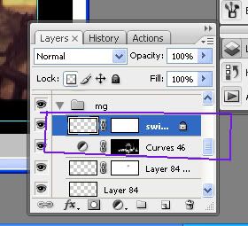
The photoshop file - just added two adjustment layers (~500kb (ps cs3)

Haven't tried the game yet, but looking forward to it!

Edit: added a bit of space
#302
Most likely final version, though there are still things to refine:


Some cleanup and colour treatment, and also added a couple of toys.

-

Regarding voting:

Since Andail has separated the editions, I'm not sure if voting is neccessary, as it would basically be us patting eachother on the back.

Any thoughts?

-

Quote from: gypsysnail on Fri 19/09/2008 02:14:18
Also below is a grabbed a print screen of something in your file to ask you a question. the subgroup of layers include a two linked part in each layer, a white box and a transparent box (obviously there is a small image within the transparent box) - why is it linked and what do the two boxes linked together in that layer mean?


Those boxes are 'Layer Masks', which allow you to mask out regions that you want to dissapear, or fade out, but without actually deleting anything, as the layer data is still intact.

Needless to say, they're a great tool, and allows you to experiment quickly and freely.

They work in the same way as 'alpha channels', in case you're familiar with those, where white regions mean full opacity, and black full transparency, and greys everything between.

Coupled with 'Adjustment Layers', you get enormous flexibility regarding values/colours as well.

'Adjustment Layers' affect the image in the same way as ordinary effects do, such as Brightness/Contrast, Levels, etc, but instead of applying the effects to a single layer as you ordinary would, you add the effect to the image by creating a special layer which then affects the layers. The benefit here, like in the case of 'Layer Masks', is that you're not doing anything to the affected layers - they remain intact - so you can turn off the effects or change the settings at any point.

Adjustment layers come with a layer mask already attached, and the layer mask works in the same way as with layers - darkening regions mean that the effect fades out in those areas, and vice versa.

Here's a gif anim hopefully explaining it:


Hope that explains it - just ask if
#303
The three major things that struck me when I saw it was:

I) The most intense contrast is by the lamp, on the side of the image, which draws the focus away from the important elements, as well as to the side of the image (the safest thing is to draw the focus toward the center of the image, to keep the viewer inside the image. An old trick is to subtly darken the borders/edges of the image, in order to achieve this).

I'd probably have a lamp by the store to produce the strongest contrast around those parts. Perhaps have a sharp shadow falling by the alleyway, to attract attention to it as well.

II) You mentioned the sideway size, and I think it goes for the street as well, and I think you could simply move the camera closer, cutting off the street, (or perhaps leave a slice), having  the lamp as a foreground object, and just reduce the sidewalk size (perhaps not realistic, but unless it's really important to have the correct dimensions, I say cheat)

III) Having the main objects centered is usually an unexciting compositional choice. The standard practise is to place them at the golden ratio, which is basically a bit off center, to the right. The idea is to avoid symmetry, which is often predictable and boring.

Regarding the alleyway, you could try making it narrower, to allow you to push closer with the camera, but have both the main elements visable.

Just a few thoughts, hope you'll keep us updated on the progress.

Edit: a few corrupt sentences.
#304
Cool to see an elaborate sketch posted.

What elements are you trying to show/needs to be there? Is the store in focus? Is the alleyway an exit? Does the lamp/street need to be visable? What mood are you going for?

Edit: Oops, accidentally quoted the image
#305
Thanks for the comments! (though I fear Andail might be somewhat annoyed, as he explicitly re-opened it only to allow the participants to post their final versions)

Quote from: gypsysnail on Thu 18/09/2008 18:05:09
EDIT: Also wanted to ask you, Loominous, is your work done in photoshop in many layers?

I try to keep the numbers of layers to a minimum, but due to the way I colourize they tend to pile up. The benefit of having few layers is that it allows you to work more flexibly, as you can tinker with the whole image without constantly having to change to the appropriate layers. I do seperate stuff like foreground elements though, to allow quick compositional changes, and if I add an object, I keep it on a seperate layer until I decide whether I should keep it or not.

Here's the photoshop (cs3) file, heavily resized (original is about 3000x2000), if you wanna take a look.(about 800kb)

I'm afraid it's quite messy.

QuoteAlso do you use a tablet too?

Yep. Can't imagine working without one.
#307


Clueless about what stable they'd visit, he errected a neon sign, got his camera ready, and hoped for the best.

Edit: Progress pics (link)
#308
Might as well do a couple of more colour versions while it's still open:


I like it better than the last, but the melancholy sure isn't there.
#309
Misj:

Quote from: Misj' on Tue 02/09/2008 00:32:55
Guys, last time I checked I was the one who brought up the impossibility to do high-res in most competitions (in a reaction to the idea that no low-res was possible in this competition), not Loominous. So if someone has to be blamed, please blame me.

Heh, don't worry, some of them are just here to deliver a few punches -- it has nothing to do with you - it's just something that they do.

But it's really quite amazing. I take issue with a clearly biased practice -- just ask yourself when it was that you last saw the rule: "no lo-res entries allowed" -- and I'm portrayed as the intolerant guy. The way that some of you are able to spin this would leave Karl Rove teary-eyed.


Anyway, I thought I'd post a few things that never got posted:

Here's a colour sketch of misj's entry:


I didn't post it as I know that he prefers vivid colours, and didn't want to push my monochrome preferences, but it might be fun to see here at the end.

-


This was part of a colour theory mini tutorial that never got finished. This one is meant to show why the sunlight gets more red in the mornings, and almost white at noon, as the distance it has to travel through the atmosphere varies during the day.

-


A grading test for Execratus' background. Not sure why I didn't post it - guess I wasn't happy with the look.

-


And lastly the first logo idea I had for the last stage, which shows in a rather nifty way how those old disney backgrounds were created.

That's pretty much I all I found.

-

Snarky:

I believe Andail will close it down tomorrow, 'least that what he said earlier. Bit of a crude ending, but I guess it's due.
#310
Yea, I always get your names mixed up.

I also think it was a shame that we didn't have more outside (constructive) comments. Andail popped in and helped me fix my composition at one point, but that was pretty much it, as far as I can recall.

Not sure how that could be fixed, as I think that the reasons are probably similar to the low participance: not enough energy/time to participate, or slight intimidation.

I think one reason why we didn't see any pixel art - one I brought up in a recent post - is that people for some reason think that stuff like sketches and composition belong to the fancy sphere of painting, and that pixel art is just a matter of grabbing a pixel tool n getting to it. Wonder how much better pixel art we'd see if this erroneous and destructive notion would vanish.

QuoteMost of the animation competitions won't allow me to use classical cell animation, because I'm restricted to use a sprite that doesn't fit within hand drawn animation. Many sprite jams have rules that won't allow me to use pen and paper as a basis and almost seem to 'demand' pixel art.

Ugh, don't get me started on the discriminating practices of the sprite jam.

Which makes it even more depressing reading that Andail has limited the resolution to 320x200 for the 'standard edition', in what I guess is an attempt to pander to the disgruntled pixel crowd. Wonder if these practices will ever leave these forums.
#311
Cat:

Quote from: cat on Mon 01/09/2008 12:53:50
I didn't want to start a fight here, that was really not my intention. The results of this blitz were very interesting, but the updates came more and more rarely and thus it became quite boring.

Yea, I think everyone, including the participants, started getting bored with the scene quite soon, and the low participance in the later stages dragged down the momentum and interest, so I totally get where you're coming from.

Andail:

Fair enough.

I think it's preferable to keep it as an edition, which anyone can host whenever they're hosting the blitz, but with a three/four week deadline. I think it's feasible now that the format has taken shape. It would probably only be zyndikate, misj or I who'd host it anyway. But for all I know, having it as a separate longer activity might work better, so it could be worth a shot.

Just that this activity wasn't even suggested by me, and was orchestrated and carried out both zyndikate and me, so making it all about me and my initiative seems limiting and also unfair to zyndikate.

When an activity has been going on this long, you start to get a bit sluggish, as one day or two more seems like a drop in the bucket, which is why I haven't wrapped it up more rapidly, but I guess that could've helped quell some of the annoyance displayed. Live and learn.

Edit: Whoops, confused two names.
#312
Dualnames:

You seem to have a peculiar idea of what's been going on here. I think I can safely say that noone has spent three and a half months on their entry -- I would estimate that the average participant has spent perhaps 12 hours in total. The activity has lasted three and a half months.

And before someone jumps in and shouts: "That's way too much!!1", let me repeat that the planned duration was set on two and a half weeks, which is a bit less than the average blitz.

Some of the reasons explaining why it's dragged out have already been mentioned in previous posts.

-

The planned and clearly advertised duration also makes your stated reason for not participating peculiar:  that you didn't have four months of free time to spend. This unless you have some gift of foresight.

-

I also have to bring up two other points, as they're something of pet peeves of mine:

Quotebut nevertheless this blitz is sort of preposterous, for someone that can't draw Disney style or would love to do some pixel art it

First off, working on your drawing in stages is something that anyone benefits from, from the total beginner to the accomplished artist. One of the main aims with this activity has been to get this idea across. As with building a house, the need for pre-planning actually increases if you're a beginner, as the more experienced you get, the more you can pre-visualize, and estimate accurately.

Secondly, pixel art is just another medium. The same art theories and approaches apply to it as with other media such as oil painting, knitting, sculpturing etc. As with any of these, you can start straight away by pixeling away without any forethought. Or you plan your composition and values/colours. The choice is based on your preference and goal. But it's just another medium - it does not have any artistic shortcuts.
#313
Quote from: Dualnames on Mon 01/09/2008 00:03:10
Ben Jordan 7 was created and released in that time..With voice pack..

As you seem keen on repeating this fact, it would be nice if you would explain what if anything it has to do with this activity.
#314
I think one of the reasons for the low turnout was that the whole format might've given the impression that participating required a great deal of effort, and also know-how. And in a sense it's true that if you've never used references to get to know certain construction/ornamental techniques, and have never played around with composition sketches, it takes a bit of time and getting used to. But the good thing is that it really only takes as much time as you're willing to put in.

As Snarky said, the initial time frame was that of an ordinary blitz, and I actually think it's a plausible schedule, now that people - myself included - are familiar with the concept. There were many late starters, and the introductory posts needed to be written (which always clashed with other stuff I had to do), which dragged it out.

A shorter execution would also help keep the interest alive, as you start to get tired of the same scene quite soon. Plus it might make it seem like like less of a deal to participate -- I got the feeling that people were slightly intimidated by the format.

The reason why zyndikate and I went with the special edition format instead of a separate activity was partly because it wouldn't divide up the interest/efforts of the background folks in the community, but also to make it part of a regular activity, and not something special that one would have to take the initiative to start up (few people are comfortable taking initiatives like that). But it would be interesting to see how it might turn out as a separate activity. I think either way would work better now that people have an idea how it can be done.

Quote from: BOYD1981 on Sun 31/08/2008 19:14:05
yeh i mean ffs, just end it already or somebody else start up another one.
background blitz doesn't belong to any one person, it's a community activity and it just seems like loominous has taken it over.

Considering that it was over a year ago since I last hosted a blitz, I'm not sure where you're coming from.

Quote from: Misj' on Sun 31/08/2008 20:18:26
Ps. Loominous...I think the workshop was a success in the end.

Yea, I was expecting quite a low turnout for the initial run, so I think it turned out pretty well. Think we managed to put the spotlight on some aspects that are often neglected, but are considered extremely important by most artists, which made it a success regardless of the low entry amount.

-

As we wrap it up, any comments or ideas about how the format can be improved are highly welcome. Even from disgruntled observers.
#315
Oh, and just a note to any observers:

One thing that one probably misses when not partaking, is that the script includes quite a few problems, which I think to a large extent is the cause of the similarity in composition and placement of objects in the entries that followed the script.

These problems were deliberately included to pose as challenges to the participants.

The deliberate problems that were included were:


I) The sign. The sign was supposed to be close to a bridge, yet still readable. This narrowed the composition down to ones where the bridge was pretty close to the viewer, and going away from us, unless some clever alternate solution was used. Most went with a 3/4 angle where we'd be facing the sign, while zyndikate went with more of a profile view. Neil solved this by having a large sign, which allowed him to have it further away from the viewer.

II) The second floor/interactivity. Being able to see the second story, along with the rest, made it necessary to include some distance to the house, while still having it close enough to show the girl playing in the window, and allow the house to be interacted with. A low/upwards angle would be another solution, but those tend to mess up the perspective on characters, so that brings complications.

III) The farm/windmill. These made it necessary to reserve space for two distant objects with different depths that needed to be recognizable.

IV) The melancholic mood/flower in a swamp. This proved to be quite a tough one, even though it seems fairly straight forward. It's a careful balance act between going sad/scary and indifferent/happy.


These may not seem as much of problems when you look at them like this, but they sure do tend to mess up things once you get started.

It would've been fun to see some more creative solutions to these problems - I guess zyndikate's was the closest to something different - but I couldn't come up with any myself, so I know it wasn't easy.
#316
Just a reminder that my pic isn't done yet. That was just my first colouring attempt, and refinement is still due (need to add toys n clean stuff up).

I'm a bit puzzled by this house design dealy. My house may be a bit quirky but exactly so what? Even if we assume that it doesn't adhere to realism - which I wouldn't agree with - then why is this even an issue? The script doesn't call for realism, I never spoke of realism, so why exactly are we talking realism? It may very well have been designed by elves for all we know (though I see no reason why one would assume so), but why is this even a topic?

Having to justify a quirky design just seems so alien in this context.

Quote from: Neil Dnuma on Fri 15/08/2008 01:35:34
I'm also a little puzzled by the very bright light in the horizon, while the lightning clearly is coming from the left.

Yea, that's one of many cheats. Just thought having that horizon bright looked better. It may appear that I go for realism, but I really just use realistic elements to get the look I want.


Snarky:

I think the houses share similar components, but saying that they "look very much alike" is quite a stretch. We did all go for porchless designs, and I would've guessed that we'd have seen more of more villa like buildings, but to me all of the houses turned out quite unique. If you'd put them next to eachother, I'm sure the differences would be very clear.

It could be more about a certain time period, which they seem to share. Think the script might've implicitly made people go for this kind of older design, just by mentioning stuff like the old swings squeeking. Still, it would've been more interesting if people, including myself, would've fought the stereotype that the script conjured up.

On the other hand I'm glad that we they did turn out quite similar, as it allows us to dig deeper into certain designs and compositions. You start to sort of distill the essence of the subjects at hand, which was part of the aim with the activity.

Which is probably not very exciting for the observer looking for contrasting images, but an advantage for the participants.
#317
Quote from: Misj' on Sun 03/08/2008 22:34:49
The only thing is, that my eyes focus on the lower window (the one in which you've also added a character) rather then the upper window (where the girl would be sitting accoring to the script).

Hm, I hadn't thought about the fact that those windows are technically on the first floor. Their high position made me think of them as belonging on the second.

I guess some lower windows might exist on the backside, which would technically make the current one valid.

Quote
Also, I find the top-right front-layer lowering the overall quality. I think it should either be darker (as in closer to black) with a little more detail, or removed completely.

Oh, that part isn't refined, like much of the pic.

-

Oh, and I'll extend for a couple days until you're ready.
#318
Finally got around to try some colours:


Larger resolution

Not very happy about it, but it's a start, and sort of capture a melancholy feel.

Must say I dragged my feet quite a bit about this, as I knew that the value sketch called for quite a transformation to fit the theme. Which is a shame since I really liked the look of the value sketch.

Having to open up one of the windows was annoying as well, as they create these weird gaping holes. My intention was to go with the right one, but the large centre one looked less bad, and does provide more space for the character.

Speaking of character, I tried quickly adding one, but the size poses a problem, so I had to go with 800x600 to make her fairly visible.


-

Misj:

Quote from: misj
To Zyndikate
I disagree with Loominous. The more monochrome pallete in my opinion doesn't create a more somber impression, just a more depressed (or maybe horror-like) impression. Personally I feel that the more colour-diverse versions have a lot more character.

You're making the strange assumption that just because I suggested a more monochrome palette, I was proposing a desaturated dull look.

Lots of monochrome looks are bright and saturated:


I personally prefer more varied palettes than those, which is why I suggested a "more monochrome" look, and not "monochrome".

It's mostly about a strong sense of colour cohesion, which is what those colour sketches lacked imo. One problem is that when you add colours like zyndikate did in those colour sketches, you get a similar saturation level in all colour areas, as you're basically "adding some green" "adding some blue" to a neutral canvas. As you're only adding, you build up these colour peaks, which gives this fake/incoherent/kid colouring book look, where only a bit of saturation starts standing out.
#319
Quote from: zyndikate on Sat 26/07/2008 04:15:50
::COLOR::
Click for bigger:


Any comments so far? which one do you think works best and why?

I personally find 1, 4 and 5 most suiting. I'd try finding alternatives to the very yellowy hue of the lit grass part on the left though, which I suspect might be kind of killing the somber mood in 1,2,3 too efficiently - leaving more than a ray of hope. Not sure how it would work out in practice though. The sunlight is yellow/orange after all.

The reason I picked those is also because the others, #3 in particular, have a very clear diversity in colour, leading to a bit of a happy cartoon feel. I think more somber stuff calls for more monochrome palettes, though it's tricky to avoid the dull impression you speak of regarding #1.

One thing you could test is to use more desaturated colours for parts of the image (not saying it should be desaturated overall), as right now it feels like most of the colours you've introduced (apart from parts of #5) have their own clear hue (green being green - not just a colour that appears green).

My eyes may very well be tricked though.

Anyway, a pretty lame bunch of comments, but I just wanted to provide some feedback.
#320
Zyndikate:

Quote from: zyndikate on Sat 26/07/2008 22:22:59
anyone know what the main problem can be? Too contrasty values foreground?

I guess you might've tried this, as it's quite an obvious solution, but letting a bit of light pass onto the window area might do the trick. It does ruin some of the mood and nice effect that the side/backlight provides though.


To enhance the effect, I removed some of the foliage next to window area of the house, to increase the contrast there, without boosting any actual values. Another thing was to place parts of the left side of the house in shadow, as if it was blocked by a tree, to lead the eye more towards the window area (and because I like shadows formed by leaves like that).

That's one thing that I find really gratifying with doing backgrounds like these: we can invent conditions that suit the angle we're working in, without there being a risk of compromising other shots.

Btw, I really liked the bush in the center middle in the previous version, that provided a nice bridge to the background part, along with the little hill that came with it. In the latest you instead have something similar to that fog you see in fps games, that looks a bit, I dunno, fake/cheap. I guess that might be one of the parts you have yet to start working on. Seems like the kind of area one leaves to be fixed later on.

Also, I love the pony stick hanging over the sign. Excellent idea and execution.

Quote from: zyndikateonly thing I could think of that isnt in my taste is that have something right infront of that beautiful house, I think I would rather have the breathing room right there. I do understand it gives depth to it with the overlapping, maybe if the gate was less complex I wouldnt mind it.

Yea, I wasn't thrilled with this solution either, and as you can see in earlier versions I tried to keep it from overlapping the house, but with this camera position I couldn't maintain it without separating them to the far sides of the picture.

The simplified gate idea might do the trick, so I'm gonna try that out.

-

Misj:

I guess when I saw your tree design I should've figured you're into straight-ish/vector like lines/designs. I assumed the un-organic quality wasn't intentional.

To clarify, it's not so much that they're not bent, but that they're bent as if they were bezier curves, with completely consistent line thickness. It's kind of like vector graphics on paper.

Which is of course a style choice as good as any other.

Quote from: misjthe house [... ] doesn't look like it's created by men. Maybe if they had a fairy architect, but humans wouldn't do it like that. It's - as you like - too organic.

Hadn't struck me that it could be perceived like this. To me it's a moderately loose design, with a few curved shapes caused by the deterioration. Something that could be found in a Pinocchio like town. I'm actually planning on integrating it far more - when I go into the detail stage - as it currently just stands there right on the grass, which to me is a really boring solution, so I'm gonna add some bushes/flower beds to smoothen out the transition from walls to ground.

As I'm just glad to hear it's this organic looking, and want to be able to repeat this, what elements in particular do you experience as different?

-

Edit:

Oh and zyndikate, any reason for moving away from the more quirky design of your earlier sketches?

Just saw this first sketch, and the design strikes me as much more interesting/dynamic. Want to move towards a more serious look with the latest design?

The first sketch:


Think this old one had a great design and layout.
SMF spam blocked by CleanTalk