Menu

Show posts

This section allows you to view all posts made by this member. Note that you can only see posts made in areas you currently have access to.

Show posts Menu

Messages - loominous

#321
Quote from: Misj' on Fri 25/07/2008 18:57:14
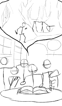
Version 3 (right side only).


Think the variation in openness, and general vertical variation makes it a lot more attractive. The angle of the house, which now appears to points more towards us is another improvement, that makes the image more dynamic. The ground area is varied and interesting, and there's no wasted space. I guess the sky now takes up a very large part of the image, but it could be filled with some foreground branches/leaves, and clouds.

I find myself in the unusual position of thinking that the angle might be a bit too low though. I think the horizon in the first one was nice, at the golden ratio vertically, and I usually place it there myself. Right now it looks like there's pretty much no view of the walkable area. Though when I look at the full size version it shows what needs to be shown, so I guess it could work well.

Another problem with these kind of low angles is that they can make the perspective a bit extreme and odd looking, especially if you don't use "a rounded lens" or three point perspective (right now the vertical lines are still completely vertical, which makes the very slanting / "horizontal" look extreme. So a box looks something like:

/|'''''|
/ |__|
|/__/

Think guys like Bill Tiller often bend the lines to simulate a rounded lens. I do at least. Our eyes have a rounded lens, so we're used to straight lines looking curved (though we don't think about it).

(Btw, something that messes up the perspective, making the roof look odd is that the upper window isn't in perspective, which I assume you're aware of, but ignored due to the sharp slanting lines it would've meant if you had followed the perspective. I don't personally think this is a good solution, as while it saves the window, it messes up our impression of the rest of the house.

Hm, looks like the lower window is out of perspective as well)

I'm not a stickler when it comes to perspective, but consistent perspective in individual elements ensures that we read the objects properly, so it's not a matter of them adhering to rules, but being read as intended.

Right now for instance, it looks like the house's top roof part is slanting, when it in fact isn't.


Regarding the lines themselves, I guess it may be a matter of style, but the many ruler like straight lines gives a pretty dull/unorganic impression. I'm not advocating extreme bended lines for everything, but something that makes run down buildings charming is their lack of clean surfaces and perfect lines. Especially for stuff like roofs. Just doing the lines freehand without the ambition of drawing perfect lines is usually enough to instill the analogue feel that is the beauty and paintings/drawings.

Zyndikate usually manages to get his lines very neat looking but still organic, so you could have a look at his stuff if you're interested. His line-work overall is annoyingly good.

It's interesting to follow your experimentation, so I hope you'll keep at it!

Edit: I think avoiding using rulers and perspective lines is a nice way to increase the analogue feel. Try estimating the perspective, and then correct the biggest error after the sketch is done. This way you keep the drawing process loose. Think zyndikate does this (me too).

Drawing a few lines from the vanishing points across the page to create a very loose grid is another way, that allows you to "see" the perspective, and follow it loosely as you put in your lines.
#322
Critics' Lounge / Re: Is it finished?
Thu 24/07/2008 13:54:36
Quote from: S on Wed 23/07/2008 12:37:13
Is there anything that should be improved?

I guess it depends on what you're aiming for. Right now it's pretty hard to tell what your aim is in terms of mood/style/etc.

A line or two about your intentions would be helpful.
#323
Quote from: Misj' on Tue 01/07/2008 23:13:02


Share your thoughts (and please compare it to the original background, which aspects do you like better in which version).

Misj'

Good to see you back in action.

To provide a response that I personally always loathe to get myself: I prefer the old one in pretty much every way.

I) It crops off the house/house area better (the new one has this huge walkable area around the house which just takes up space n makes it less functional.
II) It has a nicer variation in openness.
III) It lacks the large uninteresting stream that is taking up as much space as the house.
III) It has shorter walkable distances
IV) The camera is closer to the house (that is my impression anyway), which makes it easier to see and draws us more into the environment.
V) It has a lower angle (personal preference), that makes it more like being there, and places the horizon more at the golden ratio (it's currently at the center, which incidentally isn't recommended by most people I've heard, for the same reason why it's rarely recommended to place something in the dead center horizontally (to get a more dynamic composition).

I think these things together contribute to a nicer more lively scene.

Some other things:

I) The new window frames look almost glued on, as if they didn't really belong there. I think the borderless design of the house made the frameless windows in the old version more consistent. The new design is more interesting though, so I'm not saying that you should ditch it, but perhaps try to make the whole thing look more consistent. (the fact that the wall thickness that you can see in the new one feels too thin adds to the "painted on" impression.

II) I think the old wall with its slope worked better, as it revealed more of the door area. Right now it's almost as if that area is intentionally hidden.

Sorry about being so negative - I really tried finding some stuff that I liked better in the new one but I couldn't really find any, apart from the more interesting design of the house.

Hope you'll keep at it!
#324

Quite a bit overdue, here is:


Introduction to be added

(just want to get the thing finally started)
#325
Critics' Lounge / Re: Choosing my Style
Wed 09/07/2008 22:22:48
If you're interested in drawing/painting, then I suggest you start drawing on paper. If you keep finding it satisfying, I'd then go for a tablet.

If you're not really interested in drawing/painting, or feel that your motivation is simply too low, I'd consider styles like very simple cut-out, like south park:


I think styles like these are vastly underused, and considering their ease of production and effective communication ability, I'm surprised that they're not more popular among people with undeveloped graphical skills.

Would be really cool to see an advanced implementation of cut-outs, where the shadows beneath the cut-out bits is simulated, like in south park (they also do this in shows like the Simpsons, to reproduce the shadow that are formed due to the depth of the cels).


(This wouldn't be hard, just a matter of adding a semi transparent shadow in an graphical application, and saving it in 32bit.

Stuff like this adds a whole lot of analogue warmth.
#326
It's nice indeed to see someone going for a more traditional cartoon look, in this lo-res land of ours.

Think the best thing would be to simply do mockups of the different character resolutions/depths, with a proper background. Making judgments about elements separated from their context is usually a bad idea.

(I like the overall look of the current mockup, and would recommend just going with that (32bit), though it would require getting along with my good friend, the alpha. Think you'll find him a nice guy once you get to know him better, and an irreplaceable companion when you venture outside of pixelville)
#327
Quote from: InCreator on Tue 08/07/2008 20:48:09
But maybe too realistic, though. Like those newer 3D shooters, where everything is either yellow of blue... and it's a bless to play a game with real colors after those...

I personally prefer colorful, magical look that original had.

I guess it's inevitable that people connect the kind of colour treatment I mentioned to examples like GRAW (the game in that screenshot), which indeed quickly become monotonous.

But it can really be very colourful, which is the reason why I mentioned that my treatment was quick n crude. Just adding an overlay effect isn't enough to make the colours interesting, which is pretty much what I did.

The point is rather to create a careful uniformity, which takes a bit of work, and can be very diverse looking.

Gonna write up something about that when we reach the next stage in the BB.
#328
Quote from: InCreator on Tue 08/07/2008 19:27:15
I do not agree with loominous.

As I've merely presented an alternative which I haven't really endorsed, I'm not sure what you're disagreeing with.

Quote from: loominous on Tue 08/07/2008 15:27:06
I quickly sketched up an alternate version, not because I think it fits better (really, I'm not saying it does -  I like the feel the higher angles give in the current one), but to illustrate what they can bring


-

I had planned on doing a value/colour comment like this in the bb workshop thread, but the opportunity never arose, so I might as well do it here:


Not sure if putting citation marks around 'Bad' acts as enough of a disclaimer that this isn't a rule, just something that makes stuff look more "movie"/fantasy/(Rembrandt portrait) like.

The idea is to sort of selectively emulate fog, which tends to add atmosphere, and to also get rid of unwarranted contrast in areas that just doesn't make sense, or is rarely considered attractive.

What makes fog attractive (one presumes) is that it gets rid of sharp contrast (value and colour wise), and creates hazy highlights, which together gives a dreamy feel. I haven't added any real haze in this version, and it can easily look a bit cheap (college soft photo cheap).

Anyway, since we don't want to actually add fog, which would look weird in most situations, we selectively add the effect of fog to areas that we want to wash out, that would otherwise just steal focus from the important bits.


An animated version for comparison:


Larger size

In this edit, which shouldn't be seen as a representative of the idea, as it was quickly and cheaply done, illustrates it to some degree.

What I did was to lower the contrast and darken all the areas that:

I) Were in shadow
II) Don't feel important

It also features the fog effect on colour, as the contrast has been reduced also there, making the colours more homogeneous:


To be fair, fog wouldn't actually produce those colours - it's more as if fog had desaturated the local colours, and the sunlight/book light had then created some kind of a hazy overlay.

-

It's worth noting that while the edit may look a bit monotone and boring in comparison to the original, it's mostly due to the comparison itself. We're used to this kind of monochromatic look from movies, which in their context looks normal, but not in comparison with normal colours:


(screens from The Brothers Grimm)

The colours in these are simply designed, and the original footage most likely had ordinary colours. It's this treatment (called 'colour grading') that makes stuff look movie like, and is what often seperate amateur looking paintings/3D/footage from "pro".

Should say that not all movies go this far in their treatment of course, and it all depends on the atmosphere that the director want to create.

-

One odd thing when we lower the contrast like this, is that we're actually increasing the overall sense of contrast:


I think this is a critical thing that is often overlooked. Many try to achieve high contrast by increasing the overall contrast, which just create the kind of effect depicted in the upper part. This usually results in a harsh unattractive look.

Edit: Added a link to a larger version of the comparison image
#329
Cool idea!

I really like the lower half (that storyteller reminds me of dr Snuggles - a big plus in my book) but I'm not crazy about the upper one.

In my crusade for low and close camera angle awareness, I quickly sketched up an alternate version, not because I think it fits better (really, I'm not saying it does -  I like the feel the higher angles give in the current one), but to illustrate what they can bring:

I should also say that I tried to accentuate some stuff that didn't read well (at least to me):

- That it was a unicorn. The contrast was on his unexciting back, which made me skip the rest of the animal, just assuming it was a horse, since the horn is sort of hidden in the values. The contrast in that uninteresting spot actually made me skip most of the upper image, and made me stay in the lower part which provided much more interesting stuff to look at.

- Same went for the knife, which I also missed, due to lack of contrast, which made me think that it was just a guy standing there, another thing that made me skip the upper part.

(I should add, I'm not very good at reading stuff, so take my impressions as a sort of worst case scenario. Or rather, I'm easily bored when it comes to art, so if I'm not lead into an interesting part of an image, I'll just move along assuming a bunch of stuff)


So here is the outline sketch. I gave the lower part an oval composition, and had the walls form lines going toward the center of this.

In the upper part I went close n low on the assassin, to:

I) Give it more depth. In the current version things are rather flat, with a very limited proportional distance between the horse n man.

II) Make it more dynamic, created by the difference in size n closeness, along with the diagonal the low angle form.

III) Makes it easier to read his face/pose, and perhaps more importantly, his knife (though it being at the edge of the image isn't ideal. Perhaps make him left handed).

IV) Give it more of a threatening look. The assassin now looks very large in comparison, and since we're looking up on him, he's made more threatening, and him looking "down" on the unicorn adds to this.


Some other stuff:

One boring thing in the original was that we had this unexciting profile view of the unicorn. In the edit I've rotated him more towards us, and bent his head a bit more to:

I) Make him more dynamic

II) Make him even more innocent/victim like, with a bent head almost ready for an attack.


Here's the edit with quick/ugly values, with exaggerated focus (pretty much lacking middle values, making it darker and harsher (the less friendly atmosphere it brings somewhat fits the upper part, but not the lower)):


And animated for comparison:


So what I tried to do with the values is to create focus on the parts that I thought mattered. In the upper one being:

I) The unicorn, and especially the horn. Beside making him bright, I placed it against a darker area, to really pop, including his horn.

II) The assassin, and his blade.

In the lower one I focused the values around the lower oval, giving the background relatively little light, and thus minor focus. As I mentioned, I prefer the friendly tone of your lower part, but prefer this focus. The foreground characters in the original shared a bit too many tones/colours with the background in my opinion, making the focus suffer a bit.

Some other stuff:

The upper one now has a clear split in values, the left side being in darkness, hopefully adding to the foreboding feeling, and generally making the composition more interesting.

-

Anyway, as I said earlier, I'm not saying that the lower/closer angles work better, just wanted to show how they can affect the look. I think a mix of the two might be best in this case, where the lower one would keep the current angle, adding a sort of logic to the perspective, where we're looking up towards the upper part, and down on the lower part.

Oh, and I haven't considered stuff like cropping n placement that the new angles calls for. Just made as small modifications as necessary.


I agree with Darth that it's the best one I've seen from you so far, so well done!

Edit: spelling
#330
Thinking about moving on to stage 3, so just wondering if anyone needs more time in this stage.
#331


Quote from: ExsecratusLooking at it now, my camera angle is quite high, it's a problem to change it now

Quote from: evenwolfThat camera view is not too high.  Not in the slightest.  You're just being effected by all this LEC talk but there's no need to fret.

I hope it didn't seem like I was suggesting that high angles were bad. The right angle is whatever you're happy with.

Quote from: ExsecratusI guess the whole layout is wrong, everything is far away so I have when I zoomed a little more I had a hard time trying to make all elements visible. I should have compact the scene more.

I was about to suggest this very thing when i saw the screen. I think the bridge/house part works pretty well though, and I think the vast landscape calls for a less compact environment, as there is no space issue for the residents to consider.

QuoteMaybe if I played with the focal length settings on the camera but I don't really know much about it.

From my limited knowledge of depth of field, I think the current setting is quite a bit too strong, and gives it a miniature look. As I assume that the focus would be placed on the house, which is at a fair distance, the current strong defocus would occur at greater distances than the present ones. But again, my insight into dof is limited.

-

Regarding the lighting:

I think your current setup works nicely by the house, but I thought your previous solution by the windmill was much more attractive. That solution did include focus stealing contrast by the windmill though, so I wouldn't recommend keeping it entirely, but perhaps to an extent.

It's very dark, even for a cloudy day, so I'd probably light it up a bit more, but perhaps just to the windmill/background/sky area.

I hope you're able to tinker around with it some more, and do some grading at the colouring stage as I really like the environment and think it's the nicest looking 3D entry I've ever seen in the BB.
#332
Quote from: Misj' on Tue 01/07/2008 23:13:02

I'm curious which version you guys think I should persue: the original version (which I like, but might be a little boring; espeacially if I do not manage to colour it correctly), or this new version (that would have to be fully developed, inked etc, and thus will take up more time...but looks somewhat more fun)...

I think perhaps something in between the two might be best (just to make things even more time consuming). The new one has more vertical variation which I like, and creates a more exciting n interesting impression, but it feels pretty cramped atm, with very little breathing room, which the former one provided much more of. If I had to pick one though, I'd pick the latter, due to the more dynamic elements.

Another thing you could try is to break up the rotation of the elements. Right now things are either going in a line straight towards us, or, parallel to us, in a rectangular way. I think breaking this up with a rotated bridge, and a more curvy road would loosen things up more, and make it more dynamic.

Just some quick ideas.

-

Neil:

Your image reminds me a bit of an environment in Les Triplettes de Belleville, so in case you haven't seen it, or want a refresher, here are some screens from it, that might give you some ideas about stuff to add n such:


Larger version
#333
Quote from: Neil Dnuma on Tue 01/07/2008 04:20:37
I definitely prefer the eye-level camera angle for many things, to improve immersion and get more depth; "regular" images, film/television etc. The thing here, with the little adventure game creating experience I've had, slightly higher angles have helped the functionality of the backgrounds. The walkable areas get bigger vertically, thus giving more "air" to the clickable objects and exits, and in general a more smooth experience for the player. Also you can get away with much less scaling of the protagonist character. Foreground objects can also interfere if not balanced very carefully.

A lot of games, eg. Sierra operate with high angles most of the time.

I think the standard practice in LEC games as well as in movies is to have high angles for large environments, and low for tight, for the reasons you mentioned. To clarify:


Larger version

Looking at other games, such as Sam&Max, the angles are almost always higher than the characters, and in DOTT the angle shifts from room to room, in what looks like an arbitrary manner (but it's generally quite low (eye level)).

I also think it's a matter of style. Games with limited foreground and distant characters give more of a theater stage impression, which has a detached charm to it. Pushing the camera closer gives it more of a movie like look (as you mentioned), which creates more immersion, but lacks that charm, and can look a bit clumsy.

I think Bill Tiller is taking lower angles even further now that he's using 3D characters, as can be seen in this screen:


-

Quote from: Neil Dnuma on Tue 01/07/2008 19:35:01

A few changes, a closer and slightly lower camera angle.

Looking at the new edit, you could test going further with the limited background, in the style of Winnie the Pooh, creating a nice limited atmosphere:


I really like this kind of limited depth, as you're in a way completely focusing on the small area at hand, even though it's part of a large environment, which I think helps create the friendly world of Winnie the Pooh. It's like these places become separate worlds in some sense, even if we'd expect to see a huge surrounding if it wasn't for the fact that all these areas happen to be on small hills.

(I did the same thing in this background (the perspective is messed up though, so it's hard to read the position of the horizon, but it should be low)

Just a thought.

----

QuoteWhere is the farm gonna be?

Good question.

QuoteThe fence in the middle looks a bit dangerous for small kids...

Yea, I've considered adding gates to everything, but they'd start blocking stuff, so I've avoided it so far. Will probably need to add them at some point

Quote from: Misj' on Tue 01/07/2008 11:04:36
Small question: which window does the girl sit at?

Focus wise she ought to be in the rightmost window, but I haven't opened it up yet. I did a small test before, but I didn't like the contrast it brought to the area. Course, contrast is ideal in a spot like that, so it's functional n all that, but anyway.

I guess she could always sit in one of the higher windows, but that wouldn't be very practical or elegant.

So, in short, I don't know atm.

Quote from: Andail on Tue 01/07/2008 11:57:03
I think the issue with your former compositon was the following:
It was too layered, without any lines or shapes moving into the picture, connecting the various layers. It was like a parallax-scrolled platform shooter; various objects lined up beside each other in neat layers. Nothing linked them together.

It really boiled down to complacency, as I was trying to fix new problems with old material, leading to, at best, mediocre solutions, instead of reworking the new composition ideas from scratch. Again, could have been solved with better pre-work, a lesson I'll probably never learn.

Oddly enough, the current solution is very close to the original idea I had. It is pretty cliche though, so it's not very surprising.

Edit: Added a larger pic version
#334
Link to progress thread


This is the latest composition I've tried, and I think it's getting close to something I'm happy with. I've basically pulled the mid ground closer to the camera to become something of a new foreground, and ditched the old one. The bridge is now a wooden bridge, that is more easily read than the former stone one, and also produces less contrast which steals less focus from the house. In addition, it allowed me to quite easily add a stream beneath it, something that the other solutions (of which there have been many didn't provide. And even better, the sign is now close enough to be actually readable.

Other benefits: The sign now frames a bigger portion of the far background (where the windmill can be seen (a very messy area atm)), the fence now goes around the yard, forming a nice big curve:


which a) leads the viewer around the bottom part of the image up towards the house and b) as it's slanting /, it compensates for the  lean of the top part of the image.

The downside is that there's now a pretty large distance to the house from the bridge, which isn't ideal. Also, atm, there's a perspective issue at the bridge, where we're pretty high above the character height, which isn't ideal either. It can be fixed by lowering the camera, which I'm considering.

Some other things: I but the right side garden area in shadow to detract attention and pushed the swingset further back, to open up the yard and increase readability. The swingset has been a problem ever since I put it in.
#335
Forgot about these when I commented:

Exsecratus:

Quote from: Exsecratus on Fri 16/05/2008 21:04:27
update (06/27):


I really like the mood that the back light provides, particularly by the windmill which looks great. You mentioned that you were gonna alter it, but I think the current setup works quite well, with a few alterations that would light up the building more, if only its edges. Atm the lighting does pull the focus towards the windmill, due to the high contrast, so the cloud placement might not be ideal in that respect, which is probably what you were referring to when you said you were gonna change it.

-

Neil:

Quote from: Neil Dnuma on Mon 19/05/2008 14:22:54


I love the style, and the design of everything is just great (the sign is rather odd looking atm though, but it's perhaps just a placeholder).

-

Both:

There are a few things that I think these have in common that could be the subject of some testing:

Atm the landscapes are quite flat, and you basically have a horizon line at top of which the windmill resides, and nothing really beyond them. I'm personally very fond of flat landscapes, but a few larger bumps in the landscape (coupled with some foliage) should create some more depth and interest. It also clutters the image, so I'm not saying it's a safe bet.

The viewing angle is quite high in both (the viewer is at the height of the second floor in both (just by looking at the point at which the horizon cuts the building)), and it's also quite distant. I think pushing the camera closer n lower would create more connection to the environment, instead of a view similar to looking at an area through binoculars - very detached that is. A closer camera also creates more connection with the player character, which becomes more than a few moving pixels (my image suffers from this as well).

Another thing that a lower camera provides is foreground (which they both sort of lack), which becomes easier to come up with when you're closer to the ground.

Just a few thoughts.
#336
Quote from: Andail on Sat 28/06/2008 12:47:50
Nice progress, Loomy, but right now there's a jumble of shapes and highlights, giving a slightly disorderly impression. Maybe it will sort itself out once you colour it.

Composition-wise, I think there's simply too much in the picture right now, and the wavy shapes that are repeated here and there distract the eye a bit.

Also, you have a few lines/objects that meet somewhat awkwardly; the top of the swing-stand ends just where the balcony begins, making it look like the latter rests upon the former. Similarly, the sign blends with the tree behind it, as they have similar shapes.

These are of course minor issues, and all in all it's a beautiful piece with lots of atmosphere.


I agree with you on pretty much everything - particularly the disorderly impression. Thing is, I don't really know how to fix it, as there are many competing interests.

I) I want a lots of objects.
II) I want focus

III) I don't want high contrast or dark tones at the building.
IV) I want the building to stand out and be the center of attention

V) I want an open feel
VI) I want to block out the bright sky

(VII) I want depth)
(VIII) I want a short walking distance and minor character scaling)

As you say, perhaps colouring will sort it out to an extent, as it would separate the areas, but I don't really like depending on colour for readability. Values should suffice.

Particularly my wish to keep the house in low contrast and mid values has made it really hard to get some focus going. It can easily be fixed, but then my other intentions will get compromised. That is, given the solutions I've come up with thus far.

Feel free to give it a paint over if you have a solution that might not conflict with the interests given above.

(Good to see some feedback, been pretty quiet on that front so far)

Edit:

Oh, and my intention style wise is to have it look like something between an old photo (which blows out the sky) and something Bill Tillery.

Missed those tangents you mentioned (will fix).
#337
Updated

(I think posting the current update in your bump post might make the thread more exciting, so here it is:)

Continued with the last sketch:


800xsomething


Added more foreground (don't ask me what that close thing to the right is - have no idea), which adds a few layers to give it more depth and lines, where the bottom part is leaning / to compensate for the heavy  lean of the top (which the fence on the right also helps out with). The balance is still pretty messed up, and I'm once again
paying the price for sloppy pre-work by now having to try to fix things in this less flexible state.

There are many other issues, such as readability of the bridge (which is to the right beneath the sign post thingy, the stairway on the right side of the house, leading downwards, and other things.

Oh yea, I also flipped it horizontally, which is when I discovered the heavy  lines of the upper part. Flipping it horizontally n vertically is a great way to spot these things, and also to see the image in a new light. In this case I ended up liking it more like this, but I might go back.

I've focused the light more on the right side of the house, to draw more attention to the center of the image, and kept the left in shadow, which also creates a nice silhouette against the sky. The bright sky is an annoying problem, as it creates strong contrast everywhere something silhouettes against it, which pulls focus. This could be countered by blocking it out with trees n stuff, but I want a pretty open feel, which that would rob. So I've limited the blocking trees to the sides to lower the contrast in those areas, and also frame the subject.

All in all, the melancholy feel is pretty much non existent at this point, much due to my weakness for strong sunlight, but I'm hoping it can be fixed with some details n colour).

I added a small character to help with the scaling, which is another issue, particularly with the fence and sign post.

-

evenwolf:

Great to see you join in, and I really like the design of your building.

I think the chimneys may be unnecessarily alike, and creates rather unexciting symmetry:

   II               II
=II=/''''''''''=II==   
|                         

which is only broken up by the tower (which I didn't include in the above ascii scribble)

I like your idea of lowering the angle. While high angles give a nice overview, they do distance and detach the viewer from the environment.

-

Misj:

Great to see you join in as well, particularly with a contrasting cartoony style.

I hate giving critique regarding stuff like perspective, but I think it may be a bit too off to work, unless I have misjudged the elements:


So it's basically the scaling of the bridge, and the road as it comes towards us.

Another thing small thing is that I think it could benefit from having one of the trees reach above the upper cropping line. As it is, all objects, even the cloud reach pretty much the same vertical point, and pushing for instance the middle tree above the line would help it I think.

-

Anyway, great to see these new entries, and don't hesitate to give comments or critique, even though we're still in the experimental stages, where the creators may be aware of many flaws in their work.
#338
Good to hear.

I've been completely swamped with work for the last two weeks, and have only managed to do these two sketches thus far (which I traded sleep for).

But beginning tomorrow, my spare time will return to normal, so prepare to be swamped with incrementally altered images of no interest!
#339
Critics' Lounge / Re: Painting
Sat 07/06/2008 13:31:23
What kind of mood/feeling/style are you aiming for? What part is more important, the ship, the fort like thingy, the sky? All equally important?

I know it's more of an unpretentious relaxation piece, probably made without much forethought, but it's always tricky and discouraging to give advice when you don't know the intention and preferences of the creator.

(If someone I know well wants comments on something, I know what he/she likes n usually aim for, so I can make a lot of accurate assumptions, which makes a declaration of intentions less important).
#340
Link to progress thread (posting the images n all here as well, to compensate for the absence of imagery.)

Here's the latest sketch.

With outlines:


Without outlines, to get a better view overall impression (details really mess that up):


Still just trying out ideas, and this one is lacking the nearby farm, but I managed to get the windmill in there in the center left, and I think I could fit the farm around that area as well. Or perhaps on the right side of the house.

The lack of real foreground is bothering me, but I think I'll just add some stuff on the right, that'll nicely overlap the currently empty yard as well, and add a few lines pointing towards the house (by having the foreground consist of some plant or something pointing towards the house).
SMF spam blocked by CleanTalk