- Welcome to Adventure Game Studio.
This section allows you to view all posts made by this member. Note that you can only see posts made in areas you currently have access to.
#341
Competitions & Activities / Re: Background Blitz :: Workshop Edition :: Part Two - ending around June 2nd
Sun 01/06/2008 03:13:09 #342
Competitions & Activities / Re: Background Blitz :: Workshop Edition :: Part Two - ending around June 2nd
Sun 25/05/2008 22:16:44
Ugh, so is there some workaround?
My first intention was to just fake transparency by using the post's background colour, but the fairly new forum feature that turns new posts' backgrounds green (another thing that doesn't seem to work in IE ) messed that plan up.
My first intention was to just fake transparency by using the post's background colour, but the fairly new forum feature that turns new posts' backgrounds green (another thing that doesn't seem to work in IE ) messed that plan up.
#343
Competitions & Activities / Re: Background Blitz :: Workshop Edition :: Part Two - ending around June 2nd
Sun 25/05/2008 20:27:00
Quintaros:
Hm, the .png images have been compressed with PNGNQ to get decent filesizes (it's a lossy compression that also affects the alpha).
What browser are you using?
Hm, the .png images have been compressed with PNGNQ to get decent filesizes (it's a lossy compression that also affects the alpha).
What browser are you using?
#344
Competitions & Activities / Re: Background Blitz :: Workshop Edition :: Part Two - ending around June 2nd
Sat 24/05/2008 13:17:46
The sketches so far have been about designing individual elements, and it's now time to compose these into environments.
Thumbnail Sketches
Most artists work from really small sketches, called 'thumbnails'. Due to their size and roughness, the artist can quickly experiment with many different ideas, before settling with a design that seems to have most promise.
Another benefit with their size is that it prevents us from to starting to fiddle around with details, a strong human tendency it seems, which, as usual, just distracts from the big picture, which is still the focus.
The big picture is about finding a composition that does what you want it to do. Usually this is about leading the viewer to particular areas of interest, while having an interesting/beautiful appearance. So it has a functional and aesthetical role.
Zyndikate is going to elaborate on composition, so I'll leave that for now.
Going from thumbnails to more elaborate sketches
After a thumbnail design has been chosen, you can either use it simply as a reference for a larger detailed sketch, or resize it and trace over it (or some other way).
Even though details are now added, the focus is still on getting the image to work as a whole.
--
That's it, good luck!
#345
Competitions & Activities / Re: Background Blitz :: Workshop Edition :: Phase One ending around may 22nd
Tue 20/05/2008 17:29:33
Some ideas:
JBurger, Exsecratus:
I think your designs could benefit from smaller, less symmetrical base structures:

Starting out with a smaller base structures make it easier to get more interesting general shapes, as you don't need to add as many sub elements to compensate for the base structures' predictable shapes.
They seem to be coming along nicely though.
-
zyndikate:
I think there's a repetition thing going on that might not be ideal:

The elements could still be similar, but more contrasting.
I think the design is excellent as is, but I think countering this could help it further.
Edit: Unable to fix broken links
JBurger, Exsecratus:
I think your designs could benefit from smaller, less symmetrical base structures:
Starting out with a smaller base structures make it easier to get more interesting general shapes, as you don't need to add as many sub elements to compensate for the base structures' predictable shapes.
They seem to be coming along nicely though.
-
zyndikate:
I think there's a repetition thing going on that might not be ideal:
The elements could still be similar, but more contrasting.
I think the design is excellent as is, but I think countering this could help it further.
Edit: Unable to fix broken links
#346
Competitions & Activities / Re: Background Blitz :: Workshop Edition :: Phase One ending around may 22nd
Tue 20/05/2008 15:35:48
Andail:
Hope you do!
-
Any kind of analysis regarding the aspects we're dealing with is highly welcome, from anyone. Nobody's an expert here, so don't hesitate to give your thoughts.
Would be best if they were posted by the time we're dealing with them though, so if you have some thoughts on colour schemes for instance, then please post them when we reach that stage.
#347
Competitions & Activities / Re: Background Blitz :: Workshop Edition :: Ending around June 2nd
Tue 20/05/2008 02:02:17
Misj:
Interesting analysis there! I had only a vague idea about how I'd utilize the kind of contrast you mention, so that was very clarifying. Shame you couldn't participate.
Unfortunately you gave me too much credit when it came to the accuracy of the script, as I had simply forgotten about the bridge being an exit. But the broken bridge part still serves as a nice hypothetical analysis in any case.
I was thinking the same thing. I suspect that I have enormous gaps when it comes to deeper analysis regarding character design, so I'd be happy to participate if you'd host one.
-
JBurger, Neil:
Good to see you join in!
-
I guess part one is due to end approximately by now, but I'm extending it two days, since many joined in late. We'll see whether there's need for additional time after that. Just give a shout if you feel short on time.
So, the new preliminary end of phase one is may 21nd 23:59 GMT.
So there's still time to join in!
Edit: fixed date mixup
Interesting analysis there! I had only a vague idea about how I'd utilize the kind of contrast you mention, so that was very clarifying. Shame you couldn't participate.
Unfortunately you gave me too much credit when it came to the accuracy of the script, as I had simply forgotten about the bridge being an exit. But the broken bridge part still serves as a nice hypothetical analysis in any case.
QuoteI think that a character (not sprite) design workshop would be a great idea too
I was thinking the same thing. I suspect that I have enormous gaps when it comes to deeper analysis regarding character design, so I'd be happy to participate if you'd host one.
-
JBurger, Neil:
Good to see you join in!
-
I guess part one is due to end approximately by now, but I'm extending it two days, since many joined in late. We'll see whether there's need for additional time after that. Just give a shout if you feel short on time.
So, the new preliminary end of phase one is may 21nd 23:59 GMT.
So there's still time to join in!
Edit: fixed date mixup
#348
Competitions & Activities / Re: Background Blitz :: Workshop Edition :: Ending around June 2nd
Mon 19/05/2008 04:04:47 #349
Competitions & Activities / Re: Background Blitz :: Workshop Edition :: Ending around June 2nd
Sun 18/05/2008 19:56:27
Jens:
Cool to see your progress!

One thing I'm noticing is a symmetrical tendency, and I think the buildings could benefit from some more vertical variation, to make the silhouettes more exciting, this, if you're going for a more interesting look.
But your experimentation looks very promising, so I'm sure you'll end up with a very nice design sooner or later!
Cool to see your progress!
One thing I'm noticing is a symmetrical tendency, and I think the buildings could benefit from some more vertical variation, to make the silhouettes more exciting, this, if you're going for a more interesting look.
But your experimentation looks very promising, so I'm sure you'll end up with a very nice design sooner or later!
#350
Competitions & Activities / Re: Background Blitz :: Workshop Edition :: Ending around June 2nd
Sun 18/05/2008 19:17:17Quote from: Exsecratus on Sun 18/05/2008 17:35:33
Should I post the 3d models I've done so far?
o/
Sure, anything that is viewable - that is, perhaps not some insanely cluttered wireframe model that you can't make any sense of - is highly welcome.
Will enable us to get some feedback going.
-
About references:
As zyndikate has already said, they're mostly about analysis, finding and understanding elements you like, adding them to your mental library so you can then create you own designs.
And, as always, it's really important to try to look past details, and try to understand the basic elements, which are not only the simplest, but the ones that have the most impact on us, even though our eyes tend to focus on details.
Take for instance the Beauty and the Beast House I posted before:

First row:
Going from the left, we have the outline sketch, which even though it's been simplified, is really messy looking. This is about the usual impression we get when we look at an objects, a cluster of details.
Next is the silhouette. Now we're getting a feel for the big impression this object is making on us.
After that is a version where I've added volume to the silhouette. The basic elements of the house are coming through.
Second row:
Here we have a house design that is close to the archetype we seem to have. Apart from the chimney, we have complete symmetry, one of the things to avoid if you want to create interest. We recognize it as a kid drawing, but it's very easy for anyone to fall into this kind of design. I know I do.
Last row:
Here it's been put into perspective. Even with depth, the blandness is great, and the silhouette reveals the unexciting big impression it's making on us.
If you compare it to the top row, you notice the strong assymetry of the top one, horizontally, vertically, and depth wise (if you look at the volume version). This assymetry along with the variations between pointy, broad, and generally diverse shapes helps make the top one interesting, without the need for details. The detais then work as icing on the cake. If you building needs details to look interesting, it's kind of like a dish needing tons of spices to compensate for a bland taste. I've found this true in everything from object design, to character design, to composition, to music. Get the basic elements to look/sound good on their own, and then add details to lift it further.
--
It may be easy to jump to the conclusion that original version's relative complexity reveals some advanced architectural knowledge, only obtainable through extensive studies, when in fact the building is quite simple. And if you're able to draw the kid house in perspective, you have all the knowledge you need:

So just using the simple shape of the kid's house, we now have the main parts of the structure.
There are still some elements missing however, but we only require a squashed cube to do the work:

So now that we have the basic elements, it becomes a matter of adding stuff like windows and doors.
These things come in a wide variety of designs, which is where references come in.
But again, it's not about copying, but understanding. Take a thing like those log things on the walls that add these quaint details.
They're present because this house was built with an old building technique called timber framing, where a timber frame is first built, and then filled up with whatever material is accessible, from bricks to rubble.
This fact may sound excessive, but if you know this, you start looking at this very common building technique in a different light. You start seeing the contruction behind it all. So when you contruct your own version, you're actually building a house, not just adding arbitrary details from memory.
Quote from: lord_hellfire on Sun 18/05/2008 19:03:17
What do you mean that we can't cheat with shadows?
Where did I say you couldn't?
Edit: Fixed links
#351
Competitions & Activities / Re: Background Blitz :: Workshop Edition :: Ending around June 2nd
Sat 17/05/2008 14:40:45
lord_hellfire:
I guess the introduction could've been clearer regarding this, but this particular workshop edition isn't meant to show people's own workflows, but to focus on different artistic aspects, one at a time, enabling us to dwelve deeper into them together. I think you may be thinking more in terms of regular tutorials/lectures.
To allow this several compromises have to be made, such as the schedule drafted. After all, one person may have 10 mins a day, the other 14 hours. You can't accomodate both, so it becomes about finding reasonable durations that will also somewhat fit the length of a normal Blitz.
The phases are compromises as well, as everyone have their own workflows, and since they almost always include overlapping processes.
So I'm very well aware that the phase divisions don't fit people's usual workflow.
As the workshop is about visual aspects, such as composition, and since all these are shared by 3D and 2D, I think the current schedule should work out, perhaps with certain time additions:
Phase I (6 days)
- Design is design, in 2D as in 3D.
Phase II (7 days)
- Environmental design is visually the same in 2D as in 3D, this is directly linked to:
- Element placement and values/lighting, which is visually the same in 2D just as in 3D.
This is composition, even though it's thought of only as merely the placement of elements.
While it may be quick to set up lighting doesn't mean that artistically lighting a scene is quick, it's part of the art of composition. Nudging a lightsource an inch can create vastly different shadows, which affects the composition, etc. Lighting is even easier in 2D, as it allows us to place values exactly where we want to - in short, we can easily cheat.
Phase III (8 days)
- Colour becomes colour grading, where you add artistic colour treatment. (3D people can try out different solutions at this point, even though modeling remains etc)
- Refinement - including further developing the environment, and general refinement,
- 3D specific post work.
How does this sound 3D people out there?
#352
Competitions & Activities / Re: Background Blitz :: Workshop Edition :: Ending around June 2nd
Sat 17/05/2008 02:11:14
Updated the phase introduction in the first post, which was very vague:

Added a new small sketch
Exsecratus:
Could you gather those ref images in a large image, and then post a small version (with a link to a larger)?
Having all images displayed helps creating an overview, and saves people of the trouble of loading them all up seperately.
Added a new small sketch
Exsecratus:
Could you gather those ref images in a large image, and then post a small version (with a link to a larger)?
Having all images displayed helps creating an overview, and saves people of the trouble of loading them all up seperately.
#353
Competitions & Activities / Re: Background Blitz :: Workshop Edition :: Ending around June 2nd
Fri 16/05/2008 19:33:55
lord hellfire:
Cool to see some 3d as well.
I hadn't even thought about 3d entries -- such is my narrow mind -- but I guess the phases should work out for these as well. Would it work for you if you just built the models in this stage, and then applied materials and textures, and set up lighting in the next? Any suggestions regarding this?
Keep in mind that these phases are hardly ideal for 2d either, but seemed like the best compromise which would allow us to focus on one aspect at a time, so I can understand it if some might be frustrated with the workflow.
Speaking of which:
Mordellas:
Great to see you join in, and that's a really cool design you got there! You might want to hold your horses a bit though, as you seem to be moving on to the layout (the phases are vague in that aspect). I thought we'd do the environment sketching in the composition phase, since as soon as one starts placing objects in an environment, you're into composition. There's nothing wrong with including a small surrounding environment in your design sketches, but these should be expendable, to allow complete flexibility the composition stage.
Guess all this shows that the introductory posts, extensive as they were, could've been a lot clearer on many of these issues.
Gonna add a bit to the phase part.
Btw, is that a moon I see in your picture Mordellas? (the script says 'before noon', which I thought would indicate that it could be everything from morning to noon)
#354
Competitions & Activities / Re: Background Blitz :: Workshop Edition :: Ending around June 2nd
Fri 16/05/2008 14:02:26
Heh, feel bad about having you create all those links, must've taken ages.
Feel free to just include them all in a large file, and then create a thumbnail for that image.
I hope I haven't come across as suggesting that you have to include anything at all from the references - they're just there for inspiration. But if you mean that you feel the urge to include a bunch of nice elements that you've discovered, but simply can't fit them all into just one design, then I can completely empathize. It's just a frustrating part of it.
But I'm glad to see someone else getting captivated by all the nice designs of mundane objects that are out there, right under our fingertips.
-
Oh, and don't hesitate to make bump posts when you update something, just make sure to include a link to your particular post like so:
Update: Example
Code: ags
To get the address to a particular post, simply rightclick on that post's topic line (the line at the top of the post usually called something like Re: something), and select 'copy address' (or something similar).
(Note: You can't access these topic lines from write/edit post pages, as in, when you're typing a post, but you can of course get them from another window with the thread open, or prior to going into write/edit mode)
Going to add this to the Posting Guidelines.
Feel free to just include them all in a large file, and then create a thumbnail for that image.
Quote from: Jens on Fri 16/05/2008 12:47:11
However, I do not know if I will be able to put everything that I see on those references into a single new concept of my own
I hope I haven't come across as suggesting that you have to include anything at all from the references - they're just there for inspiration. But if you mean that you feel the urge to include a bunch of nice elements that you've discovered, but simply can't fit them all into just one design, then I can completely empathize. It's just a frustrating part of it.
But I'm glad to see someone else getting captivated by all the nice designs of mundane objects that are out there, right under our fingertips.
-
Oh, and don't hesitate to make bump posts when you update something, just make sure to include a link to your particular post like so:
Update: Example
[url=http://www.adventuregamestudio.co.uk/yabb/index.php?topic=34542.msg451551#msg451551]Update: Example[/url]To get the address to a particular post, simply rightclick on that post's topic line (the line at the top of the post usually called something like Re: something), and select 'copy address' (or something similar).
(Note: You can't access these topic lines from write/edit post pages, as in, when you're typing a post, but you can of course get them from another window with the thread open, or prior to going into write/edit mode)
Going to add this to the Posting Guidelines.
#355
Competitions & Activities / Re: Background Blitz :: Workshop Edition :: Ending around June 2nd
Fri 16/05/2008 01:55:27
I hope you will mash!
Guess I'll make this my progress post.
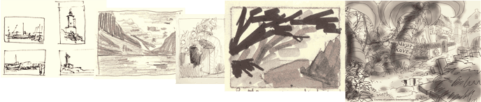
Tried my first two quick sketches of the house (and a small try at a swing set design):

They're taking the 'rundown' description quite far, but I'm a sucker for crooked, leaning buildings. Particularly the right one looks extremely unconvincing, and just plain stupid, but I like the tower-like part of it. They both lack a porch, that I was planning to add, and which would also add more variation depth wise (right now their elements just vary height wise). Also want to make them very integrated into the environment, so I'm gonna try having some large tree lean on them or something, to make the whole sagging thing a bit more believable as well.
Edit: Also, now that I look at them I notice a common flaw, in that when we lean stuff, we tend to lean them just to the sides, which is a boring and flat solution (it's the easiest though), so I'm gonna try having the different halves sag to opposite sides depth wise as well (i e, have one half lean away from us, and the other towards us).
080517:
Made two new design sketches. I tend to do one or two a day until I find one that feels like it has promise.

The right is an experimental sign design, and in the house one I tried a design with a walkway/stairway thing leading up to a door. Vertical variation like this tends to add interest (Bill Tiller (the Curse of Monkey Island Background guy) is a sucker for this). It's easy to go for the generic approach, with having everything on a flat groundplane, so it's often beneficial to at least test some vertical variation when you design stuff.
080519
Pretty close to the last one, less messy, though just barely:

The design is pretty inconsistent, particularly the left round tower thing, but the silhouette looks pretty interesting. One thing I'm going to try in the next one is some diagonals, depth wise (now it's an L shape, this would add some \ shapes).
--
Part II
080601
Haven't really had time to do any sketching until late tonight, which is unfortunate, since I really enjoy this step.
Here's what I hastily came up with:

I sketch in this zoomed out size (about 12% of the document size), where the actual size of the document is more than twice the intended end resolution. The nice thing with this approach is that I can then just keep on refining if the "thumbnail" turns out like I wanted, instead of having to resize it, and by doing so get ugly artifacts and blurry shapes. The high resolution keeps the strokes sharp, and allows me to enlarge areas without artifacts or blur.
I start out with just loosely n quickly scribbling down some ideas for areas, after which I paint the canvas almost black. I then "light" the scene, as oppose to "shade it", so instead of going from a white environment and adding shadows, I start with darkness and add light. I find that this helps me design the light much better, as I need to selectively and intentionally add light, since it's not there as default. It also keeps the image from having too bright values, which is easy if you go from a white canvas. (the reverse is true when going from dark though).
In this one I tried out some back light, which creates large shadows n thus low contrast areas, which should help keep the mood somber. I also tried having it create a desolate feeling by silhouetting the swing, which I put to the right, against the bright sky. The placement isn't optimal, and the general balance hasn't really been considered. Just trying out my first ideas. Gonna add a lot more vertical difference, as it's very flat at the moment.
080603:
Here's the latest sketch.
With outlines:

Without outlines, to get a better view of the general shapes:

Still just trying out ideas, and this one is lacking the nearby farm, but I managed to get the windmill in there in the center left, and I think I could fit the farm around that area as well. Or perhaps on the right side of the house.
The lack of real foreground is bothering me, but I think I'll just add some stuff on the right, that'll nicely overlap the currently empty yard as well, and get a few lines pointing towards the house.
080626:
(I think posting the current update in your bump post might make the thread more exciting, so here it is:)
Continued with the last sketch:

800xsomething
Added more foreground (don't ask me what that close thing to the right is - have no idea), which adds a few layers to give it more depth and lines, where the bottom part is leaning / to compensate for the heavy \ lean of the top (which the fence on the right also helps out with). The balance is still pretty messed up, and I'm once again
paying the price for sloppy pre-work by now having to try to fix things in this less flexible state.
There are many other issues, such as readability of the bridge (which is to the right beneath the sign post thingy, the stairway on the right side of the house, leading downwards, and other things.
Oh yea, I also flipped it horizontally, which is when I discovered the heavy \ lines of the upper part. Flipping it horizontally n vertically is a great way to spot these things, and also to see the image in a new light. In this case I ended up liking it more like this, but I might go back.
I've focused the light more on the right side of the house, to draw more attention to the center of the image, and kept the left in shadow, which also creates a nice silhouette against the sky. The bright sky is an annoying problem, as it creates strong contrast everywhere something silhouettes against it, which pulls focus. This could be countered by blocking it out with trees n stuff, but I want a pretty open feel, which that would rob. So I've limited the blocking trees to the sides to lower the contrast in those areas, and also frame the subject.
All in all, the melancholy feel is pretty much non existent at this point, much due to my weakness for strong sunlight, but I'm hoping it can be fixed with some details n colour).
I added a small character to help with the scaling, which is another issue, particularly with the fence and sign post.
080630:

This is the latest composition I've tried, and I think it's getting close to something I'm happy with. I've basically pulled the mid ground closer to the camera to become something of a new foreground, and ditched the old one. The bridge is now a wooden bridge, that is more easily read than the former stone one, and also produces less contrast which steals less focus from the house. In addition, it allowed me to quite easily add a stream beneath it, something that the other solutions (of which there have been many didn't provide. And even better, the sign is now close enough to be actually readable.
Other benefits: The sign now frames a bigger portion of the far background (where the windmill can be seen (a very messy area atm)), the fence now goes around the yard, forming a nice big curve:

which a) leads the viewer around the bottom part of the image up towards the house and b) as it's slanting /, it compensates for the \ lean of the top part of the image.
The downside is that there's now a pretty large distance to the house from the bridge, which isn't ideal. Also, atm, there's a perspective issue at the bridge, where we're pretty high above the character height, which isn't ideal either. It can be fixed by lowering the camera, which I'm considering.
Some other things: I but the right side garden area in shadow to detract attention and pushed the swingset further back, to open up the yard and increase readability. The swingset has been a problem ever since I put it in.
-
Finally got around to try some colours:


Larger resolution
Not very happy about it, but it's a start, and sort of capture a melancholy feel.
Must say I dragged my feet quite a bit about this, as I knew that the value sketch called for quite a transformation to fit the theme. Which is a shame since I really liked the look of the value sketch.
Having to open up one of the windows was annoying as well, as they create these weird gaping holes. My intention was to go with the right one, but the large centre one looked less bad, and does provide more space for the character.
Speaking of character, I tried quickly adding one, but the size poses a problem, so I had to go with 800x600 to make her fairly visible.

-
080911:
The second colour attempt:

Think it looks better, but lacks the melancholy feel that is called for by the script. Come to think of it, I think it's the brighter values that I like better.
-
080920:
Most likely final version, though there are still things to refine:

Some cleanup and colour treatment, and also added a couple of toys.
Edit: Fixed links
Guess I'll make this my progress post.
Tried my first two quick sketches of the house (and a small try at a swing set design):
They're taking the 'rundown' description quite far, but I'm a sucker for crooked, leaning buildings. Particularly the right one looks extremely unconvincing, and just plain stupid, but I like the tower-like part of it. They both lack a porch, that I was planning to add, and which would also add more variation depth wise (right now their elements just vary height wise). Also want to make them very integrated into the environment, so I'm gonna try having some large tree lean on them or something, to make the whole sagging thing a bit more believable as well.
Edit: Also, now that I look at them I notice a common flaw, in that when we lean stuff, we tend to lean them just to the sides, which is a boring and flat solution (it's the easiest though), so I'm gonna try having the different halves sag to opposite sides depth wise as well (i e, have one half lean away from us, and the other towards us).
080517:
Made two new design sketches. I tend to do one or two a day until I find one that feels like it has promise.
The right is an experimental sign design, and in the house one I tried a design with a walkway/stairway thing leading up to a door. Vertical variation like this tends to add interest (Bill Tiller (the Curse of Monkey Island Background guy) is a sucker for this). It's easy to go for the generic approach, with having everything on a flat groundplane, so it's often beneficial to at least test some vertical variation when you design stuff.
080519
Pretty close to the last one, less messy, though just barely:
The design is pretty inconsistent, particularly the left round tower thing, but the silhouette looks pretty interesting. One thing I'm going to try in the next one is some diagonals, depth wise (now it's an L shape, this would add some \ shapes).
--
Part II
080601
Haven't really had time to do any sketching until late tonight, which is unfortunate, since I really enjoy this step.
Here's what I hastily came up with:
I sketch in this zoomed out size (about 12% of the document size), where the actual size of the document is more than twice the intended end resolution. The nice thing with this approach is that I can then just keep on refining if the "thumbnail" turns out like I wanted, instead of having to resize it, and by doing so get ugly artifacts and blurry shapes. The high resolution keeps the strokes sharp, and allows me to enlarge areas without artifacts or blur.
I start out with just loosely n quickly scribbling down some ideas for areas, after which I paint the canvas almost black. I then "light" the scene, as oppose to "shade it", so instead of going from a white environment and adding shadows, I start with darkness and add light. I find that this helps me design the light much better, as I need to selectively and intentionally add light, since it's not there as default. It also keeps the image from having too bright values, which is easy if you go from a white canvas. (the reverse is true when going from dark though).
In this one I tried out some back light, which creates large shadows n thus low contrast areas, which should help keep the mood somber. I also tried having it create a desolate feeling by silhouetting the swing, which I put to the right, against the bright sky. The placement isn't optimal, and the general balance hasn't really been considered. Just trying out my first ideas. Gonna add a lot more vertical difference, as it's very flat at the moment.
080603:
Here's the latest sketch.
With outlines:
Without outlines, to get a better view of the general shapes:
Still just trying out ideas, and this one is lacking the nearby farm, but I managed to get the windmill in there in the center left, and I think I could fit the farm around that area as well. Or perhaps on the right side of the house.
The lack of real foreground is bothering me, but I think I'll just add some stuff on the right, that'll nicely overlap the currently empty yard as well, and get a few lines pointing towards the house.
080626:
(I think posting the current update in your bump post might make the thread more exciting, so here it is:)
Continued with the last sketch:
800xsomething
Added more foreground (don't ask me what that close thing to the right is - have no idea), which adds a few layers to give it more depth and lines, where the bottom part is leaning / to compensate for the heavy \ lean of the top (which the fence on the right also helps out with). The balance is still pretty messed up, and I'm once again
paying the price for sloppy pre-work by now having to try to fix things in this less flexible state.
There are many other issues, such as readability of the bridge (which is to the right beneath the sign post thingy, the stairway on the right side of the house, leading downwards, and other things.
Oh yea, I also flipped it horizontally, which is when I discovered the heavy \ lines of the upper part. Flipping it horizontally n vertically is a great way to spot these things, and also to see the image in a new light. In this case I ended up liking it more like this, but I might go back.
I've focused the light more on the right side of the house, to draw more attention to the center of the image, and kept the left in shadow, which also creates a nice silhouette against the sky. The bright sky is an annoying problem, as it creates strong contrast everywhere something silhouettes against it, which pulls focus. This could be countered by blocking it out with trees n stuff, but I want a pretty open feel, which that would rob. So I've limited the blocking trees to the sides to lower the contrast in those areas, and also frame the subject.
All in all, the melancholy feel is pretty much non existent at this point, much due to my weakness for strong sunlight, but I'm hoping it can be fixed with some details n colour).
I added a small character to help with the scaling, which is another issue, particularly with the fence and sign post.
080630:
This is the latest composition I've tried, and I think it's getting close to something I'm happy with. I've basically pulled the mid ground closer to the camera to become something of a new foreground, and ditched the old one. The bridge is now a wooden bridge, that is more easily read than the former stone one, and also produces less contrast which steals less focus from the house. In addition, it allowed me to quite easily add a stream beneath it, something that the other solutions (of which there have been many didn't provide. And even better, the sign is now close enough to be actually readable.
Other benefits: The sign now frames a bigger portion of the far background (where the windmill can be seen (a very messy area atm)), the fence now goes around the yard, forming a nice big curve:
which a) leads the viewer around the bottom part of the image up towards the house and b) as it's slanting /, it compensates for the \ lean of the top part of the image.
The downside is that there's now a pretty large distance to the house from the bridge, which isn't ideal. Also, atm, there's a perspective issue at the bridge, where we're pretty high above the character height, which isn't ideal either. It can be fixed by lowering the camera, which I'm considering.
Some other things: I but the right side garden area in shadow to detract attention and pushed the swingset further back, to open up the yard and increase readability. The swingset has been a problem ever since I put it in.
-
Finally got around to try some colours:
Larger resolution
Not very happy about it, but it's a start, and sort of capture a melancholy feel.
Must say I dragged my feet quite a bit about this, as I knew that the value sketch called for quite a transformation to fit the theme. Which is a shame since I really liked the look of the value sketch.
Having to open up one of the windows was annoying as well, as they create these weird gaping holes. My intention was to go with the right one, but the large centre one looked less bad, and does provide more space for the character.
Speaking of character, I tried quickly adding one, but the size poses a problem, so I had to go with 800x600 to make her fairly visible.
-
080911:
The second colour attempt:
Think it looks better, but lacks the melancholy feel that is called for by the script. Come to think of it, I think it's the brighter values that I like better.
-
080920:
Most likely final version, though there are still things to refine:
Some cleanup and colour treatment, and also added a couple of toys.
Edit: Fixed links
#356
Competitions & Activities / Re: Background Blitz :: Workshop Edition :: Ending around June 2nd
Thu 15/05/2008 21:29:28
Just a reminder that there are plenty of things to design beside the house, so while six days for just designing and studying stuff might sound a bit generous, it really isn't much, particularly since we're not doing it full time.
There's the sign, bridge, stream, playing equipment, swings, farm, windmill, and these are just the things mentioned in the script. A real environment contains ton of stuff.
You can of course just go for generic designs for these, but then there's a good chance that most parts of the image will be uninteresting.
And this doesn't mean that you need to spend a day just researching different swingsets. Three minutes browsing through images.google.com for "beautiful swingset"(to exclude the generic junk) will yield plenty of interesting designs that you can then import into whatever application you're using, and give your own design a go. Doesn't have to take more than 5 minutes in total, and you get another thing that will interest the viewer for at least a moment, and add richness to the scene.
And even though the prospect of researching stuff like signs may not sound thrilling, it's because we immediately think of the generic crappy designs that surround us. Doing a bit of research quickly opens your eyes to the many fascinating designs (particularly old handcrafted ones) that actually exist, and makes you look at these things in a new light.
And what's really nice is that for each thing you study, you gain knowledge that you can also use on all other designs, regardless of what object it is. So you can quickly build up a library in your head that will enable you to add enrichening design touches to any object you're working on without any references. And for each new design you learn, your whole library gets multiplied, as you can then cross this designs with the ones you already know.
So for each swingset you study, the better your next lamppost will look.
I hope that these big introductory posts and all don't give the impression that in order to participate, people will need to dedicate a large amount of time on this, or have any kind of artistic skill. If you happen to have 10 minutes on the bus each day, that amounts to 60 minutes of designs, which isn't bad.
So if you have a moment over each day, and find it interesting enough, I hope you'll join in.
There's the sign, bridge, stream, playing equipment, swings, farm, windmill, and these are just the things mentioned in the script. A real environment contains ton of stuff.
You can of course just go for generic designs for these, but then there's a good chance that most parts of the image will be uninteresting.
And this doesn't mean that you need to spend a day just researching different swingsets. Three minutes browsing through images.google.com for "beautiful swingset"(to exclude the generic junk) will yield plenty of interesting designs that you can then import into whatever application you're using, and give your own design a go. Doesn't have to take more than 5 minutes in total, and you get another thing that will interest the viewer for at least a moment, and add richness to the scene.
And even though the prospect of researching stuff like signs may not sound thrilling, it's because we immediately think of the generic crappy designs that surround us. Doing a bit of research quickly opens your eyes to the many fascinating designs (particularly old handcrafted ones) that actually exist, and makes you look at these things in a new light.
And what's really nice is that for each thing you study, you gain knowledge that you can also use on all other designs, regardless of what object it is. So you can quickly build up a library in your head that will enable you to add enrichening design touches to any object you're working on without any references. And for each new design you learn, your whole library gets multiplied, as you can then cross this designs with the ones you already know.
So for each swingset you study, the better your next lamppost will look.
Quote from: Blue on Thu 15/05/2008 17:31:34
I really wish I had the time to participate in this one...
Great idea loominous!
I’m looking forward to seeing the entries


I hope that these big introductory posts and all don't give the impression that in order to participate, people will need to dedicate a large amount of time on this, or have any kind of artistic skill. If you happen to have 10 minutes on the bus each day, that amounts to 60 minutes of designs, which isn't bad.
So if you have a moment over each day, and find it interesting enough, I hope you'll join in.
#357
Competitions & Activities / Re: Background Blitz :: Workshop Edition :: Ending around June 2nd
Thu 15/05/2008 12:28:10
Just added these posting guidelines to the first post:
Posting Guidelines
To keep the thread easy to read, please keep your progress for each step inside a single post. This doesn't apply to comments and discussions.
Also, to make it easy to know what comments refer to, please quote texts and pictures.
If you're including large ref pics directly from the web, such as images.google.com, then please include the thumbnail version in the post, along with a link to the full sized image. Like so:

Full size
Note: You don't have to create thumbnail versions yourself, just copy the address to the ones that google use (rightclick and select 'copy image address' (or something similar)).
--
Had a very similar house in mind, though with influences from houses like this one:

(from Beauty and the Beast, framenumber 4282 in this dvd rip)
Posting Guidelines
To keep the thread easy to read, please keep your progress for each step inside a single post. This doesn't apply to comments and discussions.
Also, to make it easy to know what comments refer to, please quote texts and pictures.
If you're including large ref pics directly from the web, such as images.google.com, then please include the thumbnail version in the post, along with a link to the full sized image. Like so:
Full size
Note: You don't have to create thumbnail versions yourself, just copy the address to the ones that google use (rightclick and select 'copy image address' (or something similar)).
--
Quote from: dkh on Wed 14/05/2008 23:28:06
Great idea. I'm working on a sketch. I'll post my first reference here, for finding it again later...
http://histpres.mtsu.edu/centfarms/rutherford_county/images/Sugg%20farmhouse.jpg (too big for direct linking, I believe)

Had a very similar house in mind, though with influences from houses like this one:
(from Beauty and the Beast, framenumber 4282 in this dvd rip)
#358
Competitions & Activities / Re: Background Blitz :: Workshop Edition :: Ending around May 2nd - Part I
Wed 14/05/2008 21:45:13
Study sketches
These are pre-sketches that you do in order to familiarize yourself with the elements of the scene.
It's easy to fall back on more or less generic designs of elements, particularly when they play a less important role in a scene, and studying interesting existing ones will widen your understanding of the subject, allowing you to create interesting environments.

They can be everything from quick scribbles to elaborate artworks.
Design Sketches
These are pre-sketches as well, where you try out designs of your own. They can be adaptations of reference material, or completely new.

(two of the design sketches for the lighthouse in CMI)
--
In practise
All this may suggest that this stage is very time consuming, but it's really just as long as you feel like. You can study an element of a scene for a lifetime, or just glance at a pic. It's all about your level of interest and need.
I'm personally often too lazy to do study sketches, and find myself go straight to the design sketching. Study sketches do teach you extremely much however, stuff that just looking at images won't, so I really recommend doing them.
Tip
One thing I've found helpful is to set up a working space where you surround the sketch area with reference pictures like so:

Besides making it easy to go from looking at the sketches to the references, it also gets rid of that horrible white space you start out with, and I also suspect it helps you in some less conscious way, as being surrounded by a myriad of shapes and design elements is bound to affect you in some way, and hopefully influences the richness of your own designs. The last part is of course just pure speculation.
--
So, that's it, happy drawing!
Edit: Fixed links
#359
Competitions & Activities / Background Blitz :: Workshop Edition :: Concluded
Wed 14/05/2008 21:43:10Where the participants in the usual Blitzes work behind closed doors, emerging only when ready, this will be about opening everything up. Rather than focusing on the final pieces, it will be about the processes leading up to them. Working in an collaborative atmosphere, the participants will share their progress and ideas from the very first doodles, up to the final touches, giving and receiving feedback as they tinker along and improve their pieces.
There are many ways of doing a workshop like this, all with their own pros and cons, and after seemingly endless discussions between zyndikate and me, we decided that this time around we'd work on independant pieces, but move through the stages of the creation simultaneously, by dividing it up into the phases:
Since we're not sharing a physical location, and can't simply look the other guys over the shoulder to see the progress, the participants will compensate this by posting WIP (Work In Progress) pics during the whole process, the more the better. Apart from their own WIP pics, any material that might be considered interesting is welcome, such as photos for illustrating ideas, reference pictures, and even stuff like music, if it happens to be relevant.
The script
The goal will be to develop a background that follows this script: (it's in a pseudo screenplay format for no better reason than that I happen to like the look of it)

The reason why it's so specified is that it will enable us to work out and discuss solutions for problems that we all share. Everyone knows what the others are trying to accomplish, so there is no confusion about what someone's aiming for (a common problem in the CL).
Voting
After the last phase, a vote will be held with the following categories:
Most Developed - the participant who during the workshop has developed the most
Most Helpful
Best Execution - the best execution of the script
The recipient of the most votes can then go back to a regular Background Blitz, a Mockup Blitz, or go for another Workshop Edition (perhaps with another approach).
Posting Guidelines
Creating posts
To keep the thread easy to read, please keep your progress for each step inside a single post. This doesn't apply to comments and discussions.
Also, to make it easy to know what comments refer to, please quote texts and pictures.
Don't hesitate to make bump posts when you update something, just make sure to include a link to your particular post like so:
Update: Example
[url=http://www.adventuregamestudio.co.uk/yabb/index.php?topic=34542.msg451551#msg451551]Update: Example[/url]To get the address to a particular post, simply rightclick on that post's topic line (the line at the top of the post usually called something like Re: something), and select 'copy address' (or something similar).
(Note: You can't access these topic lines from write/edit post pages, as in, when you're typing a post, but you can of course get them from another window with the thread open, or prior to going into write/edit mode)
Images
Try keeping image file sizes below 60kb, and if they're bigger then please create a thumbnail and link to the original image.
If you're including large ref pics directly from the web, such as images.google.com, then please include the thumbnail version in the post, along with a link to the full sized image. Like so:
Full size
Note: You don't have to create thumbnail versions yourself, just copy the address to the ones that google use (rightclick and select 'copy image address' (or something similar)).
--
On to the first part!
Edit: Fixed image links
#360
Critics' Lounge / Re: Title Screen in progress--need help with comp
Sun 11/05/2008 19:36:23
A good thing to start with is deciding one or two focal points.
It's much like melodies in music. Without one, the song will probably end up being dull to listen to, and having a bunch of them playing at the same time isn't that much better, as none of them end up being really heard.
So instead you pick or develop the most interesting and enjoyable melody you can, and then create an arrangement to support and enrich it.
In this case it could be a particularly interesting part of the city(?), an interesting part of the mountains, an interesting part of the sky etc. Doesn't have to be one, but it's usually good to have one dominating focal point (melody), and then one or two less dominant ones for added interest.
You then build the image around it/them, trying to make everything else enhance it/them, while not competing for interest. The focal point should ideally be clearly dominant already in the outline sketch, just by the way the image is constructed, and then further enhanced when values/colours are added.
(the current state is really confusing, with half of it with values and half still only in outlines. I suggest keeping all areas of the image at the same level of completion, as the sum of the parts is far greater and more important than the individual parts, and working on it evenly keeps you updated on the sum)
Hm, just looked at the date it was posted, and I guess you may very well have finished this one already.
Oh well, in any case, good luck!
SMF spam blocked by CleanTalk