Menu

Show posts

This section allows you to view all posts made by this member. Note that you can only see posts made in areas you currently have access to.

Show posts Menu

Messages - loominous

#361
Quote from: Neil Dnuma on Thu 08/05/2008 14:28:06
perhaps you're familiar with J.M.W. Turner who did some very interesting pre-impressionist paintings.

Not really, no. I'm really ignorant when it comes to classical art, or artwork in general for that matter. Which is a shame since those old guys really knew about stuff like composition, and looking at nice landscape art always reminds me how stiff and boring my solutions usually turn out, and how they could be improved.

Quote from: Neil Dnuma on Thu 08/05/2008 14:28:06
To be honest, I'm a fan of a little more sharpness though, maybe this is more noticeable in the foreground area after you put the sprite in.

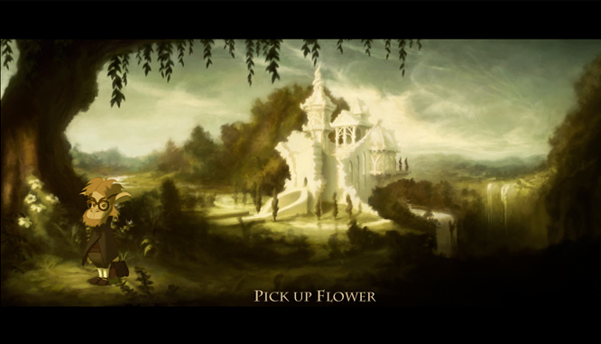
Hm, you're right. The odd thing is that those areas are quite sharp in full size, and might've gotten a bit blurred when I downsized it, while the sprite outlines remained sharp. Another reason might be that the light "bloom" added to the bright spots might've blurred out those parts in this scale. Sharp sprites do call for sharp backgrounds.

Quote from: Neil Dnuma on Thu 08/05/2008 14:28:06Any movies/TV-series you've found particularly inspiring?

I dunno, I think lots of movies and series, whether you like them as movies/series or not, feature nice footage and grading that fits different situations.

('Grading' is the post process where the camera footage, which usually looks very pale and unattractive when scanned, gets treated. Apart from simply upping the contrast and fixing the colours, there's usually an artistic grading done, where you basically add colour schemes to the footage, to give it "looks", much like in a painting).

For instance, a show like CSI shows how you can turn boring lab environments into cool looking office landscapes by limited, selective light and heavy colour bias (everything is basically blue, with warm spots of light).

Shows like Dexter how you can build a realistic everyday palette with two very dominant colours (the very predominant turquoise and red)

A show like Smallville how to achieve extremely warm friendly palettes.

Animated movies such as any Disney production often have quite particular compositions, with heavy foregrounds and strongly focused light, which translates directly to 2D game art, where you're trying to achieve maximum depth, to compensate for the 2dness. So they're always interesting in that regard.

On the whole, I think most movies and series, if they're well funded, have nice visuals that you can get inspired by, and even if the footage/grading is bad, they can still feature interesting objects and such, and I find myself taking screenshots from pretty much whatever I happen to watch, though in lesser or greater extent of course.

Btw, a screenshot/reference tip is to have a screensaver that cycles through your reference image directories. One problem I often found was that I never actually looked through the stuff that I had saved/captured, which this solves nicely. It's preferable to have two screens (or a laptop) though, to allow for one to work like a gallery when you're not using it. iSlideshow is a nice free one with a nice Ken Burns effect (slow panning/zoom and dissolve) and Nostalgic Screensaver is pretty much exactly the same, except it works better on crappy graphics cards, but can only show jpgs.

Oh, another thing is to have a good way of triggering the capture of screenshots, so that it doesn't become a hassle. Having a single button to push is an easy solution, if your media player supports it. The nicest solution I've found is to remotely trigger the screencapture by using the my cel phone, this via bluetooth. If your phone supports remote desktop, it's quite easy to set up. So I simply press "0" on my phone to capture, and by using a viewer like BSPlayer, the screenshot is then automatically saved with the name of the file watched and the frame number as the file name, for easy management.

Quote from: Neil Dnuma on Thu 08/05/2008 14:28:06Also, what about the workshop there was some talk about?

I'm thinking that I may do a special 'Background Blitz - Workshop edition' if I get to host the next one. Basically the same as the BB but with workshop features. As it's so close to the BB, it feels better to have special BB editions than separate workshop activities, as that would just divide up the interest.
#362
Quote from: Jens on Wed 07/05/2008 22:43:08
Loominous, did you train the use of those colours?

If you mean formal training, then no. I just observe stuff and experiment.

One of the many nice things with working digitally is that you can really experiment freely n quickly, whereas with analogue media, you're pretty often stuck with what you put down, or have limited or time consuming ways of altering it.

One thing I noticed when I started looking into the colours used in movie/tv-series/game screenshots I liked (which are my primary sources), was that the colours often had a clear bias towards a certain colour/s. So a picture might lean towards blue/violet, (like JBurger's entry), where everything, regardless of what colour they have under more normal circumstances, has a blueish/violetish hue.

Upon further investigation I noticed that there was often a quite rich variation within these limited colour ranges, so while they appeared monochrome, they still contained clear diversity. Another thing was that the hue seemed to often change in correspondence with the value, so a sky wouldn't simply be in one hue, but go from perhaps cyanish brights to purple darks. Which also goes for stuff like grass, which might go from pure orange brights to cyanish darks. Both these things help the image from looking "dead", which I found to be a common issue when doing more monochromatic stuff.

Here's what the colours actually are in the current version (just picked the main colours with the colour picker):


You can see the clear bias towards yellows/orange, where even the blue sky goes from yellow brights towards green darks, and that perhaps 8/10th of the hues available weren't used.

I also found that while it was easy to make monochrome like palettes for more unusual light conditions, such as early mornings/evenings/nights/artificial lights, it got trickier when doing more day time like scenes, and this pic is part of my experimentation with this (this is more early noon). The reason is that during daytime sunlight gets very white, and since white light contains all colours, objects will reflect these in the way we are most familiar with, so a blue ball will reflect the blue spectrum of the sunlight while absorbing the rest. So you can't get away with too much monochromaticity (probably just made up that word), or it won't look like daytime.

Can compare this with, let's say, late sunset light, which is very red. Since the light that hits objects only contain a range of reds, the objects can either reflect or absorb them these colours. So this means that green or blue objects have no green or blue light to reflect, and can therefor only absorb or mildly reflect the red light depending on their hue (making them either dark red or black). So this scenario by itself makes everything monochromatically red, and we have no trouble buying it.

There's lots of stuff to say on the subject, and I've been meaning to make a practical tutorial about light, but I haven't got around to it yet.

Edit: corrupt sentence
#363
Oh, and my votes:

Idea: Traveler
Atmosphere: JBurger
Design: JBurger
Composition: JBurger
Functionality: JBurger
Technique: JBurger

Meant to include some WIP images during the making but never got around to it, but here's a late GIF anim showing the process. Sorry about the file size, tried to minimize it as best as I could (250kb):


Here's a larger version (900kb).

I hope it can show that an image will often look crappy and sloppy during large parts of the process if your focus is on the big picture, and that this unappealing appearance is something to look beyond, as what matters is how it'll look in the end. It can be a bit discouraging if you're not used to it, since you're working on faith that it'll turn out good, and have no real evidence of whether it actually will until the later stages. But I wholeheartedly recommend it.

Keeping the image zoomed out whenever you're not working on details is a great way to keep help you keep the focus on the entire image, and I usually have it occupy perhaps 1/6th of the screen. There are other advantages with this: you don't need a seperate thumbnail stage, as you're working in that size, which means that you can just continue working on whatever "thumbnail" sketch you choose, without having to resize it, which leaves ugly artifacts. It also avoids the gamma/brightness problems of most LCD screens, where the brightness of the screen is quite uneven (can often notice a gradient going from the top of the screen to the bottom), but as the image only occupies a part of the center of the screen, the brightness difference is neglectible.
#364
Thanks!

Quote from: Andail on Wed 07/05/2008 12:50:47
Almost a bit overworked for a game background
Ironically, it's the quickest one I've done so far - though I guess that isn't saying much, as I usually tinker with my stuff for quite a while (this one took about a day).

I think what might give it a "worked" look is that I put in some details in the focused parts, as well as in the far away regions, where instead of just fogging out with a few mountains, I scribbled in some details that gives a fairly realistic and "worked" impression, even though they were very roughly n quickly done. Which goes for 75% of the background really, which isn't in focus. As you know, as long as it's the right value/colour in the right place, we'll buy pretty much any scribble. And this one is 75% scribbles.

Edit: corrupt sentence
#365
A sort of scholar's castle, of greek/weddingcakish design.


Here's a mockup, to show how it might work with a sprite included:

#366
Critics' Lounge / Re: Swimming with Eels
Sun 13/04/2008 19:36:12
Great character as always!

What I'd tinker with is the overall impression.

If you look at the original in a small size


then there's no real focal point to me, and the part that sticks out most is the lower left dark tail area, which I assume isn't meant as the main attractor. It gives a bland quality that doesn't do the character justice at all.

The tricky thing is that this is easily missed if you look at the image in full size, as we start looking at the details, and this overall impression is lost, though felt.


There are a couple of ways that you could use to boost the focus, here are three of them:

(sloppy edits to convey the difference, not to be seen as representative end result)


I) Adding more light to the parts you want to dominate:


I painted in some extra light on the areas that I are think are the most interesting to make them dominate by valuecontrast. Since I didn't merely up the contrast, it will just gently boost that area, without leading to a harsher look.

(I know you know this mash - just a clarification as I often see this in other's work: if your image lacks focus, increasing the overall contrast with a contrast tool isn't the solution! You need to selectively increase and decrease the dominance of areas via value contrast, colour contrast etc)


II) Making the other areas less contrasty:


This, to me, is a very neglected way to get focus, which is a shame. Instead of just piling up contrast to get things to pop, you reduce it instead, but only in the areas you deem least important.


III) Surrounding the object with light:


This makes the silhouette pop, though if it's really bright, and you want to make it realistic, you'll have to add a bunch of light wrapping around the subject which softens up the edges, in which turn reduces the contrast.

It can often give an angel like look which is neat if that happens to fit.


Here they all are in smaller sizes, to give the overall impression:


-

I think each have their own merits.

One thing that II) does is increase the atmosphere - as in the density of particles in the environment scattering the light - think fog - making things harder to see at a distance (as the further away, the more particles exist between you and the subject that scatters the light).

It has several effects: makes it more moody, makes things look like they belong together (blend) more and also provides depth.

In this case, where you want to make it look like she s swimming, it's probably good to rather overdo the atmosphere than vice versa, as otherwise it's easy to lose the sense of water. (the fact that I pushed the environment towards green doesn't help with that though, but it contrasts against her red hair, making that area pop further)

To avoid turning this into an essay, I'll stop here, though there's tons more to say about these things.

Anyway, great job!

PS. Oh, and regarding the body saturation: I think it's mostly about the shadow area, which very blue colour seems unwarranted and sticks out. The environment looks like a less saturated version of her lit up skin area, so that blue tint seems to come out of nowhere.

Edit: Just want to point out that just because the blue comes out of nowhere doesn't mean I'm saying it has to be removed. If it looks good, it looks good.
#367
Glad that you're interested Stupot - I agree that something similar for sprites would be a good idea.

I think skeletal constructions/poses are to sprites what compositions are for backgrounds. They're the basis that determine the rest, and they're almost equally neglected in the CL.

I'm not sure that there's any actual difference between making a hi res backgrounds and lo-res one, especially in these early stages, but I guess some EGA fans could add a dithering stage at the end, where they could work on those things.

-

Anyway, the idea I had for this activity was along the lines of:

We'd agree on a set of stages, for instance:

I) Composition

II) Design - a bit hard to separate from composition, as the design of the parts affect the composition, but some generic design could be used during the composition stage, and be improved in this one.

III) Value sketch

IV) Colour sketch

We'd move through these one by one, finding what we deem the best solution we can come up with before continuing on to the next.

So in this case we'd start with the composition. We'd come up with solutions and post these continuously, and since we'd be trying find the "ideal" one, discussions would naturally ensue about the benefits and problems with the submitted solutions/edits, and how they could be improved.

Once we're out of ideas, we'd either hold a vote about what solution to continue with, if there are a few rivaling candidates, or if some idea has appeared generally favored, we'd simply go with that one. And off we'd go to the next stage.
#368
I think having some kind of scenario, where specific things need to be considered, would help make it less about pure aesthetics, and also about finding practical solutions, which is part of most kind of painting.

To explain what I mean:

Say that we're for instance working on a castle pic, where the only info is that it's a background containing a castle. If that's all there is to it, then there aren't all that many real variants - you'll probably want to show it from some kind of front angle at the golden ratio with the rest of the pic framing it nicely.

If you however introduce the need to have an inn in the same picture (where the protagonist would be staying), and that the main door and a window need to be visible and useable, and that the distance between the castle and the inn is about a mile, you'll have to start working out solutions that are both practical and aesthetical, which is fun and challenging.
#369
Good to see some more faces! Hope there are more people interested out there - don't need to be experienced or anything, just interested and motivated.


To get more practical, what kind of activity would you all prefer to see more precisely?

Seems like there are two main roads with their own benefits:

I) Working from a certain provided sketch/scenario - where through discussions and edits, solutions for the specific scenario would be worked out.

I think this one has the benefit of provoking much discussion, and a myriad of ideas, as everyone would be trying to find solutions for the same problems together. A con would be that it might make some people hesitant to join in, as they may feel like they have nothing really to contribute.

The benefit of working with sketches might help here, as, aside from being quick to make, they don't require any rendering skills, just something clear enough to indicate what you mean, which can be done with a 2 sec scribble. So it becomes more about ideas and solutions than anything else. Which is really what those stages are about anyway, so anyone could contribute.

The input wouldn't have to be in the form of sketches or similar either - can be anything from just written ideas to screenshots from games/movies/tv-shows and paintings that contain solutions to the problems. (I'm an avid screenshot taker myself)

II) Working on independent pieces - similar to the Background Blitz

A benefit here is that people can choose the content that interests them personally, and can potentially use them in their own games or portfolio or whatnot. A probable con would be fewer discussions and less interaction, as people work on their pieces independently.
-

I'm torn myself, and I guess both could be tried out.
#370
Quote from: Andail on Thu 10/04/2008 07:55:24
I had a couple of activities called "from concept sketch to functional background" or something similar, which was basically about me giving a sketch that forumites could continue on and finish.

Remember starting on an entry for that one - it was a neat activity.

A modified version of that one might work well for the purposes we've talked about. It could be based around a sketch from the CL, preferably containing most common errors, and it could be used in a similar fashion for:

- Compositional experimentation, where different solutions and approaches would be submitted and discussed

- Design experimentation, where the generic design often found would be developed into something interesting

- Value experimentation, where different lighting setups would be submitted and discussed

- Colour experimentation

Not sure how this would be handled, if having for instance one week for each of these would be best, or handling them parallel etc.

-

One thing that bothers me a bit about this is that while this could provide an in depth discussion, it feels a bit like deserting the CL instead of trying to improving it. While having an activity like wouldn't exclude trying to improve the CL simultaneously, and it may very well lead to indirect improvements by raising attention to neglected areas, we would probably be moving discussions away from it.

Also, these kind of things require management and initiative, while these kind of situations pop up spontaneously in the CL.

Perhaps the best way would be to let these things spawn by themselves in the CL, and then, if a thread seems to have promise perhaps migrate into the C&A forum. Or why not both.

I dunno, I do have a preference for self sustaining system improvements rather than initiative based momentary actions. Probably the swede in me.

Quote from: zyndikate on Thu 10/04/2008 00:29:05
I just meant that you dont put random stuff down with no intention - the sketch for composition should have the intention to seek out a good composition(and all which that mean). The artist-glasses is on in the proccess. So sketch = exploring, seeking, study - for me.

Oh, just a terminology mixup then. 'Scribble' to me just means very quick sketching(/writing), not unintentional'.
#371
Quote from: MrColossal on Wed 09/04/2008 18:05:08
People might also think that in order to show a sketch they need to have a scanner but you can sketch in mspaint with a mouse for all it matters.

Just want to add cell phones as a handy scanner substitute, which usually come with some kind of camera these days. My scanner isn't even plugged in - I just snap shots of my paper scribbles with my crappy cell phone camera (if I happen to work from a paper sketch). It's just a sketch after all, I just need the gist of it.

But I agree that unfortunately 'sketch' has come to mean 'paper drawing', which to many probably sounds like it's an unavoidably tedious hardcore like approach.

-

Speaking of which, I think one general problem is that as soon as sketches and composition come up, things start to sound time consuming and difficult. 'Value sketches', 'color tests', 'thumbnails' - all that stuff suggests that if you want to try to work on these things, you'll be spending a day just with the preparations, effectively kicking spontaneity and lust out the window.

Minding the composition doesn't have to mean more than spending two secs briefly analysing where you want to go with the piece. For instance, you've scribbled down a castle that looks cool, and now you decide to make a background out of it. Instead of starting to paint the grass beneath it, you draw a few lines indicating a landscape, some scribbles indicating some kind of foreground to frame the castle, and a line or two indicating some distant mountains for depth. The right side of the castle looks empty, so you add a few hills there but determine that some foreground concealing that area might make it look more interesting, so you give that a go. That's it. It's not alchemy or a marathon run.

-

zyndikate:

QuoteI do also think that(which was my intention) you can improve a composition when you got the peices in front of you, aligning forms, grouping, repetition, leading the eye - Not saying it would have been the best choice of sketch - make the best of what you have.

Oh, I completely agree, I just forgot to clarify that in my last post.

QuoteA suggestion that has been up is a Workshop(which my tutorial was meant to be) where everyone makes a background with eachother - posting at every stage. But it would probably mean much time for the "teachers" bringing together. And most important people has to show interest, all our time is equally important and it would be waste if noone was interested. If you have any suggestions Im with you, not just to help but also to grow myself as an artist.

I sort of tried to convert the background blitz into something similar a while back, stepping away from the competition aspect and more towards an activity where you focus on the creation aspect, where people would post their developmental pics and get feedback. Was probably not the right place to do it in retrospect.

I'm not sure a new sort of form needs to be introduced, as in, a special activity or format. When I encouraged people a while back to submit their stuff while in the early stages, I recall JBurger picked up on it, and we had a good thread or two, where things developed from a rougher sketch.

Could be as simple as a new convention where people sort of flagged their threads in some way or the other, indicating that they're after this kind of help. I dunno, perhaps add something like 'Forest background - WIP help please'. Some sort of tag would be preferable, as I rarely check out the content of all new CL threads myself.

There may very well be a new and better way of handling it though. After all, that minor success was very short lived, so I'm open for ideas.

Workshop like activities do have the benefit of a much more creative and comradery atmosphere, whereas a CL thread is more like a review board (which probably why some have problems with it).

Perhaps a new activity in the competition/activities board. It seems to me that workshops work best if there's some sort of topic, so perhaps something along the lines of an activity where you'd focus on different stages in the process. The first one might focus on the initial sketches, like thumbnails, where people would submit their sketches n discuss their approach etc. Then perhaps a value sketch one, where lighting setups and values would be discussed, and one about colour palettes etc. Those ought to also be a good read for non participants, and could be referred to when critique is given in the CL.

QuoteI think you need to have a clear mind of what you want with the sketch, scribble isnt the same which some might think.

I think he's referring to the early stages of a sketch, where I think scribbling is very important. Aside from adding looseness and speed to the sketch, it often triggers many invalueable happy accidents. If you're for instance doing a forest scene, and you start carefully drawing trees etc, you'll often end up with generic boring stuff. By contrast, if you scribble away happily, you often end up with some weird shapes that you start interpreting as some kind of foliage with some weird rock next to it in front of a stream or something; the kind of stuff that's very hard to come up with if you draw careful and intentionally.

Composition is after all about large shapes where the content of these is irrelevant. From a composition perspective, the less expected these shapes are the better, and scribbling is a really good way to achieve this.


Rock Chick:

Quote from: rock_chick on Wed 09/04/2008 18:49:10
Some people are born with a natural talent for sketching, like some have for painting, etc. and others have a general lack of ability and I'm one of them.

Then we're alike, since I was never good at either the pen handling part (held it way too firmly, almost cramp like, and my lines were short, messy and just ugly), or the actual drawing part for that matter. Got a C in art class during my whole school period.

The good thing is that drawing and painting is like math - it's about understanding rather than some god given talent. When you haven't studied math, those weird symbols mean nothing to you. And even as you start to master the basics, stuff like algebra still looks and sounds like something completely unattainable. If you weren't forced to learn it in school, you'd probably consider those things as something only for people with math talent.

The same thing is true with art, like mass, light, colour, composition etc. These are things to understand the way you learn math, not by some blessing from a higher power.

(Btw, when I see beginners draw from references, it's like looking at toddlers copying down algebra lines. Even if they manage to copy them correctly they have no idea what they're doing, which is why I rarely if ever recommend relying on references. It doesn't hurt, but your understanding will most likely remain unimproved.)

And just like with math, sure, some will learn faster than others, but that doesn't mean that you can't reach those levels if you give it a go, it might just take longer time. There are probably tons of annoying 12 year olds whose art makes mine look like crap, but who cares. It's not a contest.
#372
I think my "vision" might have come across as much grander and impractical than my intent.

As you know, a good composition in the sketch stage is key to the turnout of a good piece. When you look at the critique in the CL however, this key issue seems pretty much completely overlooked. It's a bit like watching a ship crew worrying about mopping the deck when the hull is leaking profusely.

And this would make perfect sense if composition was some elusive or just extremely complex concept reserved for experienced artists. But as you said, it's mostly a set of simple ideas that you experiment with. The difference between a more experienced artist and a novice is that the former spends time considering and experimenting in this stage, while the latter (unknowingly) skips it.

I think the reason is inherent in these kind of forums, as the works submitted are in the 'almost finished' stage, which leads to mostly cosmetic improvements.

There's nothing wrong with cosmetic critique, but it can suggest that this is where the pieces are lacking, that they just need more polishing, when the real big problems are deeply rooted.

So my intention is more towards pulling the focus from the later detail stages, where people usually obsess, and instead place it more on the first simple stages that in many ways determine the outcome of the piece. A good composition won't guarantee a good outcome, but it's the start of one.

This wouldn't be aimed at people looking for help touching up that last background for their next game, but for those looking to improve their skill in general.

And like you said, it's not much about theoretical rules that need to be studied, but more about distributing a chunk of attention to the early stages, figuring out the things that you like, and what you want to make of the piece.
#373
I fear you'd end up in that 'homework' scenario quite soon, and a messy one at that, since handling parallell activities within a forum thread is often a disorderly business.

It might however work better if you instead mentored a few people via PMs, and perhaps made these PMs publically viewable in a thread, so that people could follow the progresses (would allow you to keep the thread organized n lean, as you'd be posting all the messages).


About the CL:

A big problem with compositional critique, which seems to be your main aim, is that large parts of the material submitted often end up being discarded, sometimes even everything due to a camera angle change etc, which is obviously really discouraging for the submitter, who might have spent days working on those discarded areas.

To address this, I made an attempt a while ago to encourage people to post their work early on in the progress, to allow for major compositional changes, where only roughly sketched parts might end up being cut. The problem there is that since it's not always possible to provide prompt feedback, people often end up being left hanging, waiting to proceed with the piece, which isn't ideal.

That problem should be solveable to an extent though, by having a greater number of people with some compositional insight around to help out. So if skilled people like yourself would lend a hand, it could probably elevate the critique of the CL further, more away from piece particular paint-overs, and towards more objective, theoretically based help, where people are guided towards actions, rather than standing by while someone else grabs the pen.


Btw, if you don't mind me asking, what are your reasons for not posting comments or artwork in the CL? I know I never post my own stuff, and others with me, so I'm just wondering what your reasons are, as they may help improve the place.


(Oh, and nice bb entry btw!)
#374
Critics' Lounge / Re: Art Tricks
Sat 08/03/2008 02:48:22
I'd second the wacom idea, if you have enough interest and money.

I see no reason what so ever to master the mouse as a drawing tool, unless you're forced to use it. It wasn't designed as a drawing tool and it sucks in comparison as a drawing tool. (yes, you can pixel with it)
#375
Critics' Lounge / Re: Photoshop question
Sun 24/02/2008 19:03:40
Along the lines of Binky's method, but more optimized:

Alt.1

1. Go to channels, and ctrl-click any of the rbg channels (or the gray channel)

2. Invert the selection with ctrl-shift-i

3. Create a new layer and fill the selection with black


Alt.2

1) Create a black layer beneath the stroke layer

2) Go to channels, and ctrl-click any of the rbg channels (or the gray channel)

3) Go back to the black layer, and click on the 'layermask' button (the one with a circle inside a square)

4) Invert the layermask with ctrl-i


Voila!
#376
How about a modular solution that could feature everything from modern hi res 3D graphics like Myst, to two colour Atari Asteroids.

It could be done in a variety of ways, but the first idea that pops up is:


The Grounded Kid


(Screenshot from Willy Beamish)


The player would be confined to one or two rooms, being grounded, which would constitute the main setting.

The room(s) would feature various distractions however, in form of:

Consoles/computers:

Interacting with these would let the player access sub games/apps, featuring everything from lo res shoot-em-ups to calculator programs, to whatever the contributors are able to come up with (or have already come up with, which could be implemented).

(these could be presented in the computer/console menus as being only "Trial" or "Demo" games, explaining their (probably short) length).

Various Activities

Everything from (sub games like) playing in the tub with a rubber duck to tossing water balloons from the window, in attempt to hit the neighborhood grouch. These would however call for graphical consistency, so they wouldn't probably be very fruitful.


-

I think the main benefit of this approach would be a highly flexible and modular design, where anyone could contribute "apps" of all looks and types that could be launched naturally from within the main setting without having to worry about graphical consistency etc, and which could, in theory, be added to indefinitely.

So the player would hopefully find the style they want to pursue within it, and be surprised by the additional capabilities of the engine that they might not have discovered or considered otherwise.

I guess the biggest drawback would be a potentially huge size, but that could be countered by the main coordinator in form of selectiveness and app size restrictions. I guess the modular design could even be used to provide the option of downloading different versions of the demo game of various sizes, featuring different amounts of sub apps.

-

I guess this idea of a modular design featuring sub apps may suggest that I have a giant monster demo game in mind, but it could very well simply be one or two sub apps, an arcade game and a calculator, for instance. Doesn't have to be fancier than that.
#377


As the new captain, Tick spent the next days seeking out the best hiding places the ship had to offer, in the event that his command would be called on.
#378
I have one in the making and will post it in a few hours.

A small question:

Would you consider my last entry (link) a valid sprite, or do I need to separate it further from the background? Just want to make sure, as that last entry wasn't accepted as a proper sprite, and my current one is in that stage atm.
#379
Been a while, but here's a late entry:


And the carefully copied reference: link

Hope you don't mind the canvas.

(The reason it isn't coloured is that it's supposed to be grey, which would turn into whatever colour the surrounding would suggest, so instead of colouring it a boring actual grey which it would have only under extremely rare circumstances, I kept the canvas colour, which one could interpret as how it would look if it was in a reddish room, with a warm keylight n a cooler ambient light.

(The shading used is a version of cel shading, where a feather effect has been applied to all non drop shadow areas, to give a smoother look. It's only slightly more cumbersome than normal cel shading, so it's not a difficult style to animate, and has been used in many disney productions.)
#380
Prog:

It was a simple question, and if you had answered it straight away, instead of ignoring it, the thread would be a couple of posts lighter, as my aim wasn't, and still isn't, to start a debate here. Guess the lesson is that ignoring questions as host isn't a good idea if you wish to keep the thread lean. Might want to write that down.

Not surprisingly, your post seems to mostly regurgitate the wild claims and strawmen of BOYD's post, but you finally actually answered, which is at least something.
SMF spam blocked by CleanTalk