Menu

Show posts

This section allows you to view all posts made by this member. Note that you can only see posts made in areas you currently have access to.

Show posts Menu

Messages - loominous

#381
Quote from: BOYD1981 on Mon 24/12/2007 20:50:02
Quote from: loominous
For the record, I have nothing against lo res, I think it gives a very charming look and feel that most often trumps hi res counterparts for various reasons. However, it doesn't work with the more classical form of animated character art I go for, which is why it's not a matter of simply scaling down, as you just end up with a bunch of indistinguishable blurry pixels).

well to be perfectly fair the competition isn't just for you to enter, it's for everyone, you're acting like the lo-res limit was deliberately put in place to stop you from entering, when in actual fact it was just to give that retro feel that suits the genre of games listed.
your way of thinking could apply to all the competitions on the forums, i mean i'd prefer it if the tune contest was always relevant to my own musical talents. the same way in which somebody who is good at making horror games would prefer MAGS to suit them all the time, but variety is the spice of life and the competitions would get very boring very quickly if the guidelines were just the same each time.

I respect Prog's wish to avoid a debate here. I do however think he, as host, is obliged to answer simple questions regarding the rules, which is why I've continued posting reminders and responses to his posts.

So if you wish to discuss this further, please start a new thread, though why not skip the erroneous statements and strawmen presented so far.

(Depending on Prog's answer, if he ever gives one, I may very well start one myself)
#382
Quote from: ProgZmax on Mon 24/12/2007 01:04:40
You seem to have formed your own judgmental view of me already, Loominous, and these kinds of discussions aren't really appropriate for the thread.  You could have (and still can, of course) private message me about this at any time!

I won't deny that I have my theory, but it's an honest question, as I reserve my judgment until I'm properly informed. For all I know you may have an excellent reason, which is why I asked a question, instead of jumping to conclusion and calling you a discriminating lo res bigot.

My intention isn't to start a discussion here, which I completely agree isn't the place, so it would be nice if you could simply answer the question, as the longer this drags out, the more it will resemble a debate.


And to anyone going "quit whining, whatever the host says goes":

Imagine your reaction if most entries nowadays were hi res, and yet every other round, without explanation, lo res entries were banned. You'd certainly be puzzled, and if you prefer lo res, probably very annoyed after a several iterations. If you questioned the practice, you'd be initially met by comments like: "quit whining!", "it's up to the host!", and later on with motivations like: "most gfx nowadays are hi res, so lo res people get the chance to evolve!" or some other less convincing argument.

I think this is simply a discriminating practice with practical roots (now invalid) that we're so used to that people don't even think about it, especially the lo res crowd, as it never affects them, and since some seem to have a thing against hi res. Saying it's simply up to the host is like saying it's ok for a bar owner to ban black people, since it's his bar after all, and that the black folks can always open up their own establishment where they can ban white people if they like (sure, not completely analog, but you get the point).

For the record, I have nothing against lo res, I think it gives a very charming look and feel that most often trumps hi res counterparts for various reasons. However, it doesn't work with the more classical form of animated character art I go for, which is why it's not a matter of simply scaling down, as you just end up with a bunch of indistinguishable blurry pixels).
#383
Quote from: Akatosh on Sun 23/12/2007 15:05:16
Pro-/Contra-Low-Res is already being discussed over here, pal.

Appreciate being called "pal", but I don't see how that thread has anything to do with my question.

Quote from: Akatosh on Sun 23/12/2007 15:05:16
And it's completely up to the guy who starts the competition thread to set size/palette restrictions; ProgZ appearantly just has a thing for lo-res  ;)

Again, not sure what this is answering. Prog sure seems to prefer his low res, and yes, it's up to the host.

The interesting part is how you go from: 'I sure do prefer low res!' to 'Let's ban all entries that don't correspond to my resolution taste!', which  curiously enough only seem to pass through the mind of lo res people. Some kind of discrimination complex perhaps.

(If most entries were hi res, I could understand how a restriction like that could be applied to "shake things up". But since most entries nowadays seem to be low res, this motivation would seem very puzzling.)

So, my question remains.

(And to avoid a debate, please refrain from answering unless you're Prog, or happen to know his reasoning.)
#384
Assuming you missed my question, and didn't just arrogantly ignore it, here it is again:

Quote from: loominous on Sat 22/12/2007 19:49:36
What's the reasoning behind excluding art made in higher resolutions?

Even if no restrictions exist, about half or more of the entries are already in low res, so I'm interested in the motivation.
#385
What's the reasoning behind excluding art made in higher resolutions?

Even if no restrictions exist, about half or more of the entries are already in low res, so I'm interested in the motivation.
#386
Perhaps time to round this thing up?

(and perhaps try a theme not based on established works?)
#387
Critics' Lounge / Re: Space Battle (WIP)
Fri 09/11/2007 01:25:53
Quote from: TheJBurger on Thu 08/11/2007 23:42:02
I have to be honest, I'm not too fond of the somewhat purple-ish factor of the lighting on the bright areas.

Yea, I noticed that now when I looked at it on this monitor. While I did add a lower magenta boost, it wasn't intended as that intense.

This is more like what I had in mind:


More of a subtle lower warm boost. The whole magenta tone is to make it retro like. Makes me think of older game box art for some reason.

QuoteI edited it with a couple of color layers and one curves layer for the redish sections, but for some reason that curves layer decided to darken the whole picture "tearing" dark sections into pure black.

Still have that layer, so I can look at it? Remember that what curves does is let you change the "brightness" of individual channels, each RGB channel being a greyscale image. So if you only want to change the colours, you need to set the curves adjustment layer to 'color', just like you would if you wanted to do an ordinary 'color' layer.

QuoteI was wondering what exactly the glow around the planet was

That was just my hasty rendition of what I recalled an atmosphere looked like. Probably way off.

QuoteRegarding your color scheme, how often should you try to include the whole range of hues when making pictures? All the time? Only when using warm/cool contrasting colors?

(Off topic, could you phrase those sentences as "how often do you think one should..."? The current phrasing makes me sound like an oracle or something, which, while stroking my ego, makes me rather uncomfortable, as I'm just a happy amateur like most here)

If done carefully, I would think most images would benefit from it. I think the important thing, if you like moody palettes, like me, is to keep it subtle, and the ratio very uneven. So to take the current image as an example:

- Perhaps 85 percent of it is dominated by the two main opposing "colours" (even though they are gradients with several hues, it feels like you're looking at blue or orange areas)

- The remaining 15 consists of some other hues to provide richness. These aren't pure colours, but tints away from the main "colours". Put in pure green in this one and it'll look crap.

The warms are probably less dominating in area space, but they compensate for that their contrasting values.

I think it's like composition. Two equal halves are boring, and it only gets interesting once you start offsetting things and counterbalancing. So I think in general, two dominating opposing main forces, comprised of several sub elements (hues for instance), coupled with additional seperate small ones, to provide richness and interest.
#388
Critics' Lounge / Re: Space Battle (WIP)
Thu 08/11/2007 21:20:53


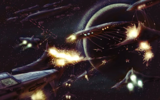
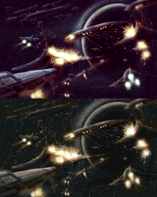
I think the colours could be more exciting, so I added some more variation and gave it a kind of retro like look.


Colour Theory as applied in this modification

Since colours can be a bit confusing, I thought I'd present the alterations, and the reasons behind them, in a pretty elaborate manner:

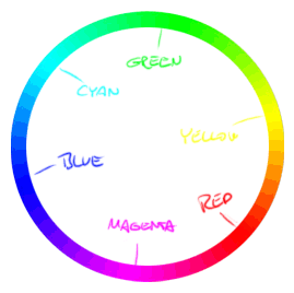
So, the available hues are:


The upper left ones are considered the cool hues (Blue, Cyan, Green), and the lower right ones are considered the warm hues (Yellow, Red, Magenta).


The original:

The original contained pretty much only Reds to Yellows, which covered the explosions, shots and a decals. This can be enough for an image - it's pretty common for movie posters - but this one seemed like it could benefit from more variation.


The edit:

Before adding any completely new hues, I started by broadening the existing warm ones. Featured were reds to yellows, but the reds were more of orange reds, so it was missing both neutral reds, as well as magentas.

To fix this, I simply turned up magentas in the darks and mid values (using curves, explained here). What this did was:

I) kept the yellows intact, since these were present in the bright parts, which the magenta add didn't affect.

II) changed the reds, which had been orange reds, to neutral reds.

III) introduced some mild magentas in the darker warm parts.

Put simply, in case the above sounded a bit technical, we now had redder reds and some magentas, in addition to the original orange reds to yellows.

So this simple fix broadened the whole warm spectrum, giving a richer look.


Adding cool hues

Since the image now featured all those warm colours, they could be balanced out with some cool ones (blue, cyan, green).

The most predominent areas beside the warm parts (the explosions etc) were the greys of the ships. Since the warms were so well represented, these areas seemed like the best candidates to compete.

So I made the sun emit blue light, instead of white. Doesn't make much sense, but hey, it's sci fi.

So I coloured the areas lit up from the back left in cool colours, ranging from neutral blue to purpleish blues, depending on their value (more purple the darker they got).

Missing now were: Cyans and Greens.

Since I wanted to increase the focus on the centre, I gave it a slightly green colour, which makes it stand out against all the reds and blues.

So, I was down to cyans, and not many places left to add it, so I made the engines of some of the fighters emit some cyanish flames, and applied it to some of the larger ship's openings.


Some other stuff:

I reduced the brightness of most of the stars, as they seemed simply distracting.

To increase the focus on the centre, and to accent the silhouette of the planet, I added two brighter space areas.

Probably something else.

-

If anything seems unclear, or contradicting to anyone, don't hesitate to ask.
#389
Critics' Lounge / Re: Background. Sigh.
Wed 07/11/2007 00:36:30
Could we have a look at those "failed" hand painted (stylewise) ones?

I think the current style might be tough to keep from looking lifeless and empty, but it might suit the game for all I know, and it's a WIP after all.
#390
Critics' Lounge / Re: Space Battle (WIP)
Wed 07/11/2007 00:27:29
Quote from: TheJBurger on Tue 06/11/2007 22:40:07
Yes, I intended to use a sun off to the left as the main lighting source. I also intended to have the explosions cast a secondary light on some of the ships, but would this be a bad idea since it would reduce contrast between the lit parts of the ship?

I think it would be nice to keep the parts of the ships not hit by the sun dark, though I overdid it to get the idea clearly across. With the edit's light setup, the larger parts of the ships are basically invisible, which is kind of dull. So some secondary light or just some detailed ship lights/details in those areas would provide additional interest, and if subtly added, the contrast could be maintained, since the darkness/low contrast in those areas would make the details pop out well without competing valuewise with the sunlit parts.

I think it all depends on what you want to focus on. A darker setup would work well if there was some central area to attract attention. If there's nothing more to focus on, then the ships need to be really interesting, in which case a more revealing setup seems better suited.
#391
Critics' Lounge / Re: Space Battle (WIP)
Tue 06/11/2007 19:37:58


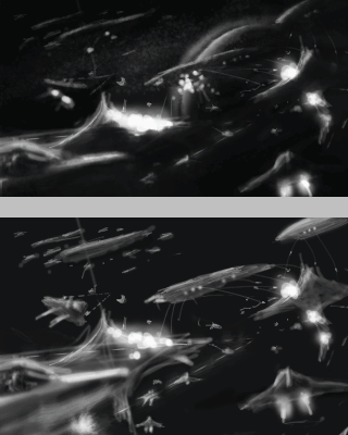
Since you have a lot of artificial bright light, the main lightsource (which I assume is a sun), could be used to accent the edges, and create interesting shapes by cloaking large areas in darkness. Backlight, in other words.

So what I did was to simply erase large parts of the ships so only the edges were left (which would be the only areas exposed to the main lightsource), and let the engines pop out with their intense brightness.

This not only creates more interesting shapes, as they were all pretty similar, but also increases the contrast, while not changing the remaining values, as you simply get rid of the bridging mid tones.

To attract more attention to the center, and to make it more interesting, I created a planet of sorts, which could be exhanged for a large ship or something, just to get a big new shape in there. A also increased the contrast by adding a bunch of dots representing shots/beams or whatnot, against the ship that' mostly cloaked in darkness due to the new light setup.

At the same time I pushed away the upper left corner, which doesn't provide anything really interesting, and seemed to simply steal focus. The backlight helped, as the shapes were reduces to thinner lines, and I also toned them down.

I also added some galaxy like dots in that corner to provide some variation.

Atm there's still some issues with interest in the center I think, but this could simply be solved by some nice detail and colour contrast, particularly if you keep the planet, which could have a contrasting atmosphere colour and surface.

Good luck!

Edit: cropped it to reframe around the center ship and refined the sloppy erasing a bit, that had pulled alot of smaller detailed along with it.
#392
Personally I'd like to see another mockup round, but with a different topic.

Or just do as Ildu suggested in the former thread and make the interface/sprite part optional.

My votes go to: sparky for idea and characters, and kaioshin for interface and background.

Edit: Oh, and please don't implement any palette/size restrictions. We're past the point where they make any sense, except as an exotic rule to spice things up every now and then.
#393
Quote from: Radiant on Sun 14/10/2007 23:27:41
Quote from: loominous on Sun 14/10/2007 13:40:05
There's hardly a popular movie these days that doesn't contain a clear rip from a music album. The only difference here is that some executive said 'fine'.
Yes, but in nearly all those cases, the movie producers paid for that privilege. And you're wrong in that they don't get accredited, because they usually do (that's why movie credit sequences can last up to ten minutes).

The executives say 'fine' because it's followed by their monetary demand. Course they're not giving it away for free. And where the devil did I say they don't give credit? Course they do.

Edit: some corrupt sentence
#394
I think there are some peculiarities in some of these arguments.

'It's about effort'

so

'it's not ok to use someone else's art'

but

'if you don't feel like making the effort, have someone else do it for you'

-

The 'make some adjustments to it, and it's ok' argument actually bugs me much more than rips, which I don't have a problem with as long as they're properly credited.

There's hardly a popular movie these days that doesn't contain a clear rip from a music album. The only difference here is that some executive said 'fine'.

Thing is, nobody attributes those tracks to the screenplay writer or director; they've simply used someone else's effort to add a little something to their own. We don't applaud the movie makers for the amazing track, just their taste to include it.

What bugs me is when someone 'rips' the effort of someone else, change it slightly, and call it their own. A rip is a quote, with the quotation marks often visible. Altered rips are disguised quotes aimed to make the utterer appear smarter.
#395
Sure got my support.

Have thought of proposing it as an activity in the past, but it seemed too similar to the bb to work out.

Nice background btw!
#396
Idea - Neil, unexpected and carried out well

Atmosphere - Neil, has this naive charm without being juvenile

Design - Neil, the trees in particular, and the colour scheme are all great

Composition - Neil, though I'm bothered by the way the trees on the right cover up the walk area to such a large degree, and robs the lower area of some breathing room.

Functionality - Neil, though I guess Buckethead's entry might have worked equally well. Some compositions are very easy to pull off those, like a straight on one point perspective, so I tend to favour trickier solutions, if carried out well. cobra's seems a bit extreme and uncalled for though, and the angle wouldn't justify, for me,  the animation required. Is it based on a photo btw?

Technique - Neil, sparse enough values to create a nice stylized look, but detailed enough to avoid the empty lifeless look they often have. Just great.
#397
The first thing I'd try to work out is this:


(not animated)

This is the image scaled down quite a bit. The main problem, as I see it, is that my eye is attracted to the upper right, to the moon, secondly to the upper arch of the building. Unless something will be descending from the moon, to then hover at the arch, this is probably not the ideal solution.

Thing is, I don't think the image is necessarily too dark, just too dark in the wrong places.

So what I would first do is to consider what the important/interesting parts of the image are. If there are none, then I'd add some, as it will be hard to keep it from being boring without something to look at. After that I'd make sure that when seen in a small format like this, my eye will go to those areas before anything else, even though you probably can't see what they're supposed to be in a thumbnail size. The point is to get the eye to go there, to then find out. Can think of it as large arrows pointing towards an area.

To get the eye to go to areas, contrast of different kinds are used, whether it's value contrast (brights against darks), colour contrast (warms against colds), shape contrast (round shapes against hard edges), sharpness contrast (sharp objects against blurred) etc. So if you make an object bright, warm, round, and sharp, against a background that's dark, cold, boxy and blurry, it will be mighty tricky to miss it. Placement is also important. If you place two dots on a blank paper, and put one in the center and one in the lower corner, then the center one will most likely get attention first and be consider the important one.

Not all of these things will be necessary to attract attention, but the important thing is to lead the eye to the areas you want it to go. While not all interesting areas must be screaming to be looked at, enough areas to create interest must be, or the viewer will ignore them all. I love it when I discover nice little details in an image after a while, but I must've been drawn into the image to ever even find them.

Anyway, I'd work this out in sketch form trying to improve any other area, as many things might get taken out or revamped, and taking stuff out that you're happy with and have spent time can be quite heart breaking.

Good luck!
#398
Hello,

I'm looking for a fairly experienced writer for the development of a shorter project.

If you have a script or idea that doesn't deal with a post apocalyptic dystopia, or some similar topic, then don't hesitate to contact me.

(I deal with graphics and music, and have decent experience in programming (including AGS scripting). There are examples lying around on the forums, for more, please contact me)

Edit: Seems like I could've been a bit clearer; while I have a couple of ideas, I'm also interested in working on original scripts, of shorter length.
#399
Here's a late edit, which I actually did a couple of days ago, but cursed firefox quit on me just as I was about to press the post button. As writing the accompanying explanations is a relatively uninteresting and frustratingly slow residual to the actual photoshopping - it often takes quite a bit longer than the edit - it's not something I eagerly redo.

Anyway, having gathered enough energy to undertake it once again, here's a couple of ideas:


Values

- I think the values could be pushed a bit further. What I did was to brighten the pod area to contrast more against the right foreground. The value difference creates a kind of atmosphere effect that increases the depth, much like you'd see outdoors or in a fog. I added to this by darkening the upper left corner. A thing to note is that there can't be any dark values in the brighter area, or the effect will be ruined.


Composition

- What this value difference also does is to create a more interesting, at least imo, composition, where you have a clear division on the right between contrasting blocks of value (I added to this by placing a pipe to add another depth level, and to make the silhouette more interesting). By darkening the upper left corner I created a large diagonal rectangle along with the foreground consoles. I usually add these kind of large diagonal shapes, and  I think it worked pretty well in this case. The upper left corner is totally uninteresting, so by lowering the contrast and darkening the area, the focus is pulled away from it, and along with the other parts it creates a kind of diagonal tube that draws the attention of to the pod area. It's usually a good idea to keep the corners from attracting attention, so the eye is drawn toward the centre areas.

- The contrasting blocks these new values creates is the kind of contrast I spoke of in another post above (or so I recall), where it's not a matter of cranking up the overall contrast of the image, which usually fails, but instead create contrast by positioning blocks of values with contrasting values next to each other.


The left area looks more contrasty due o the fact that the extreme values are placed next to each other, and the areas keep their individual contrast range low. What often happens is that you get an image similar to the right area, where the only thing to do to get rid off the washed out values is to up the overall contrast, which usually ends up with a harsh fake look.

- Cropped off the upper parts, as they steal focus from the important/interesting areas.


Colours

- I think the colour palette can be pushed quite a bit further. Atm it has this quite dull monochromatic look with basically one hue. What I did was to make the colour change depending on their value, and make it go from reddish blues, to blues, to grays, to orange.

The simplest way to do this is by using a 'Color balance' adjustment layer, where you can affect the colour of darks, mids, n brights. The problem is that the control is very crude, and you can't affect the darks without affecting the mids etc.

By using 'Curves' (another adjustment layer type), you achieve precise control, but it's on the other hand a bit harder to understand.


So the coloured curves you see are the colour channels, and the black one is them all gathered (RGB). The bottom left corner corresponds to the dark values, as indicated by the gradients on the sides, and the upper right corresponds to the bright values.

So if you wish to for instance increase the reds in the darks, you create a bump in the lower left part of the red curve, as I've done. If you want to add yellow to the brights, you create a dip in the blue channel in the upper right regions of the curve (since yellow is the opposite of blue).

By doing this you can quickly create a palette from which you can then expand. The great thing is that it's completely accurate, so you can colour stuff afterwards, without having to worry about getting the right colour at the right place, just as if you had used the palette when you painted it.

- By having the palette go from darks to brights with contrasting colours, the overall contrast is boosted, but again, without actually altering altering the image contrast levels, so you get a sort of soft high contrast.

- From this palette I'd add subtle changes in hue to the different areas. To avoid the rainbow effect, rely on careful application of colours, and just hint the colour, especially if it's a contrasting one to the area it's applied to.


Additional stuff

- Added reflections in the floor from the objects in the room, most notably from the brighter areas.


Here's the photoshop file, for reference.

Edit: Fixed link
#400
I think the topic is the coolest that I can recall, but I've had major trouble coming up with a good idea that works on paper.

I wouldn't mind giving it a couple of more tries if you'd extend it, but I can't guarantee anything.
SMF spam blocked by CleanTalk