Menu

Show posts

This section allows you to view all posts made by this member. Note that you can only see posts made in areas you currently have access to.

Show posts Menu

Messages - loominous

#401
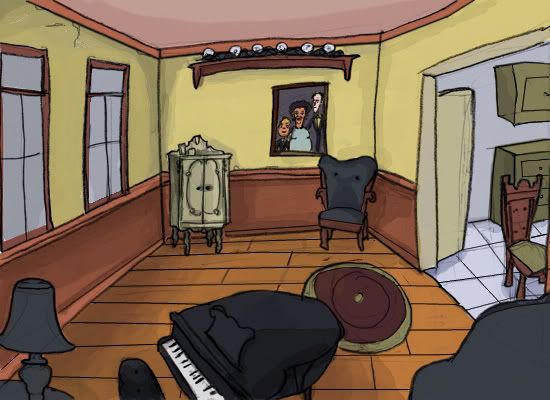
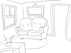
I think the new design looks great, reminds me of Willy Beamish for some reason.

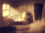
I especially like your design of the consoles in the foreground (quite a distant foreground, perhaps add a pipe or something closer to the camera to have multiple foreground layers. One reason many foregrounds you see in here look fake is that they have no depth, and look more like black paper silhouettes. By having multiple properly shaded foreground layers of various distances, you avoid this, and just add a sense of depth, as well as more complexity to the composition, which should prove more interesting).

It could use some cropping though, as the upper region seems very redundant, unless it's included for a reason. I'd crop it at the lower end of the big pipe I think.

As it is, I'd start refining, as the composition probably won't need any major revamping.

-

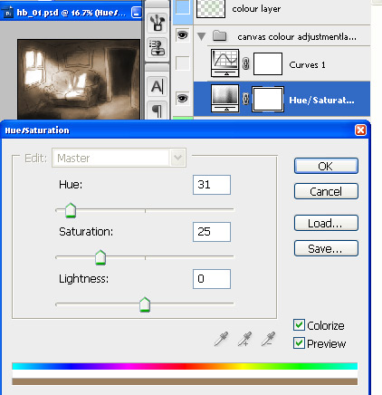
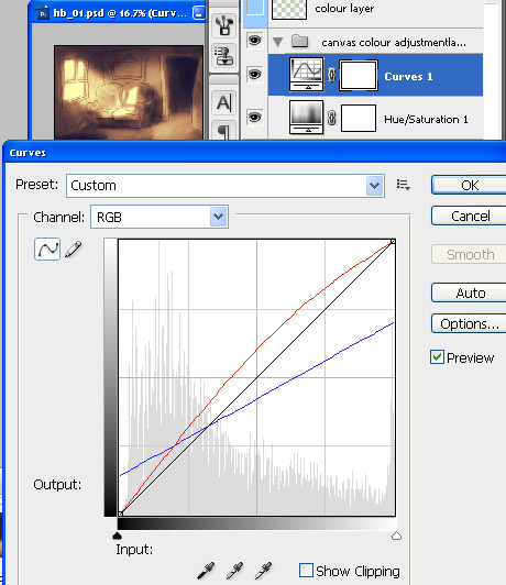
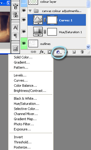
About colouring, if it's monochromatic like this, I rely on adjustment layers to keep the colours to a specific palette, at least initially. It allows me to paint in whatever colour I want, and let the adjustment layers apply the right colour for the values. I explain it in this thread, or so I recall.

If you have any questions about the content in the link, just ask, as I might've introduce some foreign tools.
#402
I personally loathe having to follow links to see/hear stuff, and usually just ignore these kind of threads.

There might be others like me, and if there are, you're potentially missing out on critique that you might have valued.

Just wanted to let you know.
#403
Quote from: TheJBurger on Thu 16/08/2007 03:36:52
Quote
Values
-The values are more or less the same over the whole background, which doesn't give any subdivisions or pull the focus to any area, which gives a static impression.
That's true, but I haven't really assigned all the values I've wanted to in my sketch.

This is a bit of a risky approach. Values are just as important to composition as objects, and leaving out important value sections is like leaving out major objects out of the sketch. It might work out, but it just as well might not, and not including them kind ruins the point of the sketch.

The value problem I mentioned wasn't about a lack of value details - these don't really belong in a sketch anyway - but major value differences. Atm, the average value of all the major surfaces are roughly the same. This makes the whole image pretty much a one value/colour surface, which isn't very exciting.

By having large areas of contrasting values (doesn't mean they should be extreme values, just contrasting)  placed next to each other, to form large abstract shapes, you create interest on a purely compositional level, where the objects themselves are irrelevant, where merely the major shapes n values, the stuff you'd be able to see if you squinted your eyes firmly, would be enough to attract interest.

Working with small thumbnails will keep you focused on these big issues initially, and it's a good idea to every now and then zoom out to view the image in a tiny format when you start refining. In a large format, we tend to focus on details and miss these big issues, which are incredibly important. (I usually use the photoshop navigator window as a constant thumbnail view of the image, and shift my eyes from the canvas to it pretty much constantly, to see how the stuff I'm working on works as a whole)

If you look at the current image in a small format, you'll pretty much only notice the lights in the upper corners, and shadows in the lower corners. Assuming that these aren't the areas which you wish to attract the most attention to, this is a major problem. Ensuring that the objects and values to pull focus to the areas that you consider important or interesting should be the main point of the initial sketches in my opinion.

Quote from: pslim on Thu 16/08/2007 04:21:05
how would you suggest working out the drawing perspective if you were to aim the camera the way you've drawn in your example?

I'd just eyeball it pretty much. Assuming that you have experience in drawing in perspective, I'd just improvise the perspective in the initial thumbnails without perspective lines etc, unless it's a very complex image (another way is to draw out multiple perspective lines from vanishing points that you set up initially, to work as a sort of grid, which you can then refer to when you draw the objects, without having to check them individually, which is almost as quick).

This is just for the initial small scribbly thumbnails though, to keep them loose and fast. Once you think a design has promise, it's good to check the lines to make sure they end up in their proper vanishing points.

There are ways to work out a 3d perspective from a 2d overhead view like this in an exact manner, but unless you have to adhere to the original sketch religiously, I wouldn't recommend it. Just because it looks neat in a blueprint view like this doesn't mean it'll look good through the camera. So I'd follow it loosely, making adjustments as I'd go along to enhance it, and possibly rework large areas.

I think perspective is a bit over rated in general. Medieval paintings could look great but lack it completely. If a painting would have to have one big flaw, I'd chose perspective.

That said, I think learning perspective is crucial to proper understand of form and other things, so I consider the understanding of it very important. I just think it gets way too much attention. A well designed image with crappy perspective will look nice though funky; a poorly designed image with good perspective will look crap.
#404
I think it looks nice, and when refined it would probably work well.

It doesn't pull me in though, and if I was to see it pass by, it would go unnoticed. That's fine if you're content with functional backgrounds, but if you want to go beyond that, then I think some of these things might be worth considering:

Perspective
- It's uses pretty much a one point perspective, which has this theater/sit com feel. It has a friendly look, but it's not very interesting.

Values
-The values are more or less the same over the whole background, which doesn't give any subdivisions or pull the focus to any area, which gives a static impression.

Design
-The room is a large box, which is probably the most boring room design you can pick.

-Most of the space is empty floor or room, which is also uninteresting.

Composition
-The lack of overlapping elements makes it look flat.

-The lack of foreground objects further reduces the depth. Foreground objects aren't just used to frame the environment, but to also give the illusion of depth. This isn't because it's a painting, but because we're dealing with a flat surface that is supposed to trick us into thinking it's a 3d space, so this is stuff that cinematographers and photographers also have to deal with, as their medium is as flat as ours.


Ideas
The pods look cool, and I'd probably focus the whole composition on them. I'd do this by rotating the camera so we'd see more of the wall they're attached to, push closer to it (decrease the room size as well probably), and perhaps use the console thing on the left as a foreground. I'd make the light predominant around the pod area, or possibly by making them have some bright leds or lights or whatnot to pull focus, and keep the other areas dark, save for a console perhaps.

I'd also make the room more interesting by breaking the box design. An easy way is to simply add another box, though offset, like so:


In this design, I used the inner box outlines to form a vertical division (so the room would have two different levels, though with a small vertical difference). This is another easy way to add interest, and I try to use it as much as possible. It's easy to miss the option to include vertical divisions, but they can really enhance the layout.

Planning out the room like this when you have several things to include is a nice quick way to solve issues, and it will also make you less prone to make the space around the camera clear of objects, which happens easily. By first decorating the room roughly like this, you can then look for a good place to put the camera, and use whatever is there as foreground, which can make it much more spontaneous than if you start empty and simply place objects after you've determined the position.

Anyway, this camera placement is more interesting, but it's also more movie like, and lacks the feel of classic adventure game one point perspective. So whether it enhances the style or not is up to your taste.

Hope it helps.
#405

Shame that many entries seem to have been abandoned halfway through,
but we ended up with a nice little collection nevertheless.


~~~~~~~~~~~~~~~~~~~~~~~~~~~~~~~~~~~~~~~~~~~~~~~~

The results:

Idea - Creed Malay, with José Luiz as the runner up

Atmosphere - Tie between Cobra and Creed

Design - Tiki with Creed as the runner up

Composition - Tiki with Odysseus and Creed as runner ups

Functionality - Tiki (bit of a surprise there), runner ups: Cobra and Creed

Technique - Tiki, with Oddysseus and Creed as runner ups

~~~~~~~~~~~~~~~~~~~~~~~~~~~~~~~~~~~~~~~~~~~~~~~~


All in all, Tiki's entry got the most votes, with Creed as a pretty close runner up.

Take it away!
#406

Ok then, let's get the voting started. The entries:


Odysseus:
Quote from: Oddysseus on Sun 22/07/2007 03:26:18


Oh, and Lavern always liked jungles, hence the background.


Creed Malay:
Quote from: Creed Malay on Sun 22/07/2007 14:40:02


What Lavern got when he died was
what everyone gets when they die which
is locked in a room with no windows
and no doors.

What you do inside this room is
you think about what you done.
How you feel about what you done,
you decide.

Tried your best? Meant well?
Hitler meant well.

And after the room?
Not never no after.
Not never no after.
Just the room.

no end.


José Luiz:
Quote from: José Luiz on Mon 30/07/2007 20:27:36


Walk until you reach that cross over there, Lavern. Then, look at the other side of the hill, and you'll see a huge white City, a place you could never imagine before. That's the place you'll live from now on.


cobra79:
Quote from: cobra79 on Tue 07/08/2007 23:56:04


Tiki:
Quote from: Tiki on Fri 10/08/2007 05:59:18


Lavern was a simple woman, her most treasured possession in life being her family.

She died recently at a ripe old age, but her afterlife is simply to exist in her self-designated prime. Because of this, she has been reverted to her state 30 years ago.  For eternity, she shall be dusting, cleaning and nagging her husband and son.

And she will love every minute of it.


The categories:

Idea - The underlying idea to the background. Doesn't
necessarily have to coincide perfectly with the theme of the
week, just strike you as interesting/amusing/inspiring; a place
you'd really enjoy visiting within a game.

Atmosphere - How well the image manages to evoke a certain feeling or mood.

Design - How well the elements in the image are designed,
such as landscapes, buildings, decorations, clouds, doorknobs,
etc.

Composition - How well the elements in the image work
together/are positioned in relation to each other.

Functionality - How well it would work when adding sprites, i
ncluding appropriate walking distances, a good angle for
character sprites, clever walkway solutions, easily understood
exits, etc.

Technique - How well the ideas are executed in form of
rendering.


Here's the code for the categories, for your copy-n-paste convenience:

Code: ags

[b]Idea[/b] - 

[b]Atmosphere[/b] - 

[b]Design[/b] - 

[b]Composition[/b] - 

[b]Functionality[/b] - 

[b]Technique[/b] - 


Anyone is welcome to vote, and it would be
great if all participants could provide their own.
You don't have to vote in all categories, and
if you provide multiple names in a category,
then please be clear about which one is your pick.

The voting will end about the same time tomorrow (12 pm GMT).
#407
Aw, that's a shame.

Oh well, since someone else might have started on something in the meanwhile, I'll hold off the voting until tomorrow afternoon (12 hours from now), so if you've started on something, please tell within this time frame.
#408
Critics' Lounge / Re: Shading statue
Thu 09/08/2007 21:47:10
Think he means something like this (I've always found anatomy studies incredibly tedious n boring, so it probably contains many errors):


I think Prog introduced many nice things, but the lighting is kind of all around the place.

What I did was to restrict the light from coming from a single direction, and only allow the bright values to areas where unscattered reflections of the lightsource would bounce directly into the camera.

I also made his legs longer (they're still short compared to the upper body), plus made the shadow values closer to eachother in brightness, in essence, reduced the contrast of the shadow values.

These statues are rarely very bright, especially after several years, so I made it less bright n saturated over all.

(The lines on the left indicate the upper n lower body proportions. Ideally, they will be equally long. As can be seen, the legs, even though extended in the edit, are still too short for ideal proportions.)

Edit: btw, I also changed some of the other anatomy, though I have no idea if it's more correct or not.
#409
Critics' Lounge / Re: Self Portrait
Thu 09/08/2007 21:30:56
I think one of the problems with sticking close to a photo reference in these cases is that you'll most likely just end up with a bad photo emulation. If you want realism, just resize the photo, and voila.

Another problem is that you won't really learn anything.

I think it's way more fun to instead use the medium for what it's best at: interpretation.

In this version below, I did a sort of caricature to emphasize the unique elements of it, by turning the lens more into a fish eye, and exhaggerating some features such as the eye, nose n chin. I kept the photo beside the canvas, but instead of copying lines and shapes, I analyzed the individual features, and then painted my understanding of what I had just seen.

I think one good way of getting around the tendency to simply start copying the photo (which is easy to fall into), is to rotate the head slightly in the Y or X axis, or in this case, use a different lens. This will basically eliminate the risk of merely copying, since the lines of the original won't apply in your version, due to the different angle.


Dunno whether it came out very much like the original, but I think it has quite much personality.

As I can't stand the chores of pixeling, I'll just leave it as is, and hope you'll find some part of it useful.
#410
Great, looks like it could turn out really good! (the foreground sections look really interesting and unforced)

Would be great if you could keep us updated on the process with some more WIP pics, as they would give an indication on how much time you need (so we don't wait a week just to find out that you've given up on the idea), and would provide an insight into how you work. Plus it would fill up the thread with some perty pictures.

Btw, if someone else is trying out some sketches, just post them here, regardless of whether you think they look like crap, or whether you think you'll end up with a finished pic. The more the merrier!
#411
So, any entries in progress?
#412
Hope you'll come up with something. Perhaps some WIP pics in case it doesn't turn out as planned.

-

The topic is extremely flexible really, in that pretty much every background blitz entry in history would be a valid submission, since any environment could be either hell or heaven for at least one person, so it shouldn't really warrant any special effort or style.

Course, the more generic the environment the less exciting it will be, and won't probably get many 'idea' votes, but that's true for any other blitz topic.
#413
Extending it another week.

Not sure if people might be taking this topic too seriously. Could be anything: an opera hating Lavern who finds himself in a land where everything is a one big opera play, with only decors for objects and singing characters (not sure how well this would translate into a background) or whatnot. So anything really.

Edit: updated date
#414
Have started on a lengthy response, but here's a snippet to answer:

Quote from: Afflict on Wed 25/07/2007 23:50:16
Just one question, the bouncing balls as you put it do they bounce in the initial direction (linear)that the light hits or do they scatter in a radius?

The light particles/waves remain intact, and bounce like balls on a billiard (pool) table, with the same out angle as in angle (so if you shoot a ball towards the rim at a 45 degree angle, the out angle would be 45 degrees (the rims of billiard tables won't act like this in practice, due to their material)).


However, since they're so tiny, they will bounce off the crater like surface of ordinary materials (which if looked at through a microscopes don't at all look smooth) in different directions, as if you were throwing tennis balls at an uneven cave wall. The main angle of the surface will determine where the biggest proportion of the balls will go however, so even though the surface is uneven, and the balls will scatter off in different directions, the largest proportion of the balls will still bounce off in roughly the same direction as it would if the wall was smooth.


In the case of a mirror, the wall would be perfectly smooth, so no scattering would occur, and an intact mirror image of the light source would be created, which is the same thing you can see in a still water surface. As soon as ripples start to form however, the particles/balls start to bounce off these in different directions, and the reflection becomes distorted.

So you could in a simplified way think of all objects as having mirror surfaces, with more or less "ripples" on them.
#415
Quote from: Ghost on Wed 25/07/2007 21:34:46
The usefulness of layers never cheases to amaze me. Thanks for sharing this, loominous, it will sure come in handy.

Glad you found it helpful.

Btw, if anyone have any questions about stuff in these mini introductions, just ask, as I'm sure some things are poorly explained, particularly as in this case, where I rushed the whole thing. (these things usually start out as a single paragraph, that then expand into these mini essays, which messes up my time planning).
#416
Quote from: HillBilly on Wed 25/07/2007 13:31:13
If I got your post right, I should first create shadows all in one shade of color, and then add the color on later? Or was that just an example on how the shadows could've been, and I need to the different colors for the different object accordingly the first time around?

What I like to do is set up a "canvas" that does most of the initial colour work for me. This means in practice that I create layers ('adjustment layers') that changes to the colour of the layers below depending on how bright or dark they are, so you could see them as scripts of sorts. They're just as easy to add as ordinary layers however, so they're quick and very flexible, as they don't actually change the layers below, just process them. This means that just like scripts, they can be changed at any time, and have a different result on the layers below. In this case, I got the impression that you wanted quite warm colours, due to the sunlight, so I made the adjustment layers tint all brighter values yellow/orange and as they get darker more towards greys/blues.

I could quickly change this so the brights get purple and darks green, if this would make more sense.

So these adjustments layers process the image data beneath them, and the ones I used in this one was first a hue/saturation layer, which I used to reset all colour data to a single tone, some orange tone in this case. This enables me to use any colour, or black n white tone beneath it, and it will still show up as that colour tone that I've set up. This is really comfortable, since I can work both in black and white, and pick colours of the screen, and they'll still show up the same.

hue/saturation layer:


(works and looks just like the image adjustment function in the top menu (image/adjustments/hue-saturation, but it's only a post process, it doesn't actually apply the changes to the layers below)

The other adjustment layer was a curves layer which allows you to affect the colour channels and the different values separately (can work with all of them as well, to modify the overall brightness etc).

In this case I reduced the blue channel in lighter values, so as to get a yellow hue (yellow is the opposite of blue, so if you decrease blue, you get yellow), and boosted the blue channel in the darker values, to get more blue.

I also changed the red channel, to get more orange tones to the mid values, so the brightest parts would be yellow, as they get slightly darker, they get more orange, and as they get dark, less red/orange.


(can see the individual channels as these lines, the bottom left corresponding to darker values, the upper right brighter)

The quickest way to access these adjustment layers is in the layer toolbar:


(can also access them through /layers/adjustment layers in the menu)

-

You can find both these adjustment layers in the photoshop file I linked to in the last post, in the layer folder by the same name, if you're able to load that project.

-

Anyway, one problem with relying on a crude method like this for colours is that whether something is dark or not isn't actually a good indicator whether it's in shadow or not. A dark object in the sun is still pretty dark, and a bright object in shadow is still pretty bright. So this isn't by far a method to rely on for accuracy, but as I said earlier, it's a quick way to get a palette going and just like the value sketches contain lots of mistakes that need to be corrected later on, but gives a nice overview.

-

About the individual colours, I tend to introduce them as late as possible, depending on how much variation there'll be. If it's a room with neutral colours (so basically, red is pure red, green is green), then it would be good to introduce them early on, right after the value sketch. If it's a monochrome environment, I introduce them late, after I've made refinements. The reason is that I want the canvas to work for me as long as possible. As long as I rely on the adjustment layers for colours, I don't need to bother about picking the right colour for specific values, so I can just work in black n white and the adjustment layers see to it that precisely the right colour is picked.

There are many ways to introduce colours, the simplest way being through a colour layer, which I set up in that photoshop file as the top layer. That one works just like adjustment layers, in that it's a post process that doesn't actually change the layers beneath it, just process them.

Using a colour layer is trickier than it might seems, but at the same time, it gives you a nice insight into how colours work. Applying the same colour to areas of a different values, let's say one mid value, one dark, will have different effects, since they have different saturation capacity, meaning that mid tones can contain a large amount of colour 'pigment', while brights n darks can contain very little.

(can think of it as if dealing with a bucket of paint: if you buy pure red paint, then it contains very much red pigments, which are the particles that makes it red. So the amount of red pigment is, let's say in theory 100%. As you want it to get brighter or darker, you need to start to add either white or black paint to it, which means that the original pigment amount (saturation) will drop. So if you just want to make it a bit brighter, and add 10% white, you get 90% red saturation, and if you want to make it very bright, there might only be 5% red left (or 0% if you want it completely white. So when you add a saturated colour to a dark or bright area, it'll quickly become saturated, since its capacity for holding saturation is so small (those 10% get filled up quickly), while a mid value that can contain 100% will only be affected to a degree).

There are other numerous ways to add colour, but I think this one might suffice for now, as I've probably introduced a couple of new concepts.

By the way, you could try to start out adding light, instead of adding shadow. This is especially good when you're not all that used to values, since you're then prone to keep stuff very bright/neutral, as you're overly careful about "shading" areas. If you instead start with a dark silhouette of an object, you only add light where it makes sense that the light would reach, and the objects start to pop more. Another benefit is that you clearly see the silhouette of the object you're dealing with initially. Keeping the silhouette on one layer, and then add another with the added values still works, and is a nice method, though it can result in a huge amount of layers, but if you just merge stuff when it look right, it's not an issue.
#417
Critics' Lounge / Re: Faild to draw
Wed 25/07/2007 02:58:26
Could be that this Ultimate Painting program is really crappy, and makes it very difficult to get decent results, in which case you could just try some other applications and have a look at some tutorials.

Or it could be that you simply give up way too easily, in which case the program or activity doesn't matter, and you might as well head back to the TV couch.
#418
Think it looks pretty good, and you've managed to dodge quite many of the pitfalls that usually pop up when people try more advanced shading.

Like you said, it would've been better if you had started with the whole thing, which isn't at all harder, just more far sighted. I know that once you try something new, it's nice to just try it out without a whole lot of preparation, to just see how it goes and how well the end result can look, even if you get plenty of recommendations to focus on the big picture. So you could continue with the rest in the same manner if you feel most comfortable doing so for the time being.

If you want to try a more secure method, you could start over with the shading and treat the whole image as one large pretty complex object.

An effective way to gain this bigger perspective is to work in a zoomed out mode. In the animation below, I've worked in about 18% scale, making it about 120 pixels broad (I just zoomed out, didn't actually scale down the image).

(animated)


So first I lay down some kind of average value, which in this case might've been a bit bright.

Then I subtracted some light from the corners and the door, and started adding light, first the direct light from the window, which will be the brightest, then the bounce light from this bright spot on the floor (remember, light bounces just like tiny balls, but for each bounce off a surface, some light is absorbed, so the effect wears off.

Then I added some light to the sofa, and subtracted some from the parts which would receive the least, such as beneath it.

Then I changed some values for stuff like the borders around the door, since these are brighter materials.

It's often nice to actually start out with darkening or brightening areas depending on the material, and then start the whole lighting dealy, but I simply forgot this time, and had to do it later on. It's not a big deal, and that goes for pretty much everything in this stage, since changing things in this rough state is most often quick and painless.

Ah yes, I also added some light effects, by adding some light haze, or whatever it's called, which happens when there's lot of dust particles in the air, that would catch light. Also added some glow around the window to make it look like it is very bright.

These "effect" layers, which are just ordinary layers, are usually best kept at the top of the layer list, so you can work beneath them, to make changes to the areas behind them much easier.

At the last frame I switch off the outline layer to check how the values work by themselves. In this case I regret not making the couch darker to give a clearer silhouette, and the light design isn't all that nice.

One version that would be more exciting would be to have the direct light hit the couch instead of the floor. Luckily, this stage allows for quick experiments, so whipping up such a version would be a matter of a minute or two.

Here's the photoshop file (cs3) .

I've added a colour layer at the top which you could try fiddling with. As the canvas colours are yellowish in the brighter spots, and more neutral/bluish in the darker spots, you automatically get colour variation to the different parts of, for example, the sofa, even if you just add a single hue. This won't of course be enough, but it's a nice quick way to get the palette going.

Quote from: ildu on Tue 24/07/2007 23:22:46
Oh bless you, dear child.

Was a bit condescending, wasn't it?

-

Edit: Here's another lighting design:


Edit II: Forgot to mention the purpose of the whole thumbnail lighting dealy, which is that it ensures that everything works together. If you think of each element as a chord, to use a crappy analogy, it doesn't matter how good that chord sounds by itself, if it doesn't fit with the one preceding it, or lead well to the next one. So this whole thing ensures an overall harmony.
#419
Yea, I think it might be best to redo it completely in photoshop.

It could be turned into a painterly style at this point, but very much would have to be modified, since, as zyndikate pointed out, all the lines are simply too perfect at the moment.

Another problem is that the scene has very little direct light, that is, light that goes straight from the light source (the sun in this case) to the object, without bouncing off some other object first. In this particular case, only a bit of the rug would be hit by direct light, that would then bounce around in the room, much like balls being thrown in through the window. This kind of behavior is trickier to deal with than direct light, which might make a scene with more direct light better to start off with, such as a room with artificial light, such as a lamp, or a scene outside in sunlight.

Anyway, if you want to do it in CMI style (with outlines), you need to spend some time on the outlines to make them look good and dynamic. This doesn't mean that they need to look good in the initial stages though - it's usually best to keep the sketches very loose to allow you to focus on getting the composition and design down - and only refine them once everything is set. Once that's done, you can start with value and colour layers beneath the outline layer. I suggest first starting with just values, and apply colour once you're satisfied with the lighting design. The default big round soft brushes will work well for the non outline layers.

If you want to go with MI2 style, you can pay much less attention to the outlines, as these will only serve as guides. I usually start out with the outline layer on full opacity, and reduce it as the value and colour layers beneath get more clear and refined, to finally switch it off when the paint layers can stand on their own. Alternatively, I merge the outline layer with the underlying ones at some point, and just paint over the outlines. This can help bring some artifacts along and definition to the edges. I would suggest using brushes with hard edges for this style. Can use the default round hard ones, or the chalk brush, that looks like a rotated rectangle, but there's also some nice more random brushes further down the default brush list that you could experiment with.

Anyway, if you choose either of these paths, you could post the progress in this or a new thread, and we can help you as you move through the stages. My main advice would be to really keep it loose and experimental, and not pay attention to whether the actual drawings look good, and only judge them by how good a painting they can lead to.
#420
Forgot to ask, do you have a tablet?

Without a tablet some techniques are trickier. CMI uses soft shading, modern disney like, with big soft brushes and works ok with a mouse, or so I would imagine. It also features dynamic outlines.

The MI2 screen uses more of a traditional painterly technique with hard brushes and no outlines, and would be trickier to replicate with a mouse.

If you're interested in computer based painting and don't have a tablet, I'd strongly urge you to get whatever tablet you can find. If it's a 5 year old wacom artpad from a flee market doesn't matter, they're all sufficient, though I can't vouch for non wacom tablets (and the larger the better).
SMF spam blocked by CleanTalk