Menu

Show posts

This section allows you to view all posts made by this member. Note that you can only see posts made in areas you currently have access to.

Show posts Menu

Messages - loominous

#421
What shading look are you after? DOTT? Do you want it just less clean, or painterly? Would make it easier to give you advice if you could specify a bit more what style you're going for, since different ones use different techniques. Also, what mood are you going for in the room?

Do you have any experience in using photoshop?

I think one of the program's main strengths are the very powerful non destructive layer types/effects, which allow you to experiment freely and quickly with colour and values, which is incredibly useful especially when learning, since finding the right combination right off the bat is nearly impossible, and might take a couple of hundred tweaks.

These techniques may be a bit difficult to grasp at first, but they're really simple and logical. If I knew what style you were after, I could combine an edit with an introduction to them.
#422
Quote from: Misj' on Fri 20/07/2007 15:45:12
Are we talking about Laverne from Day of the Tentacle? - Or can it be the afterlife of any Lavern/Laverne/LaVern/LaVerne we can find in, on, or around Wikipedia?  :)

Any lack of definitions/specifications in the description is meant as being up for interpretation by you guys.
#423


THE AFTERLIFE OF LAVERN


Turns out there is an afterlife, but it's not one of those lame Mormon summer camp on clouds
dealies, or horrid torture dungeons for that matter, but instead a specially tailored destination
based on the life and preferences/dislikes of the deceased.

Lavern, having recently passed away, has just arrived at the destination.

-

Guidelines: Depict this place.

No technical limitations other than those of AGS.

If you want to include the character, feel free to do so.

(Any lack of definitions/specifications in the above is meant as
being up for interpretation.)

Edit: Btw, please include a description of the life of Lavern that explains
the pleasant or grim eternal fate.


-

Btw, everyone is encouraged to post some work in progress pictures, partly because they're
fun and interesting to look at, and partly because it livens up the thread and provides some
continuous material, and at least something even if a background doesn't get finished.

Good luck!


Edit: Added another guideline

Edit: Extended the deadline
#424
Thanks, I'll get the next round up soon!
#425
Shame there weren't more entries this time around, but the actual entries were very imaginative.

-

Idea

Tough one. It's a bit hard to make out what the actual idea of raddick's n Snarky's entries, though in a game scenario where you'd somehow be introduced to the place they'd probably work very well.

I think I'll give it to Dnuma since it introduces a whole scenario which you can't help but to wonder about when you see it. I like it in games when scenes pull you into a context, instead of act like a gallery with merely a bunch of stuff to look at (my own entry would be a prime example of the latter).

-

Atmosphere

I like the atmosphere of raddick's entry the most, mostly due to the elements, with a nice restaurant like house with a BBQ n an old big tree.

I guess this might seem more of concern for the design or idea categories, but I think elements just by their mere presence evokes certain moods, plus in this case just the sheer amount of elements. Sterile spaces bother me.

Dnuma's entry on the other hand has this weird, dreamy, thick atmosphere that creeps me out a bit, but I think it's very well done, and gets my vote.

-

Design

I think Dnuma have succeeded to create a very nice coherent whole, from the palette to the lonely trees.

-

Composition

I think Dnuma's entry has a simple yet effective composition, but I can't help but to think that a more interesting angle could've elevated it very much. On the other hand the straight on high angle might be adding effectively to the interesting atmosphere.

-

Snarky on the other hand has clearly made an effort to find a good, interesting composition, and while I think it has some issues, I think in itself it works well in making a quite boring room - pretty much a large box for a room with smaller boxes inside it - into something quite exciting looking.

-

Functionality

Snarky, due to the clear walkable area n exit.

-

Technique

I think raddick's technique (is it based on a photo in some way?) without the evil smudginess would have worked very well. Another gory photoshop victim.

I think Snarky's lighting is unfortunately a bit of an unhappy mix between noir contrasty, and ambiently lit, which gives an incoherent impression. That aside I think the technique is nicely painterly yet still functional, and would probably work very well.

Again, I think Dnuma's consistent execution in all areas really elevates the whole pic, in a 'more than the sum of its parts' kind of way, and gets my vote in this category as well.


Edit: Neil: can only agree about the subject matter; I was just itching to do a house design n much has suffered for it.

About the name, it's not related to either Loomis (which just turned out as a strange coincidence, though I think my endorsement of his work has been misleadingly inflated), or to the luminism style (which you just introduced me to. Looking briefly at some wiki entries it seem really nice though, even though I'm not all that fond of pure landscapes without any human constructions).
#426
Sorry about the delay, I asked zyndikate to hold off the voting until I got home so I could upload the latest version.

Unfortunately I'm still stuck at work, but here's a mockup version I made yesterday, which is the most recent version that I have access to at the moment.


If you strip away the test character and interface it's very close to the latest version.

I'm gonna be home very late (if at all), so if you want to get the voting going, I'd have to use this one as my entry.

(Those hanging thingies on the right is supposed to be some sort of photographs or something, and would be animated, hence their deviant appearance.)

Edit: There are still quite some issues that I would like to deal with, and refinements to be made, which might seem odd due to the exceptionally generous deadline, but as my biggest talent is that of procrastination, I haven't really touched it more than a couple of times.
#427
Critics' Lounge / Re: Coloring B&W background
Tue 17/07/2007 21:09:42
Quote from: Snarky on Tue 17/07/2007 15:57:07
If the problem is that all the detail is off to the right, how about just moving those bits one space to the left, shuffling the tomb with the yarmulke (from The Shivah, to the left of the top hat) to the right end and shifting all the others over? The mummy will be partly obscured by the foreground silhouette, but I can slide that down a bit so that it won't cover it up quite so much.

Sounds like a nice, simple solution.

One problem with having the viewer focusing at the corner of the image is that the eyes are more easily drawn away from the image, instead of back into it. If you design it so the edges work only as framing and arrows back into the image, the chance that the viewer will stay in the image n fully explore it is more likely.

The main reason why I'd alter the composition would be to keep the viewer interested. If you have high contrast areas in the center, you have two of the most powerful devices for directing attention working for you, but if the interesting part of the image is elsewhere, the viewer will most likely discard the image as boring before exploring those other parts. And who could blame them; these devices are pretty much like huge arrows pointing towards areas, and if you point them at some dull part of the image it's like saying that those are the best parts this image has to offer.

Good luck!
#428
Critics' Lounge / Re: Coloring B&W background
Mon 16/07/2007 16:11:16
I think one composition issue is that the center of attention seems to be very far off right.

The contrast is highest near the door, but more elaborate shapes tend to draw even more focus.

In the edit below I pulled the detailed area, which I assume is supposed to be the focal point more towards the center (close to the golden ratio).


It does leave the sides quite bare though.

Another thing I did was to pull the camera closer to the ground. Brad Bird (the iron giant, the incredibles) even has this as a standing advice: 'lower the horizon!'.

Having a high angle is of course a device as good as any for certain purposes, but in general, lowering the horizon does get a certain more interesting/intimate less distant feel.

About the colours added: I just added a curves adjustment layer n made the brights go towards green/yellow, the mid brights towards green/yellow/reddish and the shadows more towards red/blue.

This colour scheme might not be even close to what you had in mind, think it looks sort of, I dunno, Max Payneish perhaps.

Also, I added some lightwrap around the brightest areas, to give the impression of strong light.

Anyway, it's all in this photoshop file, if you wanna take a look.

Glad to see that you're keeping at it; I think people let go off images way too soon, sort of like stopping to exercise as soon as you start to feel tired, which of course means they'll develop only incrementally.

Edit: fixed the links, or rather the files on the ftp

Edit: Btw, some stuff I don't like in the edit: What you had was a nice vertical division of the image with the bright wall in the center at the golden ratio. In my edit this has been pulled back to the center, so you now have two equal halves, which isn't at all as preferable.

Editing images like these is quite tricky, if you wanna change the camera position n such, that is, if you don't want to a lot of work, so there has to be compromises.
#429
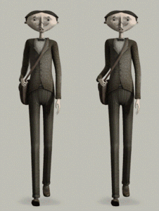
Think the style is really cool, but I can't say I sympathize with the character just by looking at him.

I think it might be the very small mouth n open eyes along with worried eyebrows that to me gives this Betty Boop coquettish expression that I very much don't like.

Or it might be something less tangible bothering me. As I seem to be the only one bothered by this, perhaps it's just some personal hang up that would best be ignored.


I think just mirroring the angle of the right upper arm will fix much of the effeminate quality though it adds some stiffness:


(animated)

Anyway, love the time period n presented environment so I'm very much looking forwards to it!
#430
Critics' Lounge / Re: Alkonost
Sat 14/07/2007 18:29:00
Love the detail n look of the body area, just great.

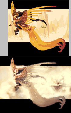
Composition wise, I think it's kind of constrained n awkward, with the main focus (n contrast) on the far left.

In this rough edit I placed a balancing focal point to the right - some kind of a floating mountain dealy - to balance it out, and added more space to the left, to get her focal point more centered and give some breathing room:


__

Some other stuff:

I messed with the palette a bit, giving it a more monochrome look (which I'm a sucker for) with quite saturated highlights n pretty much greys for the shadow areas.

Also added some lightwrap, since the sky I added seems quite bright, which makes her blend in more.

Keep us posted on the progress!

Edit: added a single frame version
#431
Critics' Lounge / Re: Coloring B&W background
Wed 11/07/2007 23:53:06
I guess this is the problem with pseudo tutorials; my approach seems to have come across heavily distorted due to case specific anomalies.

Doing the whole image in detail in black n white to be coloured afterwards is an approach I see very few advantages with. But who knows, it might be a superior method.

When I stress focusing on values n composition this first of all doesn't mean it has to be in black n white; I rarely if ever work in black n white - looks so glum n dull - and secondly, this just mean that you don't pay attention to it in the early stages, where you try out different compositions.

Especially if your pic is going to have great clear colour variation, introducing colour fairly early on will save you a lot of double work; applying colour is as you've noticed trickier than it seems, and the more detailed image, the harder.

The common approach among computer artists seems to be to use a sort of average colour of what you're going for when you start with values; if it's a nightscene you may sketch using a lot of blues, n some orange for the moon perhaps. These colours are more or less placeholders, but they're not far off the target and will provide a foundation.

I think Neil Dnumas' wip pics (below) illustrates quite well the usual process except that he seems to use a white background as a foundation for the values; more common would be to use a dark base value, about the same as as the darker ambiently lit areas will have:


So first, a general sketch, followed by addition of general values to determine compostion/lighting (negative areas are hard to read without values), followed by colour tests, followed by refinement.

-

So, you may wonder, what's with the method used in the background blitz thread? Well, I'm a sucker for seemingly monochromatic palettes. The canvas colour, which also seemingly monochromatic ranges from yellowish orange brights to reddish orange darks. This is more or less precisely what I want for the lighting. By working in "black n white" I can get the right colour shift in the lit up areas, without having to do any work. What I mean by colour shift is precisely what you see in candles, yellow bright centre expanding to orange.

This is something often overlooked when adding light, as in, if for instance orange light is added, only one hue of orange is used, which will look fake and harsh. By working on a canvas with the colour range already set, I get yellow brights n more n more reddish mid tones n darks. And since I was going for very orange highlights, I let the canvas work for me, and only add colours to the areas I want.

When I said I added a layer set to colour, that was also misleading, since I actually rarely rely on colour layers except for quick stuff.

The reason is the same as with the canvas, I want colour shifts depending on how bright/dark an area is. If I'm doing a bush, I want the brights to have a certain colour, and the darks another. Using the same hue for everything will, again, look fake.

So I rely heavily on Curves, another adjustment layer method. Curves allows you to affect the colour depending on the value, if you want yellow highlights n bluish shadows, just adjust the blue channel like so:


By using tools like this you can quickly sketch up a palette and play around with it. I also use similar adjustment layers to create my canvases, which allows me to paint with white n black or whatever colour is most easily picked at that moment n not worry about picking the right colour for the current value, and letting the adjustment layers worry about that. (so basically I use a hue saturation level at the top to neutralize colours n add some basic hue n saturation (set it to colorize) and atop of that a curves layer to create a colour range).

You can still apply it on this background, and I'd suggest creating a colour range for the light coming in by making a curve similar to the one above, but adding red to mid values to get a yellow-orange transition. Small note, adding blues is rarely a matter of actually adding blues, but neutralizing orange which will come across as blue.

Anyway, experimenting with methods is the only way to find one that you like, so at least you can strike one off your list!

Btw: watch out for flat foregrounds! A simple pitch black foreground layer without any depth may work well in some styles like DOTT but will look crap in other styles. I wouldn't worry about making foreground understandable though, as long as they frame the scene interestingly they're good, in my opinion at least.
#432
Critics' Lounge / Re: Cellar BG (from sketch)
Sat 30/06/2007 19:33:13
It's looks pretty interesting, and I'm glad that you're asking for advice early on, with the intention of doing the rest yourself.

Some stuff I'd look into:

Designwise:

-the room is currently pretty much a box, the probably least interesting shape. Try breaking it up, perhaps adding a large recess somewhere, a corner, whatever that makes it less symmetrical n boxy.

-much due to the symmetrical design of the room, the lamp has been placed in the center, along with the hatch. This, as with the room design, is a pretty boring solution, that with a little effort can be changed to create interest.

-the door is also placed in the center of the wall, as with the pillar.

Symmetry is a tough tendency to fight.

Compositionwise:

-the hatch, which I assume is the most important element is placed in the bottom of the screen, and centered. Try placing it off center in the middle somewhere to make sure our eyes, with the proper lighting, will be drawn there first.

-try placing foreground objects, like Jens did very creatively in his edit

Most importantly: Keep it loose n sketchy! Lay down blobs that represent stuff. If you're thinking about adding a pile of boxes, just draw mountain like shape with perhaps some scribbles inside it. As long as you know what it is, it's good. At this stage you're looking for a general impression, not details.

If you squint your eyes tightly n look at Jens edit, you'll pretty much only notice a large dark rectangle shaped thing infront of some white area. This is the general impression. These are the sort of large abstract shapes that are easy to forget when looking at pictures, but it's the basis of the whole thing, large blobs of values creating abstract interesting shapes n framing the subject. You don't have to think up exotic shapes for this either, a box placed next to a lamp can together form a really interesting shape together.

So my main advice would be: stop looking at the objects!, and work on the whole thing as if you were looking at some really out of focused picture, where you can't make anything out, but the shapes in themselves are intriguing enough. Lay down blobs that represents stuff, boxes, tables, windows, whatever, and compose them so they all pull the focus to one or two objects, which you think are the most important.

Good luck!
#433
This will more or less just be an echo of what Ildu said.

I think what makes a good background, and anything else for that matter, is a clear vision, and an execution where all elements work towards that goal.

If you don't have a vision, there's a very small chance the elements will happen to work together towards any goal, and even less likely, to one that you're happy with.

Course, just the vision isn't enough; you need to know how to construct the elements so they work in whatever direction you've set your mind to.

This latter part is where we can help you, but we need to know the vision. The more details you can provide, the more we can help you.

Course, this assumes that you have a vision, and it's more likely that this is more of an improvisational attempt. That's all fine and dandy, but we'd be more or less wasting our time trying to help you, so if you're looking for advice, try crystalizing a vision.

(sometimes the vision is vague to begin with, and morphs along the way, but it's heading in a single direction at a time that's crucial)

-

(to not leave you hanging, here are some things that the vision could include:

-What is the purpose of the background
-What is the most important element in it; a car; a clearing; a typewriter; a log
-What are the other important elements in it; a city in the background; a creepy tree
-What are the less important ones
-What environment are you looking to create; a tropical forest; an opium den; a principals office
-What specific age is it set in
-What kind of style do you want; gritty realism; road runner cartoony; van Gogh; powerpuff girls
-What kind of mood should it have

etc)

(this might seem like much thinking, but it's more like:

'I really like CMI backgrounds (style), but with more of Heroes feel to them (mood/style), and a bit of a Seven creepiness about them (mood), and in this scene the protagonists would be heading for this castle (the most important element) in this Bladerunner wasteland kind of thing (environment), where he'd be going to in his wagon (an important element), and there would be a dark sky n lightening n such in the background and some skulls n such (less important element/important element).'

This would be enough for a vision, and you could construct a composition around it that would focus on the castle, while including the wagon nicely, and set it against a stormy sky and a wasteland with skulls.

Then you could study CMI backgrounds, look at some Bladerunner wasteland shots (not sure that there were any when I think about it), look at some episode/pictures of Heroes n Seven, and try to give the elements the style/colours of those inspirations)

-

This might seem like much work, but it really only takes less than a minute of thinking.

Quote from: TerranRich on Fri 29/06/2007 16:14:50
Well, sorry, but I thought my advice was sound. It may have come off as a bit harsh, but I'm not going to tip-toe around it: one should try it out oneself, then ask for crit...not ask for repaints immediately.

I agree that the lounge shouldn't be a place where you just order a background.

I do on the other hand encourage people to ask for advice early on; not so we can finish the background for them, but give advice in a stage where the most significant decisions are made, so they can steer the background into a more fail proof direction.

Often when people show more or less complete pics, it's already way too late to make any significant changes without spending a large amount of time on them, and while the advice given can be implemented in the next attempt, the "lessons learned" will be far more abstract, and tougher to apply in a completely new pic.

Ideally, imo, most stuff in here would be sketches, that slowly evolves into finished executions, but that's most likely just me.
#434
Critics' Lounge / Re: Art Nouveau Woe
Tue 26/06/2007 20:06:40
Think the lower parts n crown thing looks really gorgeous, and you could have easily fooled me that they actually were from an ad back when.

The face does bother me though, and the upper part with the logo as well.


About the face: I think evil pretty much nailed the eyes with his edit; her left eye is placed above her right for some reason.

Atop of that I'd remove the dark lines at the sides of the eyes, and the one at the nose/brow intersection (dunno why people tend to place an outline there). Outlines is such a selective technique, and if you leave out most lines, the ones you do put in need to be mighty important, or people will look like they have scars or extremely defined sockets.

Also, her left cheek/eyesocket line looked rather weird, with very defined curves, which are to my knowledge rarely seen at that angle.

The mouth were facing front sort of, and I made it curve around the face a bit more.

Last thing, her eye brows looked a bit too high, even for a snooty empress.

-

About the whole thing, I think it looks rather boring when looked at from a distance. It's nice  to always have a small view of the document open, to get a sense of the piece as a whole, like painters do when they move back from a painting.

This is a very quick crappy attempt, using the pattern the smoke makes to create a pattern in the upper section of the pic:


It might be too detailed or whatnot, but I think it makes the whole more interesting, as you get a sort of vertical division, instead of an upper part that's a less interesting version of the lower.

-

Anyway, as I said before, apart from a few things it's a gorgeous piece!
#435
Is there a way to make edits appear as new posts or something else that would update the thread as containing new material?
#436
Unless we're going to extend it (which I'd be all for), this will have to be my final version:


There are oh so many things I'd want to add n refine, but that's life.

I went with a more open composition, which I like much better, but it reduced the effect of the small lightspots on the house. The walkway n foliage bugs me the most, along with the top window part, and the colouring (or lack of) on the house.
#437
I think the problem with former works being submitted as entries is that this whole thing turns from being an activity, where the focus is on creation, to basically: "Rank these backgrounds, period" (the idea of ranking artwork kind of sickens me).

Course, one can argue that more entries, regardless of when they were made, means more stuff to look at, which is a nice point.

In any case, I'm gonna submit a version around 00:00 gmt, which will have to count as the final one.
#438
Critics' Lounge / Re: New tablet, new sketch.
Sun 24/06/2007 20:27:11
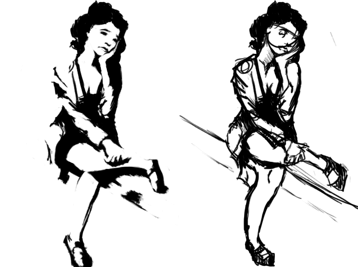
I was unsure what kind of facial expression you were going for (looked either sad or like a runny mascara), so I went with sad.

If you're aiming at taking this thing further than a small sketch, I agree with scotch's advice of reducing the lines and making sure that the posing n such is solid to start with, otherwise you're probably gonna end up spending ages modifying it later on, or be stuck with a funky looking result.

If it's more of a sketch where you more spontaneously want to blob something down and don't want to ruin it with too much pre-work, I think you could just remove some of the lines n modify some stuff to get sort of a xerox look:


(I basically removed some of the outlines n shadow blobs n added some black areas. The pose was modified a bit as well)

I went with the first version because I think the second one started to mess with the values a bit. Adding mid tones is really tricky because as soon as you lay down the first value at a particular place, all other values must be carefully based around it. The mid values also to a large degree determine the surface material, and it's easy to end up with a skin that looks like some kind of metal or something else weird.

About the outlines, I just removed some of the ones that encapsulated areas being hit quite directly by the light.
#439
Might be a bit hasty to call an end to it just yet. I know I tend to submit stuff in the last second.

I'll be updating my pic as I progress this evening.
#440
Quote from: zyndikate on Fri 22/06/2007 02:47:30
A question loominous: The design(like the architecture of the building), do you look much at references or is things you already can see?

Architecture, like most other things, seems based on a quite limited amount of basic ideas. When I observe stuff, I try to distill these, in order to understand them and in a way master them. Sort of like finding mathematical axioms, instead of trying to memorize specific calculations. In the case of architecture, I'm quite ignorant, but I think I know a couple of these underlying ideas by now, and I just combine these into whatever I think might look cool.

In the case of less common things, like old time fonts, I have to do some research, since it's not something you encounter very often these days, but as with architecture, I try to understand the basic patterns, instead of memorizing specific executions. The nice thing is that you can sort of cross breed these ideas, by for instance using a pattern from a font in a bookshelf decoration, so the knowledge you gain by researching one area will boost your entire bank.

I think the most important thing is to try to avoid the first couple of ideas that will pop into your head when you start out, as these will probably be very predictable. As the current design was just that, the first idea that popped into my mind, I was quite weary and wanted to ditch it, but it turned out ok.
SMF spam blocked by CleanTalk