Menu

Show posts

This section allows you to view all posts made by this member. Note that you can only see posts made in areas you currently have access to.

Show posts Menu

Messages - loominous

#441
I've encouraged others in the past to show some work in progress pictures, since they're fun to look at, and provide different approaches to painting/drawing, as well as function as sort of pseudo tutorials. I haven't really seen any yet, so here's a small attempt at getting the ball rolling:

Thumbnail stage:


In this stage, I keep the size of the sketches loose and small, about 4 cm wide (bit more than an inch). This allows me to try things quickly, and prohibits me from going into detail, since you can't really make anything out anyway. The focus is on composition and the general feel of it.

I usually do about 15 of these, and if I think some design has some promise, I add values to see how it works out. Some things look great as outlines, but turns out less so when the lighting is added, and vice versa, so even if a design doesn't look all that promising in outlines, I might give it a go with values, as in this case.


(click pic for full size)

The point of this stage is basically to create as many versions of the painting as is needed, until you find one with promise, but with the advantage of only requiring one or two minutes each. In theory, you could skip this stage n go straight to a full blown thing with details, but few have the patience, time n stomach to spend hours on each version, only to discard all but one.

-

As for this one, I'll most likely find a new design, as the centre angle on the house, and general design n composition isn't what I was looking for; was thinking a more antique looking house/workshop in the outskirts of a town. The kind of lighting, with small areas of intense light will probably prevail though, so at least that part is more or less set, though I'll have to test it against the new design.

-

I'm gonna be posting pretty much everything related to the creation, so as to show all the crappy stuff as well, n not just the gold nuggets. To avoid clogging up the thread n eating up bandwidth, I'm going to resort to small thumbnails of everything but the current sketch.

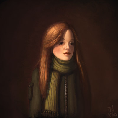
(Btw, the sketch in the upper right has nothing to do with the background; it's only there because I tend to fill up empty spaces with sketches of the kind, and there would usually be a couple more. They're a nice distraction from the thumbnail sketching and livens up the document. I hate sterile spaces.)

-

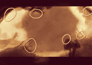
Some more thumbnails, design sketches, n a font test, for the sign above the large window (yep, that's supposed to be a sign)


-

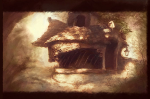
Post thumbnail stage (crappy title, I know)


After I've decided on a thumbnail, I blow it up in size, to at least the double of the intended resolution (think this landed on about 1900x 1300).

(I wasn't very satisfied with this thumbnail in its current state, but I felt compelled to start refining to be sure to finish it in time, and I can hopefully fix it later on, though this is a risky approach. Btw, the reason I picked this view was that it allows us to read the sign, while still not looking at that part of the house straight on).


The point of this huge size is to allow me to paint with rough strokes in the new original size while still appearing detailed when zoomed out to the intended end resolution.

-

Now I simply start refining things. Since I'm not content with the composition yet, this is rather risky, but I'm gonna let it turn out in whatever way it does. At least it'll be a house design sketch.


I still focus on the composition n values, though I do some colour tests, by simply adding a layer n setting the blending mode (the small textbox in the upper left of the layer window) to colour, which means that only the colours of the layer will be applied to the layers below, not the values.

A quick colour test.


As the colours are roughly applied, it gets this technicolour look, (which I really like), but I'm going to refine it further at a later point for more of a disney's Robin Hood look.

-

-

With the additional time, I should have some time to make this into a semi decent tutorial.

So, to continue from the latest version, it's on to:

Fixes

This is a stage I reallly hope to avoid, but due to crappy pre planning I'm here.

When I did the thumbnails, I talked about focusing on composition, which to some must've seemed like bs, since I mostly did outlines of the house, and I can only say that I agree, and the composition has suffered for it.

The problem I still have is that composition is very flat. Luckily this isn't all that difficult to fix, especially since I'm working on layers.

So this is the current version (same as above):


To simplify, it looks something like this:


The thought behind this composition is firstly, place the house at a good position, in this case close to the golden ratio, both horizontally n vertically. The golden ration is something like 1.6, which in practise means that it's a bit off center (at number 6 in the pic below):


The house is placed closer towards five since the small wall to the right of it argueably feels like part of the house, which would offset the center much more to the right.

Then it's a matter of the foreground, which is the real culprit in this case. In the current state it does the job of framing the scene and dragging the eye towards the center.


I tend to try to frame it so it creates a sort of rotated square, which should create more dynamic lines than vertical n horizontal lines.

The plants all points towards the house, as to drag the eyes back into the center, so they can be lead around the image. This might seem a bit too constructed, but the nice things with plants is that they grow towards sunny areas. In this case the house area seems to receive the most light (at this time of the day anyway), so there would be a reason for them to grow in this fashion.

Anyway, to the problem with the foreground: in this state what it doesn't do is to create depth by intersecting with other objects. As illustrated below, they're all small isolated islands, detached from each other:


The easiest remedy is simply to reposition the foreground objects, and as in this example, also adding an object (a mailbox):


Now pretty much everything is concealing some other area:


The problem with too many covering objects, and especially if they're bushes n similar is that you can get a sort of stalker view, the impression that the camera is spying on the subject.

I placed these objects in a zig zag order depth wise, which the eye seems to enjoy to follow, plus it makes the intersections more clear.


I think this composition is a bit crowded, so I'm probably going to go with some sparser version

-

More foreground added and some perspective stuff

In this one I've added some much needed overlapping (rough) foreground, as well as corrected the wooden frame on the window to look like it's curved around the section, which was very unclear in the previous versions. The distinction between the ground n the house wall is still unclear though, which I think I'll deal with by added more grass n stuff at the bottom of the wall.

It's still a bit flat, with the distance between the house n the foreground being very close, and I'm going to look into some closer foreground objects n objects in general to add some life to the environment.

The stairs were added basically to create a more interesting varied look.

The foreground foliage is in much need of some value variation n detail, but I want to settle their silhouette first.


-

Since there aren't really any other entries atm, I'm going to keep the current pics in their larger size for now.

-

Hope this might prove interesting to someone.

(I'm going to be out of town as of thursday evening, so I probably won't be able to update this pseudo tutorial until sunday).

Edit: A small comment: one of the benefits of working from small loose thumbnails, which you then increase in size, is that you'll have tons of artifacts, which should really be treated as gold. It's awfully hard to construct randomness, and it's easy to loose it once you start refining, things. When I start refining, I make sure to boost the artifacts of the thumbnail, but try to touch them as little as possible, since even when you boost them by strokes, you start designing. Course, in more stylized styles, this isn't an issue.
#442
I think the main clash here isn't the toonshading versus the painting like background, but an unrealistically coloured/treated character versus a realistic looking background.

The character has local colours, as in, those are the actual colours of his clothes, skin etc, when seen in a white room with white lights. But as soon as he's taken out of this environment, those colours aren't valid anymore, and need to be adjusted to the new surrounding. Same goes for the brightness of the colours.

If you look at disney movies for instance, you'll note that while the characters often have the same clothes throughout the movie, the actual colours are rarely the same from scene to scene, since they're adjusted to correspond to the surrounding.

While it's not practical (or often desireable) to paint characters as you would the background, the same colour rules for a consistent background can be (and are in most high quality animated movies) still applied to character colouring.

Here's a quick example of a more integrated character:


In practise:

I) Make sure that the brightness matches the background
II) Make sure that the saturation matches the background
III) Make sure that there's some kind of shadow, even when it makes little sense (as in this case), since it places the subject on the ground. Safest is just to place them under the feet, visible when the feet are just above the ground.
IV) Make sure that the colours of the surrounding affects the colours. Easiest way to do this is to sample an average colour of the surrounding, create a layer filled with this colour, and set the blending mode to 'Color' (the blending mode is the small textbox in the photoshop layer menu that normally says 'Normal') and then adjust the opacity to increase or decrease the effect (the blending mode will make the layer content only affect the colour of the layers below, not the values).

There are some ways to affect these things through the AGS engine (so you wouldn't have to have multiple sprite versions), but I'm not very familiar with them. You should however be able to achieve a similar look.

I share the views of most in this thread about the look of the actual sprite, but the background looks great!
#443
I just did a quick count and came up with 21 votes for neil and 13 for jburger, so unless we're waiting for nihylist to return or a moderator, I suppose we could just continue to the next round. Nice entries btw.
#444
Quote from: theRedPress on Sat 14/04/2007 10:46:19
Seriously, "inconsistent" - "consistent" who cares?? 

Judging by the look of dott, the artists did.

I like Zaidyer's sprite, but there's a huge quality gap between it and those of dott, something you don't seem to realize. I don't claim to know everything that separates them, but among what I register are some fundamental flaws.

These are rooted in a lack of volume, a very common weakness. If you don't know the volume of the character, you can't draw outlines that encapsulates it, apply shading that boosts it or maintain shape consistency in different angles.

Even if by a freak occurrence Zaidyer's sprite would happen to be in its optimal state as is; that applying these things in any way would topple a delicate balance of pseudo-errors that together form perfection; then unless he knows this magic formula, his remaining artwork would probably benefit from learning/improving on these fundamentals.

My sketches were meant to comment both on the volume of the character, the construction of it and on the shading that comes as a byproduct of this.

These are general pointers that I suppose could possibly be considered a bit off topic, but that's precisely why I prefer them; because they don't comment on the shoelace of a particular sprite but themes that can hopefully be applied to any drawing/painting.

-

I can see how all this might suggest that I'm in favor of elaborate shading, but I myself prefer the simpler shadeless style of dott. Knowing how to shade doesn't mean you have to apply that knowledge to everything, but rather when you see it as beneficial.

My preference regarding whether to shade or not is totally irrelevant though, since it's Zaider's taste that matters, which is why I haven't mentioned mine before. But thanks for improving the thread by so thoroughly sharing yours.

Edit: grammar
#445
Quote from: Zaidyer on Thu 12/04/2007 19:33:48
I think that's where these paint-overs sort of got off track... They changed the overtly cartoony intention of the original design too much. Now we're talking about things like realistic lighting and hair. That's good advice, but it doesn't apply to this particular art style without changing it completely.

I think the main common misconception about the dott style is that it's not based in realism or if it is, that connection is very weak, which is also why I think it's almost always poorly mimicked.

The style stretches the rules quite a bit, but it's still anchored in them and I think it demands even more from the artist than realistic styles, since it's warped realism.

-

Looking through the thread, the style of the character did move away from the more goofy dott like initial style, but I think the concepts introduced, such as shape consistency of the hair etc, are all important things to consider, regardless of the style (well, it may be pointless in certain styles). Since dott featured cut scene close up animation, these things were even more important, where a thing such as morphing hair when a character turned their head would have looked really weird.

QuoteI'd prefer to think of the highlights as coming off of a light source that is most convenient for the readability of the sprite.

If the choice is between readability and realism, I'd go with readability as well.

Lots of classical realism works break rules to enhance readability and composition. Thing is, only the rules that need to be broken are actually broken. It's like a poet deliberately misspelling words or ignoring grammatical rules for effect. Reading a poem with crappy spelling or poor grammar due to the author's ignorance is just annoying (can be interesting at times though).

Take the shading of the hair, shoulders, face, torso, legs and pelvis in your version for instance:


From the point of readability, the bottom lighting of the shoulders, front lighting of the face (camera front), the small lit areas on the legs, the top lighting of the hair etc serve no purpose as far as I can see.  All it does is mislead the viewer. (the left version is the compromise I suggested in my other post, a sort of upper front (character's front)

-

It's not like these things are really important, especially if there are only a few instances of them; a book with great plot n dialog but with lousy composition n spelling is still enjoyable. They're often rooted in ignorance however, which means that if you'll be unable to spot what might be wrong, or what could be improved, so you'll keep making the same potential mistakes over n over.

Luckily, the theory behind improving these things is often quite easy and requires no talent, so if you're interested in improving, I think you should keep an open ear.

Edit: added a small comment

Edit:

Quote
As far as the shoulders go, however, I'd have to disagree with you; not in this particular case, but generally, the shoulders of a person stick out far enough from the head to catch light from an overhead source while the head casts a drop shadow

So you're disagreeing with my edit not because it's wrong, but because it could have been wrong if the character had had a smaller head or wider shoulders? Whatever you're on about, the point about the shoulders was consistency. If the head is shaded in one way, and the shoulders in another, we'll be recieving peculiar data that we can either ignore as crappy/creative shading or interpret as his shoulders being wet (which would add a darker shade to them), or that they're deformed by birth/accident, or that the fabric features a darker shade of red in those spots, or whatever.

I guess this is mostly an issue where there's already some consistency. If a pic is shaded seemingly randomly, we'll ignore the shading data, whereas if everything makes sense to us except for one thing, we'll start to ponder.
#446
I think adding shading poses more problems than just extra labour.

We're used to judging the shape of objects by the way light reacts to them and when we start shading, we're providing these clues. The tricky thing is that unless you know the volume of the object well and some light theory, you'll be misleading the viewer, so instead of reinforcing the shape with the shading, you'll be contradicting it.

In the case of well known objects, such as humans, it's not like we're going to get stumped by peculiar shading, but it can often flatten or deform parts of it and suggest unintended materials (the way the tie is shaded in Progzmax's latest edit for instance suggests a metalic material (though that might've been the intention)).

Without any shading on the other hand, we'll just assume a bunch of stuff based on our experience and we'll even compensate for some peculiarities, so it's far more forgiving. It also has a nice stylistic look.

Anyway, if you're going for a top down lighting, I'd avoid simply shading the edges, which I guess also goes for any other lighting condition.


(the head shadow on the body should be larger to be accurate, but I thought a smaller looked better)

Something I've found incredibly important in shading is to leave areas in shadow in low contrast. A very common mistake is to shade every part of an object or environment separately, as if they all had their own little dedicated light sources. Beside flattening the image and generally looking alien to us, the focus is lost, unless maintained by other means, since you'd be trying to call attention to everything.

What I've found to be the most important though, is knowing your volume/mass. I'm not sure how the sketch looked, but constructing the character from simple forms, that you know how to shade, will give ensure convincing volume and will also give you the indications you need for how to shade it.

(I think working from larger sketches, hand drawn or with a tablet is really the key here.)

For instance, the head looks sort of like an egg turned upside down. If we lit it from above, pretty much the whole lower part will be in shadow. This means that nothing in this area should get any "highlights", except for the top side of the nose, that sticks out far enough to get hit.

Toplighting edit: (I made a couple of changes to the pose n some other stuff as well).


You can of course ignore these rules and as long as it looks good, who cares whether it violates some principle. The face in the toplit modification in the edit above (marked with an 'e') follows the rules, but looks kind of glummy (though that's pretty much a reality of topdown lighting). It does portray the shape of the head though, so even in the front view, where we have no geometrical indications to determine the shape of the face, we assume that the face slopes since the light is blocked by the upper head.

The face in progzmax's latest edit (lower left) on the other hand doesn't have this gloomy look, since it looks frontlit, and gives a more friendly and nice impression.

Beside not adhering to the proposed lighting setup, the problem is that while the face looks frontlit, the shoulders looks almost as if lit from behind, while the legs seem to be lit from the topfront.

These kind of inconsistencies will make a confusing impression, so instead of boosting the sense of volume, the shading ruins it. It does lend a more elaborate look though, so even strange shading can add a possibly desirable touch.

Anyway, a nice compromise could be to have the whole character lit from the topfront, avoiding the gloominess of the topdown lighting setup, while making at least some sense in most areas.

Really cool character in any case and good luck!
#447
Great round last one, and an interesting new topic. Never got past the thumbnail stage myself unfortunately.

Small thing: with the convention of copy n pasting the categoy rules, would you mind adding a "you" at the end, at:

"You don't have to vote in all categories, and if you provide multiple names.."

For some reason this really bothers me, even though I'm rarely anal about these kind of things.

Hope this will be a good round!
#448
I really like the idea, and am eager to try some ideas out, but havn't had any time so far. If you'd extend it a couple of days, I'll give it a shot.
#449
QuoteIf I ever write and sell a game that (heaven forbid!) people don't like, I hope they have the decency to direct their rage toward the game, and not toward me.

If you start making bold claims on your site, drop by only occasionally with an self dillusional attitude and create new titles of declining quality, then I suspect you might have to deal with similar treatment eventually.

Then again, you've struck me as a nice, humble (as far as entrepreneurs can be) guy, so the above seems unlikely to happen, and even if it did, you'd probably get away with much due to your history.

(My insight into this conflict is limited, so my facts are questionable.

What strikes me as weird is the blindness from, what I can see, americans towards the thing that's annoying, again, from what I can see, to europeans. So I feel inclined to point this out, as there seems to be much unneccessery confusion and irritation.

(And I hope all this isn't taken as another example of america bashing. As the land of entrepreneurs, it would be strange if self promotion wasn't more accepted than in other cultures.))
#450
QuoteWho gives a shit what someone's tag line is on their pretend interenet company? Are we so desperate for drama in our lives that we have to make mountains out of mole hills?

Not sure if you're referring to some previous discussion, but it doesn't bother me further than meeting someone who greets people with: "Hello, my name is X and I'm the best".

Unless your irony detector picks something up, you just think: "Ok, what kind of weirdo is this". Then your life goes on.

The problem is when this person produce something you enjoy. You can't help but to feel ambivalent towards them, when both you and they would benefit from an untainted appreciation.

From the extensive survey in this thread, americans seem less affected by this kind of bold claims, so this might be a regional problem, and something they might want to consider, even if it seems silly to them. It's like avoiding a company name that's offensive in the language of the main market countries, even though it's perfectly harmless in your own.
#451
I suspect that this might all be a culturally based misunderstanding, one that if it has any bearing might be of interest to americans wishing to avoid alienating the european market.

As a european, or, to narrow it down, swede, I'm not really used to reading claims like that of Himalaya studio and Herculean Effort, so instead of just filtering it away, like Prog seem to be able to, I get a conceited impression of them, which I assume is bad for their PR.

Out of curiosity, do you other americans react similarly to Prog (without the agitation)?
#452
I think the sky looks really great, and the boat roving guy has a really nice painterly look.

Some ideas, perhaps a bit too big to be incorperated, since you seem to have already started refining it:

I) Camera:

I'm not sure how dramatic it's supposed to be, especially if it's meant to be more corny than exciting, but a few things that struck me:

Ia) Lowering the horizon quite a bit will probably make it more dramatic, since the monsters will feel a lot more intimidating if we're looking up towards them, and I think it's pretty common in comic covers.

IIb) If you also move the camera closer to the archer, let s say a meter or two behind him(to the left) at waist level, he'll pop out more. Atm there's not that much, except his shirt's slightly different hue, that drags our attention to him.

It would also provide a nice foreground (his bow would take up a large part of the screen, which could provide a nice interesting foreground element that could overlap other elements (atm they're all seperated, for clarity I suspect), so the depth would increase as well.

II) Poses:

I think the roving man looks like he's out on an leasuire boat ride with his beloved, and the archer gives a very relaxed impression as well, even if he's supposed to be a really calm professional hunter.

Some things that could add some drama:

IIa) Bend the knees of the archer, to make him less relaxed and more "ready" looking.

IIb) Make his hair "fly", as if he was sitting down when he noticed the monsters and flew up to engage the monsters. Will probably add more drama and urgency. Atm it's like he's on an archer range.

IIc) Make the rowing man row intensively, as if he's trying to gain distance to the approaching beasts.

IId) Make the water splash really much from the oars, to add drama and make it look like he's rowing quickly.

III) Lighting:

IIIa) think there's a lack of contrasting value areas. Not neccesserily a lack of contrast in the lighting, but lack of contrasting areas. Everything except some parts of the monsters are in mid value, though the sky is pretty bright. (The water in the foreground is dark I suppose, but since it's gradual, it's less noticeable)

I think this makes the composition less exciting than it could be, and robs it of focus, as we're not really led to look anywhere.

IIIb) I think the lighting could be quite a bit more dramatic. Could be a small thing like making some light beams slip through the clouds hitting parts of the castle, though that would pull the focus from the action, which imo already lacks pulling force.

-

I think in general that if you'd move the camera to the position I mentioned much would happen automatically. You'd have a foreground, interesting larger shapes, overlapping elements, natural drama, depth etc.

Just some thoughts though. I dunno what you had in mind.

Hope they help!

Edit: added comment:

Another benefit of moving the camera closer would be that we'd be able to see their expressions, perhaps not so much the archer, if we're sort of behind him, but the rowing guy could be placed in the right corner, allowing for a close up on his face (though a sidewide/behind view)

Edit: made the topic font bolder n some added a comment
#453
Think they look very sierra like, qualitywise as well.

If you're going for a more realistic/believeable look, you may want to make some adjustments to the lighting and colours.

Atm it's hard to tell what lighting condition we're looking at.

I) The trees suggest that there's a directional lightsource, but very faint.

The problem is that if it's that faint (and directional), it would probably have to be evening, and the light temperature would be very low, so it would be reddish.

II) The general brightness suggests an overclouded day, but the contrast, of the grass for instance, suggests a dark room with a faint lightsource, and not an enviroment lit up by a giant lightbox (the sky).

This is an incredibly[/b] common mistake, that is, not keeping the contrast low in ambiently lit areas, which gives you a very harsh, fake and artificially contrasty look.

III) The saturation need to correspond to this as well, which is why I think the first version works best, because it correlates with the desaturated colours an overclouded sky causes.

-

If you want to have a directional lightsource, make sure you seperate the values substantially between the lit up parts and the parts not hit.

In practicality this means lowering the contrast of the current parts, and keeping them at, let's say mainly between values 3-4 (where 1 is black, 10 is white).

You'd then add the lit up parts, keeping these values seperate from the other, so perhaps mainly between 6-7.

This will give you a pleasing contrast, that looks convincing and isn't straining or harsh. If you blend the values, you'll have to resort to cranking up the general contrast, which will look fake n, at least imo, ugly.

Depending on the colour of the lightsource, make sure you tint everything it hits appropriately, which will also add a nice colour contrast.

-

Lightwrapping:

This is kind of overused in particularly conceptart/mattepainting, and I tend to overdo it myself, but is nevertheless a vital concept in achieving a believeable look.

You can think of it as the same thing as the glow around a lightbulb, but instead of glow emitting from a small object, the same thing happens from the sky or any other lightsource. So just as glow from a candle, any part of the lightsource showing will have a "glow".

In practicality, you'd see it in the back of this pic, since there seems be an intense light coming from there. So the sky there would work just light a lightbulb, and glow, so you'd add glow around any sky that's exposed, which will "wrap around" the trees.

-

Composition:

The two not distant trees are both lined up at the same depth which goes for the bushes as well. This is a pretty boring solution, and robs it of both depth and interest. By pulling one of them closer, or adding additional closer objects (apart from the very close foreground), you'll probably end up with a more pleasing look. Example would be to pull the right tree partly infront of the tent.

-

Small note: The leaves of a tree works as efficient shades, so make sure you keep the tree trunk fairly dark in the regions surrounded by leaves.

-

Keep up the good work!

Edit: added some notes
#454
General Discussion / Re: Concept Art
Mon 15/01/2007 19:32:13
Looks like pure 2D to me (except the obvious 3D pics), though with some larger custom brushes, which is common for speedpainting, that can give a 3D look.

-

I think people put down art like the one linked to in contexts just like the one in this thread, basically:

A: "Bah, that's nothing, look at THIS guy! Now this guy's good!"
B:"But he just copied a photo, anyone can learn to do that!"
(A: "You're just jealous!")

So I think it's most often a reaction to ignorant over elevation of copying skills (which is indeed a skill that requires much practise, though comparably less). The idea of original creation's superiority over copies, which many hold, probably contributes.

-

Nice concepts though!
#455
Critics' Lounge / Re: Movie Poster Art
Fri 12/01/2007 22:02:35
Here's a warmer, retro kind of a colourscheme of the first version, which is the version I prefer myself, where I've removed the harsh black parts and contrast of the lower section:

Edit: (will probably take a while to load due to the large image files in the thread)


Original:


The lower text is harder to read due to the lower contrast, but it enhances the focus on the title while reducing the overall contrast. The colour spectrum is kind of narrow, but there's still some contrast between the reddish border against the greenish main area.

I have no idea if the scheme fits the theme of the movie, but it's an idea.

PS. If someone prefer the original and feels the need to point this out, please PM your opinion to me, where I'll store it in a special folder.
#456
QuoteBut how on earth do you blend color so smoothly? I can't spot a single apparent brush stroke!

Well, I just used a smooth brush. Faces is one of the few areas where I actually use those (unless I want a brushy look), however they can quickly turn the face into a smooth blob if you're not careful.

#457
Great character and colour choices!

If you're going for realism/semi realism, you might wanna consider some things though:

(yes, she looks different in my edit, mostly due to the altered right eye, which I made more symmetrical to the left; more on this below)


I) Eyes: make sure you include the "inner" sides of the eyelid, so the whites aren't merged with the eyelid. The upper one is usually in shadow, so we don't notice it, but without a small border between the whites of the eye and eyelashes, it'll look fake.

In your version the eyes weren't symmetrical, and that's probably more realistic than if they were, but it's good to know how to make them so, to achieve control. Her left eye - the far eye is always trickiest - is very flat, and isn't wrapping around the face, which makes it look different than the right.

The eyelashes get thinner and scarcer towards the inner sides of the face, and a darker line all the way makes it look like makeup has been applied.

The irises were very large in the original version, and I resized them a bit. The speculars suggested a very low lightsource, which didn't seem consistent with the rest.

The whites of the eyes are rarely, or never actually white, so make sure you keep them sufficiently dark.

II) Hair: as with everything else, it's usually preferred to deal with hair as larger masses, instead of tiny individual objects. I usually start by making the hair like a helmet of sort, which I lit accordingly, n then start breaking it up in locks. The stripy look of the original makes it look pretty unrealistic and flat.

III) Nose: the nose was very flat on the underside, and I suppose your character might have a nose that looks just like that, but most noses are rounded underneath. Make sure you don't darken the underside to much, since there's usually quite much bouncelight from the areas beneath, lighting it up.

IV) Nosearea: the sides of the nose gets meatier as they get closer to the cheeks, and form masses that are usually quite glossy, so it's important to make them seperate masses, and add some small speculars (can't lit it as a flat surface, since the skin there is rarely very smooth). The nose tends to be pretty glossy as well, so you might wanna add some speculars there as well.

V) Lighting/Colours: to get depth and a portrait kind of look, you might wanna lit it less subtle. I chose a warm keylight, and let the shadow parts blend into the background, to make the lit parts more prominent.

Make sure you seperate the lit up parts from the ones in shadow. The transition will be smooth if it's due to a shapechange, and sharp if it's caused by a blocking object, so if the forehead is "turning into shadow", it'll be a quite smooth transition, whereas if part of the forehead is in shadow due to part of the hair blocking the light, the transition should be pretty sharp. If you compare the shadowline on the left and right side of her forehead, you can probably see the difference.

-

I really like fictional portraits, and I think they're an extremely good way of learning about mass and light/colours, because of the complex shape of head and our pickiness about the features. Compared to my first attempts, this one is genius.

Edit: some spelling
#458
Critics' Lounge / Re: Aristocrat & Fairies WIP
Tue 19/12/2006 23:24:20
Finally some time to do some edits, though it feels like there's not much to do on this one - another great pic there mash!

Here's some rather picky things:


I) Her left eye was pointing a bit to far right, as far as I could see.

II) Her left eyebrow didn't really wrap around the head, and was mirrored instead. Also altered the eye a bit in a similar fashion.

III) Her ear was still very close to the eye, which I suppose could work, but only really if her head was really flat, which it doesn't look like it is.

IV) Her back was curved in a peculiar fashion, though I dunno whether this might be due to the clothing of the time.

V) Altered the nose, which was pretty weird in the original.

As always, looking forward to your next piece.

Btw, the background, which I know you're usually a bit uncomfortable with, works really well imo.
#459
Think it was clear to start with, though it required the reading of the second paragraph (imagine the effort), so to make it more foolproof, perhaps add:

"I want you to make a background (no tracing/copying) that you really like from a adventure game..."

or something.

Cool topic btw, though I personally have a harder time getting motivated when I'm not creating something that I can completely call my own.
#460
Nice entries everyone and appreciated comments/crits voters.

So, just having compiled the list, here be the result:

Idea: - Prog, runnerup Mash.

Atmosphere: - zyndicate

Design: - Penguin, with a fairly close runnerup being zyndicate,.

Composition: - Penguin n zyndicate in a tie.

Functionality: - zyndicate, with victor as a close runnerup.

Technique: - zyndicate

And the piece with most votes was:

zyndicate

with his great entry. Take it away!
SMF spam blocked by CleanTalk