Ok then, let's get the voting started:
the vict0r:
zyndikate:
Penguin:
ProgZmax:
MashPotato:
Ildu:
-
Please place one vote in the following categories
The categories:
Idea - The underlying idea to the background. Doesn't
necessarily have to coincide perfectly with the theme of the
week, just strike you as interesting/amusing/inspiring; a place
you'd really enjoy visiting within a game.
Atmosphere - How well the image manages to evoke a certain
feeling or mood.
Design - How well the elements in the image are designed,
such as landscapes, buildings, decorations, clouds, doorknobs,
etc.
Composition - How well the elements in the image work
together/are positioned in relation to each other.
Functionality - How well it would work when adding sprites, i
ncluding appropriate walking distances, a good angle for
character sprites, clever walkway solutions, easily understood
exits, etc.
Technique - How well the ideas are executed in form of
rendering.
Anyone is welcome to vote, and it would be great if all
participants could provide their own. You don't have to vote
in all categories, and if provide multiple names in a category,
then please be clear about which one is your pick.
Here are the categories, for your copy n paste convinience:
Code: ags
Man, this post is huge.
the vict0r:
Quote from: the vict0r on Wed 22/11/2006 19:13:00
I thought it might have been time to post something

zyndikate:
Quote from: zyndikate on Sat 25/11/2006 03:37:32
"But honey, the ridiculously suspicious-looking captain said that this was a nice spot to eat, drink and engage in fun activities!"
http://img208.imageshack.us/img208/6373/piratebarfinaldc1.png (background only)
Ok, My entry.. and I spent so much time on it I probably could just aswell made a one room game of it.
I didn't want to make the grass-picnic-like background, so I looked the word up in the dictionary too see if there was another way to use it, so I choosed the regular Pirate bar with alot of drinking and fist fighting for everyone.
The purpose was to make a real background that was ready for ingame use, also added cellshaded 2D characters so its shows how it would fit the background ingame, so they dont have any shadows.
It was fun and I learned alot!
EDIT: its looks kinda dark against the forum background color, try it on a dark background.
EDIT: Someone asked me to do a tutorial on how I make my backgrounds, I haven't started yet, but Ill use this one in the tutorial.

Penguin:
Quote from: Penguin on Wed 29/11/2006 12:28:26
Kinda weird resolution and kinda undone entry ... is better than no entry! :3
I don't mind the first post collection of backgrounds at all, nor any critique.
Couple of very nice entries so far, hopefully more to come.
ProgZmax:
Quote from: ProgZmax on Wed 29/11/2006 21:14:39
I have to show up every so often to show you punks that lots of colors and high definition aren't everything!Ã,Â
Besides, even Satan has a picnic once in awhile!
14 colors, C-64 palette, C-64 double-wide pixels!


MashPotato:
Quote from: MashPotato on Sat 02/12/2006 22:33:43
Well, I won't be able to finish because I have to help my grandmother move, but here is what I have so far in all its terribleness...
The first church picnic in history, ill-fatedly situated in the Roman Colosseum:

Ildu:
Quote from: ildu on Sun 03/12/2006 20:24:35
Yup, it's too late for me. I don't even have a decent idea, let alone sketches or anything. So don't wait up on me
.
EDIT: I just started working on an entry some 30min ago
EDIT: I'm almost done
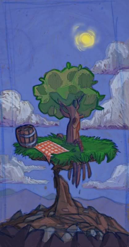
Done. This entry doesn't deserve an introduction
I know it's a friggin' lame idea and crappy altogether

-
Please place one vote in the following categories
The categories:
Idea - The underlying idea to the background. Doesn't
necessarily have to coincide perfectly with the theme of the
week, just strike you as interesting/amusing/inspiring; a place
you'd really enjoy visiting within a game.
Atmosphere - How well the image manages to evoke a certain
feeling or mood.
Design - How well the elements in the image are designed,
such as landscapes, buildings, decorations, clouds, doorknobs,
etc.
Composition - How well the elements in the image work
together/are positioned in relation to each other.
Functionality - How well it would work when adding sprites, i
ncluding appropriate walking distances, a good angle for
character sprites, clever walkway solutions, easily understood
exits, etc.
Technique - How well the ideas are executed in form of
rendering.
Anyone is welcome to vote, and it would be great if all
participants could provide their own. You don't have to vote
in all categories, and if provide multiple names in a category,
then please be clear about which one is your pick.
Here are the categories, for your copy n paste convinience:
[b]Idea:[/b]
[b]Atmosphere:[/b]
[b]Design:[/b]
[b]Composition:[/b]
[b]Functionality:[/b]
[b]Technique:[/b]
[/code[/b]
Man, this post is huge.
