24 hours to go, if anyone wants a smaller extension, please PM me.
- Welcome to Adventure Game Studio.
This section allows you to view all posts made by this member. Note that you can only see posts made in areas you currently have access to.
#482
Competitions & Activities / Re: Background Blitz - 061015-25
Mon 23/10/2006 21:13:14
If you guys happen to have any early versions/layers/sketches saved, I'm sure many would be interested in seeing them, to see how you go about painting.
And to anyone still working on their contribution, why not take some screenshots/save some progress versions.
Keep up the good work!
And to anyone still working on their contribution, why not take some screenshots/save some progress versions.
Keep up the good work!
#483
Competitions & Activities / Re: Background Blitz - 061015-22
Wed 18/10/2006 20:21:35QuoteWell, in my opinion, in this matter quantity is more important. I believe that everyone has some sense in judging visual design and most people do have preferences in techniques, styles, etc.
This is exactly what I would want to avoid, because the only consequence of a competition where the taste of others is the judging factor, is the discouragement of originality, and by originality, I'm not talking a crazy looking building, but true style originality, which more or less by definition won't appeal to many.
The categories are instead meant to be based on objective qualities, which I'm well aware is a vain ambition, but in my opinion, a sound ideal.
I can still really hate a background while thinking that it has a great composition, lighting, colours, exits, walkareas, etc. So with these categories, I'd be basically voting for a entry that I don't like at all, because I'm not basing it on my personal taste.
-
As for the possibility of few votes, I can't really say that it bothers me, just as I much prefer a CL thread that contains two really good constructive posts, than 100 one line smiley posts.
One way to get a few votes is to encourage all participants to vote. I was at first opposed to voting myself, wanting to remain impartial, but I now see it as a way of emphasizing the activity aspect, where the participants are there to create n not compete.
This would mean that many contributions would generate at least the equal amount of votes, which should be sufficient.
One could make the argument that few votes means that the most deserving entry wouldn't, at least neccessery, win, but that's only bothersome if you care about who wins.
-
I realize that some may feel uncomfortable voting in some of the categories, but that can be easily solved by not demanding votes in all categories.
-
Anyway, a good thing about this competition is that its small scale allows for experimentation, so we could try numerous systems, and simply see what has potential.
Lastly, I wan't to repeat my ambition to keep this activity open to anyone interested in backgrounds, regardless of experience.
#484
Competitions & Activities / Re: Background Blitz - 061015-22
Mon 16/10/2006 18:31:29
calacver:
I see your point, but I think the categories might hopefully turn the competition more into an activity where you create and learn, rather than a contest where only those who hope to win enter.
Fewer would probably vote like you said, since it would be more demanding, but at the same time, it would mean that only interested, and at least remotely knowledgeable people would cast their vote, instead of people just wanting to cheer for someone whose style they like. And I'd personally rather see a few quality votes than a lot of casual, thoughtless ones.
I hope this hasn't come across as elitist, since I'd like the activity to be welcoming to anyone interested in the backgrounds, regardless of their experience.
#485
Competitions & Activities / Re: Background Blitz - 061015-22
Mon 16/10/2006 16:57:25
Do like the ideas, though 'Emotion' might not be ideal, especially when dealing with more functional backgrounds, and I think 'Atmosphere' might be able to replace it. Anyone got any other ideas?
'Storytelling' might not be very intuitive, but I really like the idea. 'Authenticity' isn't very close, and probably even less intuitive, but the best alternative I can come up with atm. Would really like to hear some alternatives on this too, if anyone can come up with any.
I also like the symmetry between, like you put it, "mental" and "technical". Here's some other categories, where you'd sort of maintain the symmetry, but where you'd seperate between the aesthetical design aspect, and the functional.
Example:
Idea
Atmosphere
Storytelling
Design - The design of landscapes/objects/architecture
Composition
Colours/Lighting - I don't really like bundling these together, but it creates a nice consistency, categorywise.
Camera Placement/Angle - Should fit/emphasize the mood of the scene, while still work technically with 2D sprites.
Walkareas - Cleverly restricting the movement, to give the illusion of freedom, while not confusing the player.
Exits - How clear the exit areas/paths are, and the lack of areas that look like exits, but aren't.
Hope to hear some further thoughts.
#486
Competitions & Activities / Background Blitz - 061015-26
Sun 15/10/2006 20:56:00TRANSPORTATION (RENTAL) SERVICE IN WATERFALL VALLEY
Guidelines:
Create a background that you think matches the description above.
It can either be a rental or passenger service, but as to the kind,
location, timeperiod, universe; that's up to your imagination.
Voting:
I thought we might try some new voting categories, so if anyone
has any interesting replacements in mind, please do tell.
Voting will commence on the 26nd at 00:00 GMT, unless fewer than
five entries have been submitted by then.
Good Luck!
Ps. It would be great if those who like would include some
work in progress pics, to show how they work. Some comments
describing the process would be even better, but all of this is
highly optional.
Perhaps better include these as clickable thumbnails, not to
overcrowd the thread, or some other solution. Ds.
Edit: Deadline extended by request
#487
Competitions & Activities / Re: Background Blitz: September 27th - October 12th [VOTING CLOSED!]
Sat 14/10/2006 14:10:34
Thanks, and kudos to ildu for a well hosted round.
I think the 3-item rule was a nice and interesting bonus, and I think similar innovations would be a great way to keep the activity fresh, which is why I'd rather see the rule as an alternative for the host to use, rather than a permanent addition.
Speaking of rules, while I think the current voting categories work pretty well, the design/idea/technique categories are a bit vague, in that there's the possibility of interpreting design choices as ideas, technique as design choices, etc.
I suppose this could be fixed with more clear (not to mention gramatically correct) descriptions, but it would be interesting to hear some alternative ideas.
Some examples (I'm not advocating any of these):
*Idea
*Execution
(A concise alternative, but doesn't provide the indirect criticism of the current categories)
*Idea
*Design (Landscape/Architecture/Objects)
*Mood/atmosphere
*Composition
*Colours
*Lighting
*Walkway solutions
*Viewing angle
(An elaborate and less ambigious version of the current categories, which would provide lots of indirect criticism, and would probably eliminate the need for a category description, though it's messier)
Again, these are just examples.
#488
Competitions & Activities / Re: Background Blitz: September 27th - October 12th [VOTING! 12 Entries]
Sat 14/10/2006 00:02:29
Indeed great entries.
Idea:
I like Neil's idea about a distorted organ in the middle of a swamp, echoing throughout the forest. I think what bothers me about the execution is that it doesn't look weather proof, and although the idea itself is a bit fantasy like, so one could make the argument that it doesn't have to take these things into consideration, I think it would've helped envisioning someone sitting there playing all night long.
I think Bulought had the cleverest ideas regarding the extra rules, but since they're a relatively small part of the pictures, I'll go with Neil.
Design:
Scotch's island design is about the coolest thing I've seen in here - and those cliffs on the left side of it are gorgeous.
On the other hand, I find Bulought's entry more consistently excellent designwise, especially those large tree windows, and the atmosphere is great.
It's a tough choice, but since I favour consistency, and since scotch's entry wasn't really in line with the rules, Bulought it is.
Functionality:
Mikko's layout is very clear, so he's an obvious candidate, however the style makes makes it easy to accomplish.
Neil's style and perspective is a bit more complex but is still very functional.
Bulought's would seem to have worked well in a game, however it seems like the character's movement isn't very restricted, unless he/she is supposed to be able to walk anywhere, and I'm not sure how the walkway up to the house would've worked.
Since Neil has managed to combine a more complex style with functionality, I'll go with Neil
Technique:
Scotch's style stunned me at first - there's some really excellent parts in it, but I think it lacks consistency too much in the current state, something would've probably been fixed if there would've been more time to refine it.
Bulought's entry makes an excellent use of few colours to provide impressive lighting (I really like how he's captured the texture of the house tree), and it's generally really well done.
So, Bulought once more.
-
Afraid I'm late late as usual, so I didn't have time to comment any more pieces.
#489
Competitions & Activities / Re: Background Blitz: September 27th - October 12th [1 Hour Left!]
Fri 13/10/2006 00:00:26
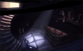
The picture might be tricky to spot, but it's there. The odd looking drum like object is supposed to be some sort of large ship compass (instrument of navigation).
Could've used a couple of hours to touch it up, but the more relevant parts are fairly refined.
#490
General Discussion / Re: Christianity VS White Magic (Only for Spiritualist/WhiteMagicians & Christia
Tue 03/10/2006 22:50:44Quote from: ProgZmax on Tue 03/10/2006 22:29:39QuoteWhat kind of a screwup god gets mad at his creations for his own crappy craftsmanship.
I gather you don't have children?Ã, If you do I wager you'd see how someone could get mad at something they created for screwing up/getting into trouble.
So, as a parent, I would be allowed to design my children from scratch, molecule for molecule, knowing everything there is to know about the universe, and the outcome of any action? Not to mention I'd be rid of any human failings, such as irrationality, which allows us to blame other things for our own mistakes.
Parenthood does sound nice.
#491
General Discussion / Re: Christianity VS White Magic (Only for Spiritualist/WhiteMagicians & Christians)
Tue 03/10/2006 22:17:53QuoteJesus was sent as more of a mediator, in my opinion, between God's wrath and man's spiral into evil.
What kind of a screwup god gets mad at his creations for his own crappy craftsmanship.
As for forgiveness, the bible seems contradicting enough to support any view.
#492
Competitions & Activities / Re: Background Blitz: September 9th - 24th
Mon 25/09/2006 00:45:40
Didn't have time to finish it, but here's what I came up with:

Not the most intimidating of detention facilities, but probably the most visited one.
Edit: Spelling
Not the most intimidating of detention facilities, but probably the most visited one.
Edit: Spelling
#493
Critics' Lounge / Re: My 2nd Tablet Background
Mon 04/09/2006 23:22:21
Nikolas:
I understand perfectly where you're coming from. I tend to exhaggerate certain aspects to get the points across more clearly, which has a tendency to make my edits loose the original feel.
In this one it was mostly the variation of hues, which makes the image a lot cooler, and along with the saturation decrease n brighter/darker parts, makes it a lot less friendly.
On the other hand, there's always a problem of objectivity, when looking at shifting images like these. If the original image is very saturated for instance, an edit with ordinary saturation will look desaturated in comparison. So if the original is extreme in some aspect, a "correct" version won't look right either, if flipped back and forth.
Also, you never know when something's intentional or not. There's a definate purple pattern in Mordellas pics, but that doesn't mean it's neccesserily a concious decision that he's happy with. And since what we're doing here is providing ideas, for the creator to dismiss or use, almost any suggestion is of help in some way.
-
There's actually a plus to the style breaches when you think about it, since it means that people won't just copy the pointers they like, but will have to incorperate the pointers in the style themselves, which is really the only way you really learn.
#494
Critics' Lounge / Re: My 2nd Tablet Background
Mon 04/09/2006 21:35:24
Some lighting ideas:
First off, I think the composition has improved a lot in this one. You got an assymetrical division, a foreground, diagonal lines (the foreground wooden bars), and a nice angle.
The design has already been touched on, and I think it's the biggest thing holding this pic back.
If you paint "just a staircase", or "just an ordinary coffin", then the viewer will skip these objects, since we've all seen these things plenty of times before, and will be done watching your image within a sec.
I suggest you google for some references of these things, to get an idea of how they can look. Skip through the ordinary designs, and save the interesting ones. Open these images in photoshop, and surround your workarea with them.
Using existing designs isn't as fun as creating your own, so I suggest you just look for ideas, and try to come up with something that you think fits the mood and general style of the image.
Our first idea of how something looks is often very generic, and thus boring, so watching these references will allow you to get a new perspective on them, and after a while you get a feeling of the different traditions with their respective trademarks, and can just mix n create something you like.
-
Colours
A good thing with both these images is the colour consistency, though lacking a bit in this one (the reds). That said, varying hues is as much part of creating an interesting image as the design.
A tinted lightsource will rarely totally change the hue of an object, so when I've said that, for instance, the colour of the sky should tint the objects, it doesn't mean that they should all take on the same hue, just towards that hue.
Using a colour layer in photoshop is really great in doing this, since you can, if you like, paint the image in the local colours, that is, what they would look like in a white room, with a white lightsource (a red box having pure red sides), and then tint them using other layers, which makes it extremely flexible.
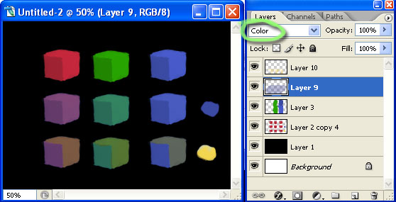
So, first we have the local colours (the first row).
Then I ve added a layer, n set it on 'color' (as marked with green). This means whatever you paint in there will only affect the colours of the layers below, so if you make it totally green, regardless of dark or light, it'll only affect the colours of the underlying layers.
You can fill it with the colour of your choice, and use the opacity setting to adjust how much you think it should affect the layers below, which is similar to the photofilter.
I took the blue from the blue box n just filled the area of the second row with the colour, at about 50% opacity (layer 9 in the pic).
In the last row, I did the same thing, but with yellow, and only on the lighter sides of the cube.
As you see, the colours are quite different from the originals, but there's still a lot of difference, and it's important to preserve these differences, even in images that have a very heavy influence of one or more hues.
About the reds in your image, they look pretty fake, especially the doll, because they're too local, and don't look affected enough.
-
Brushes
I use the chalk brush quite a lot, which is just a squarish brush, nothing fancy, with hard corners. You can achieve anything with any brush if you have enough patience, but choosing the right one will make it quicker, so pretty much, hard brushes for anything that has hard edges, smooth ones for large smooth areas.
-
Lighting
I made the roof lightsource more blue, partly because it's more of a moon light colour, and more importantly, to create contrast to the warm door light. I also increased the brightness of the light spot, for extra punch, n to create a focal point, and darkned everything that wouldn't recieve much light, and were boring to look at anyway.
-
Looking forward to your next piece.
First off, I think the composition has improved a lot in this one. You got an assymetrical division, a foreground, diagonal lines (the foreground wooden bars), and a nice angle.
The design has already been touched on, and I think it's the biggest thing holding this pic back.
If you paint "just a staircase", or "just an ordinary coffin", then the viewer will skip these objects, since we've all seen these things plenty of times before, and will be done watching your image within a sec.
I suggest you google for some references of these things, to get an idea of how they can look. Skip through the ordinary designs, and save the interesting ones. Open these images in photoshop, and surround your workarea with them.
Using existing designs isn't as fun as creating your own, so I suggest you just look for ideas, and try to come up with something that you think fits the mood and general style of the image.
Our first idea of how something looks is often very generic, and thus boring, so watching these references will allow you to get a new perspective on them, and after a while you get a feeling of the different traditions with their respective trademarks, and can just mix n create something you like.
-
Colours
A good thing with both these images is the colour consistency, though lacking a bit in this one (the reds). That said, varying hues is as much part of creating an interesting image as the design.
A tinted lightsource will rarely totally change the hue of an object, so when I've said that, for instance, the colour of the sky should tint the objects, it doesn't mean that they should all take on the same hue, just towards that hue.
Using a colour layer in photoshop is really great in doing this, since you can, if you like, paint the image in the local colours, that is, what they would look like in a white room, with a white lightsource (a red box having pure red sides), and then tint them using other layers, which makes it extremely flexible.
So, first we have the local colours (the first row).
Then I ve added a layer, n set it on 'color' (as marked with green). This means whatever you paint in there will only affect the colours of the layers below, so if you make it totally green, regardless of dark or light, it'll only affect the colours of the underlying layers.
You can fill it with the colour of your choice, and use the opacity setting to adjust how much you think it should affect the layers below, which is similar to the photofilter.
I took the blue from the blue box n just filled the area of the second row with the colour, at about 50% opacity (layer 9 in the pic).
In the last row, I did the same thing, but with yellow, and only on the lighter sides of the cube.
As you see, the colours are quite different from the originals, but there's still a lot of difference, and it's important to preserve these differences, even in images that have a very heavy influence of one or more hues.
About the reds in your image, they look pretty fake, especially the doll, because they're too local, and don't look affected enough.
-
Brushes
I use the chalk brush quite a lot, which is just a squarish brush, nothing fancy, with hard corners. You can achieve anything with any brush if you have enough patience, but choosing the right one will make it quicker, so pretty much, hard brushes for anything that has hard edges, smooth ones for large smooth areas.
-
Lighting
I made the roof lightsource more blue, partly because it's more of a moon light colour, and more importantly, to create contrast to the warm door light. I also increased the brightness of the light spot, for extra punch, n to create a focal point, and darkned everything that wouldn't recieve much light, and were boring to look at anyway.
-
Looking forward to your next piece.
#495
Critics' Lounge / Re: My 1st Tablet Background
Sat 02/09/2006 17:42:25
Pretty rough edit to illustrate some points:

To begin with, I think it's a nice first attempt, composition n colour wise.
A couple of pointers:
Planes
To make the background appear to have depth, it's generally adviced to have as many planes as possible. At the moment, the pic is pretty much limited to one, if you overlook the very subtle gravestones.
I added a fence n some kind of a bush as a foreground plane. Making foregrounds look natural is quite tricky, n I always have trouble finding proper objects that don't just look like a dark sillhouette pasted on. Using focal depth will make foregrounds appear more natural, but it clashes with many styles.
I added more clearly defined gravestones as another plane, just behind the house, and a couple of hill planes, n lastly a mountain plane.
Making defined planes in night time enviroments is tricky, due to limited value range the darkness imposes, and looking at the edit, it doesn't look convincing, but it should get the point across.
-
Perspective
I'm not a stickler for exact perspective, but the current one is strange enough to warrant some adjustment, imo. I just edited the upper window, which, looking at the angles of the house lines, is above the horizon, meaning we should see the upper inner part, not the lower.
-
Composition
At the moment, while there are some clear points of contrast, the windows, lamp n tree, the image lacks a kind of focus. Apart from these objects, everything in the image calls for about as much attention.
By making the lamp ground area n wall brighter, n the rest darker, the image has a clearly defined focal area, apart from the moon, which acts as a secondary.
The moon placement isn't really ideal in its placement, since it drags the eye towards the edge of the image, which means the chance that it'll jump off the image is greater, and won't lead to another desireable part of the image.
Placing it on the right of the tree wouldn't probably work any better, perhaps behind it, but I think it's a problem with the basic composition, and is one of the things that should be worked out very early on in the sketch stages.
The general composition is kind of dull, in that you have a symmetrical vertical split. In composition, there's a preference towards dividing in threes rather than twos, and while it's not a rule that you must follow, it usually helps to land around those parts. Too obvious balance is boring, and doing asymmetrical divisions forces you to compensate in interesting fashions.
-
Values
Highlights are tricky since they suggest the material of the object, and if not careful, they'll misinform the viewer.
The tree in the original has a shiny look to it, for this reason. Matte objects, such as most trees, will have no clear speculars, unlike shiny objects, and the lit up parts will have even values. The value range in the original is simply too wide, that is, the parts hit by the lamp's light should be more similar in value.
This is also true for the parts not hit by the lamp, which should have a limited range n be low in contrast, due to the relatively weak lightsource (the sky).
-
Colors
As Mash pointed out, there's no realistic justification of the blue tone of the tree n house, unless the sky behind us is very blue, but this appears not to be the case.
So, all objects hit by the sky will be tinted towards magenta rather than blue. This will make the objects in the image look like they're part of the same world, n not copy n pasted in.
I decreased the saturation for most parts, especially the very saturated magentas in the door n window frames. Especially in night time enviroments, it's very tricky to maintain high saturation without it looking wrong or straining, because of the low light level.
On the other hand, you can contrast this saturated artificial light sources, such as the lamp n windows.
I made the lamp light less pure yellow, since lightsources of this kind are more orange, which also looks nicer, that is, imo. I also varied and increased the values in the bright areas, to make them brighter n less flat. In dark enviroments, lightsources will look much brighter than during daytime.
-
Additional pointers
The rotation of the tree is boring, and makes it look flat. I moved the hole a bit to the left, but didn't have the energy to repaint the branches to point more towards or away from us.
The branches are very strange in themselves, though it may be a style decision.
I made the lamp a bit more interesting design wise, though it was a rather strange design to work with.
-
Hope you don't get discouraged by all the pointers, though the praise of the other posts ought to compensate well enough.
Looking forward to your next one.
#496
Critics' Lounge / Re: Dancing
Tue 22/08/2006 14:02:58
I usually don't have anything to suggest when it comes to your pics - they seem fit their aim perfectly - but this one seemed like a departure in style, perhaps to accomodate the client.
(Animated)
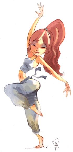
I think the thing that bothered me the most was the rather heavy makeup, as well as some of the saturated colours, which made her look somewhat like a, excuse the exhaggeration, drunken prostitute at a gym.
I think another thing that added to this was the glossiness of the face.
-
The things I altered was:
The lip and eye shade makeup, which I toned down to give her a more natural healthy look.
Seperated her eyes apart a bit, by deleting a bit of the centre lines, to make her eyes smaller and prettier.
Changed the lighting, to give the impression of strong sunlight, causing overexposure, removing the specular on the cheek, which makes her skin look more smooth and healthy, and also gives it a bright summer day look. The lighting was only applied to certain areas, to draw the attention to the face.
Changed her pelvis direction, to avoid a strict sideview and make the pose more dynamic (it now twists more to the left).
Probably some other thing which I've forgotten.
-
Hope some of the suggestions might help, and I'm looking forward to your next work.
(Animated)
I think the thing that bothered me the most was the rather heavy makeup, as well as some of the saturated colours, which made her look somewhat like a, excuse the exhaggeration, drunken prostitute at a gym.
I think another thing that added to this was the glossiness of the face.
-
The things I altered was:
The lip and eye shade makeup, which I toned down to give her a more natural healthy look.
Seperated her eyes apart a bit, by deleting a bit of the centre lines, to make her eyes smaller and prettier.
Changed the lighting, to give the impression of strong sunlight, causing overexposure, removing the specular on the cheek, which makes her skin look more smooth and healthy, and also gives it a bright summer day look. The lighting was only applied to certain areas, to draw the attention to the face.
Changed her pelvis direction, to avoid a strict sideview and make the pose more dynamic (it now twists more to the left).
Probably some other thing which I've forgotten.
-
Hope some of the suggestions might help, and I'm looking forward to your next work.
#497
Critics' Lounge / Re: (updated) Mermaid Photoshop painting
Sun 02/07/2006 17:12:53
It's amazing the time you find for these kind of things, when you're really supposed to be doing something else.
It's often said that there are no pure colours in nature, and what usually differentiates novice work from more mature is the usage of them.
In a white room, with a whitish lamp, your ball would be close to pure red, but like you said, in a situation with coloured ambient light, like the sky, and a yellowish keylight (main light, ie the sun), you'd be dealing with orange reds, and reds towards purple with low saturation. Or some other colour, depending on the type of ambient light.
You can still maintain a warm and saturated style if using this, take CMI for instance. What it does is provide colour contrast, which is usually found attractive, and unity, which will make it feel more believeable, even though the world may be really odd, and thereby increase the immersion.
Glad you found it helpful, and I'm looking forward to your next piece (with or without the implementation of these things).
Nik: Thanks for the encouraging comment.
-
A tip: Photoshop provides plenty of ways to blend colours, so that you don't have the guess the right colour by picking from the chart, or redraw areas if you just want to change the colours. It's usually safest to have seperate layers when doing it, and merge them when satisfied.
Probably the easiest, and safest way is making a new layer and setting the blending mode to 'Color':
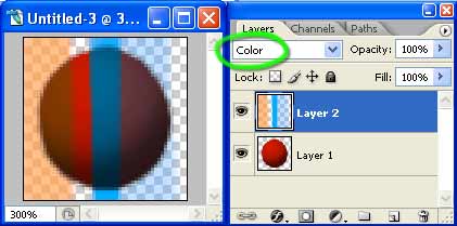
In the example image, the bottom layer is a red ball, and the layer above has been set to 'Color'. This means that anything you draw in there will only affect the colour value of the layers below, and the brightness values will remain intact.
You can set it to many things, such as luminosity, to just change the values (colours won't be affected), saturation, hue etc.
Small note: When you merge a colour layer with another, the effect will only be applied to that layer, none other. So for instance, let's say you have two layer, a subject layer, and a background layer, and only want to change the colours of the subject layer. In this case, you don't have to worry about the colour data spilling over on the background, since when you merge the colour and subject layer, the colour data will lost on everything but the merged layer, ie, the subject layer.
Anothe way of changing a certain part of an image, is by changing the 'brush mode':
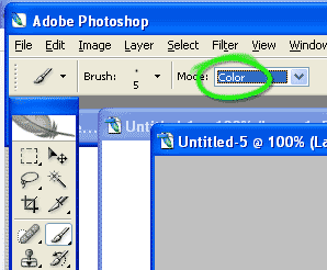
(just select the brush tool, then change the mode. Don't forget to change it back to 'Normal' when you want to continue painting as usual)
This enables you to draw directly onto an image, without additional layers, but only affects one part of it, such as the colours, saturation etc. This is quicker, but less flexible, since with a seperate layer you're always able to erase parts, and so on.
Edit: Added a note
It's often said that there are no pure colours in nature, and what usually differentiates novice work from more mature is the usage of them.
In a white room, with a whitish lamp, your ball would be close to pure red, but like you said, in a situation with coloured ambient light, like the sky, and a yellowish keylight (main light, ie the sun), you'd be dealing with orange reds, and reds towards purple with low saturation. Or some other colour, depending on the type of ambient light.
You can still maintain a warm and saturated style if using this, take CMI for instance. What it does is provide colour contrast, which is usually found attractive, and unity, which will make it feel more believeable, even though the world may be really odd, and thereby increase the immersion.
Glad you found it helpful, and I'm looking forward to your next piece (with or without the implementation of these things).
Nik: Thanks for the encouraging comment.
-
A tip: Photoshop provides plenty of ways to blend colours, so that you don't have the guess the right colour by picking from the chart, or redraw areas if you just want to change the colours. It's usually safest to have seperate layers when doing it, and merge them when satisfied.
Probably the easiest, and safest way is making a new layer and setting the blending mode to 'Color':
In the example image, the bottom layer is a red ball, and the layer above has been set to 'Color'. This means that anything you draw in there will only affect the colour value of the layers below, and the brightness values will remain intact.
You can set it to many things, such as luminosity, to just change the values (colours won't be affected), saturation, hue etc.
Small note: When you merge a colour layer with another, the effect will only be applied to that layer, none other. So for instance, let's say you have two layer, a subject layer, and a background layer, and only want to change the colours of the subject layer. In this case, you don't have to worry about the colour data spilling over on the background, since when you merge the colour and subject layer, the colour data will lost on everything but the merged layer, ie, the subject layer.
Anothe way of changing a certain part of an image, is by changing the 'brush mode':
(just select the brush tool, then change the mode. Don't forget to change it back to 'Normal' when you want to continue painting as usual)
This enables you to draw directly onto an image, without additional layers, but only affects one part of it, such as the colours, saturation etc. This is quicker, but less flexible, since with a seperate layer you're always able to erase parts, and so on.
Edit: Added a note
#498
Critics' Lounge / Re: (updated) Mermaid Photoshop painting
Sun 02/07/2006 14:29:14
Hope this will explain it to an extent:
The aim will be to lit this grey ball:

This approach is a bit hardcore, and I doubt many use it fully, I certainly don't, but it will hopefully explain it enough so you can skip some steps and work as fast as you do now.
Since it's done by hand, it's not as accurate as photos or 3D, but should suffice.
(I) You'd start out with pure black, since we havn't introduced any light,
(yep, same image as above)
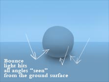
(II) This is the lightsource. It will always be brighter than the subject it hits, unless that object is recieving additional light from something else.

Now we'll lit up the surfaces, by adding light to the parts that would be hit, in this case all, but with less light hitting the lower part of the ball, and beneath, since those areas are exposed to less or none skysections.
(III) We've now added light to all the surfaces. The area below the ball has been least affected, and the top the most, since it's hit by light particles from most angles.
The blue is exhaggerated to emphasize the colour variation, but since the lightsource is blue, everything it hits should be affected.

(IV) Bouncelight added, which is mostly visable in the darkest parts, since the small extra light is a relatively small addition to the already bright parts, but relatively big in the low light surfaces.
(V) We'll now prepare to add the main lightsource, also referred to as keylight.
In the case of a directional lightsource, such as the sun, we'll have a "light equator", that is, a line going around the ball seperating the parts that will be hit by the light.
The brightness inside this area will depend on the ball's material and the lightsource. In case of a smooth surface like this ball, it will be roughly the same over the whole area, with a small brightness reduction towards the equator.

We also need to consider the ground surface, which will recieve the same light. Since the surface is flat, and the sun is far away, the area will be lit even. If the lightsource would've been close, areas closer to it would recieve more light.
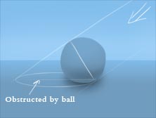
The ball is the only thing obstructing the light from the surface, and this will leave an area without direct sunlight, the dropshadow, which is the absence of light, so we won't be adding it, it'll appear due to lack of addition of light from the main lightsource.
Based on the angle of the lightsource you either calculate the shadow shape by some method, there are fairly easy ways, or just approximate.
(VI) We've now added direct light. It's quite yellowy, and the temperature will depend on the time of day, or just what you think looks best.
At this point, the areas not hit directly have been left untouched, but they need to be affected by light bouncing off the ground, and the ball.

(VII) The bouncelight is now added. A rule of thumb is that the value, as in brightness level, of the bouncelight should never, or rarely, be higher than the lowest value of the surfaces directly hit, that is, the values of the bouncelight, the lower left of the ball, should be lower than the values on the right side of the ball.
This is because light scatters as it hits something, so direct light means that that light "package" will hit the surface more intact than if it was to bounce first, off the ground for instance, which would scatter it.

One thing to note with castshadows, is that they get blurrier the further the way they are from the object causing them. This is because light bounces off air particles, so their path isn't straight. This means that you actually have a multitude of castshadows, all with a slightly different angle, caused by the individual light particles. Since the total particle amount is huge, there won't be distinctive seperate castshadows, like you see in stadiums, with four seperate castshadows around the players, and will together just form a blur between their areas.
This will be most noticeable with large lightsources, like the sky or a lightbox, since then we have a great spread of light directions, and the result will be soft shadows beneath objects, since pretty much all other castshadow areas will be neutralized by some part of the sky.

Hope this makes it a bit clearer. Just ask if something is still confusing.
Edit: Updated some of the images
The aim will be to lit this grey ball:
This approach is a bit hardcore, and I doubt many use it fully, I certainly don't, but it will hopefully explain it enough so you can skip some steps and work as fast as you do now.
Since it's done by hand, it's not as accurate as photos or 3D, but should suffice.
(I) You'd start out with pure black, since we havn't introduced any light,
(yep, same image as above)(II) This is the lightsource. It will always be brighter than the subject it hits, unless that object is recieving additional light from something else.
Now we'll lit up the surfaces, by adding light to the parts that would be hit, in this case all, but with less light hitting the lower part of the ball, and beneath, since those areas are exposed to less or none skysections.
(III) We've now added light to all the surfaces. The area below the ball has been least affected, and the top the most, since it's hit by light particles from most angles.
The blue is exhaggerated to emphasize the colour variation, but since the lightsource is blue, everything it hits should be affected.
(IV) Bouncelight added, which is mostly visable in the darkest parts, since the small extra light is a relatively small addition to the already bright parts, but relatively big in the low light surfaces.
(V) We'll now prepare to add the main lightsource, also referred to as keylight.
In the case of a directional lightsource, such as the sun, we'll have a "light equator", that is, a line going around the ball seperating the parts that will be hit by the light.
The brightness inside this area will depend on the ball's material and the lightsource. In case of a smooth surface like this ball, it will be roughly the same over the whole area, with a small brightness reduction towards the equator.
We also need to consider the ground surface, which will recieve the same light. Since the surface is flat, and the sun is far away, the area will be lit even. If the lightsource would've been close, areas closer to it would recieve more light.
The ball is the only thing obstructing the light from the surface, and this will leave an area without direct sunlight, the dropshadow, which is the absence of light, so we won't be adding it, it'll appear due to lack of addition of light from the main lightsource.
Based on the angle of the lightsource you either calculate the shadow shape by some method, there are fairly easy ways, or just approximate.
(VI) We've now added direct light. It's quite yellowy, and the temperature will depend on the time of day, or just what you think looks best.
At this point, the areas not hit directly have been left untouched, but they need to be affected by light bouncing off the ground, and the ball.
(VII) The bouncelight is now added. A rule of thumb is that the value, as in brightness level, of the bouncelight should never, or rarely, be higher than the lowest value of the surfaces directly hit, that is, the values of the bouncelight, the lower left of the ball, should be lower than the values on the right side of the ball.
This is because light scatters as it hits something, so direct light means that that light "package" will hit the surface more intact than if it was to bounce first, off the ground for instance, which would scatter it.
One thing to note with castshadows, is that they get blurrier the further the way they are from the object causing them. This is because light bounces off air particles, so their path isn't straight. This means that you actually have a multitude of castshadows, all with a slightly different angle, caused by the individual light particles. Since the total particle amount is huge, there won't be distinctive seperate castshadows, like you see in stadiums, with four seperate castshadows around the players, and will together just form a blur between their areas.
This will be most noticeable with large lightsources, like the sky or a lightbox, since then we have a great spread of light directions, and the result will be soft shadows beneath objects, since pretty much all other castshadow areas will be neutralized by some part of the sky.
Hope this makes it a bit clearer. Just ask if something is still confusing.
Edit: Updated some of the images
#499
Critics' Lounge / Re: (updated) Mermaid Photoshop painting
Sat 01/07/2006 20:00:37
Here's a version which integrates the character more, while still making it stand out quite much, and maintaining saturated colours:
(I don't prefer it over your version, it's another take on it with things that you might want to incorperate)
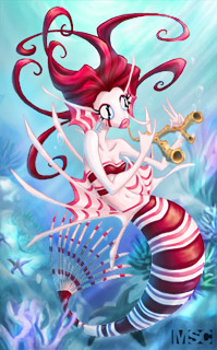
The biggest change is probably the colours. The parts of the character not hit by the sunlight are now coloured cyanish,Ã, like the rest of the enviroment. It's far from realistic, but incorperates part of reality which can help the image.
Another thing with the colours is more colour variation in the background. They're still all bluish, but with enough amount of other colours to make them appear different, which tends to provide richness, and interest.
There's also water colour variation, again taken from reality, where the water closer to the surface gets an almost green hue, and the depths one closer to purple.
Another difference is the lightbeams, which I added to create a bit of imbalance, and diagonals. In the original, the lightest part is just above her, and creates a bit boring symmetry. They also cause some smaller lightspots, which creates interest.
I added some leaves, or whatever they're called, on the closest plant, to make it overlap the subject, which creates some depths n also makes the character "sit" more in the picture.
A dropshadow just beneath her adds to this. Also added some more bouncelight to the tail section.
I also made the background objects fade out more, mostly to give the feeling that the world continues, and doesn't stop just after those rocks, just that we can't see it, but also to create the illusion of dense atmosphere (particles), and depth.
That's about it.
A tip: When doing colours/lighting, it can help greatly to work additatively, rather than subractively, that is, by adding light, rather than adding shadow.
You'd start out without the main lightsource, direct sunlight. If outside, you'd tint the whole subject with the colour of the sky, which is the lightsource. In this case you make it whatever colour the water is at the position. You can add the bouncelight caused by this lightsouce at this point, though it's a fairly small amount, or do it after the next stage.
Lastly you add the main lightsource, which then tints the subjects once again, in case of the sun, anything from red to white, depending on the time of day, in the case of artificial light, any colour. You also add the bounce light/colour, which will be mostly visable in the parts not directly lit, due to the relative strength. Bouncelight will pick up any colour it's reflected off, and tint the next surface it hits.
Edit: Also edited the bubbles, and just made them bright at the position where they're hit by the sun, and around it, where it would reflect the enviroment, but transparent otherwise.
(I don't prefer it over your version, it's another take on it with things that you might want to incorperate)
The biggest change is probably the colours. The parts of the character not hit by the sunlight are now coloured cyanish,Ã, like the rest of the enviroment. It's far from realistic, but incorperates part of reality which can help the image.
Another thing with the colours is more colour variation in the background. They're still all bluish, but with enough amount of other colours to make them appear different, which tends to provide richness, and interest.
There's also water colour variation, again taken from reality, where the water closer to the surface gets an almost green hue, and the depths one closer to purple.
Another difference is the lightbeams, which I added to create a bit of imbalance, and diagonals. In the original, the lightest part is just above her, and creates a bit boring symmetry. They also cause some smaller lightspots, which creates interest.
I added some leaves, or whatever they're called, on the closest plant, to make it overlap the subject, which creates some depths n also makes the character "sit" more in the picture.
A dropshadow just beneath her adds to this. Also added some more bouncelight to the tail section.
I also made the background objects fade out more, mostly to give the feeling that the world continues, and doesn't stop just after those rocks, just that we can't see it, but also to create the illusion of dense atmosphere (particles), and depth.
That's about it.
A tip: When doing colours/lighting, it can help greatly to work additatively, rather than subractively, that is, by adding light, rather than adding shadow.
You'd start out without the main lightsource, direct sunlight. If outside, you'd tint the whole subject with the colour of the sky, which is the lightsource. In this case you make it whatever colour the water is at the position. You can add the bouncelight caused by this lightsouce at this point, though it's a fairly small amount, or do it after the next stage.
Lastly you add the main lightsource, which then tints the subjects once again, in case of the sun, anything from red to white, depending on the time of day, in the case of artificial light, any colour. You also add the bounce light/colour, which will be mostly visable in the parts not directly lit, due to the relative strength. Bouncelight will pick up any colour it's reflected off, and tint the next surface it hits.
Edit: Also edited the bubbles, and just made them bright at the position where they're hit by the sun, and around it, where it would reflect the enviroment, but transparent otherwise.
#500
Critics' Lounge / Re: (updated) Mermaid Photoshop painting
Sat 01/07/2006 02:02:12QuoteAs for the characters colours making it stand out, I think MashPotato is right in her choice of contrasting hues between subject and background. It's pleasing to the eye and creates a nice sense of depth.
Guess I could've been clearer when making that example.
Providing that Mash wants the character to blend in with the background, as in, create the illusion that the mermaid is actually in that enviroment, the colours, especially the shadow ones are too pure red. But again, this is providing that she wants to achieve this effect, which isn't clear. The current scheme is attractive in a stylized way as is.
Colours are relative. If doing a red enviroment, green colours will usually be just grey, which are percieved as green because of the red surrounding.
So my example wasn't aimed at the colour choice, as in, red subject, purple background, but the actual colours.
SMF spam blocked by CleanTalk