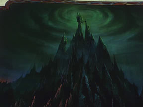
Menu

Show posts

This section allows you to view all posts made by this member. Note that you can only see posts made in areas you currently have access to.

Show posts Menu

Messages - loominous

#501
Great pic again!

As with the previous, it's tricky to give suggestions since your aim is pretty unclear.

For instance, at the moment the colours do seperate the subject from the background effectively, but do at the same time create the effect of two seperate elements layered ontop of eachother, rather than of a character in a setting.

There's no real way for people to know whether these things are design decisions, or issues that if pointed out n "corrected" would enhance the pic in your view, specially when dealing with more stylized styles.

A small description of what you're aiming at might generate more relevant suggestions.

Once again, great pic, and hope you'll post more.
#502
The results:

Best Idea: Prog
Best Functionality: Prog
Best Design: Prog, runnerup Traveller
Best Technique: Tie between Traveller n Neil

Congrats, and I hope the next comp will attract more activity.
#503
Voting will be over at midnight, so there's still time. Perhaps a couple of more elaborate ones, in the style of Ildu n others?
#504
Voting time.
#505
Last day then, if you want to extend the deadline an hour or two, please tell, otherwise the voting will start in 24 hours.
#506
Let's extend it to the twelfth.

Is it a particularly boring/tricky/uninspiring topic, or is the low participance due to other causes? If the former is the case, I could close the comp down earlier.
#507

THE ORPHANAGE

Guidelines:[/font]

- Interior or exterior view, or both if you like.

- If you want to include sprites, go ahead, but submit a version without them, which will be actual submission.

- No real size or colour limits, as long as it would work in an AGS game.

- Voting will be in the usual categories: Best idea, functionality, design and technique.

Techniques:

You can use any technique you like in achieving the background, beside drawing/painting from the imagination, such as tracing photos, photo collages, copying parts of other backgrounds/paintings/photos, using filters on backgrounds from other games, or whathaveyou, but:

- Include all significant material/references that you've used, to allow the voters to judge the actual effort. 'Significant material/references' is a vague formulation, but I think the intuitive interpretation should be sufficient.

Hope you'll have fun.
#508
Thanks for the comments. The next comp will be up shortly, or so I hope.
#509
A bright and saturated palette experiment. Very uneven, and if I had the time, I'd tinker with the coloring and refine some areas, though I like the roughness of many parts.


It's supposed to be some sort of airship, a zeppelin like thing, housing an adventuring professor.

Btw, most lab equipment is on the foreground table.
#510
Shame that there weren't any more entries, since it's a fun topic, so I've started on one, which should be done later this evening.
#511
I think very few people mind these things, as long as the references are included. There's nothing wrong with references, just as there's nothing wrong in writing arrangements for existing musical themes, but to leave this information out is to take credit for other's accomplishments.

These incidents really spoil the mood of the activities/competitions, and I think encouragements or rules to always include significant references might make them less common.
#512
Critics' Lounge / Re: I want it eerie
Sat 15/04/2006 12:12:59
Glad you found it helpful. While Disney tend to keep a generally friendly atmosphere with the application of rules like these, they use them to accentuate the opposite when desired. Here's an example from Sleeping Beauty:


So "Disney like" isn't bad per se, if you want a creepy look.
#513
Critics' Lounge / Re: I want it eerie
Sat 15/04/2006 11:53:28
Here's some shape/lighting theory that you could try out:


So basically, if you want it friendly, like most disney movies, make the shapes round and shadows soft and diffused, and if you want it hostile, make the shapes edgy, and apply hard light, like in film noir for instance.

This doesn't mean that you have make everything pointy in a creepy enviroment. Too obvious application of these "rules" will probably make it silly looking, but just like I doubt most people payed any attention to the round shapes in your version, a good application of this will just leave the viewer unnerved.

Here's your version, with some of the round shapes accentuated:


Here's a part of it with a harder shadow, and cooler colors:


Cool style and nice composition btw.
#514
Nice!

I agree with Stefano, this is one of the best things I've seen in here.

Kind of hard to give advice on these more illustrative designs, since the aim is more vague, but here's some edits:

(animated)


I tried giving the top a more greenish hue to add more color variation and contrast the red flowerthing. I'm very ambivalent as to whether I prefer it, but I included it as a suggestion.

I edited the stomach, mostly by removing the line, which rarely works for these non-contour details in my experience, when coupled with more elaborate shading.

I gave the fur a more lustrious look, which I've seen on horses, though I never do these things so it's probably very off. It also sort of clashes with the shading on the rest, even though I simplified it quite a bit.

As for the lighting, I added castshadows, and darkened some parts, to which I also added some subtle blue, which comes out as a hint of purple. I added a darker shade to areas which would be in shadow from both the main light, and the ambient one, a sky for instance, areas such as beneath her top, and worked a bit on the arm shadow line.

The shading on the horselike bodypart was a bit odd, in that mostly the edges were highlighted. Edges only really get lit like that if the light is coming from behind, and bounces directly into the camera/eyes (rimlight).

But anyway, really nice work, hope you'll post more.

Edit: Forgot to mention, I increased the saturation of highlighted parts of the fur, which felt a bit too washed out in comparison to the rest.
#515
Quote from: Bernie on Mon 06/03/2006 22:20:41
I actually prefer not to build the actual character's face on the polygons themselves. However, putting them over an existing face and working from there seems to work very well for me. Thanks.


I think that I may have been misleading when I introduced the polygon mesh like construction.

The point of the demonstration was to illustrate a way to determine how to shade a face, not how to construct the head. I'd suspect that very few people actually draw out mesh-like grids like that except for studying purposes. It's simply something you project onto the face in your mind. When it comes to shading, I just picture the object from the lightsource, and note what parts are hit, and how.

That said, drawing models like that is an excellent way of getting to know and sort of "feel" mass, that is, a way to begin to sculpt on paper, seeing and working in the z dimension whenever you draw, even without any construction models or meshes, rather than drawing lines in a 2D space.

Something I forgot to mention in my other post is that if you are to add grid like surfaces as illustrated, it would be added after you've constructed the basic shape of the head. The pic below illustrates a common approach how to do this.

A construction like that would be redundant if you are to draw a frontview, since the lack of perspective problems makes it easy enough, but once you start doing trickier angles, it's pretty much the only alternative to using references, and is how animators work, since they need to maintain the volume and shape of a character's body in whatever way it moves.

The constructions are just like perspective grids, that is, something you lay down lightly and quickly beneath, and use as guidelines.

Here's an excerpt from Loomis' Drawing Heads and Hands:


So while you can of course continue simply adding the "grid" once you've drawn the face/body, you'd be missing out on the major point of the construction approach, and would be sort of similar to drawing a building in freehand, then adding a grid onto it, which would probably result in a wonky building with a grid, instead of starting out with the perspective lines, establish the major shape, and go from there.

-

Here's how you can construct some easier more cartoony characters (crappy style, but illustrative) (from Loomis' 'Fun with a Pencil')

You can see this technique in pretty much any book on animation, and the idea is the same as the top illustration.

-

Btw, the same techniques are used for bodies, here's one construction model from 'Figuredrawing for all it's worth' (a great book on anatomy and constructing bodies).

-

The techniques may seem cumbersome, but really aren't. Getting tricky angles right on the first try will take a while (I havn't reached that point), but for easier angles/poses, it's mostly it's a matter of spending 30 secs.

Hope you find it useful, and good luck.

Edit: Fixed links
#516
Before you're off learning anatomy, I'd really recommend looking into mass and lighting.

I'm very envious of the linework and character of the pieces in the first pages, but the shading of the later pieces reveals a lack of understanding in these two areas.

Especially when doing highcontrast work, which is sort of inevitable in comics, you really have to know your form/mass if you are to apply light, or else the shapes will turn out distorted and freakish looking.

Some like the creepy style you automatically get when you determine the light with limited understanding of the shape you're dealing with, and how light works in general, but if you aspire to have control over how things will look, I'd recommend taking some time to learn how to construct objects, rather than relying on linework, and postpone things such as anatomy and lineart studies.


Basically, you learn how to simplify shapes so they become comprehendable, and also because blockiness is quite attractive if done right, and will boost the 3D feel, since we're dealing with a 2D medium.

So, if you were to construct some planes on the head of the character, it could look like this (really rough):

(animated)


If we were to follow the simplified shapes of the planes, you can easily see that the current shading is sort of arbitrary, as in, the shadows overlap the planes, getting darker at places without any real reason n so on.

If we instead rely on the planes, we get a simpler, and more comprehendable result. Here I used only three tones, or two, depending on how you count:

(animated)


Here are the two after eachother:

(animated)


Now, he's lost his ruggedness, and this might not at all be what you want, but that's easy to add. The tricky part is to learn how to construct object and apply light and have it look convincing. This is how I do it:


First, construct the head. You can draw out the planes like above, in more or less detailed versions, or not at all, once you get used to it.

Secondly, determine the lightsources. Usually there's more than one, but for excersise it's best to start with a single strong one. Later you probably want to add a fill light, to light up the shadow side, and a rimlight to accentuate certain edges.

This isn't an easy decision, since if you stick to the lightsource placement and type consistently, the look of the image will drastically change depending on this choice.

Thirdly, picture, or draw the object as seen from the lightsource/s. This will be your guide in deciding what value the planes will have.

Note what edges are facing you directly (as seen from the lightsource). These will be the brightest ones.

Then note which ones you can't see. These will be in shadow, and completely black, if no other lightsource hits them, or reflected light bounces onto them.

Now note which ones are visable, but facing away from you. These will get a value according to the angle in which they face you, the more away, the darker.

Lastly, note which areas are concealed from you, not by turning away, but by being obstructed by other geometry, such as a nose. These areas will fall under cast shadows.


The difference between castshadows and ordinary shadows is the geometry that causes them. In the case of ordinary shadowedges, we can take a ball on a table as an example, the shadowedge will be "feathered", since the geometry gradually goes into shadow. In the case of castshadows, the light is instead blocked by an object, such as the ball blocking the light from the table beneath it. In this case, there is no gradual surface change, since the table is either recieving light, not blocked by the ball, or vice versa.

The edge will be feathered anyway depending on the distance between the blocking object and the castshadowsurface - the further away the more blurry -Ã,  the spread of the light, and the intensity, the more intense, the sharper shadows, which is just our brains compensating for the contrast.


Here are some examples illustrating how I determine the values using the planes extracted from your guy, the first one being your lighting situation:


I really recommend obtaining a fairly solid understanding of form and light before anything else. Anatomy knowledge and feathering techniques are both neccessery to achieve high standards, but serve really as icing on the cake.

A character with messed up anatomy will still look right if properly shaded, since we'll just assume his anatomy is strange, which is the case some people. A character with perfect anatomy, but shaded without understanding will always look crap, atleast to other artists, since light is form and texture.

As always, I recommend Andrew Loomis' books, which used to be available for free online, but has been removed as of late. Due to their popularity, it's not hard obtaining them anyway.

Great style in general, and good luck.

Edit: Some spelling

Edit II: Also, I'd loose all the small lines that I assume you've created to add detail, until you get an understanding why they're supposed to be there. Lines will be concieved as form, and any erroneous ones will distort the shape.
#517
Quote from: Afflict on Fri 24/02/2006 15:49:04
Using a reference is way better well untill you get so good you dont need it. (Used mostly for colors anyway)

I am completely new at this and well I want to achieve the highest quality background that I can posibly get.

The problem is that if you rely on photos, you won't probably reach the point where you won't need them.

Realistic rendering is in a way pure math, which is why 3D software is able to do it. The nice thing is that the important laws aren't tricky. Extracting them from photos without prior knowledge is though.

To achieve real creative freedom within realism/semi-realism, you have to learn to operate like a 3D renderer.

Photos then become a nice additional source for ideas, designs, palettes etc, and not a neccessery foundation, without which any attempt will crumble.

Relying on references is very tempting for beginners, since you get relatively impressive results quickly. Your understanding remains unimproved though, so your progress is illusory in that sense.

I'm not saying that this is the wrong route to take. I can see how this would be satisfying enough for some, but if you find the prospect of being able to create whatever scene that falls into your mind worth the many years of practise it takes, then put the photos aside.

Sorry about the off topic post, but I'm unable to watch reference encouragements of this sort pass by unconfronted.
#518
It will probably be of much interest, so I believe its worth the effort, but I think the name of it should indicate that it's based on a tracing technique. As is, the reader will discover this by the third page of tutorial, which is very late.

Apart from that, I think the language works well, but the pages feel too long and unstructured. Smaller chunks with clear headers would make the steps feel more approachable and easily remembered.

Good luck with the rest.
#519
Including the points would make it more accurate, but I think you'd run the risk of making it too focused on score and winning. After all, it's really meant as an activity rather than a competition.

But if it's the opinion of the majority, I wouldn't have any problem with it myself.

A compromise would be to include (close) runner ups. In this case there weren't any really though.
#520
Nice entries everyone, but the main price goes to:

Andail

Congrats.

-

The category winners are:

Best Idea: Rel

Best Design: Andail

Best Functionality: He-man

Best Technique: Tie between Rel and Andail
SMF spam blocked by CleanTalk