Menu

Show posts

This section allows you to view all posts made by this member. Note that you can only see posts made in areas you currently have access to.

Show posts Menu

Messages - loominous

#541
Not what you asked for, but something that bothered me:


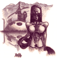
I always liked that hat. It's true that she looks cuter without it, but she looses much of her originality, and I find too cute/attractive protagonists a problem, similar to how flawless personalities usually equals boring.

That avatar you've got could work well as coverart in it's simplicity, which I think is a good indicator of a solid design. I doubt that these modified looks would suffice in that situation.

Since you seem unhappy with the old one I suggest that keep looking for a new design that has the good qualities of the original and as well as satisfy your new demands.
#542
Some mods:


Since it's monochrome, the ways you have available to define distance is pretty much limited to altering values.

Due to particles in the air, you will only have "pure" values right infront of you, and the further away you look, the more particles will come between you and the objects you're looking at, with the same effect as a fog. In practise, this means that if you're painting two black boxes, one close, the other 500 meters away, the distant box should be middle grey, not black, while the close one will have its "true" values.

I also modified the shading on her body. You avoided the pitfall of overlooking the main form and shading each feature seperately, and the main thing I did was to make the lit up areas more uniform. The contrast between the litup areas' values musn't compete with the contrast between the lit up and unlit areas. What I mean is that the areas that the lightsource hits will have similar values, which also goes for the the ones in shadow, and if you start mixing these up, by for instance, having the shadow values present in the lit up areas, the shading won't look convincing.

Last thing, don't forget bounced light.

You're definately improving, hope you keep posting so we can see your progress.
#543

(Top, original composition, bottom, composition suggestion)

I think the values work fine. The composition however strikes me as boring.

First off, everything is pretty much in a single line, observed slightly from the high right. This gives it limited depth and dull appearance.

Another thing adding to the flatness/dullness is that apart from the left tree covering some of the rock, no objects are overlapping.

Besides the lineup, the trees are really similar, which along with the monochrome palette (which I don't have any problem with per se), creates monotony.

Though I may be a bit over sensitive in this matter, Ã, I think the empty lower left corner is too big if it will remain empty (and I don't count characters, the background should be self sufficient in my opinion).

-

What I did in my (quick) composition suggestion, was to place the camera a bit more to the lower right, and move the trees so they intersect with the stand. Also, partially to fill out the left corner, and also to give it more depth, I added a foreground element to the left. Another thing the angle does is to lower the horizon to be more vertically centered (though not in the centre), which in my opinion usually looks best.

-

About the repetativeness in style, I don't think it's a problem as long as you fight off monotony in form of shapes and lighting. It's a cozy and really nice style you've got.

PS. Another thing, the whole thing was leaning to the right, which sort of threw it off balance.
#544
Quote from: Janik on Wed 05/10/2005 17:20:43
Could you elaborate a bit more on that? I saw from demo videos that the tilt matters for the airbrush, where you can tilt and spray in a particular direction on the canvas. But for the oils, I just don't see what it does. I'm thinking that the brush size will be determined by pressure, not tilt...

Painter sets out to emulate natural media, whereas photoshop use artificial brushes, and while these are often based on natural counterparts, they are rarely convincing, and don't really try to be.

Since most natural media works differently if they're tilted or not, Painter does its best to emulate this. While there are brushes in Photoshop that do the same, they are quite rare, and my impression is that it's even more rare that people actually use them. Photoshop people in general tend to use different techniques than Painter types, utilizing the computer capacity to speed up the workflow and perform computer unique tasks, while you're pretty much stuck with traditional techniques in Painter.

So if you're accustomed to traditional media, you'll probably like Painter better and end up using the tilt function.
#545
Quote from: Janik on Tue 04/10/2005 02:23:14
1 - How important is the tilt information? Do you use it regularly, or is it just a 'nice' feature with no real application?

Since you're planning on using Painter, I'd say it's pretty important. To take full advantage of many of the brushes, especially medias like oil, you'll need it, though you can get by without. If it's only for goofing around though, and you suspect that you'll mostly be using programs like Photoshop, it's rather redundant.

Quote from: Janik on Tue 04/10/2005 02:23:14
2 - Is 4"x5" too small? If you own a similar-sized tablet, do you wish you had a larger one; or conversely if you have a 6x8", do you feel you could have gotten along with a smaller area?

The advantages of larger tablets in my experience are that 1) you'll be utilizing your elbow more rather than your wrist, usually resulting in better strokes, as well as making your arm posture less static, 2) you'll have to zoom in and out less often 3) lets you maintain a good overview of the image while you work on smaller areas which otherwise would require zooming.

Smaller tablets on the other hand are 1) cheaper, 2) easier to use in other programs, since you won't have to move your arm as much to get across the screen, 3) easier to fit on a table.

My advice would be to go with one as large as you can afford, though not A3, which is just a real pain using, and the size which would be most practical in your working enviroment.

I don't have any experience with other brands than wacom, but I can't imagine that the difference is significant. Better check a couple of user reviews though to see whether there's any quality problems so you won't have to bother with pen replacements and such.
#546
Topic:

YOUNG ENTREPRENEURS

Inspiration:


Guidelines:

Can be any sort of enterprise really. The vendor, if you have one, must be absent (perhaps stick a "out to lunch sign" in there) and no other character sprites should be included, though you're free to add other interactive sprites.

No size or palette restrictions.


Dates:

We'll try slightly less than a week, and if less than three entries has entered by then, it will be extended another week. Since a whole weekend is included it will hopefully suffice.


Voting:

PLEASE OBSERVE: I thought we might try a slightly different voting system this time which could inspire people with great ideas but lacking in the actual rendering technique and generally promote forethought.

It wouldn't be anything fancy really, just instead of picking an overall best background, you'd give a vote for:

(these aren't set yet, suggestions are welcomed)


* Best Idea - The underlying idea to the background. Doesn't neccesserily have to coincide perfectly with the theme of the week, just strike you as interesting/amusing/inspiring; a place you'd really enjoy visiting within a game.

* Best Design - The style of the picture, architectural, landscape design, best mood, most evocative etc.

* Best Functionality - How well it would work when adding sprites, including appropriate walking distances, good angle for character sprites, clever walkway solutions, easily understood exits etc.

* Best Technique - How well the ideas are executed in form of rendering.


So, each voter would provide four votes instead of one. As mentioned, these aren't really set yet and far from ideal, so suggestions and opinions are welcomed.

Edit: Deadline extended
#547
QuoteIs this a painting or a rendering?

It's a painting, if by rendering you mean 3D. It's somewhat ironic that I've never been interested in 3D when my analogue attempts tend to get a similar look.

Anyway, thanks for the kind comment.
#548

Horizontally flipped version, which has an interesting look (link)

A style experiment. The palette was inspired by "Sky Captain and the World of Tomorrow", a movie with nice visuals, though not much else.

It turned out as a sort of mage fortress. I suppose the functionality as an ordinary background might be limited, especially after I added the left cloud which partially blocks a path leading upwards towards the plateau, but could work as an establishing shot for a cutscene or something.
#549
Critics' Lounge / Re: Spooky room (CMI style)
Fri 30/09/2005 10:31:36
I'd say yes and no to whether you're on the right track.

Yes, because it does have a certain CMI feel to it.

No, because you're taking a very risky approach to the whole process.

A common situation for people with somewhat limited experience in whatever field they're into, is to start going into detail very soon. This doesn't mean that the project won't stand a chance, but it makes it likely that it will have substantial fundamental flaws, and while these can be corrected later on it will come with huge time costs.

While any part of the process can trigger the idea and remain intact, like an object, colorscheme, whathaveyou, the starting point which usually makes most sense is the composition. This would be part of an approach in which you'd go from large messy forms and ending up with refined tiny ones.

The potentially unsettling part of this process is that you'll have to make decisions whether toÃ,  proceed with a design or not based on how you think the image will look like later on, just by looking at some large, messy, shapes. With experience you'll be able to judge more and more accurately whether those large blobs have potential or should be reworked.

So, to get practical:

Start with determining the composition of the whole background. You can do this in different ways, I prefer to go directly to laying down the values, though roughly, so you'd be making a messy, simple, black and white sketch of the room where you just focus on getting things to balance and "read" well. "Reading well" means that even though the shapes are more or less silhouettes without any detail, you should be able to seperate them and be able to figure out their shape without any effort.

Apart from "reading well", you should ensure that the focus of the image is on the parts of your choosing. Our eyes are drawn towards parts of high contrast, value and/or colorwise, and also usually to the center. In doing this you can also figure out ways to lead the eyes of the viewer around in the image in a pleasing manner.

When you think you've come up with a composition that is balanced, easily read, pleasing to the eye and interesting, you can then start laying down the values in more detail, where you apply the lighting of your choice and generally get a more or less sketchy black and white version of the final image down, with only colour and detail missing. To get a better sense of whether it will work well at this stage, you can occasionally squint which will give you a preview of how a more detailed version will appear, though blurred.

Lastly, apply colour and detail.

-

This may all seem a bit hardcore perhaps, but it's what most artists use and really what ensures quality paintings. It's a bit like different approaches to building a house: starting on the walls right away versus creating a solid blueprint and ending up with the actual construction.

Edit: spelling
#550
Declare voting over and winner to be InCreator.

Again, nice to see so many entries with the relatively short deadline.
#551
A reminder that the voting period started today and will end tomorrow night.
#552
Some messy ideas:


The proportions/perspective was a bit strange, but might serve well in a map kind of background due to clarity. Think I overdid the shrinking of the distant house.

I felt it could use some more depth, so I cooled down the shadow areas and decreased the contrast the further away the surfaces were.

Created a difference in the color coldness of areas in shadow and those lit up by the moon. The difference is quite subtle though to maintain the warmth, since the backlight made the shadow areas dominant.

The moon placement seemed somewhat childdrawing like and out of place.

Increased the contrast between lit up areas and those in shadow, mostly to compensate for the darkening the lightsource relocation created.

Changed the moonshine, to a more subtle radial gradient type.

I added reflections of the stars, sky and mountain.

Created a subtle sky gradient where the stars faded away towards the horizon.

Some other things probably.

-

I'm afraid the clear valuetransitions were lost in the edit, something I really like about the style. The building farthest away is somewhat hard to read in this version, but in fullscreen it should be fine.

In any case a nice background as usual.
#553
Quote from: InCreator on Thu 15/09/2005 07:45:53
Quote from: Misj' on Wed 14/09/2005 11:12:50
...Shading and perspective are wrong.

That's most ridiculous thing I've heard for a long time.
You definetly draw in cartoony style.

What makes it cartoony then?

This is a common misconception. Most professional styles adhere to the rules of perspective and light, even wacky ones like DOTT. Following them doesn't mean that you'll end up with ultrarealistic shading and orthogonal boxes, just a convincing look.

What usually contributes to a cartoony look are things such as outlines, simplified (yet correct) shading and distorted shapes (which are still in perspective).

-

Even though six entries is about five more than average in a competition of mine, I'm still hoping that some more will pop in. Keep up the good work.
#554
Topic:

Mansion Exterior

Anything from a creepy horror movie manor to something from a Jane Austin novel dramatization.

Guidelines:

- The whole mansion does not have to be visable. If you'd like to focus on the main entrance, the yard, porch, outhouse etc it's perfectly fine as long as you get the feeling that it's a mansion exterior.

- A mansion is pretty much defined as a grand house and so they can vary greatly in apperance. Anything from large villas to castle like buildings will do.

Inspiration:


About the deadline

We'll try with a single week's duration but if fewer than three entries have entered by the time of the voting, the deadline will be extended another week.

Restrictions

None. If you like EGA, do it in EGA.

Edit: Whoops, wrong dates
#555
I'm not sure where the skepsis about whether my background would work in a game comes from, but I added a testsprite to see how it could look and it seems ok to me:

Image at its original 640x400 res with a character (around 50 kb)
#556
Critics' Lounge / Re: BG Improves
Tue 06/09/2005 18:21:37
Quotewhy did you gave the picture a weird effect?? it looks odd

I assume that you're referring to the bulging shapes which is there because CMI, which he wanted to mimick features them, though perhaps not as exhaggerated,Ã,  as opposed to the right angles in the original background.

Example from CMI:

#557
Critics' Lounge / Re: BG Improves
Tue 06/09/2005 17:11:40
Quick modifications (I'm aware that the lines are wavy in an odd way, a by product of the tool I used to alter the shapes (the 'liquify' tool, for you photoshoppers):


CMI usually featured sunny weather, which I think along with the forms of the objects differs most from your background.

First off, the sky is really dark. Normally, the sky would be among the brightest parts of a daytime enviroment, save for white buildings etc. CMI had a different sky hue as well, pretty much pure cyan which adds to a tropical look. Sunny weather also makes the contrast high, whereas you can hardly tell the difference in value between the sides facing the sunlight and those in shadow in your background.

The outlines are as mentioned too straight and thick to mimick the style and the shapes need heavy distortion.

Another thing is the colors which I altered by making the surfaces facing the sun yellowish and the ones in shadow purpleish.

I also think that you need to crop it unless showing that big part of the street is of great importance.

In any case you got the perspective down and the shading is logical, apart from the lack of contrasting values, so the step to a CMI like style shouldn't be big at all.
#558
I'll put my vote on Stefano's, though those white areas really annoy me, mainly because of it's nice layout.

Quote from: Neutron on Tue 06/09/2005 08:33:51
the backgrounds seem to be getting less backgroundy (spartan, ready to be filled with sprites) and more fleshed out, with what would ordinarily be accomplished with sprites.Ã, 

I see your point, but I personally would draw the line at characters. If you look at the backgrounds of at least LEC games, they're usually quite crowded with objects to make the enviroments believeable and interesting, and only few of these are actually sprites added later on. I think one of the biggest flaws in amateur backgrounds is a kind of sparse theatre stage setting look with huge areas and few objects, which is why I liked Stefano's, though I think that those characters shouldn't have been included prior to an agreement on their implementation.

Quote from: YakSpit on Mon 05/09/2005 05:09:01
It is, however, more art and less background, particularly with low contrast darkness

I think with what AGS is capable of today people should be pushing the styles of game art further than what's done. If an old LEC sprite without any anti aliasing, brightness adjustment and color tinting would've been put into my background it would've clashed terribly, but with these it should work fine. Even the glare coming from the window works by adding it as a semi transparent object.

Games today have the potential of looking more or less like traditional animated movies and I hope more developers will snap out of the nostalgia and pursue styles that will intruige people outside the old school sphere.
#559
Another modest watering hole, featuring even subtler nudity:

x2


I hasted through the sketch stage resulting in poor composition and perspective and didn't have time to add enough details to make it interesting and convincing.

Edit: Added entry
#560
Some pretty sloppy mods:


I think the valuerange is good but the some values are confusingly distributed. The trees on the right seems lit up from the camera and the wagon lacks a casthadow from the moonlight.

The colors are pretty incoherent, the probable reason is that you've based it only to an extent on sampled cmi palette colors. The tree close to us is pretty much green whereas the one to the left is red, which goes for the wagon as well. The cmi look is pretty much monochromatically green, and reds being the opposite of green shouldn t really exist in these conditions. To get them to fit in they need to neutralized, which you do easiest by applying a green filter on those areas if your program permits. A greyish/neutral area next to a green will look red, and that's about as far red as you can go (unless the area is lit up by an artificial light).

The moon is pretty messed up saturationwise, with those white dabs sticking out, and even if you'd like a fairly white moon the saturation needs to be quite even or it'll look odd.

To increase the color contrast I'd go with quite high saturation on the moon and the lanters, as well as brightening up the lanternarea.

In any case a nice first attempt.

Btw, regarding the the moon reflection, it wouldn't really be visable from this angle as far as I know. A simple way to determine a reflection is to have it at an equal vertical distance from the horizon, which would put it roughly at the centerleft of the landmasse, hence, not visable in the water.

Edit: some spelling
SMF spam blocked by CleanTalk