I declare Opo's excellent entry the winner, congrats.
- Welcome to Adventure Game Studio.
This section allows you to view all posts made by this member. Note that you can only see posts made in areas you currently have access to.
#562
Competitions & Activities / Re: Background Blitz - voting starts the 22nd
Mon 22/08/2005 22:13:33
Voting's open and will end in 24 hours so we can get the next one going.
I'd vote, but as host I want to remain neutral.
I'd vote, but as host I want to remain neutral.
#563
Competitions & Activities / Re: Background Blitz - voting starts the 22nd
Sun 21/08/2005 18:55:21
Any entries in the making that requires a deadline postponement?
#564
Critics' Lounge / Re: Maniac Mansion characters in DOTT style
Sat 20/08/2005 21:56:54
I hope you don't take this the wrong way, but I think the reason why you seem frustrated is because you don't really grasp how big a difference there is between your sprites and the DOTT/bb's sprite.
We're all more or less blind to our own shortcomings in these matters and and it takes the eye of an artist beyond our skill to see just how flawed our work is. When you look at BB's sprite you may not see much difference between it and your own but when I see it, they're miles apart.
And I'm not talking about the character in question which may not fit your idea at all, it's a matter of understanding form/volume and posture which displays itself clearly in the sprites. When I look at BB's character I see a three dimensional character with a personality. When I look at yours I see , and I hope you don't get too affronted by this, an advanced, generic stick figure.
This isn't a matter of talent, BB has simply gained more skill by extensive practise and you'll be able to reach that level the same way. I think you need to acknowledge this and focus on the basics, utilizing the manikin method I showed some post ago. This is the same technique professional animators use so it's not a beginner's method, and will gradually make you understand form/volume, posture and with this how to shade convincingly.
I think it would be best if you were to post a couple of hi-res manikin sketches of the characters instead of these pixel versions. Good sprites, as backgrounds, usually start with solid sketches, and if they work in as sketches they'll should turn out well in pixels.
About the face of Dave, here's a more handsome version. I urge you to work out your own version from scratch:

Edit: I'd also urge you not to use BB's sprite with a modified face.
We're all more or less blind to our own shortcomings in these matters and and it takes the eye of an artist beyond our skill to see just how flawed our work is. When you look at BB's sprite you may not see much difference between it and your own but when I see it, they're miles apart.
And I'm not talking about the character in question which may not fit your idea at all, it's a matter of understanding form/volume and posture which displays itself clearly in the sprites. When I look at BB's character I see a three dimensional character with a personality. When I look at yours I see , and I hope you don't get too affronted by this, an advanced, generic stick figure.
This isn't a matter of talent, BB has simply gained more skill by extensive practise and you'll be able to reach that level the same way. I think you need to acknowledge this and focus on the basics, utilizing the manikin method I showed some post ago. This is the same technique professional animators use so it's not a beginner's method, and will gradually make you understand form/volume, posture and with this how to shade convincingly.
I think it would be best if you were to post a couple of hi-res manikin sketches of the characters instead of these pixel versions. Good sprites, as backgrounds, usually start with solid sketches, and if they work in as sketches they'll should turn out well in pixels.
About the face of Dave, here's a more handsome version. I urge you to work out your own version from scratch:
Edit: I'd also urge you not to use BB's sprite with a modified face.
#565
Critics' Lounge / Re: Maniac Mansion characters in DOTT style
Sat 20/08/2005 17:53:34Quote from: Mats Berglinn on Sat 20/08/2005 17:06:36
both DOTT and Sam & Max have character both "dot-eyes" and "normal" eyes. J
I didn't say there weren't any "normal eyes", as you put it, but "I can't really recall any fairly normal human characters from lucasarts/sierra that featured them".
If you look at the lead characters in LEC and sierra 320x200 res games, they're pretty much always done with dot eyes, and probably since these make most sense. If you look at a scaled down photo of a person to the size of game sprites you won't be able to see the whites because a) the whites are tiny, b) they aren't very bright, and certainly not white.
More extreme characters, which needs to express a certain state do feature whites.
QuoteThe reason for why dot-eyes doesn't fit for Dave is that he is a football player (How many times do I have to say this?), a teenager, a popular guy at school, a leadertype, brave, nice, understanding and stout-hearted. Do you understand what I'm talking about?
Frankly the only point I see in this is that he's supposed to be nice and understanding which might warrent larger eyes. If you look at very leaderlike, strong character like Ben in full throttle, you'll notice that you can't hardly see the eyes. Our culture's ideal when it comes to male eyes, is fairly heavy eyebrows and squinting-like almond shaped eyes. Translated into 320 res this eliminates whites imo.
QuoteSeriously, what's wrong with having characters normal eyes in 320 x 200? Just because MI1 and MI2 didn't have characters with normal eyes (apart for exaggerated reactions and close-ups) it doesn't mean that you shouldn't do
First off, there are plenty more games with dot eyes, about every one I can think of - FOA, Simon the Sorcerer series, Full throttle, Police quest series, Larry 320 game series etc. I'd say "normal eyes" is an exception.
But none of this really matters since, like you say, it's a matter of taste. I was merely expressing my lack of understanding why whites are so popular, since most popular games don't feature them and getting them right is close to impossible (I think they really spoil 9 out of 10 sprites I see in the CL).
#566
Critics' Lounge / Re: from sketch to color
Sat 20/08/2005 17:18:28
Sloppy mod:
As usual, I think the most critical area to improve is values. Using darks and especially brights is something commonly forgotten and yields flat and usually boring results.
Try beginning with a value sketch where you make sure to use brights (close to white, not just brighter middle grey) and darks and to build the objects as if you where constructing 3d objects.
Edit: The photoshop file
Edit II: Fixed link
#567
Critics' Lounge / Re: Maniac Mansion characters in DOTT style
Sat 20/08/2005 16:09:27
To elaborate on what bb is talking about, or so I think, the problem with the stiffness and lack of body language is probably due to a focus on outlines rather than form/volume.
If you'd make simple manikins of these characters, they would look something like this:
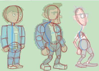
The left one looks pretty much like a tin soldier and doesn't really express anything and the shape is very simple as well as pretty boring.
The center one, even just by looking at the form, suggests a confident, relaxed and strong character, and the right a nerdish/loony char.
-
Without a good understanding of form/volume, creating the center and right character from that angle would be fairly impossible, unless traced. Going from drawing outlines to creating forms with outlines is a rather big step, but you'd want to take it as soon as possible since it has an enormous impact on the results.
Using manikins, like those above, is usually the first step in getting an understanding. Try reducing objects to primitives (such as balls, cubes, cones etc), then connect them with lines. When doing this, try imagining that you're sculpting 3d dimensional objects, not drawing on a flat surface.
Which primitives, how they're placed relatively to eachother and in what manner they're squashed (such as the squashed ball for bernards head) will determine the characteristics and is usually the first step, long before any details such as clothing, facial features etc.
For instance, in the center figure you'll notice that the thorax "ball" (it's quite deformed) is larger than the pelvis ball. If you compare this to the right character, you'll notice the opposite relationship and this gives the impression that the centre guy is strong, whereas the right would be considered weak unless proven otherwise.
If we were to compare the position, rather than size of the pelvis and thorax balls again, which usually have the greatest impact, you'll notice that the pelvis of the right char is heavily pushed forward, whereas the centre guy's is position roughly beneath. This adds to the impression of a weak, geeklike character to the right, and the slight forward push of the centre guy adds a relaxed air.
These things and more are discussed in this book by Andrew Loomis which I recommend:
http://www.saveloomis.org/fun/1.htm
I think pixelart can be a severe hinder, unless compensated with hi-res drawing, in developing a sense for form/volume and I suggest doing hi-res sketches of the characters prior to beginning with the pixel pushing (which is most likely what the LEC artists did).
Btw, I've never understood why showing the whites of the eyes in this resolution is so popular around here. I can't really recall any fairly normal human characters from lucasarts/sierra that featured them, but my memory is admittedly lousy. As for bb's character, I think it could've unaltered been included in DOTT without anyone taking notice.
If you'd make simple manikins of these characters, they would look something like this:
The left one looks pretty much like a tin soldier and doesn't really express anything and the shape is very simple as well as pretty boring.
The center one, even just by looking at the form, suggests a confident, relaxed and strong character, and the right a nerdish/loony char.
-
Without a good understanding of form/volume, creating the center and right character from that angle would be fairly impossible, unless traced. Going from drawing outlines to creating forms with outlines is a rather big step, but you'd want to take it as soon as possible since it has an enormous impact on the results.
Using manikins, like those above, is usually the first step in getting an understanding. Try reducing objects to primitives (such as balls, cubes, cones etc), then connect them with lines. When doing this, try imagining that you're sculpting 3d dimensional objects, not drawing on a flat surface.
Which primitives, how they're placed relatively to eachother and in what manner they're squashed (such as the squashed ball for bernards head) will determine the characteristics and is usually the first step, long before any details such as clothing, facial features etc.
For instance, in the center figure you'll notice that the thorax "ball" (it's quite deformed) is larger than the pelvis ball. If you compare this to the right character, you'll notice the opposite relationship and this gives the impression that the centre guy is strong, whereas the right would be considered weak unless proven otherwise.
If we were to compare the position, rather than size of the pelvis and thorax balls again, which usually have the greatest impact, you'll notice that the pelvis of the right char is heavily pushed forward, whereas the centre guy's is position roughly beneath. This adds to the impression of a weak, geeklike character to the right, and the slight forward push of the centre guy adds a relaxed air.
These things and more are discussed in this book by Andrew Loomis which I recommend:
http://www.saveloomis.org/fun/1.htm
I think pixelart can be a severe hinder, unless compensated with hi-res drawing, in developing a sense for form/volume and I suggest doing hi-res sketches of the characters prior to beginning with the pixel pushing (which is most likely what the LEC artists did).
Btw, I've never understood why showing the whites of the eyes in this resolution is so popular around here. I can't really recall any fairly normal human characters from lucasarts/sierra that featured them, but my memory is admittedly lousy. As for bb's character, I think it could've unaltered been included in DOTT without anyone taking notice.
#568
Critics' Lounge / Re: Occultas Veritas - Background C&C
Wed 17/08/2005 20:45:33
Some more things:
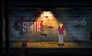
The saturated border of the lit bright areas are still there giving it a fake impression (the upper left mark).
The gradient of the bright part of the wall is still odd in that the brighter parts are at the farthest corners, which is quite the opposite of what I'd imagine how it would be, and makes it look like a selflit wall.
Another thing is the lighting of the wooden board in the lower left. Atm it appears to be shaped something like a gold ingot, you know, with those tilted edges. If the surface isn't visable from the light's position, it shouldn't be lit, and if visable, evenly lit if flat (unless close to the lightsource, like the wall).
-
Anyway, I love that sortie sign and think case the background is vastly improved. I think a common mistake is to move on way too quickly from a picture to the next. This means the next one will feature the same things that is holding the last one back and the progress will be very gradual.
The critics lounge is a prime tool to steepen this curve, since it features work on all levels, meaning that anyone can find work that is roughly on their level and skip the whole timeconsuming process of actually drawing/painting and start at the point where they have trouble figuring out what's actually wrong, and how to improve it. Everytime you find something that you think can be improved, and manage to improve it, you've automatically raised your next image up a notch. If this is true, and I believe it is, you can improve your abilities vastly faster by criticising other's and your own work than by painting/drawing new images, if by criticising we mean practically improve images on roughly your own level.
I think it's a shame that few people use this tool in this selfish manner.
#569
Critics' Lounge / Re: Improving my skills...
Wed 17/08/2005 16:53:38
Some crude modifications:
x2

I think the main problem is values. The lightsource is undefined and along with the muddy strokes makes it hard to read and not very convincing.
Getting the values down early on will save you an incredible amount of work, energy that you can spend on getting the details down in the latest stages. One of the most common quite fatal mistakes made is to start detailing right after the sketch is made.
When laying down values, try to reduce the shapes to simple primitives and look up how these look when light hits them. It's worth taking a look at this even if you think you know how light hits a ball for instance, since many have the misconception that it's similar to a circular gradient.
This will rid you of problems found in this image such as similar values on both sides of the head, that is, if you sample the values on the left and right side, they are quite identical. The head can be reduced to a squashed ball and if look at a ball lit up by a main lightsource (often referred to as 'key light') you'll notice that the values on the side in shadow are substantially darker than on the opposite side. If this fact isn't taken into consideration, the object will seem flat and quite often dull.
Another way to approach lighting objects is imagining looking at the object from the lightsource's position. Everything you can see from that position should be lit, everything else should be in shadow (which means it should be black unless: the area is lit up by another lightsource or bouncing light, which is pretty much always the case). The lit areas will have different intensities depending on how directly the light hits them. For instance, if it's a ball, the edges will be hit by light but much less than the center surface.
Lastly, there's highlights, which exist if the surface is reflective and works like a more or less clean mirror. This means that their position will depend on from which angle you're looking at the object, and like a mirror, the light will bounce off the object into the eye of the viewer, more or less intact; if the surface is clean, reflective and flat, the lightsource will simply be mirrored intact (you can see the lamp/candle/whatever in the surface), and if the surface is dirty, hardly reflective and deformed, the lightsource will be scattered and vague. Highlights might be the most missused part of all of this and more often than not screw up objects rather than improve them.
Anyway, I like your strokes and textures, apart from the mudiness, and the design is imaginative, but like the last piece it falls quite heavily on its values. On the upside it got more seperated from the background this time but I'd skip the bluriness.
Here's the messy photoshop file incase you have the prog
I made this image a while ago for another nitpick, but it might be helpful for you too:

x2
I think the main problem is values. The lightsource is undefined and along with the muddy strokes makes it hard to read and not very convincing.
Getting the values down early on will save you an incredible amount of work, energy that you can spend on getting the details down in the latest stages. One of the most common quite fatal mistakes made is to start detailing right after the sketch is made.
When laying down values, try to reduce the shapes to simple primitives and look up how these look when light hits them. It's worth taking a look at this even if you think you know how light hits a ball for instance, since many have the misconception that it's similar to a circular gradient.
This will rid you of problems found in this image such as similar values on both sides of the head, that is, if you sample the values on the left and right side, they are quite identical. The head can be reduced to a squashed ball and if look at a ball lit up by a main lightsource (often referred to as 'key light') you'll notice that the values on the side in shadow are substantially darker than on the opposite side. If this fact isn't taken into consideration, the object will seem flat and quite often dull.
Another way to approach lighting objects is imagining looking at the object from the lightsource's position. Everything you can see from that position should be lit, everything else should be in shadow (which means it should be black unless: the area is lit up by another lightsource or bouncing light, which is pretty much always the case). The lit areas will have different intensities depending on how directly the light hits them. For instance, if it's a ball, the edges will be hit by light but much less than the center surface.
Lastly, there's highlights, which exist if the surface is reflective and works like a more or less clean mirror. This means that their position will depend on from which angle you're looking at the object, and like a mirror, the light will bounce off the object into the eye of the viewer, more or less intact; if the surface is clean, reflective and flat, the lightsource will simply be mirrored intact (you can see the lamp/candle/whatever in the surface), and if the surface is dirty, hardly reflective and deformed, the lightsource will be scattered and vague. Highlights might be the most missused part of all of this and more often than not screw up objects rather than improve them.
Anyway, I like your strokes and textures, apart from the mudiness, and the design is imaginative, but like the last piece it falls quite heavily on its values. On the upside it got more seperated from the background this time but I'd skip the bluriness.
Here's the messy photoshop file incase you have the prog
I made this image a while ago for another nitpick, but it might be helpful for you too:
#570
Critics' Lounge / Re: Occultas Veritas - Background C&C
Sat 13/08/2005 19:19:12
Relief to see most evil neutral colors gone.
Couple of other things I'd change:
I) Surfaces
One thing that has remained from the original pic is the flat surfaces. These work well in isometric styles but once you start going for more painterly like qualities they'll add a sterile unconvincing look.
It boils down to gradients really, which if used in one manner can nauseate beyond belief, but in another emulate real-world conditions making the enviroment seem believeable and thus hopefully increase the immersion.
In the edit I've tried maintaining the lightlevel of the surfaces while adding gradients, meaning I've made parts brighter and some darker.
In the center wall, I've made the bottom lighter and also made the color more neutral. This is due to the light bouncing off the floor up on the wall. The color changes because the colors blend, the warm light blending with the cool surrounding creating a sort of grey (opposing colors blended creates grey). Same goes for the walkway closest to the camera where I darkened the edges and brightered the center.
Darkened edges will lead the eye towards the center and usually adds some nice mood and is a common "trick".
Added a gradient on the lit up part of the center wall and ground as well.
II) Colors
The biggest problem as I see it is that the blue tint of the center wall isn't present elsewhere, making it seem like a blue wall, not a grey one. To remedy this, simply make sure to tint all other shadow areas similarly. The water/goo in particular has maintained it's hue too well.
Another problem that sticks out is the edges of the lit up parts on the wall, which are very saturated. As I mentioned, opposite colors neutralizes eachother, so the saturation should be low or it'll look fake.
I suppose you probably ignored the character when doing all this, but in order to get her to blend in she'll need to adopt the same hue as the light in which she is standing. The shading is also too "isometric" like to work imo, and I would go with simple cell shading.
III) Misc
The wooden boards had a black outline which stood out.
The lit up part of the wall had an inversed gradient, where it got brighter further down instead of closer to the source.
Edit:
Don't agree. As Iain McCaig puts it, you must be ready to kill your babies; if it's not right it should go. Now, whether it's right is up to the taste of mr Mandarb, but keeping things just because you've spent time on them will just hurt the image.
Couple of other things I'd change:
I) Surfaces
One thing that has remained from the original pic is the flat surfaces. These work well in isometric styles but once you start going for more painterly like qualities they'll add a sterile unconvincing look.
It boils down to gradients really, which if used in one manner can nauseate beyond belief, but in another emulate real-world conditions making the enviroment seem believeable and thus hopefully increase the immersion.
In the edit I've tried maintaining the lightlevel of the surfaces while adding gradients, meaning I've made parts brighter and some darker.
In the center wall, I've made the bottom lighter and also made the color more neutral. This is due to the light bouncing off the floor up on the wall. The color changes because the colors blend, the warm light blending with the cool surrounding creating a sort of grey (opposing colors blended creates grey). Same goes for the walkway closest to the camera where I darkened the edges and brightered the center.
Darkened edges will lead the eye towards the center and usually adds some nice mood and is a common "trick".
Added a gradient on the lit up part of the center wall and ground as well.
II) Colors
The biggest problem as I see it is that the blue tint of the center wall isn't present elsewhere, making it seem like a blue wall, not a grey one. To remedy this, simply make sure to tint all other shadow areas similarly. The water/goo in particular has maintained it's hue too well.
Another problem that sticks out is the edges of the lit up parts on the wall, which are very saturated. As I mentioned, opposite colors neutralizes eachother, so the saturation should be low or it'll look fake.
I suppose you probably ignored the character when doing all this, but in order to get her to blend in she'll need to adopt the same hue as the light in which she is standing. The shading is also too "isometric" like to work imo, and I would go with simple cell shading.
III) Misc
The wooden boards had a black outline which stood out.
The lit up part of the wall had an inversed gradient, where it got brighter further down instead of closer to the source.
Edit:
Quote from: InCreator on Sat 13/08/2005 00:09:29
Covering such a lovely and detailed bg with darkness (as Loominous suggested) would be realistic, but sounds like a waste of hard work to me.
Don't agree. As Iain McCaig puts it, you must be ready to kill your babies; if it's not right it should go. Now, whether it's right is up to the taste of mr Mandarb, but keeping things just because you've spent time on them will just hurt the image.
#571
Critics' Lounge / Re: Occultas Veritas - Background C&C
Fri 12/08/2005 22:45:22
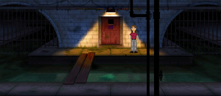
Would probably go for something like this:
Since there only seem to be one lightsource in a pretty large enviroment, most would be very dark. The light would've probably been a dull fluorescent lamp (which has a green tint) but a warm tungsten would provide more color contrast so that would've been my choice. A fluoroscent light would probably serve better if it's supposed to be a more scary looking enviroment though.
I like the wall textures and enviroment was interesting, but the lighting struck me as quite boring as you mentioned.
Edit: The very messy photoshop file
Edit II: Updated the files. Some things that struck me once I had posted.
#572
General Discussion / Re: AGS: The Comic #2
Thu 11/08/2005 23:41:32
This forum is degenerating.
Blake, I hope you ignore their loutish behaviour and stop posting threads for a while.
I think this section desperately needs some new approach to tackle unwanted posters because this is embarrasing and sadistic.
Blake, I hope you ignore their loutish behaviour and stop posting threads for a while.
I think this section desperately needs some new approach to tackle unwanted posters because this is embarrasing and sadistic.
#573
Competitions & Activities / Re: Background Blitz - voting starts the 22nd
Wed 10/08/2005 19:45:07Quote from: Alias on Tue 09/08/2005 21:44:07
One question will our background be worth less if we did use EGA?
Up to the voters I suppose. Since underwater enviroments tend to be very monochromatic (if you look at the reference pics everything is pretty much blue) EGA palettes shouldn't be that crippling.
#574
Competitions & Activities / Re: Background Blitz - voting starts the 22nd
Tue 09/08/2005 14:51:40Quote from: ildu on Tue 09/08/2005 14:30:35
Nice topic. I may just enter.
Glad you liked the topic, but please keep the thread free of "I may enter" posts, since they serve no purpose what so ever.
#575
Competitions & Activities / Background Blitz - Winner: Opo Terser
Tue 09/08/2005 14:26:41
The topic:
Ã, Sunken ship
Specifications:
Ã, None really, any resolution, any color amount
Inspiration:

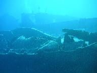

Ã, Sunken ship
Specifications:
Ã, None really, any resolution, any color amount
Inspiration:
#576
Critics' Lounge / Re: a piece of post-nuclear "art"...
Sun 07/08/2005 22:52:39
Some value/color mods:
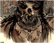
Upon looking at it the first time I had some trouble distiguishing the foreground subject. To make it pop out more you can lower the contrast in the background and increase the value range in the foreground. Increasing the saturation in the foreground and adding some color contrast will further differentiate it.
I'm personally not very fond of anything post-apocalyptic, but the character looks cool.
#577
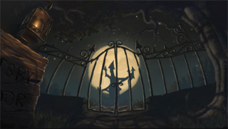
Competitions & Activities / Re: BG Blitz : July 13th - August 3rd*
Sat 06/08/2005 20:47:33Quote from: Floskfinger on Sat 06/08/2005 12:21:12
I'd vote for loominous too. That BG is amazing :o
Didn't the rules say that the size should be 320x200 pixels? :

Em, so it did I see. Here's a resize:
#578
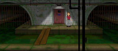
Critics' Lounge / Re: Double post updated First BG
Fri 05/08/2005 11:19:02
Some value/color mods

I think the values and colors are keeping the image back mostly.
The tree and pole both look like they're lit up from our viewpoint with a strong light, which could be feasible but spoils the mood imo.
The pitch dark value of the sky doesn't look convincing and robs it of some potential depth and horizon. There's usually some noteable gradient in the sky, at least towards the horizon.
The pure blacks in shadow areas robs it of a lot of detail and gives a fake impression. The human eye is very good at noticing value differences in dark areas (as opposed to brighter) and since all areas in the image are exposed to light from the sky and bouncelight from the moon (perhaps not beneath the wagon) we expect them to have some minor value variety (very little though, medium to high contrast in shadow areas completely ruins the impression).
-
The colors suffer from a very common mistake, in that they disregard the enviroment. A common approach, when picking colors is to pick pure colors, that is, if you wish to color something green, such as grass, you simply pick a green color. This seems logical, which is why it's so common, but is usually inaccurate to how it would look in real life.
Any object lit by a tinted/colored lightsource will adopt it's hue to a degree. In the image the strongest lightsource is the lamp which has a slight yellow hue. This means that the surfaces lit up by it will have slight yellow hue, but mostly pretty neutral/pure colors since white light doesn't tint.
The sky and moon provides the remaining light. The sky, being bluish will tint everything it hits (which is pretty all surfaces) in a bluish hue, and the moon provides some yellowish light (though not much in this case, it hardly being visable).
The blue light from the sky and yellow light of the moon pretty much neutralizes eachother being almost opposite of eachother (blending to opposite colors (such as red/green will render grey), so the saturation in areas they both hit will be low, as in all lowlight areas (which is partly why the grass doesn't look right in the original, the saturation being much too high).
-
All in all, I liked the lighting on the trashcan, the van construction, the pole and the treeshape. It seems like you did some heavy contrast alteration quite late in the process. This will mess up the values and colors pretty much and I wouldn't recommend it. I'd suggest spending a lot of time, after doing the initial sketch, on laying down values that looks convincing before moving on to coloring and doing any detail work. Working in a small format in this stage helps you to focus on the big picture instead of obsessing about details looking crap. If it looks good in a small format, it'll look good zoomed in, provided the neccessery details are added later on.
About the distant buildings, to push things back in a picture, simply blend them with the sky. If you're using a program with layers, just lower the opacity, or just pick the sky color and paint ontop of it with low opacity.
Btw, I liked the first version better with the moodsetting smoke and unusual pole.
#579
Competitions & Activities / Re: BG Blitz : July 13th - August 2nd
Wed 03/08/2005 14:07:17
Not very creepy looking, but then I don't like anything horror evoking.
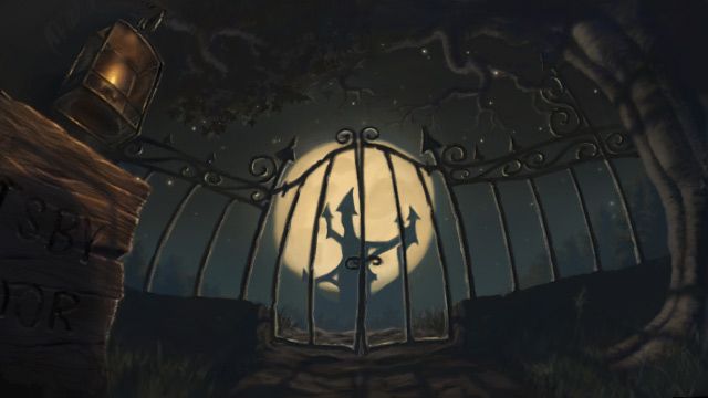
Wasn't able to post it yesterday, hence the late arrival.
Wasn't able to post it yesterday, hence the late arrival.
#580
Competitions & Activities / Re: sprite jam 26.7- 1.8.
Mon 01/08/2005 04:38:01
Quick, pretty boring last minute entry:

x2
Edit: Obeying the somewhat strict rule, 'tis Batman.
x2
Edit: Obeying the somewhat strict rule, 'tis Batman.
SMF spam blocked by CleanTalk