Menu

Show posts

This section allows you to view all posts made by this member. Note that you can only see posts made in areas you currently have access to.

Show posts Menu

Messages - loominous

#581
My, my, that's really good of you to take the time, thanks a bunch!

As I understand it the script only works with monospaced fonts, so I'm thinking of a solution for proportional ones, since the game depends on them.

The only way I've come up with so far would be to find out the width of each character and then have the script add those values up to figure out the current mouselocation.

Does any easier solution strike anyone?
#582
Could you elaborate somewhat? I'm not asking for the script, just an idea of how it could be made, functions to be used etc.

Atm I have no idea how to get the game to respond to clicks on text.

Thanks.
#583
Is it possible to select text as one would in a texteditor? My goal is to enable the player to select any text from the game (and save it), so cumbersome workarounds with clickable invisible objects or such isn't really an option.

Much obliged for any solution.

(To be completely clear, the player should be able to select single words, so just saving individual lines wouldn't do it)
#584
Critics' Lounge / Re: AMI - Background
Wed 13/07/2005 15:11:41
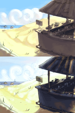
Some modifications:


I think it's a good attempt. There's value and color contrast which many pics in here usually lack. They're quite exhaggerated though which I think destroys the image.

It seems like you did a contrast adjustment after you painted the image. There's nothing wrong with this, but if it's really significant the values will get messed up.

The important thing is to keep the contrast low in areas that are in shadow from the main lightsource, and lack another direct lightsource. In your version there's quite some contrast at the side of the bar facing the viewer, which doesn't make much sense since there's no additional lightsource, atleast none that could compete with the strength of the sun.

Think you should also be careful with dark values in outdoor enviroments, especially blacks. In a sunlit enviroment there will be contrast, but that will usually range from medium dark to very light. Due to the sunlight bouncing off the reflecting sand and bright sky, most parts will be pretty lit up except concealed things such as the stuff beneath the bardisk.

Anyway, as I said earlier, I think it's a good attempt, just try getting the correct values down first, then color n such and make minor adjustments last.
#585
Critics' Lounge / Re: cliff
Tue 12/07/2005 09:15:13
QuoteI would use just black, and then adjust the opacity of the layer (that's the Mandarb method Smiley)

It's a good quick method and if you're new to photoshop and similar programs I'd recommend it too.

It does have a serious drawback however, in that the saturation of the affected areas will be reduced, which, depending on the opacity, can be quite devestating.

One way I prefer, which is just as quick although more advanced and probably intimidating, is to use a Hue/Saturation adjustment layer which features a 'lightness' slider. This one will maintain the original saturation better and will also give you control over the it and the hue.

So, in steps:

I) Create a Hue/Saturation adjustmentlayer, and make sure it's above the image layer (adjustment layers affects all layers beneath them).


II) Adjust the lightness level and click OK.


III) The whole image will now have been affected by the changes. This is because the quickmask, the white icon to the right of the adjustment layer icon, is completely white.

The quickmask basically decides what part of a layer will be transparent and what will be opaque. White areas will be opaque while black will be transparent, and greys, depending on the values, will be semi-opaque/transparent. Atm the quickmask is completely white, meaning that the whole layer beneath it will be affected by the adjustment layer.

Since you only want parts of your image being in shadow, you need to modify the quickmask to only affect the desired areas. You can do this in any way really, since the quickmask is simply a black and white image which you can change just like and ordinary image, by drawing, using the fill tool, using the lasso tool, applying level adjustments etc. So select the quickmask by left clicking on the icon and edit it in the manner of your choosing.


One of the handy things with adjustment layers is that you can adjust the settings at any time, in other words, the changes aren't permanent. You do this by doubleclicking on the adjustment layer's icon, the one to the left of the quick mask, and right of the eye.

You can have several adjustment layers, so for instance, you can have one creating shadowy parts, one applying a photo filter to give lit areas a warm tone etc.

Edit: PS9 was used, however any later version should work. Actually, any should work, but I don't think the earlier versions had the adjustment layer icon at the bottom of the  the layerpanel. You can access it through the menus in any case (Layer/New Adjustment Layer/)
#586
Critics' Lounge / Re: Derelict
Sun 03/07/2005 16:20:18
Quote from: Helm on Sun 03/07/2005 04:56:41
no offense and that's great and all, but editing pixel art in non-pixelly means doesn't help the artist besides academically in a 'what would it look like' fashion. You're obviously very skilled as an artist, and in the usage of photoshop, but pixel art entails a host of specifics which do not benefit from putting on layers and going in with opacity brushes.

I see where you're coming from. What a wanted to present was different lighting settings that I myself would've used, if technically possible. Pixel art isn't something I've taken the time getting into, and if I would've attempted a pixel edit instead it would've most likely come out quite unattractive, which would've misrepresented the idea, not to mentioned taken ten times the time.
#587
Critics' Lounge / Re: Derelict
Sat 02/07/2005 20:30:15
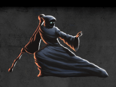
Since you seem into quite subdued lighting I'm not sure whether this will be any helpful:


More exhaggerated stronger sunlight version, probably more in the style I would've gone for:


-

The charming simplicity of the original is pretty much lost in both edits, especially the second. I think it might be recapturered somewhat with some color reduction, which would be needed in any case since the amount probably doubled or tripled.

Anyway, cool pic.
#588


Dress needs much improvement so I'll probably alter it before the deadline.
#589
x3

100%

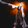
Ghost Pirate Elaine

Would've changed the lighting had I had the time.

Some things that might be misread:

I) The fire is meant to be her hair

II) She's supposed to be carrying a pistol with two huge barrels in her left hand.
#590
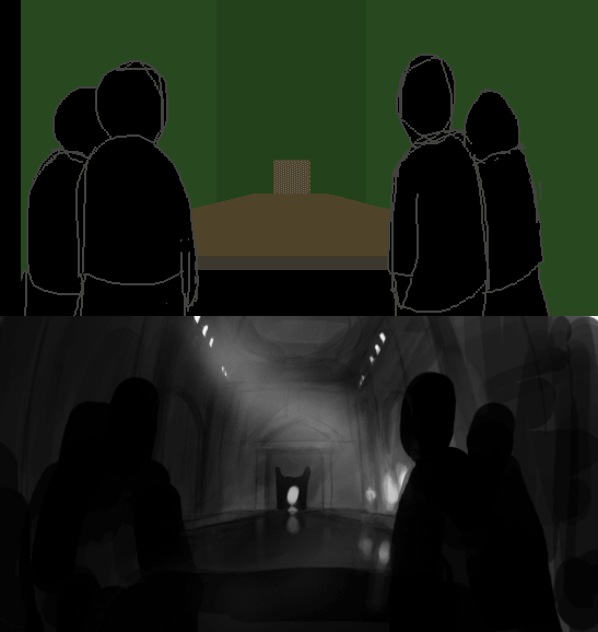
Quick value sketch (with screwed up perspective):


As people has pointed out, the perspective isn't the real issue.

Think the important thing is to provide references that the viewer is familiar with, such as human figures. Another thing is to use repetative objects, such as pillars, windows and similar.

In my modification I've used values to give the impression of depth. The foreground is dark, which seperates it from the background, and the values further away have less contrast. This is quite exhaggerated since we 're still talking fairly small scale but helps giving the impression and in this case makes it seem like the room has a thick atmosphere.

Using a 3 point perspective helps as well.
#591
Critics' Lounge / Re: Sprite Happens
Mon 20/06/2005 12:52:01
Small mods:


Her eyes were very high indeed and while it's tricky make them point in a good direction with a limited amount of pixels, pointing them downleftwards is probably not the way to go.

She also seems to lean forward in the original, so I straightened her out.

I really like the character btw.

Edit: Forgot to zoom it
#592
Quick edit:


x3


Nicked the helmet off Darth.

Basically made his posture more natural n lowered the belt/waist. By decreasing the width he'll appear taller n more adult.
#593
Really quick edit:


x3


Basically raised the crotch to make her legs longer and flattened her feet area to increase the height giving her more adult proportions.

Her arms gave her a masculine look due to their outwards arc. The closer the elbows are to the waist the more feminine look, and I went with some sort of compromise.

Feet were quite large n pointing outwards, something giving her a masculine n clownish look.

#594
Critics' Lounge / Re: Portrait sketch.
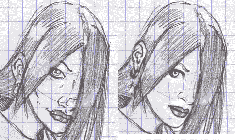
Sun 29/05/2005 16:03:43
Some modifications:


Some things making her look old:

I) Long face

II) Pointy chin

III) Lack of eyelids

IV) Random lines in the face giving the impression of wrinkles. The smoother the face, the younger

-

Some other things:

I) Her ear is set very low for the headtilt.

II) Her eyes looks odd due to the linethickness of the lower line. The upper line is usually much heavier due to more eyelashes, shadows from eyelashes/eyelid, eyelid and eyelashes blending.

III) Make sure you make the iris round and the pupil centered. The eyes are the most important facial features to get right since we tend to focus on them and any oddities will be noticed immediately.

IV) I'd avoid small, seemingly random lines in the face. They tend to just make the pic messy and distort the face unless carefully applied.

-

General thing:

Pretty much all heads in this thread have perspective/shape issues. The best way to counter this imo is to do a proper headcontstruction a la Loomis. This will steadily increase your mass understanding which won't only aid you in drawing heads but any objects. The head is a complicated shape and if you master it you should be able to draw any shape properly.

The better understanding you acquire the less you have to lean on these constructions, so if they bore you, think of it as a step that you'll gradually get past.

In any case, it's looking better n better, hope you keep posting these.
#595
As hms points out it s somewhat hard to judge from a single background whether a whole style would work, but based solely on this piece I d advice you to elaborate on the style or find another one.

Judging by your other work you should be able to pull off something more solid, and while you re probably going for a style that is fairly fast as well as goodlooking, this style doesn t strike me as a good compromise.

Afraid I can t offer anything more constructive than this.
#596
Critics' Lounge / Re: C+C for friend, please!
Tue 26/04/2005 14:30:26
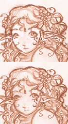
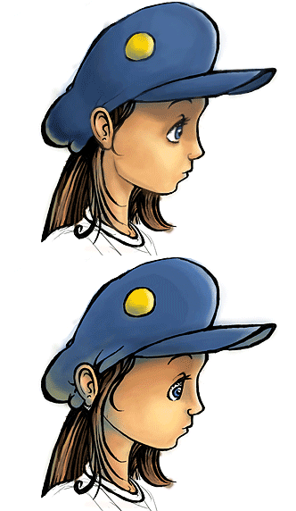
Quick face mod:


I) Looks like her left eye is too far to her left in relation to her right eye. That is, her left eye is further away from the centre than her right.

II) Her right eye looks too small vertically in comparison to the left eye, even with foreshortening taken into account.

III) The ears are very close to the eyes, which might be a feature of the character, but usually they re set way back on the head, past the centre.

IV) It looks like her right ear is connected to her right eye. Seperating that part with a cheek contour will help it make more sense.


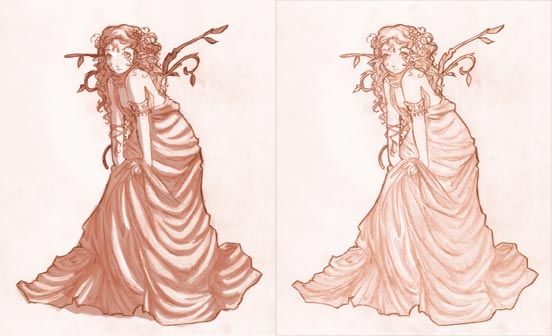
Quick, somewhat exhaggerated shading mod:


I) There was some shading done, mostly on the dress. Shading some areas more than others will render the unshaded areas very flat and the small value difference will make the image pop out only slightly.

II) Using a darker shade is as fast as using a lighter, and a single shadevalue per object is sufficient to create some depth so I d strongly recommend it.

III) Giving objects some values to distinguish them is useful even in a sketch. Since I m assuming that she has a white dress and white/yellow hair, what I would make darker would be the woodbranches.

-

Really nice sketch in any case, hope you ll post some more. The hair and decorations in particular look great.
#597
Critics' Lounge / Re: demon sketch
Mon 25/04/2005 21:18:24
Sloppy mod:


Since the head had quite some intense highlights, it looks a bit odd if the other surfaces that face a similar direction don t as well.

The lack of highlights/reflections in the upper armour/areas along with the relatively lit up front armour gives him a sort of a slacker pose as I see it, since the lit up areas lit up pop out.

Of course, in the end a matter of what looks best. Not sure if I prefer my version.
#598


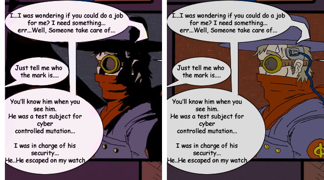
Think a standard inked shadow would work quite well. It s strong for well lit areas (and most others really) but since your comic seems to take place in mostly shady enviroments, it should work.

Some pros:

I) Quick
II) Creates dramatic scenes
III) Provides a classic comic look
IV) Easy coloring (no second shade to pick)

-

On a sidenote, I noticed that your linework is very rounded. There are two potential problems with this:

I) When working in 2D it s often adviced to exhaggerate "blockiness" to enhance the illusion of 3D, since well rounded and soft shapes don t suggest surfaces as clearly, and thereby tend to give a flat look.

II) Soft/rounded shapes tend to give a more friendly/feminine impression, and since you seem to aim for a sort of dark style, this may work against it.

Just a matter of style though.

-

Edit: Another thing. When coloring, a simple way to get the elements to connect to eachother, is to tint it towards some color.

A common mistake is to color things in neutral colors, as if shot seperately in a studio with white lighting. In reality, light bounces off and on all objects mixing the colors of the surfaces with the others, which is why you ll never find pure colors anywhere (if you observe a poolplayer leaning over a well lit table, you ll notice that regardless of the color of his clothes, he s pretty much all green on the side facing the table, caused by the light bouncing off the green surface of the table).

So by simply tinting the painting, you ll make the colors appear uniform and get rid it of neutral colors, which will connect the objects to eachother.
#599


The changes should be explanatory, or so I hope.

Nice casual lines and form. The shading is somewhat strange though and doesn't really help convey the form imo.
#600
I agree that coloring sounds like you ve merely chosen a colorscheme or used the paintbucket tool, so I would be hesitant to use the term myself. What you could do (and imo should do) is just to include: "Linework by X", which indicates that you ve done everything but the linework.

Anyway, I really like the overall values, lighting and color (I would ve made the some areas more saturated though). What I d spend some time on would be the wooden boards which have too even values imo, and on the clock, the upper portion mostly which, although very old and probably covered with dust, doesn't look metalic.

I'll wip up an edit I think when I get some time. Getting really hard to find areas improve though.
SMF spam blocked by CleanTalk