Need another vote to break the tie and get on with the next one.
- Welcome to Adventure Game Studio.
This section allows you to view all posts made by this member. Note that you can only see posts made in areas you currently have access to.
#602
Competitions & Activities / Re: BG Blitz - Voting starts the 24th
Fri 25/03/2005 18:57:27
Well, time to vote.
#603
Critics' Lounge / Re: Work sample; desert background
Sat 19/03/2005 19:17:12
Some pretty exhaggerated modifications along with inaccurate cast shadows (ca 150 kb)
-
Some issues:
I) The image tilts to the right
II) Depth. I don't think the cliff with the houses is pushed back far enough with colors and values. I exhaggerated a bit.
II) The lighting. My biggest issue is with the cliff with the houses. Please refer to the pic below and mod above which I think explains it best.
What we can see of the cliffwall to the right should be in shadow from what I can tell and can provide a resting place for the eyes with cooler colors. Make sure to neutralize it's color to compensate the strong sunlight color, which goes for all shadows (add violet/blue or simply lower the saturation, both will cool it down when next to the lit up parts yellow hue).
The foreground could use a bit more saturation.
The mountains on the horizon are lit up as if the light was coming from our direction. Same value issues as the cliff with the houses. The clouds have similar problems.

-
Very nice all in all though. Your linework's really good and I think lighting/shading is pretty much everything that's holding it back. Looking forward to your next piece.
-
Some issues:
I) The image tilts to the right
II) Depth. I don't think the cliff with the houses is pushed back far enough with colors and values. I exhaggerated a bit.
II) The lighting. My biggest issue is with the cliff with the houses. Please refer to the pic below and mod above which I think explains it best.
What we can see of the cliffwall to the right should be in shadow from what I can tell and can provide a resting place for the eyes with cooler colors. Make sure to neutralize it's color to compensate the strong sunlight color, which goes for all shadows (add violet/blue or simply lower the saturation, both will cool it down when next to the lit up parts yellow hue).
The foreground could use a bit more saturation.
The mountains on the horizon are lit up as if the light was coming from our direction. Same value issues as the cliff with the houses. The clouds have similar problems.
-
Very nice all in all though. Your linework's really good and I think lighting/shading is pretty much everything that's holding it back. Looking forward to your next piece.
#604
Competitions & Activities / Re: BG Blitz - Voting starts the 17th
Thu 17/03/2005 20:05:56
Oh. Deadline extended.
#605
Competitions & Activities / Re: BG Blitz - Voting starts the 17th
Thu 17/03/2005 02:03:24
Anyone else planning on entering?
#606
Competitions & Activities / Re: Sprite Jam: Ends March 15th
Tue 15/03/2005 22:12:47
Close call.

x3
Hope they're somewhat recognizable. A sort of blend between the char's development over the games.
x3
Hope they're somewhat recognizable. A sort of blend between the char's development over the games.
#607
Critics' Lounge / Re: myself - front view [edit: & sideview]
Sun 13/03/2005 23:07:36
His mouth and jaw are lower in the front view (and it's not a matter of sprite alignment, but pixelheight) as Helm mentioned, making him look quite different in the views.
The main problems in my opinion would be the neck and shoulders which make him look very tense.
Another thing is the shading, where you've pretty much restricted the shadow and highlight placement to the edges. This will make the edge of the character pop out, but the rest will remain flat.
Nice choice of pose though.
#608
Competitions & Activities / BG Blitz - Voting starts the 24th - WINNER: ZOOTY
Wed 09/03/2005 16:51:26
Topic:
---------------------
Film Noir Street
---------------------

Rules:
I) Greyscale
II) Unlimited amount of "colors"
III) 320x200 or 640x400
---------------------
Film Noir Street
---------------------
Rules:
I) Greyscale
II) Unlimited amount of "colors"
III) 320x200 or 640x400
#609
Critics' Lounge / Re: Jedi C&C
Wed 09/03/2005 12:41:21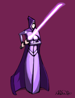
I liked the look of the original, except the shoulders. The lightsabre wasn't saturated enough imo to give a lightsabre-esque impression, and the lighting, while working, made it look like she was holding a white stick.
Anyway, nice style, one that I wasn't able to maintain in the higher contrast edit.
#610
Competitions & Activities / Re: BG Blitz | 19 Feb - 5 Mar | Unseen location | Ended
Mon 07/03/2005 22:05:09
Thanks for the kind comments.
New one will be up shortly.
New one will be up shortly.
#611
Competitions & Activities / Re: BG Blitz | 19 Feb - 5 Mar | Unseen location
Sat 05/03/2005 17:32:51
x2
Not sure if the right part of the room reads properly. It's supposed to be a desk situated in a about half a meter deep recess.
#612
Competitions & Activities / Re: Sprite Jamb Feb. 27 - March 5
Thu 03/03/2005 02:12:24
x3
Can't say that I have a favourite so I just picked one that seemed interesting and it fell on Artemis, the goddess of hunt and something else.
Been meaning to try out some figuredrawing on a pixel level. Turned out to be quite tricky.
#613
Critics' Lounge / Re: Trying out bigger sprite sizes...
Sat 26/02/2005 06:02:13
Sketchy mod:

I) There's quite a lack of contrast, particularly in the face which makes it very flat.
II) I'd try avoiding a common shading technique where you simply darken the edges of objects. This does provide some depth but distorts the object's shape and never really looks any good.
In order to place the shadows in a way which makes the object feel believeable you need to know the basic shapes of the object you're dealing with. I'd suggest holding up an actionfigure, manikin or something under a lightsource in a darker room and just noting where the light tend to hit and try connecting it to how the body is constructed, not in detail but the larger shapes. Anatomical knowledge is nice, but the important thing is to get an idea of the larger masses of the body, which will enable you to render light hitting it from different angles.
The face was shaded in a manner which suggested that the lightsource is somewhere above centre. The body however was shaded as if lit from front centre/right. A lightsource in front usually gives a boring result and doesn't feel appropriate since the position is rare in real life, so I'd stick to the above centre lighting of the face.
Anyway, once you know where the main lightsource hits, you know where the shadows are. How dark these should be depends mainly on the presence of other lightsources. If you're making a character in a pitchdark room with a single lightsource, the shadow areas should be pretty much black since nothing but bouncelight is hitting them. However, if the character is in an enviroment with much surrounding light of more or less equal strength, most shadows will be faint.
It's import to make a clear distinction valuewise between areas in shadow and lit areas or the lighting will look unconvincing. That doesn't mean there can't be a vast amount of shades/tones within these areas, but there should still be a clear distinction (unless the object is lit up by multiple lightsources of equal strength).
Once you start shading, I'd suggest starting with a two shades, representing the lit up parts and the parts in shadow. The contrast between them (how much brighter/darker the tones should be in relation to eachother) depends on the lightsources as stated earlier. Once you got these shades down in a manner which makes the _main_ shape of the object pop out, you can then start with smaller features, like folds and facial features.
#614
Critics' Lounge / Re: A witch's cottage (Abandoned background) with tutorial
Thu 24/02/2005 21:23:23
You seem to be aware of most of the issues so I won't bother with an edit.
Think another work order might've benefited the background in prioritizing the most relevant parts.
I) In order to get a more interesting layout I think you should ve started with loose sketches just tossing out ideas. Especially with a witchresidence you should be able to come up with pretty much any quirky layout while still seeming believable. Since the sketches are loose and quick you're not wasting precious time when discarding ideas.
When you've found a good layout you can correct the perspective and make a tighter sketch. Make sure you flip the page horizontally quite frequently to make sure it looks correct - the current background is leaning slightly to the left which could've easily been spotted at the sketch stage (in PS you can bind a key to this in the later versions for quick access).
II) In order to get the general values/colors right it helps if you start out by working with a thumbnail. Basically, resize the sketch to a small format (I prefer around 150xXXX, but depends on the image) and start adding values and, if you like, colors until the image looks good in this size/distance. If it does the chances that it'll look good later on are vastly improved.
By working in this format you force yourself to ignore details and focus on the general look/feel which will benefit the picture composition and save time since changes are quickly done.
III) Resize the image and use the old highres sketch, or just use the thumbnail as a reference.
At this stage you can safely start rendering objects in detail.
-
By doing these steps you ensure that the image is coming along in the right direction right from the start and can discard ideas (sketch, colorpalette, values) at an early stage with minimal time/workloss. Since the values and colors are set early on, the general idea, mood and composition is present at an early stage and details can be added as time permits.
Just some thoughts.
#615
Critics' Lounge / Re: Old Man's Pixelated Head.
Thu 24/02/2005 17:10:57
I've found that you can usually use very highly saturated colors, if you limit them to the lit up parts of the objects.
In my mod the brightest skintone has maximized saturation, however the darker ones have somewhat lower, which makes it more realistic and pleasing on the eye.
I also made the darker tones more pink while letting the brighter stay yellow. This is to simulate it being lit up by a yellow lightsource (like the sun for instance), lending a yellow hue to the lit up areas.
On the same note I gave the the white tone a yellow hue to simulate the yellow light once again, which also cools down the darker parts, creating some minor color variation.
I changed the light direction as well to provide more shadows which increases the depth and makes it somewhat more interesting, and added a rimlight on his right side for the same reasons.
Another thing is the usage of darker lines with darker areas around them, as in the forehead in the original. In my opinion this never really looks good, and I'd replace them with a single darker tone, skipping out on the lines. Lines in general looks bad in my opinion but that's just a personal preference.
His face anatomy was somewhat distorted, where his eyebrow line was tilted in one direction and his forehead in another. I did some other mods in the face which I'm not sure are correct but looked better in my opinion.
Anyway, I liked the original and this is just what I would've done.
#616
Critics' Lounge / Re: Inking practice.
Wed 16/02/2005 15:00:47
Some mods:
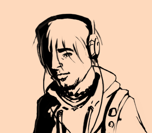
Very nice linework which I m afraid I messed up. Think perhaps you should make some lines thinner than others in a consequent manner. Usually, the lines on the surfaces which are well lit up would be thinner and vice versa which will provide some depth.
I wasn t sure as to whether you meant for him to wear eyeliners or not, but if you didn t, make sure you make the bottom line of the eye very thin or remove it, otherwise it ll look like he s wearing makeup or has abnormally heavy eyelashes.
Also added some shadows and made the headphones black to provide more value variation.
His ear placement was a bit odd, his left (our right) being to far up n back and his right too low and far out, as far as I could tell anyway.
Anyway, great lines, and overall nicely done.
#617
Critics' Lounge / Re: traditional pastel house
Fri 04/02/2005 13:06:57
Really like the colors though the lighting confuses me. The house seems lit up by strong warm sunlight which doesn't seem to hit anything else.
Nothing says you can't be creative with the lightusage of course, and it does create an interesting atmosphere. If you want the house to blend in more in the picture however, I'd apply the same light to the rest of the enviroment.
I'd also go with more blue in the house shadow.
Since I'm unsure what you want I won't bother with an edit. Nicely done in any case.
#618
Critics' Lounge / Re: Pro Mistakes
Tue 18/01/2005 19:09:27
"he did not manage to defend the use of divergent shadows."
I never intended to defend them since they were wrong (which I mentioned in my initial post).
I never intended to defend them since they were wrong (which I mentioned in my initial post).
#619
Critics' Lounge / Re: Pro Mistakes
Tue 18/01/2005 00:54:18
I never claimed that the original was correct. What I said was that it's not that far off, since the first post claimed that it was all wrong.
My vanishing point lines were adaptations to the original pic just to show that the current perspective n shadows, while wrong, wouldn t require much modifications to be valid.
Edit:
Yak: What additional rules are you referring to? As far as I know, the ones that I've used are sufficient to determine all shadow properties.
#620
Critics' Lounge / Re: Pro Mistakes
Mon 17/01/2005 22:45:04
This is the technique I m using:
http://www.saveloomis.org/fun/110.htm
Edit:
I now realise you weren't placing the lightsource but just showed the perspective. Thought you meant the moon was supposed to be placed that low which would result in much longer shadows.
http://www.saveloomis.org/fun/110.htm
Edit:
I now realise you weren't placing the lightsource but just showed the perspective. Thought you meant the moon was supposed to be placed that low which would result in much longer shadows.
SMF spam blocked by CleanTalk