Menu

Show posts

This section allows you to view all posts made by this member. Note that you can only see posts made in areas you currently have access to.

Show posts Menu

Messages - loominous

#621
Critics' Lounge / Re: Pro Mistakes
Mon 17/01/2005 20:37:29
As far as I can tell, they re not far off the mark:


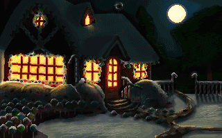
Snarkys positioning of the lightsource wouldn't really cast those kind of shadows; it needs to be higher up.

The right windows (our POV) are a bit off though.
#622
What time of the day is it supposed to be, and is it cloudy or sunny?
#623
Quick lighting mods:


What pretty much defines film noir visually is the use of shadows and contrast and I missed both (mostly the shadows), in the original version.

Nicely done otherwise though.
#624
Critics' Lounge / Re: A sea view
Sun 02/01/2005 01:11:23
Some lighting modifications:


Lit it up with some sunlight from the left. It had a kind of dull cloudy day look to it.
#625
Some sloppy lighting modifications:


Seems like you forgot the higher values. Everything looks like it lays in shadow which creates a pretty dull n uninteresting look.

If you're using photoshop or any similar programs, you can fix this quite easily though, and without editing the actual drawing.

There are various ways but I've come to prefer this method as of late:


1) Fill a layer with a desired color or greytone that you want added. If you'd like to add yellow light for instance, you'd choose yellow, if you want to add a blue shadow, you'd take dark blue.

2) Create a layermask (in photoshop by clicking on the button marked with red in the image above).

3) In the white box in the upper left corner, select an appropriate mode. There are quite a few and you can experiment with what they do.

3) Select the layermask by clicking on it (the black n white square beside the layerimage, marked with red in the image).

The layermask controls what parts of the layer that will be transparent, and which will be opaque.

It's shown as a black n white image, where the black areas are transparent, the whites opaque, and the greys semi transparent. A totally black layermask for instance will make the layer completely transparent.

4) You can now edit the layers opacity by either drawing, using the fill tool, using gradients or what have you, to make certain areas of the layer appear and other be transparent.

-

To see what the layers does in the image:

Click here (about 75 kb)

-
#626
Some quick lighting modifications:


A common mistake is to ignore the color of the light hitting the objects. Greys rarely exist as present in the original, because the light hitting the grey areas is colored.

The main color in the pic would be blue. This is due to the color of the sky, which is the lightsource that hits all (well, most) surfaces, even where the moon don't shine.

The areas the moon shines upon will have yellow added to them. If they hit the same areas that the sky does, they will become greenish since blue+yellow=green. Same goes for the light that shines out through the windows.

Placing the moon in the back, means that most objects will lay in shadow, so while it's nice to see the moon, the picture won't be very well lit (atleast at nighttime).
#627
Critics' Lounge / Re: Intro Comic...
Sun 26/12/2004 21:48:26
I like it, except the lighting, or what is commonly referred to as "shading".

In all views the lightsource is coming from the camera. There is nothing inherently wrong with this, but it can cripple the scenes quite much.

Some cons with it:

* Creates an often uninteresting look, the same kind you get in photos, taken with a camera with a flash mounted on it.

* Makes the objects less three dimensional.

* Especially when going for a detective/noirish style, the shadows plays a hugh role. By having the lightsource and camera at the same angle you efficiently kill most of them. A common thing is to have a single lightsource from above, leaving most of the face and body in shadow for a dramatic effect.


Judging by the drawings, I'd guess that the choosing of lightsources havn't really been an active decision.  A common thing is to simply "shade" the edges of an object. While this creates a more realistic look than no shadows at all, it pretty much always results in a bogus look, since the shape of the object isn't considered.
#628
Some sloppy, exhaggerated modifications lacking detail:

Around 80 kb, requires flash v7

One problem is the lack of brighter values. When peeking at the tutorial, it seems to feature the same oddity, which I guess may be part of the style.

Especially when using very dark shadows like in the original (pretty much pure black), it needs to be compensated in the higher tones as well or it'll look odd and unnatural.

Another important thing is the cool hue of the lit parts in your version. If the sun is the lightsource, it will add a yellow tone to whatever it shines upon, just like a lamp with a yellow filter. The greens in your version for instance, have a blueish hue, when they should have the opposite (yellowish).

The parts that aren't lit up by the sun, will be lit up by the sky which is blue, as well as by bouncing light. The same thing should therefor be applied to those areas, which should have blue added.

Another thing is the trees, which have a flat look to them. This is due to how the values are distributed on the object. Regardless of how dark you make the shadows, the distribution of the tones will define the shape of the object, and will render it flat if done, I hate to use the word but, incorrectly.

My modified version has been exhaggerated to illustrate the points, so if you're going for a more realistic look, you may want to reduce the saturation and the yellow channel.

I preferred the first version of your image with more lively colors. The details are well done as well,  though I don't like the black dither.

I'd suggest that you wait with starting on the details of the image before you've painted a sloppy version where you just pay attention to the vaules and colors, kind of like mine.

Edit: Btw, don'f forget to add cast shadows, they make a hugh difference.

Also: be careful when using the smudgetool. It may seem like it gives the image a more realistic look, since you don't see the sharp edges between fields, but I'd recommend that you do this by hand to get better control over the values.
#629
Some quick modifications to the main char:

x4 zoom


While I like the style of all of them,  the lack of depth bothered me, so I added some lighting.

I also did some alterations in his face which unfortunately made him look younger, and I wasn t able to correct this without altering his facial features too much.

Solid style, looking forward to the game.
#630
Critics' Lounge / Re: Clothing issue
Sun 07/11/2004 20:26:35
Some modifications:


Basically made their hairdoos more contemporary/strict, lowered her skirt and altered their jackets.

Anatomically I centered their eyes vertically, raised their crotches, altered their legs and made the woman s pelvis larger.
#631
Some quick inaccurate lighting modifications:

Requires flash 7 player (about 40kb)

Some notes:

(I) Since it s daytime, the omnilight (not directional) coming from the sky wouldn t leave the image so dark, so I d brighten the whole thing leaving dark areas in the lower parts of bushes etc where the omnilight n the directional light (the sun) don t t hit.

(II) Including the sun in the image makes it seem like a childdrawing (not at all saying that the rest of the image looks childlike). Also, if the sun would actually be visable, the whole image would pretty much be a large white blur because of the immense strength of the light.

(III) A tip is to let the areas in shadow have a blue hue, due to the blue tone of the light from the sky, and a yellowish hue in the areas that the sunlight hits.

(IV) Make sure that you make flat surfaces appear flat by keeping them in a single tone/shade. The housewalls in the image are shaded as if the light would hit the center of the walls more than the edges. This would make sense if they were bulging, but not if they re flat.

(IV) Picture the bushes etc as simplified geometrical objects and shade them accordingly. The bushes n treecrown is rather like spheres and can be shaded in a similar fashion.

If you don t know how spheres etc should be shaded, you can see what areas are lit/in shadow when holding a spherical object at a lightsource.

Nice, cozy picture all in all, which could be greatly enhanced by some lighting alterations.
#632
Quote from: MrColossal on Thu 30/09/2004 02:57:59
In an adventure game you usually know when you've come to a puzzle because it acts as a huge screeching road block that usually means you'll have to retrace your steps and pick up all that stuff you saw in the room before.

I d blame this on the standard point n click interface which narrows the puzzletypes down to almost exclusively inventorypuzzles, which in turn forces people to constantly backtrack to search for pointless objects to pick up, which in turn kills all flow.

Textinterfaces or hybrids, while suffering from other problems, evades this. So a step backwards in the interface would be a leap forward for the games as far as I can tell.
#633


The problem with the current shadows is that they assume that the that sun/lightsource is just outside the window.

If you stand right outside a window, you ll be able to see quite much of the room inside, while if you watch it from a distance you won t.

A mistake easily made though. The fact that you re considering the lightsource and try to be accurate will boost your images considerably in the future though, so I hope you keep it up.
#634
Critics' Lounge / Re: Helecopter shading
Mon 27/09/2004 20:38:18
Some sloppy modifications:

Requires flash 7 player (about 30kb)

Basically, what you need to do is imagine the helicopter as seen from the lightsource. The best way is to actually draw the object in the angle from which it is seen from the lightsource n then note all the areas that are _not_ seen.

These areas, which are in shadow, should be given a darker tone (how dark depends on the other lightsources; if there s a lot of ambient light for instance, the shadow tone should be pretty light; if there s no additional lightsources, it should be pretty much pure black (light bounces off object though, so if an shadow area is close to a lit up area, the light will bounce, if the angle is right, onto the shadow area, illuminating it).

Edit: When choosing tones, make sure you re not afraid of using contrasting tones. Something seen in pretty much all novices drawings/paintings is a lack of contrast which makes the image look flat n uninteresting.
#635
Critics' Lounge / Re: Knight needs help
Mon 27/09/2004 19:58:38
Some modifications:

Requires flash 7 player (about 90 kb)

Some notes:

(I) Changed the lighting in the face/helmet/armour to correspond better to a high midright lightsource.

(II) Changed his facial anatomy somewhat, while trying to stay true to the original.

(III) Changed the reflections in the armour to correspond better to the rest (the armreflections below his left arm shouldn t be visable as far as I can see, since the armour would be reflecting downwards n not upwards in that area).

(IV) Added some depth to the body/armour by adding shadows to some flat parts, particularly his right side armour/collar/belt.

(V) Changed the skintone on his left hand which totally different from his facial tone.

Really nice image all in all (but I like the face the least once again).
#636
QuoteApart from the fact that you totally changed the face - not just edited it [....] But to the face again; it's hard to explain perhaps, but there is nothing left from what I intended with the portrait in terms of style and mood.

I guess my modifications got a bit extensive, but they re all modifications, that is, I havn t redrawn anything, although nothing in the face really remains from the original version.

QuoteFirstly, I didn't want her face to look asian

Guess this was a clumsy assumption of mine. No offense was intended.

Quoteher skin-toned may be a bit too ghastly, but yours is just too rosy and healthy. That wasn't simply my intention.

I might ve compensated a bit too much with the rosiness I agree.

One thing to remember is that when you re used to a color, such as the color of her skin, you sort of get stuck with it and can t objectively judge other colors. So while mine seem very rosy, it s not infact as rosy as it seems as when switching between the two.

--

One thing I ve noticed is that you seem to highten the contrast using the contrast/levels function in PS.

The problem when doing this is that when increasing the contrast, you simultanously increase the saturation. While midtones n highlights can stand pretty high saturation the shadows will suffer quite badly, and the endresult will look unrealistic (even when going for cartoony style).

Speaking of shadows/darks, make sure you never go pure black. In order to keep the contrast strong, you don t really need to use the extremes (black n white), just make sure the values are dynamic.

--

Another thing is the values in the face which goes for the new version as well. The values you choose will pretty much determine how good/realistic/convincing it ll look in my experience, and I know of some artists who start doing the pic in black n white just to get the values correct from the start.

The problem in both faces as I see it, is that you re using the whole valuerange, even though nothing is really in shadow (since the face is lit up by other lightsources, I m considering the color below the cheekbone as the higher end of the shadowrange, that is, as dark as the face could get).

The face is lit from the front sort of, which means the light will hit pretty much the whole visable face straight on (with the exception of some eye n forehead areas n the nostrils).

Because of this, I d suggest that you d use the midtones for pretty much everything n highlights for the parts which reflects the light directly. So the shadow values wouldn t really be used at all in the face with a few exceptions.

It s important in my experience to save values like this n not try to include the whole range in each object, which might make the part lack contrast, but will be compensated by other parts.

Edit:

QuoteI made a prettier version of my lady, without going to the extreme cuteness of Loominous'

I tend to go for a handsome look on characters atm, not because I m a beauty fascist, but since since I want to master humans. I believe that once you can actually paint an ideal human, then you re able to give them them deliberate flaws to add character/make them more interesting. If you don t know how to create the ideal, then your characters will have flaws that you lack control over.
#637
I think the first one worked much better as well.

The sketch style of the buildings (the center one in particular) works really well and looks excellent (except the dome which seems to be lit by a really strong spotlight).

The face however drags the pic down considerably imo. The shape of the head seems distorted and the skintone sick and plain odd. The facial features are too inaccurate n sloppy to look good.

I m not saying that a sketchy style doesn t work in the face but it s very hard to get it to look good in my experience.

Some modifications:

Requires Flash 7 player (about 100 kb)

Some notes:

(I) Made the eyes more asian looking. They re still western in that they re set fairly deep.

(II) The far building had the same values as the front building, which deprived the pic of some depth.

So all in all, a potentionally excellent pic if it wasn t for the face and some other smaller issues.

Edit: fixed the link
#638
Critics' Lounge / Re: Characters
Sun 19/09/2004 13:54:24
Some modifications, featuring inept pixelation:


I m aware that both looks squinting, which I was unable to get rid of, but prefer over the stary look of the original eyes.

The style s loveably retro though.
#639
Could you provide a .mid file as reference? Would make it easier to critique.

Edit: what libraries btw?
#640
QuoteNo change necessary I think!

QuoteNo modifications needed.

QuoteAgreed. Don't even try to modifying it, it looks fine.

While my modifications might ve not improved it, very few things can t be improved. I might not be able to myself, but excluding the possibility is silly and discourages critique, which is what this place is about.
SMF spam blocked by CleanTalk