Menu

Show posts

This section allows you to view all posts made by this member. Note that you can only see posts made in areas you currently have access to.

Show posts Menu

Messages - loominous

#81
Perhaps it would be a good idea to break the thread off after the deadline, and have a new thread for each step. Would be a nice fresh start, and it would gather the pieces that moves on neatly.

The artist could simply post their last version as their new start, and thus we could also filter out a lot of pics.
#82
Main thread


Bit of refinement/modifications.

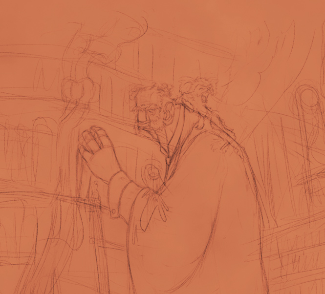
Thinking about adding a few of these kitten like creatures, perhaps giving his robe a hood where they would gather. Quickly sketched in two of them, and they do make the scene more interesting, particularly if they're not that easy to spot, adding some exploration. Overall gonna keep things in low contrast, with hopefully lots of nifty things to discover.
#83
Main thread


Reworked the char a bit, his neck in particular, giving it more of a straight line to his back, and fleshed out the backdrop with diagonal shapes n arcs.

Been thinking about ditching the ladder, and instead just make him this hugely tall guy, which could be cooler as well as avoid the whole ladder readability mess.

After I saw the cute creature in dactylopus' montage, and probably due to the fact that I've been periodically accompanied by a yawning kitten for the last few days, I tried adding one to his long neck. I initially thought it could be holding a candle, as I had some issues with the current lighting setup, and a candle behind him could help, but then I started fleshing out the background, and it seemed to work without it. I't s quite generic atm, so like with the char I'm gonna push it further.

The backdrop is working okish atm, wanna get a sense of scale and the windows might detract a bit too much, might end up hiding them and just have light haze be visible, we'll see. Also considering flipping the whole thing, as it would make things flow a bit better. (also, when I flipped it, way too late as usual, I noticed a lot of tilting issues, which I'm gonna have to deal with, along with the severely flawed perspective (I tend to be very loose with perspective when I sketch, just winging it, hate straight lines).
#84
Main thread

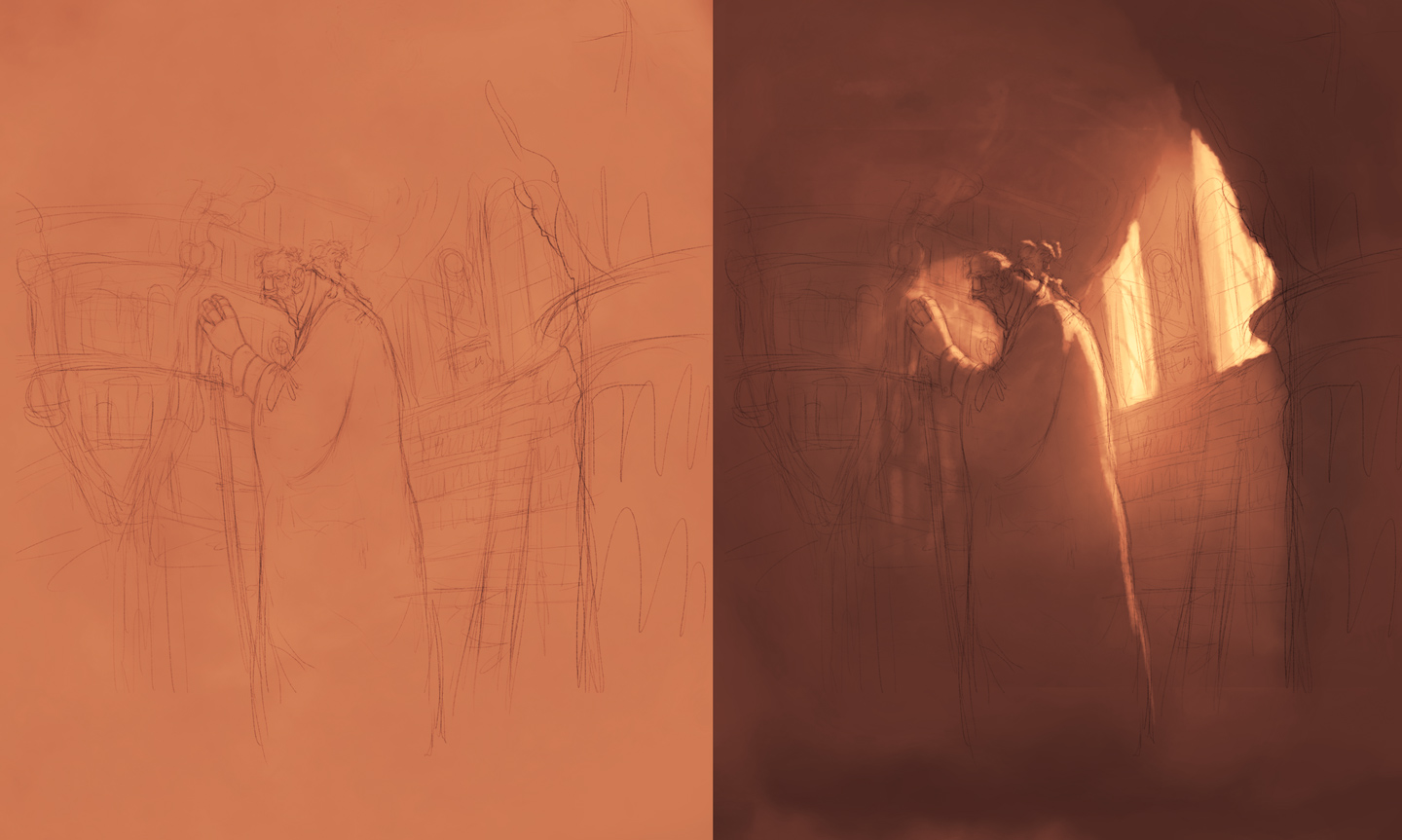
Started sketching on my monster intellectual and tried some lighting. The 'monster' label will be used in a Quasimodo fashion, where it denotes freakish qualities, rather than scary.

Still a bit too harmless human like, so the plan is to push the extremes further.

The character is supposed to be standing on a shelf ladder, in a library, which is hardly readable atm. The designs are quite generic, so I'll be researching and trying to come up with some nifty ones. The angle of the shelf and ladder will probably change as well, to better suit the back lighting, and making the character pop.

#85
Great initiative Andail, and will be cool to try out a new format!

After seeing ProgZmax's ogre, I did start sketching on one of my own yesterday, an ogre intellectual, or as close as they're able to get. It didn't look very monstery though, but I figure one could take the concept further, more towards the topic. (was a paper sketch, which I don't have with me atm, but I might find n scan it).

So yea, monster intelllectual is the current plan.


05-09 - Initial Sketches w lighting

Started sketching on my monster intellectual and tried some lighting. The 'monster' label will be used in a Quasimodo fashion, where it denotes freakish qualities, rather than scary.

Still a bit too harmless human like, so the plan is to push the extremes further.

The character is supposed to be standing on a shelf ladder, in a library, which is hardly readable atm. The designs are quite generic, so I'll be researching and trying to come up with some nifty ones. The angle of the shelf and ladder will probably change as well, to better suit the back lighting, and making the character pop.


05-11 - Further Sketching w lighting


Reworked the char a bit, his neck in particular, giving it more of a straight line to his back, and fleshed out the backdrop with diagonal shapes n arcs.

Been thinking about ditching the ladder, and instead just make him this hugely tall guy, which could be cooler as well as avoid the whole ladder readability mess.

After I saw the cute creature in dactylopus' montage, and probably due to the fact that I've been periodically accompanied by a yawning kitten for the last few days, I tried adding one to his long neck. I initially thought it could be holding a candle, as I had some issues with the current lighting setup, and a candle behind him could help, but then I started fleshing out the background, and it seemed to work without it. I't s quite generic atm, so like with the char I'm gonna push it further.

The backdrop is working okish atm, wanna get a sense of scale and the windows might detract a bit too much, might end up hiding them and just have light haze be visible, we'll see. Also considering flipping the whole thing, as it would make things flow a bit better. (also, when I flipped it, way too late as usual, I noticed a lot of tilting issues, which I'm gonna have to deal with, along with the severely flawed perspective (I tend to be very loose with perspective when I sketch, just winging it, hate straight lines).

05-12 - Some refinement/modifications


Bit of refinement/modifications.

Thinking about adding a few of these kitten like creatures, perhaps giving his robe a hood where they would gather. Quickly sketched in two of them, and they do make the scene more interesting, particularly if they're not that easy to spot, adding some exploration. Overall gonna keep things in low contrast, with hopefully lots of nifty things to discover.
#86
Critics' Lounge / Re: Let's Draw an Ogre!
Sun 05/05/2013 13:47:23
Quote from: Shane 'ProgZmax' Stevens on Sun 05/05/2013 00:35:29
Quote
This probably sounds confusing, but you go as far as you like with this.

No, it's not confusing at all, really.  I already understand the concept of reflective light quite well

I'm sure little to none of what I wrote was really news to anyone, but even though most people are familiar with the topic, we tend to ignore it, and treat every object as if it was lit independently in a white studio. Think it might a combination of focusing on other things, failure to put theory into practice, and plain ol laziness.

Going from dark to light is really the classical approach of painting, but takes a bit of getting used to. Just as painting on a bright canvas tend to make everything bright, going with a dark one tends to produce darker paintings, so it s just something to get used to and compensate for.

Re: ogre workshop, I d be up!
#87
Critics' Lounge / Re: Let's Draw an Ogre!
Sat 04/05/2013 19:21:42
Quote from: Shane 'ProgZmax' Stevens on Sat 04/05/2013 16:32:17
What sort of problems do you foresee happening as a result of doing things this way?

One problem with this approach is that it kinda assumes that the colours/values of objects exist independently, in which case you can simply work on them individually, and then in the end everything will work out fine.

The problem is that they don't. All that we can see are reflective surfaces, basically more or less muddy mirrors. And just as you can't paint a mirror without knowing what it's gonna be reflecting, you can't really paint any object without what it's reflecting, that is, if you're going to do it convincingly.

It's quite popular to talk about 'bounce light', but it really is a misnomer, because everything we see (apart from the lightsources themselves) is bounce light. It really is like a hall of mirrors, where the reflections never really end. If you're painting a soccer ball on a grassy field, the ball and the grass will be reflecting the sun, more or less diffusely, but the ball will also reflect the green grass which in turn is reflecting the sky and surrounding, and the grass will reflect the white ball with the sky and surrounding reflecting in the ball, and so forth..

To illustrate, let's say you're painting a pool player, about to make a shot.

If you go with the individual element approach, you might paint the head first. Let's say you start with black and white and am considering what colours to use.


Now, what skin tones should you use? Well, if you go with the individual approach, you'd simply pick some colours which you think seem like nice skin tones.

What you probably wouldn't do is to go with colours like these:


So what on earth are those greens doing in his face? Well his face, being a muddy mirror, it's simply reflecting whatever light there is, and in this case it's mostly reflecting the green table, because the main light source is obscured, so what we see is the lightsource being reflected in the table, which is then reflected by the skin (this is simplified, since the table is also reflecting the surrounding, which is reflecting everything else, including the table, which is then reflected in the face, which is reflected in in the table etc).


Now, adopting this truly when painting would be completely crippling, so what artists utilize are simplified models. In the case of the pool player, the artist might think: "hm, those shadows would pick up quite some greens from to the table", and when choosing the colour for the table they might go: "so the light source is yellow, and the room walls have a reddish colour, so the table would mostly reflect the yellow light, and only really reflect the red walls to any larger degree in the shadows, unless they're at an angle where they mostly reflect the bright portions of the table".

This probably sounds confusing, but you go as far as you like with this.

By the way, this is one reason why "tinted" paintings often look better, it's because in a way you've already made sure all the objects are connected, and seemingly reflecting one another, as they all share a colour.

I should lastly point out that while I've mainly talked about colours, all this of course applies to values as well, which is why all this has to be considered as soon as you leave the outline stage.

My advice would be to start out with a dark background, perhaps not black because it's tricky to sketch in, and then deliberately start adding light reflections to everything (if you start out with a bright background, you're kinda going to opposite direction, reducing unwarranted reflections everywhere, which makes little sense, really).
#88
Critics' Lounge / Re: Let's Draw an Ogre!
Sat 04/05/2013 11:00:55
I personally hate working in higher resolutions, don't like the feel of it, I like sensing the pixels, then again my stuff is kinda notorious for being rather unsharp, though that's also to do with the brushes that I use.

So I'd say work in whatever resolution feels best/is needed, the only thing it'll affect is the sharpness, the rest is resolution unrelated (unless you go really low res). I personally prefer drawing/painting in reses around 640x###/800x###, and upsizing at some stage if need be. Higher reses does give you the opportunity to work on minute details, but focusing on those is counter productive in many cases anyway.

Cool to see you try out hi-res. Could you post the sketch?
#89
Think it looks really good, though there are some things that clash with the style imo.

The sam n max style is heavily stylized, and uses a limited palette, and while you captured it well in general, the grill and smooth reflection deviates quite heavily, and kinda makes it look like a photoshopped screenshot.

If you look at the handle, which looks nice, it uses about 4 colours, even though it has a wide value range, and could've contained hundreds.

The grill and reflection on the other hand use smooth gradients with plenty of colours, even though the value range is rather limited.

So in these cases you kinda have to treat it as pixel art, where you have your palette, and kinda pick whatever colour is closest to what you re going for.
#90
So, anyone with forum creation powers wanna weigh in?
#91
Hm, unlike Leafshade the former activity thread did strike me as hard to follow when I looked at it the other day, particularly the feedback (which you often found many pages later, detached from the participants' threads), and I do think this needs to be addressed, particularly if we'd be moving in more of a collaborative CL direction, where things are bound to be even messier.

One way to counter the feedback lag would be to have the participants quote all the feedback in their progress post, though I'm not sure how this would work out, and doesn't address branching, as all branching could be considered feedback, and I just foresee one messy thread. Would also put place a burden on the participants to not only create but quote n organize, and might feel like too much work.

Another way would be to split up the activity thread into individual threads for each stage. Last time we kept all progress in a single post, which made the participant's main posts very anachronical from the rest of the thread. So with a separate thread for each stage, we'd at least compensate a bit for the feedback lag.

A separate board would be nice, and would solve some issues, though branching would still be a problem (when does a branch get a separate thread, does it? As we've seen in the CL, modifications can often be major revamps).

As creating a unique board for the one activity seems like overstepping some bounderies, perhaps there could be a workshop board, and as long as there aren't simultaneous activities, I suppose the dates should neatly clump the threads together, or perhaps there's some moderator trickeries that could be used to keep it organized.
#92
So, at least there seems to be some interest in a Character Workshop as well, while I'm taking the lack of responses regarding a game setting/world/script activity as an indication that there's less on the writing side.

As there seems to be less activity nowadays on the boards, do you guys think it would be best to have some kind of 'sign up' period, to allow people to get ready/read about it, or should we just go? Any preferable starting date, like before/during/after easter?
#93
Quote from: cat on Sat 16/03/2013 10:13:19
What about a combination? If people want to continue working on their own drawings they can do that, but other people are allowed to pick any result of last round to continue. This way noone has to worry that his work was useless and he's not allowed to continue with it, but others can join in later on or skip a round and continue later with a BG another person has started.

Sounds like a nice compromise, I'd be up for that version. The only drawback I suppose would be some potential confusion for new participants stumbling into the activity, as the format might appear a bit confusing, but some clear introduction text should take care of that, and would be a relatively minor con.

-----

Forgot to touch on the potential for hosting adjoining activities, like a writing/concept activity to create 'the script' (for those that didn't participate in last one, a small script was provided with details about the scene. (Could be more of them, such as sprite creation, world creation, character (writing) creation).

As a non-writer, I don't feel very qualified discussing the writing parts, so perhaps someone else could pick up the ball on this one?

Edit: Oh, and the same goes for the Sprite/Character design part, any interest in this? Do feel more comfortable hosting one of those, though someone else hosting should provide some nice new take on the whole concept/s.
#94
Quote from: Snarky on Fri 15/03/2013 23:43:07
The two possibilities I could think of was voting a winner after each stage, or actually working as a team towards a collaborative background, so that at each stage we pick two or three favorites, and everyone uses one of those as the basis for the next stage. I'm not really sold on either idea, though.)

I think a combination of these might work nicely, where it wouldn't be too dissimilar to how it works in the CL.

So at each stage people would branch out, some going for their own ideas, while others might simply modify/comment on other's. Then at the end of each stage, we'd pick let's say three versions (or one, dunno what would be best), and use these for the basis of the next stage. This would allow people with limited time to either just participate with some occasional branching, some modifications, or simply some commments. Think the fact that things kinda reset at the beginning of each stage might make it more encouraging, as we'd start anew, almost like a new activity, instead of demanding a longer commitment.

Course, there would be drawbacks, we'd be killing quite a few darlings, and people might feel intimidated or reluctant to contribute, which would really suck.

The last part really worries me, so some feedback would be appreciated, perhaps there would be some way around it (perhaps by picking entries from different skill levels at each stage, so that newbies feel like they have their place in the activity?).

The former format allowed people to tinker along with their babies in peace with friendly input, and perhaps this is what people would feel most comfortable with. In a way this new format might prove more valuable, as we'd be molding the same entry/s, trying to figure out what could be improved, which is usually an eye opener, though on the other hand there's a risk that only people with more developed eyes/skills would feel comfortable contributing, which would kinda suck.

Would be interesting to hear the opinions on this, particularly from painting newbies.
#95
Hello all!

I'd be up for a new one, have a bit of an uneven schedule, which I'm guessing applies to many other, so it would be nice if we could mold the format to allow people a bit tight on time to participate, without dragging it out too much - think the last one showed that maintaining a momentum is pretty crucial.

Not sure how this would be achieved, but it should be doable. I suppose we could simply keep it more casual, where people could simply spend as much time they have on the various stages and be encouraged to not worry so much about the final result - perhaps someone will have plenty of time during the composition stage, but not much on the rendering, or vice versa - but should still be able to get something out of it.

Just throwing out some ideas, thoughts?

#96
Critics' Lounge / Re: Tablet Portrait Test
Sat 05/01/2013 20:36:05
Oh, you can use it as a lighting foundation if you want, where you just push it further, but it was mostly just to demonstrate smooth/sharp value transitions.

Taking this route can actually be helpful, since you clearly see how much light all areas are receiving, whereas if you started by making areas darker/lighter (like making the hair darker, and the eye whites brighter), it would be more difficult to determine how much light they're picking up relative to the other areas.

So if you'd want to take it further, you just need to start adding colours/values to the different areas, as you have the basic lighting done (this "clay" basis lacks any highlights as well, so you'd have to add those, if you want any that is, as not all styles include them).

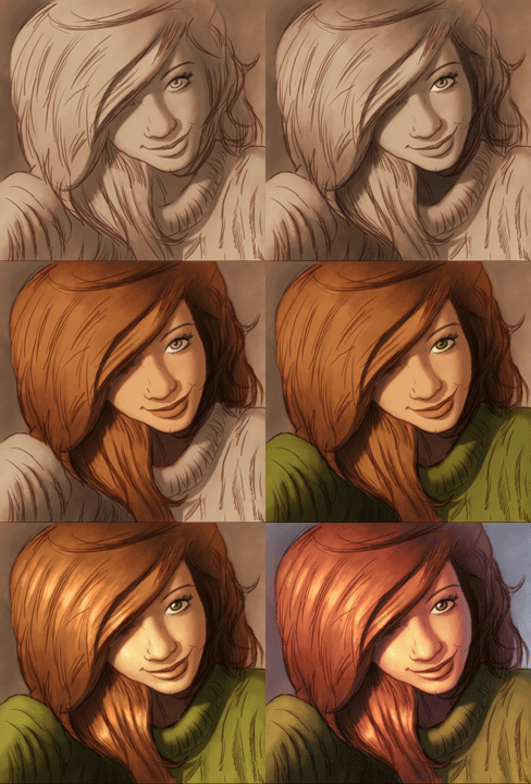
Here's an animated gif where I've taken it towards something comic book like (as you didn't want it too realistic), a style I'm not at all used to, so it's not very good, but it could be of some assistance I suppose:


(animated)

The psd file (1.5ish mb)
#97
Critics' Lounge / Re: Tablet Portrait Test
Sat 05/01/2013 12:01:33
Some excellent advice here already, so I'll just throw in a few cents about a somewhat overlooked point:

One common occurrence when people start using larger brushes is that they go for the big smooth ones, as they tend give a pretty decent result quite easily, perhaps not realistic, but something in the ballpark.

The problem with large smooth blobs, or at least one problem, is that they're not very good at conveying forms/mass, and one of the purposes of lighting/shading is to explain to the viewer exactly what kind of object they're looking at.

With outlines, this isn't a bit issue, we know how to read them (usually), and the lighting/shading mostly acts as a filler, but once you move to an outline free painterly style, things get rather messy.

So the trick is knowing when to go for the smooth brush (or paint it smooth(ish) with a sharp brush), and when to go for the sharp (or just a smaller version of the smooth brush).

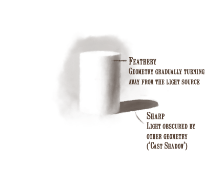
The following is a simplified take on lighting, but it's a pretty good place to start:


So here's a simple cylinder, and what you have are two different kind of occurrences: a large smooth light transition on the cylinder body, and a sharp cast shadow.

The smooth transition is due to the cylinder gradually turning away from the light source, reflecting less and less of it into our eyes.

The shadow on the other hand is sharp, since what you see is the light on the table obscured by the cylinder, which is a sharp solid object. (Note: this is a simplified take on it)

----

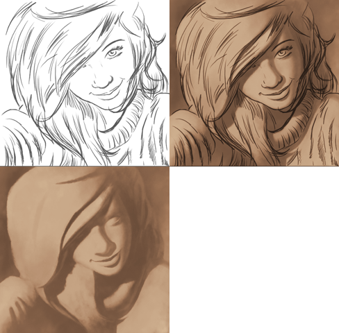
If we apply the same rules to your outlines (skipping out on details, and going for the larger shapes), it becomes something like this:


(animated)


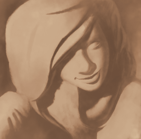
So what we end up with when we remove the outlines is something akin to a painting of some clay sculpture, where you can read the main shapes and light without outline assistance, which is kinda what you hope for when you're working on lighting.

(Should note that this is very simplistic lighting)

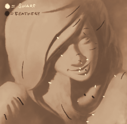
Here are the different transitions marked out:


----

So, that's pretty much it, making things sharp when they're supposed to be, and making them smooth when they ought to. Hope it helps!
#98
One thing you could experiment with is dynamics, which makes things more organic, exciting, and less computery.

You do achieve a build up by adding on more instruments, like the timpani at around :16, but you could amplify this by changing the velocity/volume of the instruments over time. Suspense music utilizes build ups, and dynamics in general, perhaps more than any other music, so it could be well worth looking into.
Speaking of dynamics, it's very rare for (trained) instrumentalists to play notes at a constant velocity/volume, so you could also try varying the dynamics of the individual notes. One way to do this in more aggressive lines is to emphasize certain notes of a repeated sequence. A common one is where you have a loud first note, have the following be more quiet, the third a bit louder than the previous, the fourth a bit more quiet, and start over. So in the case of the timpani, you could have the first hit being at velocity 127, second at 85, third at 98, fourth at 85, and repeat. (if you use a tracker program, rather than a midi sequencer, 127 represents the max volume value, so the equivalent might be FF, or whatever the software uses).

Quote from: AnasAbdin on Thu 20/09/2012 21:00:49
I feel the key needs revision. The instruments are beautifully selected but I can't seem to digest the key used, what is it?

The key seems to be C#/Db minor, not sure what you mean by it needing to be revised. (to play it simply take a C#/Db minor chord, then regress the base note a half step at a time - it's a very common sequence)
#99
It often helps to take a step back from the pic in these cases, and view it from afar (which on a screen means zooming out), which makes it easier to spot the big issues, without getting distracted by details.

The main thing that comes to mind is that the composition could be helped by tightening/grouping everything together a bit, where there's some breathing space left around the quite packed center.

Another thing would be to relieve it of some unnecessary details, such as legs, and resizing the less important parts, which helps create focus.

In this rough edit, I also introduced a purple "tone" for it, which went along the lines of that Disney ref pic, which may look a bit cutesy, but can be easily altered to look more serious/whatnot.


Side by side comparison:


Animated:


Elaboration:

The idea is basically to create a hierarchy of what's important. In the modified version, the eye is supposed to be drawn to the horse, which I made brighter and gave a warm hue, to make it pop a bit extra from the cooler purple main tone of the image, and hopefully thereafter to the princess, though it doesn't work all that well atm, despite her dark background.

By toning out her unimportant legs (rather crudely executed), we gain some breathing room, and allow the logo to pop out, and the resizing and repositioning of the dwarves on the left works in a similar fashion. By doing so we also get a more interesting overall shape of the whole image, which looks a bit like a mushroom cloud or something, instead of the rather chaotic impression the original's main shape gives.

The tone is basically a sort of ambient light, which ties the whole thing together. Instead of simply applying a colour effect on the whole thing, I applied it only on the background, and in the shadow regions of the content, as if they were all in a purple room, with a warm spotlight shining on them (didn't really do this to the witch or the fairies - I skipped the witch because she resides in her own environment, with a different lighting setup, and the fairies were skipped due to sloppiness).

The new composition suffers from balance issues, and is hardly finished, but might give you some ideas.

Anyway, nice pic!
#100
Nice entries!

Idea - oraxon
Atmosphere - Ilyich
Design - Cuiki
Composition - Mordellas
Technique - Ilyich

Btw, I would like to voice an objection about conflating Composition and Functionality, which in my opinion don't have anything to do with each other.
SMF spam blocked by CleanTalk