Menu

Show posts

This section allows you to view all posts made by this member. Note that you can only see posts made in areas you currently have access to.

Show posts Menu

Messages - seaduck

#21
Well.. drawing humans is not very easy - you still need to work on the anatomy

- she is way too "narrow" considering her height
- the waist is too low
- needs more feminine shapes, all her body parts are too long (again in relation to the body surface) and thin
- needs a more dynamic pose
- suggestion: less saturated colors are better as background

Since the problem is anatomy, painting-over wouldn't help much, so I rather tried to redraw it from scratch. I'm not very good at drawing humans, so I re-used a stick-figure from my older sprite for the pose (which was an alien; I just gave it more human proportions).

I don't claim it's very good.. I just wanted to have some fun - and possibly give you some inspiration.


The reason why my sprite is smaller and doesn't have shoes is... that I'm lazyÃ,  :P
#22
Critics' Lounge / Re: My first background.
Fri 02/06/2006 16:40:37
Now that's easily the best "first background" I've ever seen, gorgeous!

By the prickling of my thumbs, a great artist this way comes...
#23
You could also use a PC emulator, see http://en.wikipedia.org/wiki/Comparison_of_virtual_machines.
but you also need an OS to run in it (say, Windows 95 or Linux)
#24
OMG not THIS background AGAIN!!Ã,  ;D
#25
I just thought this thread makes it look like they are only two type of people: those who love Star Trek and hate Star Wars and vice versa. This can'tÃ,  be true.

I, myself, love BOTH the Star Wars Trilogy* AND Star Trek (especially TOS and the TOS-related movies).

(* intentional, I don't like the new movies)

I also like Red Dwarf and Stargate SG-1, for example, but I didn't see an extensive amount of episodes.
#26
For a first background it looks very good!

- never ever use lens flares
- never ever have the camera looking into the Sun
- your shadows indicate that the Sun is actually completely off the screen - no lensflare could occur

- the black outline of the house looks bad agains the sky
- the house appears to be floating due to the slope of the hill, that doesn't respect the house, and due to no background
- the grass must have been hell of a work, but it actually puts it down, because it doesn't get smaller with distance and makes the hill too flat

- the house should be standing on something (small stone wall or something like that), the grass should interact with the house, now it really looks as if you pasted the house over the grass pattern
the wood plank texture interacts with the terrace in a weird way
- the windows are lacking frames and pane-splits. shutters would be a nice touch
- the doorknob should be higher above the ground
- the ceiling seems to be a bit high (with respect to the windows and type of the house)
- the text "Fat Swan Inn" doesn't respect perspective, and is hardly legible

- the roof should extend farther beyond the walls
- drainpipes would really spice things up
#27
Critics' Lounge / Re: Sunset
Tue 30/05/2006 15:13:10
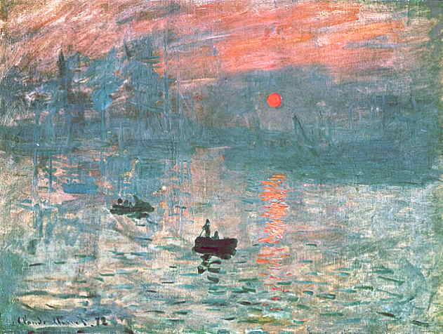
Sunsets are EXTREMELY difficult to draw (it's easier to avoid them) - they contain 2 very difficult elements:

- water (with ripples - must reflect the Sun)
- the Sun on the screen - you can't actually draw this at all unless the Sun is at least partially veiled in clouds - otherwise it's too bright.

Your Sun is too large, it should be rather small. It could be this large only with a very long telephoto lens, in a very special camera setup (say looking at a ship or island on the horizon).

Also the sun's outline should be clearly visible.

The most famous painting of sunrise: Monet's Impression - Soleil levant

A
#28
Critics' Lounge / Re: making a dome look curvy
Tue 30/05/2006 15:00:23


Remember, strong, dark outlines are not your friends.Ã,  ;)
#29
Yeah, this Kafka's Koffee guy can really draw, but I wouldn't recommend using his walkcycles as a reference. The leg movements are too exagerated (the legs move too far out) - the guy would be thus also walking too fast (try walking like that, it's impossible). Also the perspective is exagerated. His rear-view walkcycle is unusable - it looks too weird.

It kinda works for his cartoony characters, but definitely not for a more realistic sprite. I would suggest using e.g Indy walkcycles - they are much more realistic and simple.

#30
Critics' Lounge / Re: C&C on girl sprite
Mon 29/05/2006 18:51:38
A Spooks sequel, oh boy! Go Ivy!! Ã, ;D

The sprite is gorgeous, really.

It does look a bit flat, though. It is partly due to - as BigBrother said - the shading, which is very subtle (and in some places missing) and strong outlining. I tried to make the outlines less prominent, but didn't change the shading, as to respect your style.

What bugged me the most was the shading on the skirt, the shape of the skirt, and her right armpit, arm and hand, so I tried to change these.


Ã,  Ã,  Ã,  BeforeÃ,  Ã,  Ã,  Ã,  Ã,  Ã,  Ã,  Ã,  Ã, After


Quote from: The Ivy on Mon 29/05/2006 15:51:26
This game is going to be in 640 x 400, hopefully so I can showcase some decent graphics this time around.
What's that got to do with anything? I love 320x200, I think it was just fine for Spooks.

BTW: Your sprite uses 234 colours?! You should really get a paint program that handles palettes well, it will save you a lot of work (and colours!) You really don't need more than, say 20-30 colors for this sprite. (BigBro would instantly repaint it with 8 colours and it would look the same)
#31
You can also use music if it's copyright expired, such as classical music. This is what they did in the Nyet3 dos game and in this particular case it worked great. - This applies only to the music itself, not to a recording! You would have to either sequence it yourself, or find a free midi.

BTW: 90% of websites offering "free" midi actualy offer stolen files, that are copyrighted. By "free" they mean they let you download them without paying - but they don't care about copyright.
#32
Well, it's not bad, but since you want to make it better:

About the nail:

1. Most people (unless they have some nail problems) don't cut their nails so short: a normal short-cut nail on the thumb ends almost at the end of the thumb! There are a few people who cut their nails this short but that's just gross!

2. Nails tend to appear brighter than the rest of the skin, except for people with very bright complexion. (That's exactly what you've drawn - a very bright/pink skin and darker, pink nail background). So unless this is specifically a trait of the person holding the letter, you might want to add some tan to the skin, and to make the nails brighter.

Also:
3. The thumbs seem to be bent in the wrong direction in the joint closest to the tip. (As if it were pushing on the paper with an extreme force).

4. It is oversaturated, especially the outlines. Also, the outline doen't look good over the paper, since it's too contrasting. I'd either get rid of it altogether, or make it more subtle, and remove it over the paper.

5. Use your hands as a reference. (The anatomy and shading still need some work)

6. Do you need pohotorealism? Why not make it more simple? Drop the details and simplify the shading. You can leave out nails altogether - many cartoons do that and it works great.
#33
Critics' Lounge / Re: First go at making music
Thu 25/05/2006 09:21:56
First, I bow before thee, because I wouldn't be able to write something like that...

Ok, I'm not a musician, but I'd say you should add some velocity(=loudness) variation, also it seems to go on an on without resting, perhaps you could add more obvious breaks(or transitions or what's the right english term?) - let the music rest for a while, before recommencing with renewed energy (like when a human needs to breahte-in when speaking).

To the musicians here: Anyway, if I'm talking nonsense here, don't hesitate to tell me off.

Anyway, I like it, very good job!
#34
Completed Game Announcements / Re: Spooks!
Thu 25/05/2006 08:52:11
m0ds, you should really play it to the end, the ending sequence is so cool!Ã,  ;)
#35
Rendering:
- the perspective is too agressive (you can see 5 walls out of 6 - your focal length is too small), also why is the right wall's surface greater than the left one, if you are directly facing the far wall?
- don't use black outlines
- put in a light source and shade accordingly
- using less colors will make your life easier

What you can put in your room:
What kind of room is it supposed to be? A basement room? Basement rooms have often irregular shapes, pillars, vaulted ceilings/uneven ceiling heights, small windows, they are full of pipes, rubble, junk (such as old furniture, boxes, crates etc.)
#36
To be honest, I'm baffled.

Had I not seen web gallery, I'd say you just don't beleive you can draw humans adequately, so you figured out that if you populate your game with amorphous blobby this, you won't have to draw humans. - I had the same idea for a platform game, some 10 years ago or so. - This of course is cheap and nobody will fall for it. The game will just suck.

..But I've seen your gallery, sporting many beautiful drawings, so I know that can't be the case. (At least if those really are your drawings).

But hey, what's with this blobby thing? I don't want to be mean, but this doesn't look like a work of a skilled artist, which you undoubtedly are.

Even if it's just a blob, it must be a 2D-rendering of a 3D character, not just a flat circle-exercise. It should have personality, style, flexibility (or else how will you animate it?), some interesting anatomy.

No harm feelings, I like your art very much - so I know you can do better than this!
#37
Use: [ img ]http://img167.imageshack.us/img167/5452/ghorts9wl.gif[ /img ] (without the spaces) to insert your image directly into your post.


Are you sure this is a sprite? I mean it's 400 pixels high, that's way too much for any resolution supported by AGS. This means:

- it takes tou many times longer to draw
- it will occupy too much memory/disk
- it will look hideous when scaled down

You should draw your sprite at the maximum size it will ever appear in the game. For most games, this is about 1/5-1/4 of screen height. (Thus 40-50 pixels high for 320x200, 90-120 pixels high for 640x480), or even less. (Indy from LucasArts, for example, is 50 pixels tall).

I higly recommend starting at 320x200 or 320x240, because its 4-times less pixels, four times less work, than hi-res.

I can see you started with a pencil sketch and scanned it. That's not a bad idea, but you need to scale it down radically. Also this particular pose will probably not work as a neutral standing image.

The head:
Now I know the head is intentionally big. I've seen children's animated movies that used big heads aswell. However, it might be better if you attempt a more realistic anatomy first. (First learn the rules, then bend them. Those movie artists knew very well what they were doing...)
#38
AGS Games in Production / Re: Square John Boy
Sun 21/05/2006 17:56:44
Indeed, the graphics of this game look fantastic, and the low-contrast, grayish colors convey the depressing atmosphere very well. This will be one hell of a game, no doubt about that!

Just one thing: In some rooms the ceiling appears to be very high, and the upper part of the screens (mostly back walls) are too empty. It would greatly benefit from some decorations (paintings, mirrors, etc.)
#39
This is indeed great news, InCreator!

I'm very pleased that the game I'm eagerly looking forward to playing is progressing well.

Quote from: InCreator on Sun 17/07/2005 23:19:27
There's few critical things I STILL haven't done yet, such as GUI (I might try making something different from Sierra-style)

As a big antagonist of Sierra-style GUIs I highly encourage you to do just that! There are many interfaces that are way better (The Dig, Teen Agent, Goblins 2/3, DOTT, Return To Zork)

Take your time, so that the puzzles stand up to the graphics!

All the best
#40
The characters don't stand up in quality to the background, which looks great. Also they don't match in style and colors/lighting.

The resemblances to Loom are striking (tree, characters). Take care not to loose originality.
SMF spam blocked by CleanTalk