Menu

Show posts

This section allows you to view all posts made by this member. Note that you can only see posts made in areas you currently have access to.

Show posts Menu

Messages - silverwolfpet

#21
Ack, super-sorry... forgot to add them. Here, done, I added them to the post above.

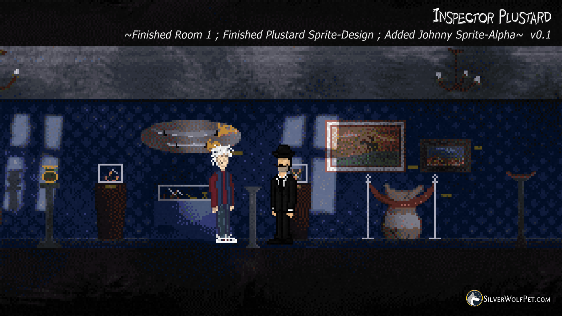
As for their personalities, Plustard is very uptight, very stubborn.
Johnny has a kid-like mentality.

If we'd be talking stereotypes here, think of Plustard as a grumpy John Cleese, while Johnny could be represented by a hyperactive Naruto.
This is a very, very thin characterization, but if it helps... :)

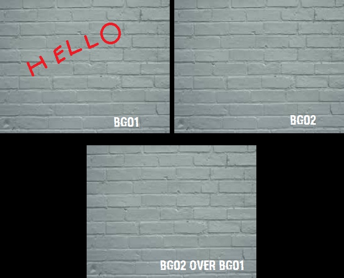
The flashlight works now, still need to tweak it but let me post a WIP screenshot. This is why I hesitate on going wtih "50 Shades of Gray" on Plustard ;-D - the flashlight should suffice in bringing him out of the background.
Although I agree on Johnny's hair and shoes, they should be darker.

#22
You are a genius, thank you!

When this game will be finished, I'll write your name in the credits!
#23
Using an object did the trick exceptionally well!

Looks good, moves good... now the ONLY issue remaining is that the circle remains behind when I move the character to the right.
It's like it is not updating its position via the mouse cursor.

So if I stay in the first part of the room, it's perfect. Once I move and start scrolling, it looks good but the circle stays behind and won't move past a point.

EDIT: Ok, gonna try the new code as well.

EDIT 2: Tried it and I'm getting some serious ghosting on the circle. The Object method seemed to be cleaner, hmm...

Maybe I'll just stick to non-scrolling rooms and that's that ^^'
#24
AHA!

Yes yes, now it seems to work! YES! Thank you!

Two issues appeared though:

1. The characters are behind the GUI, so we cannot see them. Do I have to set a different Zorder for the characters?
2. The BG02 does not scroll with the rest of the screen, it stays in place.
#25
Quote from: Blondbraid on Tue 03/05/2016 22:34:11
Looks like the game is coming along nicely, best of luck! ;-D

Thank you kindly! :-D

Here's the latest update. We're focusing now on walking animations, dialogue portraits and a functional flashlight system.

Spoiler
[close]
#26
Quote from: Monsieur OUXX on Wed 04/05/2016 13:02:33
the central issue is : CHOOSE A CHARACTER SIZE. Everything else is secondary. and then stick to it.
That includes CHOOSING THE SIZE OF THE FACE. Otherwise, later on, you'll have a lot of issues if you badly chose of many pixels should be used for the eyes, the nose, etc. There is only a handful of resolutions that actually work well.

I completely agree! We've spent the last days debating just that, comparing, testing... we think we finally got it.

Quote from: oareaso on Wed 04/05/2016 13:51:22
I like number 5 most, because of his big head, a big head helps to show his emotions easier, only his left shoulder feels a little weird to me and as Danvzare said the mustache is low.

Yes, true, then again we'll use portraits so all the emotions will be shown above the sprite. It's a little tricky to pull off, but we might just make it.
Mustache readjusted accordingly.

Quote from: Grok on Wed 04/05/2016 17:23:20
It the mustache is a trade-mark feature of the character you might want to exaggerate it and make it really big
[imgzoom]https://db.tt/jsRifC6A[/imgzoom]

That is a beautiful rendition of the Inspector, hahaha! Excellent work!
We'd love to tackle this look as it seems to be quite adequate - however we're really striving to finish this game till mid-August. It's a little challenge we're gonna tackle, so the fewer pixels, the better.
However, if this experiment goes well, we will most likely increase the number of pixels and, implicitly, the overall quality of the sprites.

STILL, you make a fair point there. We think we found the perfect balance to make it look good AND not give him a weird hillbilly-look. :-D

Quote from: Sinsin on Thu 05/05/2016 01:22:52

I had a little (not great) paint over session with this and played around with the stache,  I managed to make it a little bigger but maybe too big now lol.
I'm having some real issues shading that suit too.
If it doesn't help, at least I got some practice in
EDIT   just noticed that coloured pixel   DOH

This is pretty much identical to one of our drafts and tests. Yours actually looks a little bit better than ours ;)

That being said, taking into account all your suggestions, we think this final combined-look of Plustard will be more than ok for this game (at least until we gather more experience).
We also made Johnny's Sprite (the white-haired associate). He's still WIP, but we made a test shot with him too.

AND to take things further, we're gonna settle the issue with "the characters might blend into the background" by adding a flashlight support, which should be appropriate for a scary game. :P Here we go!


Focusing the emotions on the (upcoming) portrait sprites, keeping the style close to the background-art, all while balancing the real-life look with the cartoony tendency AND making them effective for (upcoming) scary scenes, this should prove to be the final version of Plustard and a good starting point for Johnny's sprite.


Whacchu think?
#27
Woah! Thanks for the help, guys!

@slasher - I'm not entirely sure I understand how that would achieve the result I am looking for, because it's not just one message that is hidden. I need multiple things to be visible and I probably shouldn't make 100 hotspots for 100 hidden messages. :-D Still, thank you for your answer! I used part of your code!

@Joe - That is precisely what I'm looking for. I followed your instructions to the T and I cannot seem to make the gGui1 with a transparent border and background (unless I use transparency at 100, if that is what you meant). Otherwise it just shows up as white.

I used Slasher's suggestion for making the Circle GUI follow the mouse cursor, but it won't do that. It just spawns in the top-left corner and stays there. Hm, the code seems fine, I triple checked everything. Maybe I'm missing something? I named everything properly, I checked the sprite numbers...

I use 32-bit colors.

The problems that seem obvious at first glance would be that the GUI is not following the cursor and that the BG02 sprite is not being spawned.
#28
Critics' Lounge / Re: My little beach
Fri 06/05/2016 12:39:44
I really like how you take into account the lightsource position (the Sun) and even the clouds have proper shading.
It looks really good. Is this only a part of the whole room you are working on, or is it the entire room?

I ask because the aspect ratio seems a tad off to what I'm used to see. :)
#29
Hello,

Yes, I've read the manual. Twice.
I've tried different scripts/modules. Nothing helped.

Here's what I want to do:

- a circle shaped GUI
- it has to follow the mouse cursor (or even better BE the mouse cursor)
- when hovered over the background, it must reveal a "hidden" image

Allow me to offer a little bit more details on the last part. :) 
I'm thinking of using two identical backgrounds (let's say a simple wall image) - BG01 and BG02
BG01 has a message written in red over it.
BG02 should go "over" BG01, covering it, making it look like there's only one image on your screen.


The GUI is hovered over BG02 and, only in the circle area, it shows what is underneath (respectively BG01).


I can make the GUI, I can create a room (BG01) and perhaps have BG02 as a separate GUI spawned over it.
I just dunno how to make the circle-shaped GUI "cut through" BG02.

Ideally, it would also be scrollable (left-right) so the images used can be bigger than the screen size.
The game I'm making is 320x200.

Could you please help me and tell me where to begin? Or perhaps I'm tackling this the wrong way?
I'm not exaaaactly a beginner, but this seems like something simple and I'm missing the obvious here. ??? Any advice is welcome and I thank you for your time!
#30
Quote from: Blondbraid on Tue 03/05/2016 17:08:21
I really like your new sprite, although the blue one seems a little bit bright, maybe slightly slightly darker (especially the rim of the hat, it sort of blends into the background)?
All in all I think it's an improvement.

Quote from: Danvzare on Tue 03/05/2016 17:43:15
Definitely a huge improvement.
Now THAT is a mustache. :-D

The mustache does look better and I think I'm a bit fonder of the black suit (as it is show-accurate). However, the backgrounds are and will be quite dark... maybe this can be a good thing, that he blends into the background sometimes? Maybe it adds to the creepiness?

We decided upon the opening scene (it takes place in a museum). What do you think?

#31
Quote from: Snarky on Tue 03/05/2016 15:56:25
You don't have to scale up the image before you post it. Use [imgzoom] to get a picture that can be dynamically scaled up in the browser.

Thank you for the tip! I noticed that, although it does make the images blurry (at least on my side, on Chrome). Thought I'd make it easier for everyone ^^
What do you think of the model, Snarky?
#32
Quote from: Danvzare on Tue 03/05/2016 13:57:16
I think (...) that's probably a good place to start.
Good luck. :-D

Quote from: Blondbraid on Tue 03/05/2016 14:34:46
Part of my brain thinks (...) Maybe you can try and zoom out the photo and see what the pixels look like?

Took both of your suggestions (thank you very much!) and tried coming up with a better sprite. It's also important to keep it in the same "feel" with the backgrounds. What do you think? Is it any better? Any worse?

I think we're getting there.


Big image (7Mb), even though it is PNG :)))
Spoiler
[close]

Quote from: Gurok on Tue 03/05/2016 15:08:14
That's a nice way of putting it! Go with the fourth option. That looks most convincing to me.
(...) If you'll excuse me, I have to go play a Poirot game now...

Oh, wow! That's SO nice of you to draw Plustard! We love it! :-D
Hmmm, you may be on to something there, with using a shade different than black. We've played with that and here's what we got so far:


Aaaand another big image to see the blending in action:
Spoiler
[close]

Hmmm... what do you guys think?

#33
Hello!

I'll keep it short. First, thank you for taking a look into this thread, every suggestion and advice is more than welcomed.
Working on a game (based on one of our webseries) - got stuck on the character sprite.

Screenshot from Webseries:


Sprites variants:


Enhanced Sprites variants:


As you can see, there's a bit of trouble when it comes to the mustache and facial expression. Trying to keep the game at 320x200, the mustache can be confused with his mouth. If we make it too small, he starts looking Charlie Chaplin. :)
Giving him a curved mustache will make him look "happy" or "smiling" which is something to be avoided.

The game is a thriller/mystery type of game, it has tense moments, scary environments but it also has a lot of humor in the "calm" parts of the story. It's quite tricky to balance this since the character must look good enough for a scary experience but also be animated funny for comedic purposes.

We'll be using Sierra-style portraits for dialogues, so the facial expressions should not be a problem.
What do you think?
#34
Quote from: Darth Mandarb on Tue 03/05/2016 01:47:33
Please review the forum rules and update your first post accordingly.

Also if you want feedback on the graphics post in the critics lounge. 

Apologies - we thought that by going with a "mysterious approach" we will make it sound more interesting. Same goes for the feedback request, thought it would be more interactive for everyone. ^^'
We changed the main post accordingly, offered plenty of info and we'll keep the rules in mind when posting. Sorry for the trouble. :)

We'll take this up to the critics lounge should we not find some middle ground regarding graphics.

Thank you!!

EDIT -- UPDATE:

Decided upon the first screen of the game (respectively, a museum) and re-made the sprite for Plustard to better resemble the character.

#35
AHA! First feedback, yes, thank you very much! Welcome aboard, Mr. Stupot+ ! ;)
#36
Howdy!

My name's Wolf, nice to meet you! Together with my brother, Mihai, we're making a game based on the "Inspector Plustard" series.
So far we've got this going:


We'll use Sierra-style dialogues (with portraits at the top of the screen).
The game will feature a Flashlight use and will be controlled via Keyboard and Mouse.


The story follows the adventures of Inspector Plustard and his associate, Johnny, as they solve a strange case. Typical murder/mystery stuff with a comedic twist.
The action of the game takes place between "The Fallen Groom" and "The Transylvanian Diamond" which are part of the "Inspector Plustard" Webseries we've been making.


The game starts off in a museum from which Plustard and Johnny have to escape because... well, spoilers. As you can see from the above image, we're slowly but surely starting to shape the game and its design style.


Progress so far:
Story: 19%  (if you focus only on the game and not the Webseries)
Rooms Finished: 9
Puzzles Implemented: 2
Music: 50% (we have the tracks and the major themes have been composed)
Scripting/Implementation: 17%

We're trying to make this in as little time as possible and we're looking into using live-video footage for the cutscenes, since the story ties in with the rest of our project.

If you have any questions, we're more than happy to answer!
Thank you for the opportunity of posting here. :D

#37
Judging by those stats I posted, I'm not sure if it was this game :)
I'm just happy that I found Michal, our current artist. He just sent me some incredible works right now and... wow! It's coming together nicely!
#38
Just a quick reminder... we're still working here ^^

#39
Small update:  We got three new awesome backgrounds for the game, made by Michal. This guy is working SO fast! Awesome!
Here's a teaser/glimpse:


Also, Jasmin finished the pick-up animations and the idle ones. We're now working on more complex-detailed stuff.
I need to program all this in the game and I will as soon as I can. Right now, I'm focusing on character design for... well, I don't wanna spoil it. :)

I also updated the stats in the original post. ^.^

Oh and to answer your question, if Michal doesn't one day tell us: "You all suck, I don't wanna be friends anymore"... we can confirm that the styles will be the same in each episode.

Ah, one more thing, we'll soon be releasing more episodes from Ask a Monkeyologist so you can become familiar with the Universe we're gonna throw you in, haha! Stay tuned.
#40
As promised, demo launched!


Quickly, click on the image! :D
SMF spam blocked by CleanTalk