My avatar is a self portrait 
This section allows you to view all posts made by this member. Note that you can only see posts made in areas you currently have access to.


Quote from: Radiant on Fri 23/11/2007 12:22:05
Aaah, wait and see!
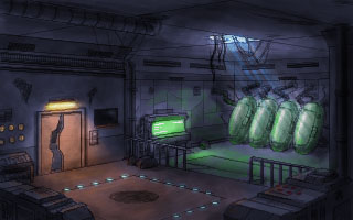
It's not a sequel. It is an adventure game. it's also high resolution.
Coming soon to a website near you.
Quote from: monkey_05_06 on Mon 26/11/2007 16:28:45
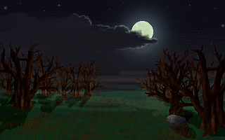
This reminds me of The Chub-Chubs.


Quote from: Sylvr on Fri 23/11/2007 22:22:40Quote
22 november -> 2 october (midnight!)
I'd like to point out that this competition is nearly a year long
In fact I expect A LOT of entries this time!


 )
)Quote from: Afflict on Mon 10/09/2007 18:07:43
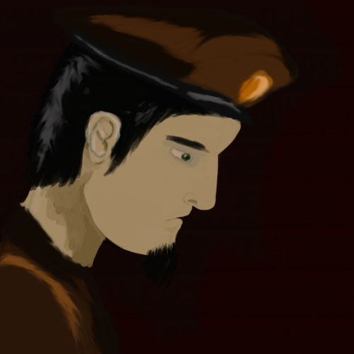
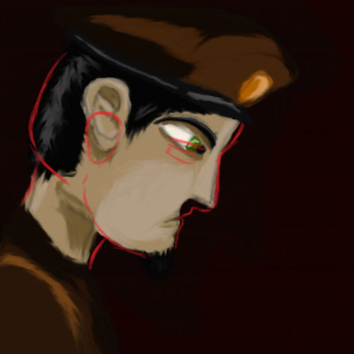
I like Progz's take on it, though it is a much older more mature Ben Jordan (or a brother), which I can totally picture with a leather jacket
Anyway ProgZ as always has done a really awesome job.
@ InCreator I really don't like the colors you are using atm. I would go with lighter tones.

Quote from: radiowaves on Sat 08/09/2007 00:12:33
PS is only good when manipulating something or just brushing.
Quote from: Snarky on Sat 01/09/2007 01:35:40
there's nothing to say that the roads have to be parallel to the castle.
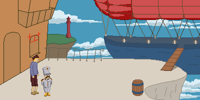
It's not exactly a run and jump game.. You play the squids by the way 
 )
)