Menu

Show posts

This section allows you to view all posts made by this member. Note that you can only see posts made in areas you currently have access to.

Show posts Menu

Messages - Drawken

#1
Topic.
Topic with the module:
https://www.adventuregamestudio.co.uk/forums/beginners-technical-questions/eblock-enoblock-and-looking-at-an-object/msg477380/#quickreply_anchor

Can't even get this working with older version of AGS? (!GotThere()) always gives the error "Parse error in expr near 'GotThere'
"
In the main script, if I'm not mistaken, "ProcessClick" needs to be replaced with "Room.ProcessClick".
And to call the module in the room script "GoFace" became "WalkFace" in the latest 2019 version.
What else am I missing? Or perhaps the module needs updating? Would really like to get this working. Thanks.
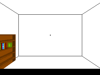
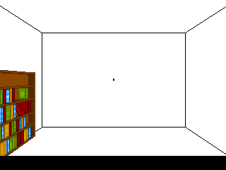
Code: ags
// room script file
int GotThere;

function oHall_Door_01_Interact()
{
  if (!GotThere()) WalkFace(104, 131, eLeft);
  else 
  {
  //code
  }
}
#2
Critics' Lounge / Re: Carousel Poster
Fri 24/04/2009 20:53:00
Is this an improvement?


\/ With added faint "beams" from windows. \/
#3
Critics' Lounge / Re: Carousel Poster
Tue 21/04/2009 23:55:33
Quote from: GarageGothic on Tue 21/04/2009 22:20:37
I'm not really crazy about the blurry patches of light cast from the windows (especially the ones on the roof of the two-story building seem a bit distracting)

What would you suggest I do with them?
I feel that there needs to be some light being cast from the windows, as the scene looks kind of "blah" without them.
Pehaps I'm not executing the lights correctly.
How would the light be coming from the windows in real life?
#4
Critics' Lounge / Re: Carousel Poster
Tue 21/04/2009 22:09:42
Here's an update.
To make "CAROUSEL" the main focus I erased all the embellishments that were in the lettering, then added a gradient and an inner outline. I also changed the colors and added drop shadows to the surrounding text, so they would blend a little more into the background, as they aren't too important.
Though the date and phone number are the same color as the rest of the text, I made it a bit bigger as it needs to draw some attention.
The director thought the moon was too "cratery", so I made it a little more realistic and dropped the outline.

minor edit -- I made it so the letters in "Rodgers and Hammerstein's" were connected. I also shortened the line in front of the "H".

#5
Critics' Lounge / Re: Carousel Poster
Wed 01/04/2009 23:23:02
Quote from: Kyrandiafan on Wed 01/04/2009 06:47:15
Looks good. Maybe make the title stick out a little more. It seems to get lost in the surrounding text.
The glows near the windows look too sharp and unrealistic. Only true directional lights (like the sun) produce that kind of shadowing.
I like the whimsical perspective. It looks much better in the latest version.

So, should the glow around the windows be taken out altogether, or be expanded?
I'll make the surrounding text of "CAROUSEL" smaller. I think that will solve the problem of "CAROUSEL" being lost.
#6
Critics' Lounge / Re: Carousel Poster
Wed 01/04/2009 04:01:02
Well, I sent the latest poster to the director, and he didn't like it.
Oh, well. It did help me to figure out how to get around Photoshop again.

He liked the first one, but I wasn't 100% happy with certain aspects of it. So, I redrew some of the buildings since they were too small compared to the others. I also redid the color scheme. I quite like the outcome, and so does the director. I think I can call this finished now, unless anyone has any suggestions.
#7
Here's a tutorial of how I would go about animating it.

1. First, in paint, make the bookcase blank, with no books. Save it as "back1.png"


2. Now, make shelves half way between the existing ones.


3. Then erase the top of the bookcase and cover up every other shelf, keeping the ones you just drew.
The bottom of the bookcase should also be in the ground. Save it as "back2.png"


So, now you should have two bookcases.
The normal one and the one in the ground.

4. In Photoshop, open "back1.png" In the layers menu, create a new folder and name it "Book 1". Copy and paste "back1.png" into that folder.
Underneath the folder "Book 1" create a folder named "Book 2".
Now File >Open  "back2.png" Copy and paste it into the folder "Book 2".


5. Copy the folders "Book 1" and "Book 2" and paste them under the originals renaming them "Book 3" and "Book 4". Do this a few more time until you have 11 "book" folders.

6. In the folder "Book 3", cover up the top shelf along with the backing (with the Pencil Tool). Do the same thing in "Book 4".
In "Book 5" and "Book 6" erase the top two shelves. 
7 and 8, three shelves.
9 and 10, four shelves.
11, all of the shelves except for the bottom one.

You now have an empty descending bookcase. (You should also color the new tops a lighter brown, or whatever color the top should be. The right side should also be closed off with the pencil tool.


7. Now, open your original bookcase and put it above the folder "Book 1".

8. Make a copy of the layer. Hide the original. In the copied layer, erase everything but the 1st row of books. Click and drag that into the folder "book1". (Make sure it is on top of "back1") Rename it "1st row" Click and drag it so it's lined up on the bookcase correctly.


9. Copy "1st row". Hide the folder "Book 1". Paste into the folder "Book 2". (Make sure its on top.)

10. Click and drag it until the books are in the general area, of the shelf, they need to be.
With the selection tool, (M) select each book, and moved it (V) up or down to where it should be on the shelf.


11. Copy that "1st row", hide the folder "Book 2" and paste it into "Book 3". Repeat step 10.

12. Copy from "Book 3" to "Book 4". Repeat 10.
Copy 4 to 5. Repeat 10.
So on and so forth.

13. After that's all said and done, go back to the original bookcase, at the very top, and unhide it. Repeat steps 8-12 with each row of books naming them "2nd row", "3rd row", and "4th row".

14. You will also have to do this, to some extent, with the lighting in the top shelf.

15. Now is the time you can go back to each folder and edit the perspective of the book, weather it be erasing or painting with the pencil tool. (I just erased the tops of the books where they were overlapping the shelf. I didn't bother with the lines on the books.)       

You should get something like this when you are all finished.


Hopefully this will be able to help you to create it yourself.
#8
Critics' Lounge / Re: Carousel Poster
Mon 23/03/2009 21:10:34
Alright, here's my latest attempt at the poster. What do you think?

Full Size:
http://img.photobucket.com/albums/v254/drawken/Poster_New_01.jpg


#9
Critics' Lounge / Re: Carousel Poster
Wed 18/03/2009 15:55:37
Here are two mock ups of a redesign of the poster.

The first poster pretty much mimics what I have in my first design but makes sure all the sides of buildings and boardwalk are all slanted "\" or "--". I understand that this isn't "proper" perspective but believe that this is more controlled than my first attempt. Do you guys think it looks good this way or should have a set vanishing point?

The second one I took KhrisMUC's advice and used two point perspective.

So what do you guys prefer?
The first, second, or the way it already is?
Or maybe something else?
Thanks.

By the way Andail, thanks for making me aware of "naïvism" I never heard of that style of art before. It doesn't seem to be too popular as I could only find 3 examples of it on the net.
Maybe I should try to mimic the perspective of this painting:
Full Moon by Edgar Calhado

I rather like it, and isn't too complicated.

Number one:


Number two:
#10
Critics' Lounge / Re: Carousel Poster
Sun 15/03/2009 16:27:45
Hmmm... I was aware of the perspective being off.
(Probably because I didn't use a set vanishing point. ::) )
I guess the reason I drew it that way was so It would fill up more space.

I'll take KhrisMUC's suggestion and draw it with a lower horizon and proper vanishing points and see what I think of it. I should have done that in the first place. It will no doubt look better.

I also didn't really like the text being off to the side but thought it fit better than going OVER the plank. I was thinking maybe moving the plank over a bit. But then it seems like the text is literally being overtaken by the sea.

Well, after I finish redrawing the pier I'll see what I can do about that issue next.
#11
Critics' Lounge / Carousel Poster
Sun 15/03/2009 03:45:28
I know this isn't AGS related, but I would like your guys help with this.

I was asked to design the poster for an upcoming production of "Carousel."
I'm still not finished with it and would love some input. (Colors, layout, drawing,etc.)
Thanks.

Full Size:
http://img.photobucket.com/albums/v254/drawken/Poster_04_mock.jpg


Resized to fit:
#12
Quote from: InCreator on Mon 29/10/2007 07:24:51
* Getting into thing. The intro didn't say anything to me, to be honest. A man hates the hamster. Next screen, lots of people, questions and confusion! I had no idea what's going on or who is who until later in the game. Intro could have shown the dinner, with people introducing themselves by hints in dialog or something like this, to understand what the hell was going on at all and where. Even a simple text, like "there's a dinner at Blackwin manor and he and he is invited and suddenly something happens blah blah" could give a better idea.
[/color]

I'm glad I'm not the only one who felt confused by the introduction. Now I don't feel so dumb.
#13
Lovely game. Great graphics. Didn't even notice the music was from other games except for the title screen, which I believe was from Maniac Mansion. All the music fit nicely into the game.
I had a fun time playing it.

I have to honestly say I was a bit confused, at the beginning of the game, when the answer choices came up when Ernest asked Lionel about his profession. I had thought that Ernest was the main character since he was the first one to be shown. I became brain dead for a couple of seconds and thought "Why is he answering his own question?". It finally clicked that Ernest wasn't the one answering. It was one of the two guys on the couch. (I would have known which one, had I actually comprehended beforehand what the LEFT guy said about being a psychiatrist.) Well, I finally found out who it was after selecting one of the answers, obviously.

Am I the only one without foreknowledge of this game to be confused this way?

Wow. I feel stupid.
#14
Critics' Lounge / Little Red Progress
Wed 25/04/2007 04:48:31
I've been working on this since yesterday. It's obviously not finished.
I was just wondering how it looks so far before I continue.
Any critique would be helpful.
Thanks.


May 1, 2007
Updated progress

I finally found a tutorial on pixeling skin. I'm quite pleased the way her head turned out. I also redid her hair to have tighter curls.
I rendered the right boot.
I made her basket a little bit bigger.
I thought framing the pic into a book would give it a nice look.
I styled the book a little like one of the "Into the Woods" logos.


Here are some pics I'm using as reference.


By the way, this isn't for a game. I'm just experimenting with pixel art.
  My brother is currently in a production of "Into the Woods" as Jack. The costume designs are really neat, so I sketched Red's costume. My Pixeljoint account is kind of lonely, so I decided to pixel her for my gallery.
  My brother's costume, as Jack, will be next.
#15
Great work. I really enjoyed your game.
I especially like the art style.
The trunk combination graphics and animated windows were nice touches.
I also liked it because it's one of the few games I didn't need any hints.
Hope to see more from you in the future.
#16
Critics' Lounge / Re: MonkeyIsland fanart
Mon 25/09/2006 16:59:40
Wow. That's neato.
I really like the foreground but find it blends a bit too much with the background.
Perhaps you could lighten the buildings etc. gradually as they get further into the background.
The arch on the beach looks to me like it would be a sign, probably the name of the town.
P.S. Saw your other pics on your website. Your MI style is great.
#17
Yay for no legs!
------------
COLORS: 16+1
SIZE: 50x146
------------
#18
I think even corridors would have chairs. At least the hospitals I've been to have chairs everywhere. (Gotta keep those patients happy.)
One thing that bothers me is the shadowing of the wheelchair. From what I can see, I would assume the bottom of the background is the wall, so it looks as if the wheelchair is stuck in the ground.
Ã,  Ã, In the hospitals I've been to they always have rubber "bumpers" along the bottom of the walls. I looked on Google Image search for "hospital corridor" and every pic has them.
Ã,  Ã, I just noticed the lighting, It looks a bit off, especially the bookcase and the light on the ground underneath the blinds. It seem to be placed randomly.
Ã,  Ã, The bookcase should have more, right now it's lookin' quite empty.
Ã,  Ã, The window shouldn't have ripples, it is inside, there should only be a few lighting streaks, perhaps sideways, and it should be lightened up a bit.
Ã,  Ã, Other than these nitpicks, I really like your artwork and spriting style! Can't wait till this is released.
#19
Critics' Lounge / Re: Female character sprite
Sun 20/08/2006 08:56:36
I know what looks a bit off to me, the leg on the left isn't the same proportions as the one on the right. Perhaps bulk up the left one, and maybe make it a bit longer, whatever you think looks best after editing. The way you have outlined the legs, it makes it look like you can see through her dress. The dress should be draping slightly between her legs.
Here's a crude example.
The way her torso is positioned, I think the upper arm on the left should like this. It looks better to me.

The way her torso is positioned, I think the upper arm on the left should like this. It looks better to me.
I still think you should do something about her face. Her eyes don't match, one has under eye makeup and the other doesn't.
#20
delete. oops!
SMF spam blocked by CleanTalk