Menu

Show posts

This section allows you to view all posts made by this member. Note that you can only see posts made in areas you currently have access to.

Show posts Menu

Messages - Drawken

#21
Nice entries so far! Welcome Tocsik, it's great to have another talented artist on our forums!
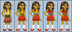
It sure is hard to be original when it comes to pirates. I started to draw some clothes on my pirate and guess who's clothes they were. No really, guess. hint: Guybrush. So I've made the head sprite so far, gotta think of some clothes, hmm....
Edit: Well I didn't finish it. Blah. I really need to get used to drawing the body without a reference.

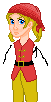
Crap! I just realized the clothes look like LeChuck's. What an idiot!
#22
Critics' Lounge / Re: kitchen bg help
Mon 17/07/2006 18:08:17
Ooooo.... I really like the shelves with all the boxes.Ã,  :PÃ, 
How 'bout some wine bottles be put into the cubby holes?
Your additions have made the background so much more alive, especially the windows.
A few critiques-
-The outside lawn looks so empty. A few pieces of lawn furniture would help. (Just a note-If you put anything on the lawn, try not to frame it in one of the window squares. It will give the scene more depth if the window overlaps it.)
-The cabinets blend into the counter too much, they are very hard to see.
-The jar on top of the fridge doesn't look to be in the proper perspective, I think making it 2 pixels wider would do the trick.
-I'm not too sure about the clock's position. I personally think it should be moved somewhere else, made smaller, or completely taken out. With the fridge edge, the jar, and the clock in the same place, it is much too cluttered.
-Is there a wall at the front of the room? Because both the calendar (against the wall) and the fridge door's position (it would swing to the center of the room) don't imply this.
-add some interesting magnets to the fridge door.
-More appliances and kitchen accessories.
I'm looking forward to seeing the progress on your background.
#23
Your walk cycle is really coming along. I really like the character you designed, you made yourself a quality sprite to animate.
There are certain things that don't look 'normal', though.
I just tried the walk out myself and noticed a few things about the movement.
-The hips 'pop' out the most on the PASSING of the opposite foot (because that's when the leg has the most weight on it), not on the CONTACT (when the foot hits the ground) of the opposite foot.
-The torso rotates slightly in the direction of the hip going up.
-The shoulders slightly tilt the opposite direction of the hips.
-Her chest should be moving all the time, not just jerk on one frame. Her chest should bounce when a foot comes in contact with the ground.
--Other things--
-her hair should move more fluidly. I don't think her hair would move that far out unless she were running, just a one or two pixel movement should do it.
-her right (our left) arm is constantly changing sizes, same with her shirt sleeves.
-the shadowing on her pants isn't consistent.
-----
You should try walking this way and try to feel how she's walking. You'll make a better animation because of it.
#24
Critics' Lounge / Re: Tracing/Masking Help
Sat 03/06/2006 02:01:14
Quote from: [lgm] on Fri 02/06/2006 21:33:22
What's wrong with the quality of the pic? That's 8 megapixels right there! :-p
I take it you were replying to me?
What I meant by quality is the background color. It isn't completely solid.
-------
OK, throw away my idea completely, I tried it, and its not going too hot.
Make the mask using the PEN TOOL instead of the line tool, it makes it a lot easier.
--------
Here's a messy tutorial of how I would do it.
#25
Critics' Lounge / Re: Tracing/Masking Help
Fri 02/06/2006 12:00:01
I just thought of a way this could be done.
I'm not sure if you know how the masking in photoshop works, so here are the steps taken.
--------
Select the picture you want to edit, and create a vector mask for it by clicking the little gray box with white circle in it at the bottom of the LAYERS box.
Now, select the white box right next to to your picture. This is to edit the layer mask.
Basically, when you color black, it becomes transparent, when it's white, it is visible.
Now use the line tool. (make sure it's set to FILL PIXELS. It's the solid box on the toolbar when line mode is selected)
Set it to 1 px . You can then make the spaces between the bristles transparent this way. (Using black) The 1 pixel brush will probably be needed in some places too.
-------
This might seem like a lot of work, but given the quality of the pic this seems, to me, to be the only way your going to get clean results.
#26
Here's a quick color over.
As pointed out already, your colors are way too dark, so I brightened things up.
In real life the closer objects get to the horizon, the lighter and less saturated they become.
With the sky it's the opposite, the closer to the earth's surface it's lightest, and farther away it's darkest.
The bubbles on the soda machine were the same exact value as the outside coloring so I brightened them up.
The smoke stack thingy should be casting a shadow, same with the roof and boxes. (I do admit the box shadowing isn't accurate.)
As far as coloring goes, I made the boxes more of a yellow color so they wouldn't be the same coloring as the shack.
-----
The shack right now is very nekid. The way you have the scene framed, whatever is put on that blank wall in the center will be the center of interest, so I would suggest moving the window to that spot then putting a poster of some kind next to its right.
-----
LINK: original color value

LINK: crit color value

#27
Critics' Lounge / Re: C&C on girl sprite
Tue 30/05/2006 05:33:55
Here are a few changes I made:
-cleaned up the outline and lighting of the hair.
-made it longer in the back to reflect the hair over her shoulder.
-made the hair outline pure black and the inside color a dark brown.
-moved the head to the left one pixel.
-brought down the ear 1 pixel.
-made minor changes to the eyes and nose.
-the crotch, in normal human anatomy, is generally in the very middle of the height, yet in cartoons, from what I've seen, it can also be in the center between the shoulders and feet. I made it like the cartoon proportion.
-I tried to make the zigzags pattern match each other.
-As far as the legs go, you can give or take anything you think might or might not be helpful.
------
The Coloring:
I made a few variations of the coloring which I found pleasing.
I think the second to the last looks best.
The last also looks Ok, but looks a bit like a Christmas outfit.
-I personally find the zigzag and stripes combo a bit odd.
-As pointed out by big brother, you could easily have a 22 color sprite since some of the colors are so similar.
#28
Critics' Lounge / Re: please critic this crew.
Fri 26/05/2006 21:26:09
First of all, I love your characters, especially the dragon guy. The pink really suits him.
Here are some critiques I have (from left to right).
-----
Guy #1
I don't see any problems accept that his back foot looks a bit off.
-----
Guy #2
Shouldn't his beard be the same color as his hair, purple?
I think his hair color is a bit too similar to the suit. I would make it a bit darker and tweak the hue to look a bit more purple.
PERSONAL PREFERENCE:
The uniform. Why does he have gray on his suit? Try using the darker blue instead so it is UNIFORM with the others. (I haven't photo-shopped the blue so it might still look better gray)
-----
Guy #3
His ear is a bit to high, it should be lowered so it's between his eye and his nose.
At the angle he's standing, I believe his other arm should be showing.
The lines on his torso look as if they're outlining his ribcage. If this was your intention, great. If you were outlining his chest, it should be a bit higher. I personally think the latter would look best.
Uniformity again:
The color on his shoulder doesn't go to the edge of the seem like Guy #1. I personally like the shoulder design of Guy #3 better and think it should be carried over to Guy#1.
-----
Guy #4
The back arm looks a bit too low.
The purple is a bit dark.
The middle toe should be angled a bit more outward.
The tail doesn't read very well. Are those feathers coming out his backside? Why are the spikes spaced out like that and why are they different sizes?
Try to make some kind of pattern for them so they look as if nature grew them and weren't just randomly placed.
Uniform:
I know he has chicken legs, but even they can be covered with pants?
-----
Uniform, again.
Guy #1 has a yellow stripe down his pant leg when no one else does.
They all have the yellow in there collars though, which looks out of place, to me, when there isn't a yellow line to back it up, like Guy #1.
#29
I'm stupid. Where is this ACR thread you're talking about?
#30
It's not like I'm an expert at coloring but this method seems to work for me using Photoshop.
I first put the "hue/saturation" filter on the top layer (with the saturation set to zero)(so the pic is seen as grayscale). Then I adjusted the lightness/darkness of EACH color using the hue/saturation masks to try and balance the values. I then tweak the hue and saturation.
Here's a few variations I came up with. I hope they can give you some ideas.
grayscale
green
purple
variation
#31
Here's my entry.
size= 41x90
colors= 16+1

#32
This Sprite Jamming stuff is hard.
------------
15 Colors
107x180
------------
#33
Well, finally got it done.
El Pollo Diablo and his porcelain mug and vase of death.
#34
What was the process of coloring images for CMI?
I've been trying to duplicate this image to test my coloring.
I can't figure out how there are so many areas with bunches of colors that don't even seem to go together.
One of those yellow knobs alone contains 50 colors.
Was this done by hand?
How were the outlines rendered without going outside the color palette?
--------
What is the process of creating a background and coloring it in this style while using a limited palette?
--------
#35
Critics' Lounge / Re: C&C on the Hands
Tue 14/02/2006 20:39:01
Quote from: ildu on Tue 14/02/2006 18:38:31
I actually would advise against a perspective, or at least one as strong as you showed.Ã,  In the context of adventure games, the game backgrounds define the perspective. Using a strong perspective, (meaning the camera virtually has a wide angle lens) may easily make the character stand out in a bad way as it's not consistent with the background. I suggest using a fake perspective, or rather a slight center perspective.
I just Googled Sam and Max, and Monkey Island.
The knees and feet angle down, the hands angle down and are a bit closer together, the shoulders are slightly angled up.
Isn't that what I drew? I'm confused.
#36
Critics' Lounge / Re: C&C on the Hands
Tue 14/02/2006 17:03:24
Quote from: Afflict on Tue 14/02/2006 16:38:10
Hey great job ProgZmax, you got thos hands down perfect.
And tweaking the other stuff was interesting, thanks I think
that solves it.
Yes, ProgZmax did a wonderful edit, but may we see an edit from you, using his advice?
Not hand related:
The feet are obviously angled toward the left, but the upper body looks more head-on than angled to me. It may be the tie needs to be moved to the left a bit. The left arm also looks to be the same exact size as the right arm when it sould be a tad bit smaller.
Another note: Perspective is your friend. Use it to your advantage. It works wonders. From what I can see in your character, the center of him is his waste, and the legs are angled down, so why not angle his shoulders up?
Here's what I mean.

(I used ProgZmax's edit as a template. No need to mess with the height.)
#37
Critics' Lounge / Re: Thug Hide-Out
Fri 10/02/2006 06:56:01
Your background is really coming along.
Each time you make an edit you're always making drastic changes. It's great.
I love the grass and treetops, but having large textured areas like that make the non-textured areas look out of place.
I would texture the trunks, road, and shack to unify the background.
-----
Here's just a little edit I made.
- Changed the perspective of the center doorframe and window to match the perspective of the right doorway.
-Made it so the wood over the window has depth. Same with a few wood panels on the shack that overlap other boards.
-Added detail to the cracks.
-I also made a horizon, but I don't think it needs it now. In your first background the grassy space looked so naked. Now that you textured it, it looks so much better.
-I also brought down the shack a bit, but that's just a personal preference.
-Cruddy lighting.
#38
Critics' Lounge / Re: Thug Hide-Out WIP
Fri 03/02/2006 22:23:35
Quote from: DonB on Fri 03/02/2006 17:41:20
Which one is best? I think 2.
I agree. The lighting looks great and the leaves blend with the style of the background so much better.
But the leaves on the right side are way too similar.
#39
Critics' Lounge / Re: Thug Hide-Out WIP
Fri 03/02/2006 02:52:43
Several Critiques:
-I can tell you used a pre-made brush to make the bushes in the foreground. Instead of using just one brush, why not make several leaf brushes, varying the sizes and angles.
-When comparing the door frames of the shack with the black foreground bushes they seem a bit dull.
I would make the wood a bit darker to balance the values.
-The insides of the shack should be darkened more. Same with the grass inside.
-The far right wall doesn't have any boards or nails like the shack in the center.
-The tree leaves don't suggest that they come from individual tree trunks.
-The window confuses me. Is it a window frame or the inside edge of the window?
If it is a frame the top left board throws me off because it looks like it's overlapping it. There also isn't a windowsill.
-Where is your vanishing point? The right wall and center doorframe don't seem to match the same point.

Things I'm not quite sure about:
-The trees are really close together
-The grass under the trees doesn't look right to me.
It looks like lawn grass, which I don't believe would be in a forest like that.
Perhaps if you replaced it with dirt and pebbles and just have little patches of grass here and there. It also wouldn't hurt to add some flowers.
-add roots from the trees popping out of the ground. to give it variety.
#40
Critics' Lounge / Re: The Cooler
Mon 30/01/2006 04:59:34
The perspective of the doors is off. I'll exaggurate to show you what I mean.
You currently have them drawn like this:

when they should be done like this:

Here's a quick paintover:
SMF spam blocked by CleanTalk