Menu

Show posts

This section allows you to view all posts made by this member. Note that you can only see posts made in areas you currently have access to.

Show posts Menu

Messages - Scarab

#41
Quote from: Arj0n on Mon 27/06/2011 11:25:42
Quote from: Ghost on Mon 27/06/2011 10:59:45
DOWNLOAD does not work for me (tell me there's too many requests)
Shutupload.com suffers nonstop from 'overload of server' since Friday...

Blast, I hadn't checked it...
Hopefully this one works.
I'll update the link above as well.
#42
@Buckethead and Secret Fawful:
Nice guys! I can see those explosions just begging for a ShakeScreen() command. ;D

@Ghost:
That credits screen is awesome! I particularly like the colour schemes for the third and fourth variations.
Did you draw it with inbetween colours first and then swap them out for the dithering? If so I'd be interested to see how a variation like that would look.

@Tabata:
Those cockroaches read very well; easily recognisable from all angles you drew them.
One thing I noticed though, is that when you place them on the floor they are slightly out of perspective. I think perhaps they would fit into the scene better if they were drawn from almost a front-on perspective, or even just squashing them vertically by 50%.

I've compiled the latest build, which can be found here.
The changes made are largely graphics/interface based, with a few of the bugs fixed. No new puzzles/cutscenes have been added yet.

Changes:

  • Removed the remaining instances of the bat cursor.
  • Updated UseInv behaviour. (Right click: Restore original cursor).
  • Fixed bug that caused guard on catwalk freezing.
  • Replaced legs on blonde scientist, and centred him in sprite.
  • Set up preliminary guard room.
  • Tested out Ali's edit of the Surgery Lab.
  • Fixed bug that caused the game to hang if you used the laser on the door if it was open.
  • If you right click on the probe in the courtyard, the cursor changes to the probe.
  • Several other minor tweaks.
Feedback is needed on whether or not we want to run with Ali's background paintover. If not, I'll revert it and import Ghost's door and magnets.
I'd also like to know if anyone has any problems with the interface, because it would be nice to finalise that before we go into Alpha.
#43
Quote from: KamikazeHighland on Fri 24/06/2011 04:17:23
Quote from: Khris on Thu 23/06/2011 10:47:45
78MB? I can't get over this, sorry, it's just too hilarious. ;D

Which I don't understand because the picture itself is only 58 KB...

Well I saved the picture you linked to as a .bmp, and it was bumped up to 48mb. From what I understand about the way AGS handles pictures, the image cannot be compressed at all, and as such becomes much larger.

Quote from: Khris on Thu 23/06/2011 10:47:45
Hmm.
Why not put the blues (and magenta) on a sprite and draw the rest normally...?

This seems like a viable solution. If there are only 33 values that do not work, surely you can just single them out?
#44
The Rumpus Room / Re: Happy Birthday Thread!
Fri 24/06/2011 03:36:53
Happy Birthday Tzachs!
#45
Quote from: Baron on Wed 22/06/2011 02:09:48
INTERFACE: The problem with leaving the inventory cursor after a click is that you still have the inventory cursor.  This is what you want in the near term, but how do you get back to the blood drop then?  Remember, right clicking is "look" now, not cycle.  Also I'm really not happy with the default inventory system or way of accessing it.  Ideally it would be combined with an actual menu and be more integrated into the game.  Clicking on Merrick might be intuitive but then we'll have to think of another way to "use" Merrick (ie struggle against the bonds).  Suggestions are welcomed.

Right click is 'look' for the default cursor, but when inventory is equipped, we are no longer using that cursor, so right click can be whatever we want; in this case, reset to the default cursor. :)

The code should be simple:
Code: ags

if(button==eMouseRight){
  if(player.ActiveInventory == null)
  {
    RunInteraction(mouse.x, mouse.y, eModeLook);
  }
  else
  {
    player.ActiveInventory = null;
    //OR mouse.Mode = eModeInteract; // depending on if the cursor is actually changing
  }
}


I don't think the crucifix is immediately noticeable. I suggest having Merrick comment on it if you try to walk through the open door without turning it into a 't'.

I think I had some more observations, but I'll have to play the game again to remember them.
#46
Quote from: DBoyWheeler on Thu 23/06/2011 01:12:25
If there are any sexual scenes in my games (if and when I get better with AGS), they will only be between a husband/wife pair, and ONLY under such circumstances (heterosexuality is a given).  But this too would be UTN.

I just want to say this up front, so others can know that at least I have SOME restraint in the material in my ideas.

Agree with Domithan that no-one should be at all offended (and anyone who would can choose to heed a 'mild nudity' warning).

As a side note, don't you think it's a little homophobic to suggest that 'UTS' between effectively two Ken dolls is somehow less acceptable than 'UTS' when one of them is a Barbie? The keyword is tasteful, and if you adhere to that you should pretty much be in the clear either way.

After all, the puppet sex scene in Team America has a man and a woman with no genitalia yet it's still [comically] graphic and full-frontal. ;D
#47
Impressive on many levels; the voice acting, the animation and the humour were all brilliant.

I pretty much died laughing at the
Spoiler
Equestrian 5000
[close]
and the line
Spoiler
"I must leave you now!"
"But what about the children??"
[close]
Not to mention the movie poster puns XD

Congratulations to the team!
#48
Quote from: Baron on Tue 14/06/2011 02:32:37
@SELMIAK: Nice background, but it looks like more of a wall than a ceiling...  Having said that, it will probably work just as well.

I think it reads as a wall because if the bricks on the ceiling being rendered as those on the walls in other backgrounds, and the bricks on the wall being drawn as floorboards (no grout/inset). I'd suggest a more ceiling-y texture like those foam tiles you see in office buildings, with fluorescent lights or a skylight of some kind. Maybe even a window or two will cement the idea that we are looking up. (It's going to take extra effort to sell this particular backdrop because of the unconventional perspective).

Another contributing factor is that the generator appears to be held in place by gravity, a thick plate with large bolts at either end should help.

Quote from: Baron on Tue 14/06/2011 02:32:37
@SCARAB: Something like ?

Bingo! Exactly what I was thinking.
Which frame would be the stationary one? The flat shade?
If it's the same light source as in my one, I'd suggest reversing the animation, so the moment you mouse-over a hotspot its first change is that the gleam moves rather than disappears.

Quote from: Baron on Tue 14/06/2011 02:32:37
I need some specifics for the "escape the chair sequence" since that's where I'm currently programming.  So we've got Merrick strapped in:

    I think originally he was hooked up to a bag of poodle blood, but now we're thinking an actual poodle on a stand.
    How exactly does he get out of the chair?  The original plot called for using the vampire teeth on the straps, but now we don't have that cursor.  My only idea is that you click the universal cursor on Merrick causing him to struggle, which pumps blood back to the dog.  The more he struggles, the more vampire blood gets back to the dog until it becomes a vampire poodle.  THEN the vampire poodle bites off the straps because....  there's blood on them?  Or maybe the vampire poodle frees Merrick because of a sacred vampire bond to protect one's spawn & progenitor (and that's why the vampire twins are trying to rescue Merrick)?  Or maybe the vampire poodle falling off its stand flips some button that releases Merrick automatically?  I need ideas -anyone?  

The best way I've seen to handle complicated interactions with no verbs is to use a dialog.
Perhaps we could have the dog shaking in fear (understandable given that his blood is being drained :P) and you can use your vampire powers or facial expression/tone of voice to change the mood of the dog, calming him, and thus lowering his heartbeat. Then the pressure is low enough to struggle and pump the blood back into the dog, and with your blood in it you can temporarily influence/possess it.
#49
Quote from: Armageddon on Mon 13/06/2011 05:57:21
I like that mouse cursor as long as left click can also let you walk when you're not on a hotspot, it also needs to look more like a bat, it's very curvy right now.
I agree that it needs to look more like a bat, although it could be hard to make one that reads well at this resolution and with limited animation.

Perhaps if the bat doesn't work out, a suitable alternative could be a drop of blood? It matches the context just as well, and has a more standard cursor shape. The @OVERHOTSPOT@ animation could be the shine on the drop moving across its surface.


Quote from: Studio E3 on Mon 13/06/2011 06:53:03
Wouldn't the game need to be a verb Coin game to do that?
No.
#51
I remember some of these from back when I was quite new here, although I wasn't active enough to ever have anything. But this thread got me going through some old ones, which I have found most enjoyable. It's nice to see that a few of them made it through to completion.  :D

My contribution:

Part of a set of assets I made for a 100x50 adventure. Behold the power of the steam-powered teleporter! ;)
I stopped when I decided it wasn't worth making something at a resolution that was not supported. :P

Keep these releases coming people! :D
#52
Quote from: Baron on Wed 08/06/2011 02:52:00
I'm still waiting for feedback about the rough build, specifically the emoticon cursors.  Do they work?  Or should we go with something more conventional (ie Cat's submission)?

I think the current cursor definitely needs to go, for these reasons:

a) They clash stylistically, (Thick black outline rather than a volumetric shading that most of the other assets use).

b) The way it hops around relative to the pointer each time you right click is jarring, because it's the same base image, and it's distracting to see it hop around when the illusion is that the character is just changing poses, rather than a new image being swapped in.

c) To be honest... it's a bit tacky. Although it has been animated specifically for this project, it still reads to me as some smiley ripped off the Internet that's been shoe-horned in. Especially because it does not specifically resemble the protagonist.

I'd be happy to see a variation of Cat's cursors come back. Or perhaps a cyborg bat could be the cursor? Flapping its wings for Walk To, clenching and unclenching its feet for Use, glowing eyes for look and exposed fangs/ biting for Talk/Bite? The bat that Sephiroth drew earlier could probably be adapted to make this work. I could mock something up if that idea interests anyone.
#53
 :o
Wow! I can't even... just wow!
That's amazing Progz!
I'll get right on seeing if I can replicate that.

In regards to the black background:
It's not for a gameplay cutscene, but rather one of several imaged to be displayed during the credits, and doubling as a final cut-scene for what happens in the plot after the final puzzle is solved. I wanted to use black so as not to take up too much screen real-estate, and to imply more depth than I could draw (Which you seem to have picked up on by adding further layers in the background.)

In regards to your comment about being afraid to use colour variation:
Yes, this is true, as my initial inspiration for doing th credits this way was taken from Cave Story:
And 6 Days A Sacrifice.

Although I only realised later that this style was better suited to images based on recognisable characters and imaged based on simple shapes, rather than an amorphous blob.

As such, now I'm open to the final product being anything I can put on a reasonable scope (If only I could match the quality of yours. Although, then I'd be kicking myself for only putting them in for a couple of seconds each  :P )

I like the idea about animated sparkling, which could probably even be done dynamically. I'll see what I can come up with.

Regards,
Scarab.
#54
Okay, latest revision:


Notes:

  • I added another shade for depth, and used it to hint at at a more irregular shape for the pile.
  • Added a few piles if 2 and other loose coins around the base of the pile.
  • Tried to break up the silhouette with the sword, chalice and stacks at the rear.
I was initially reluctant to add stacks in the middle, fearing it they would make the while thing look to rigid, rather than a relatively loose pile of coins, but I tried to add them at flat-looking areas, or in 'valleys', wedged between two 'mounds', and I think the added irregularity to the outline is enough to outweigh the unreal-ism. Thoughts?

With regards to stacks of coins being unlikely in the first place, I think that may be reading into the whole thing a bit too closely. I think they do an important job at this resolution and detail to define the content, surely if I took them away, we would be faced with the original 'it looks like sand' readability issue?

I think this is getting close to done, but I'm still unsure how to go about shading it correctly, as I traced this from a pencil drawing, where everything was defined with lines, and the look I'm going for is, I think, called 'oekaki' with the shapes defined by volumes and textures alone.

Also, adding the sword in the background, does that steal all the attention, as though that was the prize to be sought? I've been staring at the pixels for too long to be able to read the composition any more :P, so  a fresh set of eyes on this would be a great help.

Thanks again for all the feedback so far, guys. Keep it coming!  :)

Regards,
Scarab.
#55
Hey guys, Thanks for all the feedback. :)

I completely re-drew it, trying to take in all the suggestions you guys made.


@Gilbot:
I wasn't at all married to the palette from my previous image, although I am fond of the 'noticeably restricted and unrealistic palette' look. In this version I more or less doubled the colour count. Better?

@Babar, TheRoger:
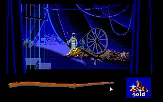
Thanks for the references guys, the one that particularly got me thinking was the one from the EGA version of Loom, because it was the only one that managed to sell the look with similar restrictions to mine. I pretty much tried to emulate the texture of the gold from this scene:
(Click for full size)

@FamousAdventurer77, Monsieur Ouxx:
You both spoke about colour and texture, which I tried to improve upon. I'm not 100% satisfied with the texture, although hopefully the coin stacks and the treasure items read well enough to sell it.
The contrast possibly still needs some work also.


So, thoughts on the latest version?
As always, any input is appreciated. :)

Regards,
Scarab.
#56
Critics' Lounge / Dragon's Pile of Treasure
Mon 30/05/2011 10:32:01
Hey all, I haven't posted anything in C&C for a while, but I really can't get my head around this problem.

I'm trying to draw a single frame from a cut-scene where the character first comes across a giant pile of treasure in a dragon's cave. I'm going for a low colour, stylised palette, and can't seem to get the texture/ composition right.

This is basically my thumbnail sketch of the composition I'm trying to achieve, with the silhouette in the foreground, and the ground around the pile fading into blackness:


This is the scale I'm trying to accomplish it at, and I'd have put more detail in it before posting here, but at this size I'm not even sure if the composition reads well, let alone the texture.


I really have no idea how to pull this off, and its rather specific to find any kind of tutorial out there.

Any help you can offer is appreciated, :)
Regards,
Scarab.
#57
The graphical style you've chosen pre-dates MIDI music, so I think it would be fitting if you were to go even further and use chip tunes.

It is no extra effort to make music sound like that if you use this program, which instantly converts MIDI music to 80's chip tunes. :)
#58
I made something resembling a down walkcycle, it's the first I've ever done, and I'm not too happy with it, but at worst it can work as a placeholder.


Notes:

  • I tried out a lighter shade for the pants, which I think is more readable, but I'm not great with colours, so hopefully they don't look too washed out.
  • At first I had the shoulders moving up and down by one pixel on each step, but that seemed a bit too far for them to move. Anyone know a more subtle way to portray back and forth shoulder movement? I'd hate for one of the most frequently viewed animations to not be as good as it could if theres a quick fix in there.
#59
My vote goes to Eggie, because he was able to adhere to the time limit, and his game made me laugh audibly at least twice.  :)

Also, in my haste, I forgot to credit Steve McCrea for writing AGSketch, which I used to do all the graphics for the game. Thank you Steve!

Quote from: EHCB on Sat 21/05/2011 23:50:30
Scarab's going on my enemy list >:(

#60
In regards to vampire/technology based plays on words, I rather like the thought of having something along the lines of 'The Byte of a Vampire'
SMF spam blocked by CleanTalk