Menu

Show posts

This section allows you to view all posts made by this member. Note that you can only see posts made in areas you currently have access to.

Show posts Menu

Messages - Sean

#1
Critics' Lounge / Re: In Ghost Light - poetry.
Sat 05/09/2009 01:07:11
Hey Melancholy,

I like the style and construction. I'm not so keen on the theme.

I'm a pretty positive and happy person myself, all this talk of pills,guns and knives just isn't my thing. Always look on the bright side, eh? ;)

I like the way the poem opens up, and invites the reader into a 'haze'. For the first stanza or two, I wasn't entirely sure what was going on or what was happening. I like that.

What I really like, is how towards the end of the poem the tone, and nature of the 'voice' changes. Clarity approaches and the voice assumes a darker but crucially more decisive tone.

There is a shift from uncertainty, to some degree of clarity.

I think that works well.

I am a fan of the 'visceral' nature of things'. "...the last minute you pussy out" in contrast to "You feel as if you're flying"

However, the actual 'climax' leaves something to be desired.  The opening hints at something complicated, and unknown. When we get to the end, it feels a little 'one-dimensional'.

"Oh noes, bad day, I must shoots myselfs! kthxbai!!"

For me, that undermines the more sophisticated build-up. It's a bit anti-climatic.

Overall I like it, it's a nice and neat poem. There are a few words, and phrasings I'd think twice about myself but that's just minor details and all a mater of personal preference.

Be sure to share some more poetry in future, and perhaps pick something a bit BRIGHTER! ;)

I hope the bleak, and oppressive tone of the poem isn't reflective of your actual state of mind. You have the potential to write good poetry. That's at least one ray of light, right there!

Peace

- Sean
#2
Heyas,

@Brad - This is the critics lounge. I will post here for criticism. Stick-figure or not, this is the place to post. I've always put up my 'stolen thumbnail art' here to get opinions and criticism on. Going on two years or so, at least. I'm well within my right to post my work in the CRITICS LOUNGE. Whether you judge it 'worth your time' is entirely up to you.

In short, I don't get your point. I don't think you really have one.

There was actually a reason for me to post here. I'd just picked up PhotoShop again for the first time in a few months, and I like to get feedback on things when I am 'getting into the swing of things'.

---
---


@ Fred. - Thanks for your input. I agree with what you have said. Sometimes I tend to go a bit overboard, and things get a bit 'messy'. I'd like to pretend that's a style choice, but the reality is I'm just a clumsy person. Sometimes I can't help it!

I agree with what you are saying though, It does all get a bit 'confused' and some bit's could defiantly be toned up/down accordingly. Ensuring that the focal points of the image are clear.

@Pinback - I don't really count 'abuse' as 'criticism' and the feedback you recieved leans more towards abuse in my books. Sure everybody has a right to comment on your work, especially when you ask for critique but there are certain things that don't need to be said. "Homoesexual buttraped faggotry..." pretty much hits that box for me. It's uncalled for, and unnecessary in my opinion.

There are better, and less disheartening ways to say you don't like somebody's work. There is also room to include CONSTRUCTIVE CRITIQUE in any feedback you offer. I don't expect people to play the prick with me in any other situation, why would feedback on something be any different?

Just because I ask for your opinion on my art, doesn't mean I hand you a license to be an asshole. If you don't like it. Fine. Say why, say what can be improved. Say nothing. Don't just attack the artist, or image in itself. That's mindless bashing. Not constructive criticism.

Fair point about not putting out a clear disclaimer, I thought the Dragon Age brand would be well enough established for people to realize I was working with and around EA's artwork. It simply slipped my mind. I thought it was a bit of a 'given'.

That's my bad, but I wasn't being deceptive simply forgetful.

Regarding 'hit me with your harsh words' that's a fair point, but to be honest I meant it more in a tongue-in-cheek way than in the literal sense. After all, I asked "for any constructive feedback you can offer."

As much as I have a right to post my soulless crap here, Brad and others have the right to criticize it in any way they see fit. I got a little too defensive, I admit.

I guess what got my back up was stuff like "polishing shit" "lower level than thumbnails" "won't get me a job" etc. I was under the impression the critics lounge is open to amateurs and professionals alike. To rip me and my work apart because I am not a serious artist seems unnecessary in my books.

I expect to be able to post and discuss my work, even if it is not up to the same standard as others. If this is an art forum for 'real artists' (whatever that means) and not the 'AGS community as a whole' then I guess Brad's comments wouldn't bother me as much.

Ultimately, I'm here to have fun, and admire the work of true artists!

..I'll get back to doing that then ;)

- Peace
#3
Thanks for the input.

You guys are pretty harsh. I never implied that I was a professional, in fact I'm pretty sure I made it clear that PhotoShop is nothing more than a hobby to me.

'Copying' somebody else's work isn't a bad thing in itself, lots of art classes, etc instruct artists to recreate the work of others. Draw a 'self-portrait' in the style of Picasso, Monet, etc ,etc

Whilst I understand that re-using the 'assets' of other artists isn't on the same level as creating something from scratch that is not something everybody has the ability to do.

I could sit here for years working towards a set goal, and in the end it'll still be pretty crappy. It won't be as good as the work of a true artist. I am under no illusion that I am anything more than a clumsy amateur artist with an interest in web-design, etc.

Whilst that may piss off you and you elitist art sensibilities, I don't think it really warrants the kind of reaction you've written down.

I'm a creative, not an artist. I am first and foremost a writer. That does not mean I will simply limit myself to working with words. I like to 'have fun' with a variety of things.

@ Brad - Stick Figures in themselves can be a creative body to express an emotion, event, etc. Why would you be so naive as to assume they are not 'art' ? Although, I do get what you are trying to say.

Lower level than thumbnails? That's just a stupid thing to say. It's not as if I open Photoshop, and the finished image is there. I was never trying to pass off this 'style' as my own.

@ Chicky - Nope, I am not working on any games. I am looking into the possibility of producing an interactive story, as part of my  portfolio for my university degree.


#4
@ Crazy - Hey, I think the 200mb file would be the raw .PSD. Still, it's a pretty hefty file size!

Heyas Chicky,

Thank you for taking the time to reply.

I appreciate that PhotoShop work is often hard to 'judge' or 'criticize' as you cannot always see what work has been done.

Generally, I look for feedback on a few key elements.

Composition

Colour Scheme

Overall Impact

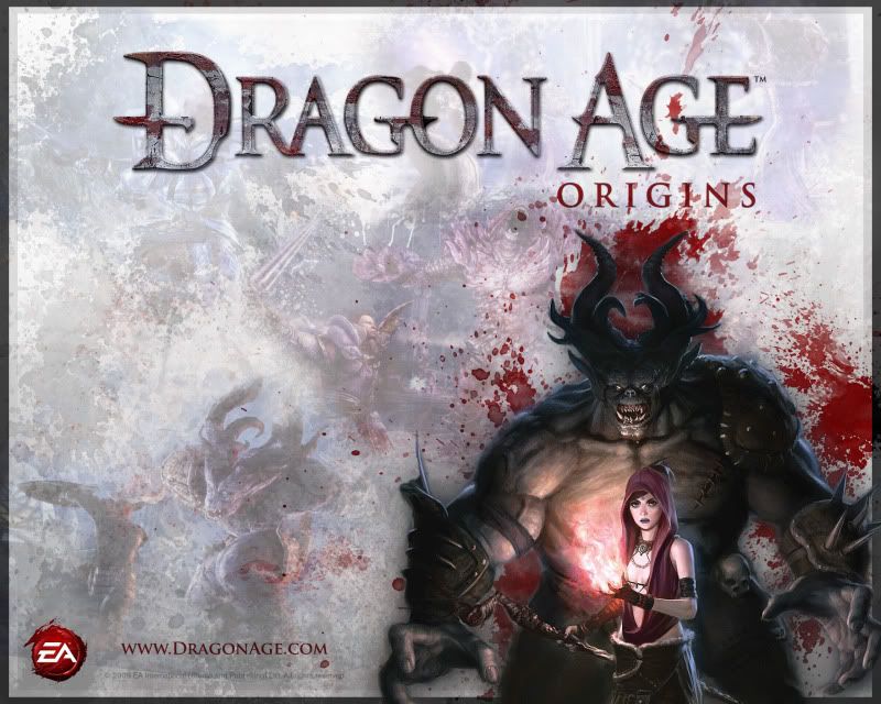
To suggest that my work is simply 'magic wanding' 'overlays' and 'transparency' is a little harsh. For instance, the wallpaper had around 30-40 layers.

The background is brush work, texture blending (photographs, etc), and masking. On top of that, I've tried to blend in some screenshots. The blood graphics are again, another separate folder of layers that are added on top of that. The big 'beast' is a big render, that has been brushed down with a 'hide all' mask.

So, whilst I can see where you are coming from there is a little more to do than 'wave a wand'.

I do understand what you're saying, but I still feel it's a bit harsh ;)

In that image, the main thing I would look for feedback on would be the blending, and splatter effects.

I was intentionally trying to re-create the style and theme of the Dragon Age Origins website. How well do you think I matched the 'essence' of it?

http://dragonage.bioware.com/index.html

Regarding the Abandonia image, I wasn't designing a logo. Just a sig graphic. I was going for a 'retro' look that kind of caught the 'style' of Campell's soup, and other classic pop art. Simple, straight-forward but catching.

Again, hope I don't sound too defensive or dismissive I just feel my images are a little more complicated than what you implied.

Regarding Cortana, c'mon it's a cool pic ;)

Edit: Re-Reading your post Chicky, I'm not sure if you was talking more about the screenshots and drawing of the Dragon Age monster/npc not being my own work. I thought that was fairly obvious. I wasn't trying to steal credit for the awesome art-skills of EA's slaves :D

Again, I look for crits on the 'cohesive whole' as opposed to individual elements of the image.

Cheers

- Sean
#5
Critics' Lounge / General Graphical Goodness.
Thu 13/08/2009 00:30:43
Hey Guys,

I've been getting back into PhotoShop.

Over the last fortnight, I have put together a few new signatures as well as a high-res wallpaper. I'm looking for crits, comments and feedback.

What works and what doesn't.

Thanks for any constructive feedback you can offer.

Abandonia Signature and Avatar


Dragon Age Wallpaper


Okay, next up is some 'Halo' themed stuff that I whipped up today. I am particular interested in feedback on these, as I am not entirely happy with them. I'll be making more with this theme in the next few days.


Hit me with your harsh words. Please.

Also, if you like my work and have a spare minute please check out my gallery.
#6
Site & Forum Reports / Re: New AGS Website
Tue 28/04/2009 00:54:39
Hey Guys,

Not sure if you're still looking for feedback on this. Have only just stumbled across it!

I have a couple questions, and comments to throw into the mix.

Why is the site being updated? (Looking for a larger audience? Updating code? etc)

Has the 'style' been locked down?

The new design by itself looks great, it's a really nice and clean design. A little bright, perhaps.

Is it really AGS though?
[/b]

As other people have mentioned the current layout runs the risk of looking a little too 'modern'. The appeal of AGS for many people, ties back to classic 'retro gaming'. I don't think 'legacy gaming' is sold that well in the new layout.

It's almost as if the new site is trying to re-invent AGS itself, is that the intention?

A design that I think gets the mix between 'retro' and 'modern classic' spot on is www.reloaded.org

For me, AGS games are about the quality of the finished product as well as the accessibility of the editor.  The new layout seems to sell AGS as more as a 'make your dream game, ITS EASY PEASY' kind of thing. Again, that's just how it comes across to me.

At the moment, I think the old layout is actually the better of the two.

Now, I'm a little tired so I'll wrap this up here, sorry if I'm just recycling concerns you've already considered. I wish you the best of luck with the latest design and look forward to seeing the finished product.

- Sean

#7
Hi Pac!

Now, I'm really rather tired, so I doubt this makes any sense. Thought I'd post it up before I hit the sack though!


For me, the biggest 'issue' I have with this background is that there's TOO MUCH going on! I suggest you try and scale things back a bit, and keep it simple. Make it easy for the eyes to read :)

You have an interesting 'shape' to work with, that I think works well. I think that your background walls can be broken into two types of 'pattern'. Any more than two, and things get crowded!

A, and B.


See what I mean? Your image keeps the 'depth' that you're trying to get across, but is a lot easier to read. Of course, the 'patterns' I' added are very simple, I was just trying to illustrate my idea!

Break things down into digestable chunks, don't feel you have to make every wall 'unique'.

#8
@ Stupot - Thanks, I thought it looked pretty nice too :) Trying to clean it up in places, so it's easier to look at though. Some spots are still a bit chaotic. I'm happy that the general style is appealing to other people! Thanks for the encouragement.

@ Ben - Thanks again. The third image is actually just the 'stock' template that I was basing my inital designs off. I've now decided to drop there code, so I'm re-arranging parts of the layout and coding everything afresh. Gives me maximum control, and I can't be accused of 'nicking' free code ;)  The logo may well be based off of Atari's logo, it does look very similar. However, that third image has nothing to do with me, or my work :) I try to original, wherever possible.

@ Zooty - Hi mate, sorry if you thought I was 'nicking' your idea. I've actually been careful about that, and am sourcing my images, textures, etc from http://www.cgtextures.com/

As Garage kindly pointed out, my logo is based on the 'ear protection required' sign. The image I used as a reference is in theory royalty-free.

Here's a snippet from cgtextures.com FAQ:

Do I need to pay royalties when I use the textures?

No, CGTextures is not like most stock photography sites. Textures can be downloaded for free and used for free.


I've never seen that image used as a logo before, but I didn't really look around much. I thought it looked cool so I cropped it, modified it and chucked at the top.

Sorry if you felt I was copying your work. That isn't the case.  :-\

Regarding the coding side of things, I've decided to just drop the template altogether, re-work the layout in photoshop and tackle the coding myself using a combination of HTML/CSS. Hopefully it will be less painful than it sounds ;)

Quick Edit - Cleaned up the first post, to make it more relevant to the critics lounge.
#9
Heyas,

Thanks for the pic, had another look and realized what the issue was.

I had my options set-up to 'save images only', = no html for me ;)

Fixed that, and have been given some guidelines from another forum regarding the coding.

I'll check back in, with a proper update tommorow. Still have a few things to try out before I ask for more crit.

--

For now,

I'd just like some feedback on the ART/IMAGES.

--

Thanks for your time Kastchey!
#10
Hey Kastchey,

Yeah, that's basically what I did. Took a free template, modified the graphics, deleted the stuff I didn't want and told PhotoShop to save it.

However, the original PSD that I modified was already 'sliced', and when I opened Dreamweaver, the index file would call for a load of redundant images that were no longer part of the design. Resulting in a series of broken images, and all sorts of crappery.

So, I had a go at slicing it myself.. and got this:

http://mynetimages.com/ce54c8e6_md.jpg

Of course, when I saved it.. I had no idea how to take my new slicey into Dreamweaver, as a working page.

What I'm trying to work out now, is how I get from Photoshop > Slice > Working Webpage.

If I want one of my sliced images, to act as a text-box, for example..  how would that work?

It's all so overwhelming, I don't know where to start.

I'm reading up on HTML now, browsing through tutorials, etc.. but it still seems very complicated.

When you say 'photoshop should be able to arrange your elements into a nice, working table'.... I get confused.

Photoshop sorts the images, sure. How do I get my images working as a web-page though?
#11
Hey Everybody,

I've been working away at a web-design project for a friend of mine, I'm designing a basic website for his internet radio station. I originally started the design off from a 'free template' in the false hope that I'd be able to dodge around all the actual 'coding' of things. I've decided the best way to tackle this, is instead to drop the 'free template' and just design everything from scratch, and try and code it myself.

So, here's the inspiration

Original Template - http://www.freetemplatesonline.com/templat...mplates-40.html


Preview Image - http://mynetimages.com/afd81814_md.jpg

I've included them just so you know where I got my inspiration from, however as I said I'll be using my own hand-written code, and PhotoShop work. I feel that my work once finished will stand alone from the original source.

Now that I've taken the plunge, and decided to code it up myself I've made some minor overhauls, that I think will make it easier to code.

Here's what I have so far:


http://mynetimages.com/a4c37a5d.jpg

I'd appreciate any feedback on the design so far. Do you like the layout, the colours, the overall style?

Would you be happy surfing a site in this mould?

Do you have any suggestions, or tips to offer?

I look forward to the feedback, thanks for your time.

- Sean


This is not my original post. I removed a long post asking for help tackling the html and css code for the layout. Some replies might not make sense in relation to the current post


#12
Quote from: bspeers on Fri 06/03/2009 13:10:59
I may end up asking the community though if there is a favourite  CHARACTER they would like to see in the final product, as I have one roster space I haven't decided how to fill yet.  I may just have a think about it first.

Darth Vader.
#13
Critics' Lounge / Re: Me go poetry
Wed 03/12/2008 00:37:26
Hi Oliwerko,

You don't have to be sure of those questions to write poetry, I was just wondering if there was a deeper meaning hiding behind the words. Some poems are written primarily to provoke an emotional or intellectual response. Others like yours are meant to entertain first and foremost!

As I said, I think they're very nice poems. Fun to read, and very accessible. As you said, they're written as a form of 'Entertainment' and they work on that level.

Rhyme is just a matter of personal preference.

What I find is that if you're whole poem (every other line) rhymes, then the rhymes begin to lose value. They sound good, they look nice.. and they make you smile. Beyond that, they don't mean much and it's all too easy to read the words, without reading into what they mean.

However, I think the quantity of rhyme is a smaller issue if these aren't meant to be 'serious' poems with some sort of hidden meaning.

Sorry if my first post came across as harsh, as an English student at college I spend a lot of time reading/writing about poetry. Sometimes it's a little easy to get carried away.

It's nice to take a break from 'serious' poems every once in a while, and I want to see some more fun poems from you soon :)

Anyway, who am I to talk to you about YOUR poems? ;)


-- Ignore any craptastic English, it's creeping up to 1am and I'm super tired! --
#14
Hey hey,

Like what you have, it's nice. A bit simple, but it works :)

Threw together a few different paint overs the other day, thought I had already posted them. Check them out below.


Just thought they might give you a few ideas :)
#15
Critics' Lounge / Re: Me go poetry
Sun 30/11/2008 00:12:10
Hi there :)

I'm sitting here, scratching my head and wondering what to say.

It's hard to critic these poems without placing them in context, and having some vague idea of what you're trying to achieve.

Why are you writing? What are you trying to express? What's the purpose of the poem?

If you can clear up those questions for me, I'd love to give you some more feedback.

--

Ultimately, I think it's simple and entertaining poetry. If that was your aim then you've hit the nail on the head.

I like the casual nature of the poems. They were fun to read.

One thing I have picked up on though, is the rhyme. Is there too much? It's quite hard to process the narrative of each verse, as you're hit with a lot of rhyming words. These tend to stick more than the line as a whole. Take your first poem.

Here/Clear
Vanity/Sanity

These are the words you remember after reading the first stanza of "Question of Sanity". These words by themselves mean very little. Maybe that's just me.

Anyway, I hope to see some more from you.
#16
Amazing!

..and then some!

(helpful, I know)

The background and character tie together nicely. One thing that caught my eye though...

Is he meant to be THAT tall? His legs seem really really long. Maybe taking a hacksaw to his knees, and knocking off a quarter foot or so would look a little better?

Either way, great stuff so far.. hope to see a game from you in the future.

As an aside, I'm a totally talentless fraud that took a butcher at Loomi's idea of focusing the image. Check out the links below if you want to see my results. I also had a stab at a "sepia" style colouring of the entire background (the background really reminds me of an old photograph, for some reason!)

http://i37.photobucket.com/albums/e85/ZoneR-fm/detec.png (Original)

http://i37.photobucket.com/albums/e85/ZoneR-fm/detechiglight.png (Focus-light)

http://i37.photobucket.com/albums/e85/ZoneR-fm/detecsepia.png (Sepia)
#17
Heyas,

Thought I'd pop in to let you know I really like what you have.

Really nice image, keep working on it!

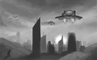
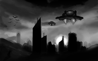
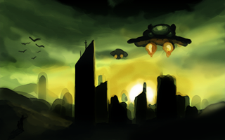
I'm not an artist (as much as I'd like to be), but I've given this a quick go-over to try and 'highlight' the chunk of city in the middle. I don't know the fancy terms, or proper techniques but hopefully these images will get my point across :D

As much as I dig the 'atmosphere' you have going, it all seems a bit 'wishy-washy'... maybe you can start 'pulling things' out a bit more?

Anyway, take a gander at these.. and get back to work. I'd love to see this finished :)


Original Image


Remix One (Black and White)


Remix Two (Colour)


Remix Two (Full Size)


#18
Critics' Lounge / Re: Space station - Exterior
Sat 09/08/2008 20:35:48
Heyas WHAM,

Really like what you have so far. The background works fine as it is, it's a nice 'low-tech' approach to creating a spacey background. It works well, and I decided to take a stab at an alternative approach myself. I hope you don't mind me posting this up.


I tried to add some variation to the stars. There tighter packed at the bottom of the image, for example. It's still quite a basic star-scape, but it looks a little more like realistic for me. Now, whether or not this meshes with what you're aiming for I don't know. Just thought I'd throw an alternative for you, in the hope it can help you create the image you're looking for!

You could of go for something with a few more layers in the vein of


This is an old image, and I doubt it fits with what you're aiming for.. but it might give you an idea or two.

Hope my images help in some way, if you have any questions fire away. Good luck, look forward to seeing the final background!
#19
Critics' Lounge / Re: Character art
Mon 29/10/2007 17:51:56
Would just like to say.. damn good job :)

Really like the style you have here.. it's great!

He does look a little off-balance.. but I'm not sure why. It looks to me as if he's sitting, but just under his left leg (our right) there's an empty space. He's sitting on thin air, no wonder he looks a little unstable :P

Again, good job!
#20
It's looking very promising :)

Looks like some truly great work, sorry to hear things are rough for you at the moment. I'm looking forward to the release.. I wish you well ;D

Thanks for the speedy update!
SMF spam blocked by CleanTalk