Menu

Show posts

This section allows you to view all posts made by this member. Note that you can only see posts made in areas you currently have access to.

Show posts Menu

Messages - Sean

#21
Heyas,

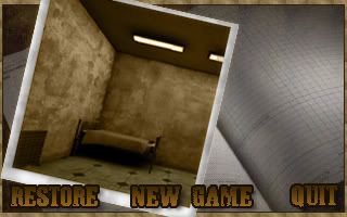
Just wondering whether or not 1.2 is still 'on the way' and when it'll hit the servers for download. The game looks great but I've tried it before and I never really got on with the English. I'd love to give it a spin as soon as thats addressed. Update please!

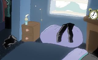
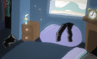
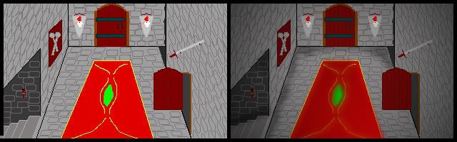
It's a shame that Litn2 has fallen apart, the photographic art style you was developing looked promising! Glad to hear you've got more on the way though :)

Keep us posted!
#22
It's great.

I don't really see anything wrong with it, it's nice and clear.. colourful. Well styled, and atmospheric. It serves it's purpose, and looks pretty nice too. Sure, there's the potential for it to look a lot better (given the talent you clearly have) but for an AGS game it more than meets the 'minimum' requirements when it comes to background art. I like the style, a lot.

Also, if you just whip up your graphics to this standard now and find they're not what you want at a later date, you can always go back and polish them up once everything is 'finished'. If you get the ball rolling, it'll be easier to commit later! Hell, you could ask somebody else to get involved and polish them up for you, if need be :)

The foreground slope seems oddly shaped, and If it's an interactive background with walkable area's I'm not entirely convinced it'd work that well (the player would probably be restricted to that tiny bit of ground in the corner) For a cut-scene,menu, etc it's great :)

Get stuck in, I hope to see some more from you soon !
#23
Alrighty,

In order to get the colour's a little muted I added a Hue/Contrast layer and played around with the sliders until I got something slightly less 'in your face'. I
After I'd established the colouring, I chucked a fresh layer on top. Painted across, and around the edges of the window with a white brush at medium transparency (30-40%), painting across certain patches more than once in order to make them less transparent. I then switched the layer style to Soft light and brought the layer transparency to  65%. This helps add a bit of ambience around the window.

I duplicated the original layer, and switched it to 'Lighten' 50% transparency and 50% fill. Then I threw this layer though a bog-standard blur filter. This again add's some atmosphere..

I added a final layer (again a duplicate of the original background) and manually smudged the pixelly bits such as the floor. I added a layer mask to this layer, and hid it. The parts of the image that looked a little sharp, I painted over on the mask layer "revealing" the smudged layer. (If you haven't got much experience with masking this bit isn't neccessary, and doesn't make a huge amount of difference)

To finish things off, I duplicated the image and flattened it (merged all the layers into one sheet). Before adding a soft/gentle omni light that darkened the edges of the image.

I'm a little tired right now so I'm not sure how much sense that's going to make, I've cleaned up my original edit a little and I'm going to attack the .PSD so you can take a look as that might help you out.

I've done a bad job of explaining this I'll try to bullet point everything when I've got some sleep under my belt. Hopefully you'll be able to toy around a bit and find something that works ;)


http://rapidshare.com/files/54098342/Softblur.psd.html
#24
I agree the colours are a little strong, and the edgers are a bit 'hard'. I tried to soften up the edges, and wash out the colours a little to give you some ideas. I'm not sure if this will help at all but if it does and you'd like some details on what I did feel free to ask.

I love your art style by the way, but you're colouring could use a bit of work ! Good luck :)

(I hope you don't mind paint overs, if it's a problem let me know!)


#25
Loving what you have so far, I really like the new angle makes for a much more dynamic and engaging background. Great work, and some really great critique so far :)

My only nit-pick concerns the somewhat "lifeless" feel the lighting adds to the room. If that's what you're going for, it works well but I personally think the whole thing's a bit on the 'flat' side. Of course, this is my under qualified opinion and my art sucks.

My cocern is that your two-tone lighting scheme takes away some of the 'magic' of the room. I think if you added more colour to the image it might add a little more 'feeling' to everything.

Here is a rough (and awful) visual re-gurgatation of what it is I'm trying to suggest you experiment with. A more varied range of colour.


I'm aware my edit kills the mood of the background as a whole, but I think that's mainly because it's a messy edit more than anything else. I think if you experiment a little more, and try adding a little more colour you may end up with a nicer piece.

I'd like to note, that I'm in total awe of your work so far and I will take this opportunity to apologize for butchering you're fine art with my amateurish edit ;) Just trying to convey an idea... hope to see more from you soon! Love the style :)
#26
Critics' Lounge / Re: Portrait
Sat 10/02/2007 15:16:10
I really like the hair, it looks pretty damn cool :D

As a whole, it's a nice portrait picture. Especially good if you're just starting out with this "kind of stuff".

Now, onto the criticism ;)

She appears to be "melting" a little bit. Some of the shading, is slightly confusing and as a result her bones/muscles etc loose structure and strength underneath her skin. Her eyes seem to be scaled a little bit funny, and her chin isn't prominant enough for my tastes.

However, it's a very nice start and I look forward to seeing more from you in the future!
#27
Hmm.... even with my monitor turned down from 75 Brightness and 75 Contrast to 25/25.. I can still see the image fine!  :o

It is a horror themed game, so things are meant to be dark/gloomy. However, if people think this is too dark, I'll try and work on it.

As for the other comments, thanks.. I was pretty sure the second was more effective and I just wanted some reassurance!

Back in a bit, with something a little brighter  :D
#28
Hey,

I've been playing around with some backgrounds recently and I'd like to know which version you prefer...


Edit: The room isn't finished by the way, window and some other bits gotta go in!
#29
Hiya Mate,

I'm not really the best person to give you advice on lighting, but I've had a go at a "paint-over" anyway!

Basically, I like what you've got so far. The only thing that gets me, is it's lacking atmosphere. The lighting is a bit flat, and you could really spruce the place up with some quick shadowing. This is a dirty, cheap photoshop edit but it gets my point across.


Now, I think even this quick lighting adds a little character to the room. If done properly, it could be really effective!

Good luck, I dig your style!

Great start, particularly fond of the brick texture :)
#30
Critics' Lounge / Re: Title Screen.
Mon 05/02/2007 19:26:12
Hey Demon,

Thanks for the tips, I'm afraid ghosts don't really work with the idea of the game. However, a corpse hand wouldn't be too bad, it's something worth trying! So, thanks for the idea :)

As for what it's about, and to put things in context check out my Production Thread:

http://www.adventuregamestudio.co.uk/yabb/index.php?topic=24657.msg306968#msg306968
#31
Critics' Lounge / Title Screen.
Mon 05/02/2007 16:41:51
Hey Guys,

Looking for some advice on how to polish this up, change the layout (if necessary) and maximize the colours.

General criticism is welcome, as always!


I'd like to modify the text, so it looks more like what Darth made for me a while back. If anybody can help me with that, It'd be appreciated :)


Darth Mandarb's Example

Edit: Oh and Darth if you're watching, I'd love a paintover.... diggin your last offerings :)
#32
I prefer the old style, it has more character.

It feels more... fun.

The new image, is too "clean" and "orderly" for my tastes. Both look good, but unless you can mix em together.. I'd say stick with the old :)
#33
Ah, glad to see the two styles match up.

Both are great, hope to see some more stuff from ya soon :)
#34
Other than the blur, and the pendant positioning/angle it all looks pretty sexy. Keep it up :)
#35
I believe, he meant this..

  ;D

Very nice background overall, what do your day scenes look like?
#36
Critics' Lounge / Space Planet Background
Sat 20/01/2007 16:02:46
Heyas guys,

Inspired by some of the other artwork kicking about the critics lounge, I decided to try my hand at some space art.

Process: Take a tutorial or two, source some sexy free textures from the brilliant cgtextures.com. Have a play around, and present a background!

Here's the final background(s):


http://img.photobucket.com/albums/v650/Magic265/Planets/FinalFinal2.png

With coloured flare

http://img.photobucket.com/albums/v650/Magic265/Planets/FinalFinal.png

With original "flare"


Some earlier variations:


Finally, a stage board:

http://img.photobucket.com/albums/v650/Magic265/Planets/StarfieldMoodBoard.png

So, what do you guys think?

What can I change, what's worth adding?

How's the colour?

Lemme Know!

- Sean

Quick Edit: Added an updated version of the "Final" Image.  8)

#37
Critics' Lounge / Re: WebBanner Like Thingy :)
Sat 20/01/2007 15:56:15
Hey, I already knew that :P

I hate big "in your face" sigs, and stick to a pretty modest 400x80 for all of mine!

This doesn't serve any purpose, other than experimentation. That's why the dimensions are slightly off!

Also, It's good practice to make Sig Graphics larger than you need. That way, you can pick out super interesting parts of the image.. and fit them into your "sig border". That usually gives you a nifty image at the end of it!

Anyhoo, thanks for the comments guys!

I'll keep em in mind for the next one!
#38
The hands hang more natural in the edit, much nicer.

Looking good so far, is his costume a one piece thing like a spandex costume?

If not, I'd say make an obvious "disconnect" somewhere. If It's based on the StarTrek template of clothing that is.

At the moment, it looks like the sort of costume you'd step into and then zip up. That sort of clothing, is better suited to "away" missions and the likes. His body and legs seem to all be "one" blob. If that makes any sense, at all :P

Maybe a little more definition, either through splitting the costume pieces or  a little undertone shading.

Like I said though, looking good.. keep it up :)
#39
Critics' Lounge / Re: Space Sytle Start Menu
Fri 19/01/2007 21:27:28
Just a quick paintover, to give you some ideas...

http://img.photobucket.com/albums/v650/Magic265/SpacePaintover.png

EDIT

Well, I spent a little more time on this version.. and I'm not sure  of Graphics Gales power but.. here's an idea of where to take things!


- Remade the main planet, adding textures,shadows and an "atmosphere"
- Cloned the planet, re-coloured it.
- Created my own custom star-field, using mainly "noise"
- Made an interesting colour layer, that uses swirls and blurring to acheive that nice "spacey" feel

If you would like any steps broken down, please feel free to ask :)
#40
Critics' Lounge / Re: WebBanner Like Thingy :)
Mon 15/01/2007 18:33:24
@ War - Thanks dude  ;D

@ Andail - Here's your clarification..

http://img.photobucket.com/albums/v650/Magic265/GIF.gif (2mb, start to finish .GIF)

@ Largo - Thanks for clearing up :) Yeh, the font could do with an enlargement!

I'll post up when I've got something more!
SMF spam blocked by CleanTalk