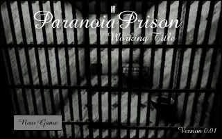
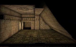
Menu

Show posts

This section allows you to view all posts made by this member. Note that you can only see posts made in areas you currently have access to.

Show posts Menu

Messages - Sean

#41
Critics' Lounge / WebBanner Like Thingy :)
Mon 15/01/2007 00:18:37
Hey Guys,

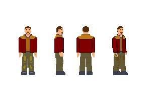
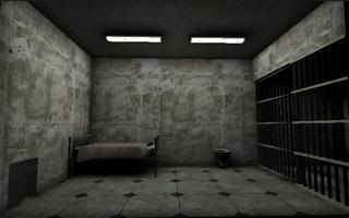
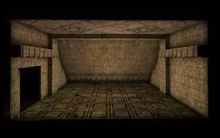
Was just trying a few new things out in photoshop...

Anybody got some C&C?


The text is very sketchy, and I haven't had time to add a border... those problems I'm aware of...!
#42
Critics' Lounge / Re: Critic of character
Thu 11/01/2007 23:27:44
This was more for my own fun, than to try and suggest anything.. I'm not very good at this kind of stuff :P


As for the hands, I'd say slip the left one (OUR LEFT) into his pocket, and the other in the rear pocket.. or leave it loosely hanging.
#43
Critics' Lounge / Re: My Style (or lack of)
Mon 08/01/2007 17:07:13
Heh, second time I've had to quote my post beacuse people didn't read what I wrote :P

QuoteI give full credit to the original developers of the UnrealEd Platfrom, and the artists behind UT2k4 and RavenShield packages. Without them, my "art" wouldn't be possible.

That one "map" was made using UnrealEd2.5, and RavenShields mesh/texture packages. It's based on IMPORT/EXPORT I beleive, but is something I made from scratch. The textures, aren't final.. so don't worry about that. I'll be replacing them with whatever I can get my hands on.. :)  ::)
#44
Photographs, might work.. I'd need an actual "model" to do the walkcycles and stuff and let me film them though, which is an arse :P

The Half-Life tool is interesting, I've got HL.. I'll install it and check it all out ;)
#45
Quote from: Sean on Sun 07/01/2007 03:32:29
Edit: That bed, is a placeholder.. that'll be replaced by in-game graphics :)

Hehe, that picture is just a placeholder. I'm going to replace that with an in-game shot later on. I'm just trying to perfect the effect first :) Also, each picture is a synopsis of the day to come!
#46
Quote from: Mr. Buckéthead on Sun 07/01/2007 09:35:02
I'm kinda worried how you are going to make your characters. You said you can't model and pixel characters in 3d bg's looks kinda weird.

I wish you good luck though!

Yeh, I'm not going with pixels.. I've decided against that. I'll get all my other art out of the way first. Then, I'll start looking around for alternatives.
#47
I tried to equal out the eyes, so both sides close together. I also added an extra blink. I still think it looks a little awkward, I don't usually animate so I'm not sure what the problem is. Do I need more in-between frames... or less frames.. or what?  ???


Edit: Would help if I attached the image!  ;D
#48
Critics' Lounge / Blink and you'll miss it!
Sun 07/01/2007 03:32:29
Hey,

Don't hit me too hard, I thought it was catchy a topic title!

Anyway, I'm working on a "title screen" for one part of my game. This is suppoused to represent a blinking motion as the character wakes up...


Half Speed: http://img.photobucket.com/albums/v650/Magic265/2blink.gif

Any advice?

Edit: That bed, is a placeholder.. that'll be replaced by in-game graphics :)
#49
Great stuff, good improvement!  ;D
#50
Critics' Lounge / Re: My Style (or lack of)
Sat 06/01/2007 20:28:16
 :o

Lovely title screen Darth!

@Buckethead - I'm going to work on improving my texturing skills for my next endeavour, for now I think I'll resort to public archives and the likes.. I can usually find exactly what I'm looking for so my vision isn't compromised. However, I really agree that it's something to look into and it's definatly something I'll work towards in the future.

@Matt - I totally agree, that title screen was just a quick thing I threw together when I was pushing out an interface demo a while back now. I had no plans of actually using it, but the critique is definatly helpful!

@Darth - Wow, just wow :) I can't really say much except, it rocks! I'll definatly be mimicking that sort of style for my interface and stuff... gave me some great ideas!   Also, thanks for the well wishes :)

I'll have some more art to add for critiques soon, I'm hoping to work in a lot of Buckets advice when it comes to creating geometry, as such I'm starting on a new area with a totally different style. Which means, I can get really creative!
#51
Hey,

I think it's damn good for you first character, you can immediately tell it's an 80's vice cop! Which is always a good sign. I'd say the shape of the shoulders is a bit square, and the stance is a bit rigid but it's looking really good. The shading also needs a bit more work, I'm not sure how to help you though. I can't pixel!

I'm eager to see how this develops, keep up the good work. If you worked from a reference, could you post it?
#52
Hey Eager,

Thanks for the crits :)

I am indeed using UnrealEd, but that doesn't mean I'm making it completely first person!

No siriee, instead I'm going for a mixture of both first person and "third person" (traditional AGS). I find, with AGS games that are First person 3D things are always a bit static. So, to try and avoid this I'll have moving characters on screen, and then first person interfaces where neccessary! Plus, I'll try and make a few animated backgrounds..  just to keep things interesting :)

Back up my stuff indeed, I've got a 1gb memory card that everything is going on everytime I finish working :P
#53
Semester?

I'm British so I don't quite follow the american lingo :P

I haven't been working on the project for the last year, but It has always been in the back of my head. It's something I'd really like to put out and I eventually will with any luck. I could give you a rough idea of when I think I might finish this, but it'd be totally wrong so there isn't much point!
#54
Critics' Lounge / Re: My Stlye (or lack of)
Fri 05/01/2007 19:29:02
Hey Guys!

@Brute - Heh, thanks man! Some of the game is First Person.. well the "looking" parts anyhoo!

@Bucket - Hey mate, thanks for the tips. I think I will start learning how to texture, before I go full steam ahead with the project again. Modelling, for now at least is an unobtainable skill but it's something I plan to address after I finish school. Textures aren't totally out of my reach, I'm a graphic artist when I feel like it heh :P

Architecturally, for the first set of pictures I'd definatly agree with you. Everything is bland, and pretty boring. Those shots were made about a year ago, in a limited version of the editor which is one way of me explaining it all away!  ::) It's a valid point, and something I'm trying to address with my work. As you'll see in my later pictures like this one:

http://img.photobucket.com/albums/v650/Magic265/NewVersion.jpg

I have made some attempts, to try and add some more depths to the room. Slanted walls, support beams and generally interesting architecture is implemented. It's not perfect, but I feel I'm getting an eye for it as I go along!

Solid advice, that I value so thanks :)

@Pants - I don't disagree, having the ability to say "it's all mine!" is something I hope to acheive at some point. It's a slightly steep learning curve but I am going to look into texturing before I proceed with the project fully. As, I'll be doing ALL the art from scratch.

Perspective issues are a valid point, and something I'll address when I get round to remaking the art.

Thanks again for the support :)

- Sean

I've started work on some textures, they look "wrong" to me but I'm not sure why!


#55
I love the art style!

Keep up the good work, looks quite novel and fun.
#56
Critics' Lounge / My Style (or lack of)
Thu 04/01/2007 13:58:58
Hey Guys,

Basically, I want to know what you guys feel towards my art style. Specifically, what you like/dislike and why. I'm interested to know if you feel my style is appropriate for an AGS game and whether or not it could benefit from a "edge" (e.g cell shadeing). Cell Shadeing doesn't fit with the theme of my current project which can be viewed below:

http://www.adventuregamestudio.co.uk/yabb/index.php?topic=24657.0

I'm open to ideas, and any criticism you have.

Here's some samples from the thread:


I've also got some other art to show, which I posted a few days ago:


http://img.photobucket.com/albums/v650/Magic265/NewVersion.jpg (Bigger)

Well, thats enough art to critique for now. Remeber, I really want to know how suitable you feel my art is for an AGS game. I suck at pixels so I've made a compromise :)

As this comes up a lot, I'll spare those wondering the trouble of asking. I create my art, using UnrealEditor2.5 and 3.0. I for the most part used PREMADE (not my own) textures and models to decorate my work. However, the rooms/structures, lighting and compostion are what I claim credit for. Heck, I do occassionaly throw my own mesh or texture in at times ;)

I give full credit to the original developers of the UnrealEd Platfrom, and the artists behind UT2k4 and RavenShield packages. Without them, my "art" wouldn't be possible.

So, how can I improve?

What is their to adjust?

Thanks in advance  :)

- Sean
#57
Thanks for the encouragement, I hope to have something more substantial for the next update which should come within a week or two with any luck.  :)
#58
Whoa, isn't this an oldie?

It's been 9 months since the last update, doesn't that suck!

So, let's get this update going...

Basically, I put the project on hold a while ago because I lost everything when my old computer died. I didn't cancel the project, and that's why there hasn't been an update. It's been a whole "I'll get 'round to it" affair. Both the game and the update ;)

Recently, I was searching through a pile of CDs and heck.. I found the thing. The backup's a little old, and isn't ALL I had but it's enough to remotivate me. I've put some new art into production, and have started reworking the story slightly. You'd be suprised what a years thought can do to things ;)

Don't expect anything to happen too soon but if you're interested in this... keep your eyes peeled and I may have a suprise for you shortly ;)

Bump

A little taster of what I've made since I got back on my feet...


- Sean
#59
Critics' Lounge / Re: cyborg psycho peeper
Wed 03/01/2007 14:55:15
Hey,

Looks alright so far, doesn't it?

Doesn't scream Cyborg at me though, I'd advise you have a go at the following; add a new layer.. cut out a selection or two of your face and add a metallic surface over the top. Then connect each surface with wires, border them up.. add scratchy metal textures.. glowing lights. Just general techy stuff!

I found a few tutorials, you might be interested in:

Wire Tutorial: http://www.eyesondesign.net/pshop/pattern_wire/wire1.htm

Pipe Tutorial: http://www.eyesondesign.net/pshop/segpipes/segpipes.htm

Tutorials for metal textures should be easy enough to find, just google and find something you like. As for "selecting" parts of your face... use the polygonal lasso tool.. and CTRL+Click around a bit.. you'll get some nice sharp sci-fi like edges.

Enjoy, good luck :)
#60
Critics' Lounge / Re: my firstish character
Wed 03/01/2007 13:33:05
Hey Pants,

I like the lumpy look, it's something memorable and different. That's always a great thing for a character to be :)

I really like the nose, It's a tad long.. and an teeny bit pointy but it still looks great :)

As for the arm, I'm not too sure... perhaps have the stick "frozen" inside a big lump of Ice.. or something?

Can't help you with the eyes, my spirteing skills are very limited  ::)

One thing, worth a mention.. is his face looks a little expressionless right now. Why don't you try adding a half smile.. or frown?

Overall, it's a really nice sprite.. good job :D
SMF spam blocked by CleanTalk