Menu

Show posts

This section allows you to view all posts made by this member. Note that you can only see posts made in areas you currently have access to.

Show posts Menu

Messages - Sean

#61
Well, what can I say to that other than Thanks  ;D

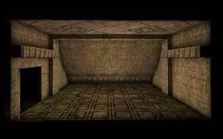
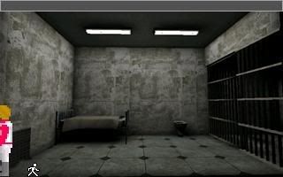
Edit: Oh, and just to add a little art to the post... this is from a previous project that never quite came together due to hard drive failure :(

#62
Hey Guys,

Thanks for the speedy replies :)

@Miez-Sure you can, it's no secret! I'm a "mapper" and I use the UnrealEd technology to create "spaces" that I then texture and decorate usually with pre-created meshes supplied by either the original developers or the supportive community. (I can't model, just yet) That doorway is dark, mainly due to my lazyness of not adding any actual doors there just yet :P
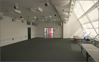
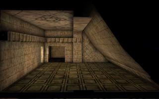
. I can't light the connecting room, without disrupting the main rooms light!

@GarageGothic-That silly wall texture, I didn't even notice it. At the other end of the room it IS  horizontal, must be a error of some sort. I'll look into it! As for light sources, I'll look into them when I next "transform" the room. I'm going to try a few different styles, I did add some Huge windows, and a sunlight source in the Slanted wall.. but that didn't work out, because of rendering errors :(

@MrBuckethead-I was originally going to add some torches, with flames.. then I realized that'd need animating which for a mini-project is more hassle than it's worth. Like I mentioned to Garage, I did have the original windows intact.. but it didn't work out :( I like your idea of borders, and it's something to consider and I struggle with the little details at times.

Thanks for the tips :)

Oh, I'll probably be playing around with the room and reskinning... just so I can get a look at the room from a few different perspectives and might get that posted a little later :)

Edit: I've added some more geometry to the room, doubled up on the Slanted edges... and added a few little touches. An enlarged view of this edit can be seen by the following the link, however this view is Model free, so you can critique my actual geometry construction :)

http://img.photobucket.com/albums/v650/Magic265/NewVersion.jpg

Below that, is a more representative view of what it may look like as a bg. Editing tools are still intact, as well as PREMADE meshes (like the textures I use) that I can't take credit for. As you can see, I've worked on the light sources slightly, added a "torch bowl" but I can't think of other ways to "light" the room. Any suggestions?


#63
Heyas guys,

Just looking for some general advice,tips and critics here. I'm mainly interested in how well you think the source material has been represented in my interpretation. Obviously, the themes are drastically different, heck this is AGS we have FUN here :P

However, I tried to retain the same architectural structure, and general room layout. This is mainly just practice for myself, and it'll probably find no use. I'm interested in perhaps helping out with a small/medium sized project and creating a few backgrounds for it. From, the existing teams art or simply from my mind.

The purpose of this "Experiment" was to refine my own skills, and try and see how well I could recreate something from source material. That's mainly what I want criticism on, the recreation. Feel free to comment on whatever you like though, I'm open to all suggestions,paint overs,etc that you can offer :)

Animated Transition:
http://img.photobucket.com/albums/v650/Magic265/transide.gif


Source


My Version

Alternate View:

This is the view, I'd most likely present as a background

Another Alternate View:
http://img.photobucket.com/albums/v650/Magic265/alt1.jpg

Pssst: If you know any projects that may have a use for me, drop me a line in a PM ;) 
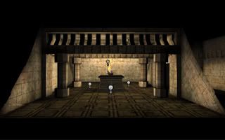
(Is the old ACR thread gone?)

Pssst(The Second): If anybody has any images they think may be worth me trying my hand at recreating, feel free to share them :)
#64
I'm particularly fond of the first passage. Mechanical,structured and emotionless. I got the impression that this relates to the characters mental state. I like that strong link, it could be quite a powerful way to convey the characters state of mind. Reflect his pattern of thought through the writing. Almost, as if the player is inside the Exo's head. This ties to the setting, the character is trapped within a robotic body (I think,:P) and the player is confined within the characters brain.

Anyway, it's a nice piece of writing and I really enjoyed it. Enough to warrant an apperance from me for the first time in several months.

I'm lying low, my game died. :P

Good Work, keep me informed and if ever you want to discuss anything contact me.Ã,  ;D
#65
Thats pretty much what the other competitors and ultimately the judge thought. I strayed too far from the original topic and didn't present Hitler in anyway that suggested a "monster". Instead, I've been congratulated on making an authentic WWII Propoganda Poster  ::)

Thanks for your criticism, it's helpful. I don't do this sort of art often, I stick too signature and splash graphics mainly. It's always nice just to experiment.

Thanks again

- Sean
#66


This is something I made a couple days ago as part of a competition. The topic was "Fear". I came up with this. Comments & Criticism are very much welcomed. I didn't win, how could I improve?

Thanks for any input.

- Sean
#67
Much better than the old stuff I saw, looks promising. Simple and clean, I like that.

Good job mate :)
#68
Critics' Lounge / Re: BG - garages
Tue 28/03/2006 19:48:39
Quote from: InCreator on Tue 28/03/2006 15:01:24


I'd actually say this is a step backwards. It's a good example of what could be done. I don't think thats as nice as his original it's far too messy for my tastes. I like what gameboy posted originally, I'd suggest adding something like a shed/bush or tree to the foreground grass. Heck, maybe even just a simple "Do Not Walk On The Grass" sign. Other than that, I like :)
#69
@Woodz- Poser requires custom meshes though does it not? I'll explore that option further. I was considering using Simpose in conjunction with custom models and stuff from the web but got stuck with the animating. Diffiicult!

@Anian - I'm creating the maps in Ued then taking stills and modifying them in PhotoShop before importing into AGS and using them as backgrounds. Quick way to get good looking results. I suck at pixel art too, playing to my strengths as a UED Mapper :)

@Fluke - It is a little 'cliche' if I'm honest but hopefully the way the story is told and everything revealed will make for an interesting play!
#70
Thanks for the comments :)

@Aussie - I'd actually be happy with either Aussie but I was under the impression that pixel help may be easier to find. I'll consider consulting some 3DArtists when I start to approach people in the future about the position. Don't s'pose you know anybody?  :P

@Terric - I think that 2D/3D can mix quite well sometimes better than a 'One Style' approach. It all depends on just how it is done as you said and I'll make sure that my artwork doesn't clash.

@Corey - The graphics are made using Unreal Editor which powers quite a few different games that have been released in past years so I'm not suprised they look a little familar. Nice too I hope ;)

Thanks again for your feedback :)

- Sean
#71
Just a mini-update of sorts.

I've lost the pixel artist I picked up a few weeks ago due to personal issues at their end. There doesn't appear to be anybody else that immediately jumps at me. The search continues  ;). Production will continue shortly, it grinded to a bit of a halt over the last two weeks as I was busy with other things. Hopefully things will be picking up again soon. I'll update accordingly when they do.
#72
Quote from: fentonfilms on Wed 08/02/2006 18:30:18
By the way, If any story desigers could give me some cool ideas from movies, or alternate ways to solve the puzzles from the original books, that would be great!

You should right down each 'Puzzle' from the book that you want to make. Then look over them and just 'play' until you have something. I'd say having the original puzzles written out is a must.
#73
Critics' Lounge / Re: Webdesign advice
Wed 08/02/2006 19:13:26
Music is never constant and it always changes perhaps Nisi represents that well?

I prefer your full name though to be honest. NiSi sounds a bit 'forced'. Really up to you though, your music kicks ass so what does the name matter?  ;D
#74
Quote from: Mr.Crow on Wed 08/02/2006 18:08:34
Perhaps he could do with a little bulking out as hes looking thin for a gangman.

To me the guy looks a little bit lean/stoned and has a 'drugged' edge to him. In which case he would be quite thin. I really like your pixel work, it's stylish and sexah. The arm looks a bit skewed though.
#75
I agree. Only thing that is a 'downer' for me is the graphics. They're good but how much freedom can you have working with stills ? It just to me seems limiting. However, it's looking good thus far and even despite my somewhat negative opinion on the graphics I'll be sure to check it out. You sound pretty damn capable of making something great :)
#76
Quote from: Forger on Mon 06/02/2006 05:07:52
Pathetic response to this thread. Not an inspiring thought. Not sure what I should think about that. Oh well. should I be hurt? or should I take a "no news is good news attitude."? seems clear that I havent been able to generate much interest in this game yet.

Don't be so negative. People don't check here often. I for one usually check every few days and in large clumps. Good work you have so far, nice art. Looks a bit 'mismatched' in some places (i.e the computer) but I like it. Looking forward to your work.
#77
Critics' Lounge / Re: Living Room Background
Wed 08/02/2006 18:42:46
I don't have any real issue with your background other than those colours. If I'm brutually honest then sure theres a few perspective errors around and it looks a little flat but really it just looks like the graphics you'd see in an old game. Nothing wrong with that, it's a style. Aslong as your graphics are consistent and the game story good then this sort of style is great. It's simple and has classic feel.

If you want to modernize it work on the colours, if you want an 'Old Skool' feel then leave it as it is :)

Hope that helped a little bit.
#78
Thanks for the comments, I'm going to make this again from scratch when I've found an approiate web platform to build upon. I'll keep what you've said in mind. I'm a fairly talented photoshop user when it comes to Sigs,Splashes and that sort of thing and I know my way around. However, webdesign is something I've not really dabbled in before. This was my way of dipping my toe into the water. When/if I get a finished website online I'll be sure to link you all to have a look. I very much agree with the gradient comments and chances are in future I'll make some proper metal textures from scratch or blend together some modified photography.

Thanks for your help :)
#79
Barbie, are there any 'Floor's I could offer my services for?
#80
Link me off to the tutorial?

Might come in handy for backgrounds and site template design.

:D
SMF spam blocked by CleanTalk