Menu

Show posts

This section allows you to view all posts made by this member. Note that you can only see posts made in areas you currently have access to.

Show posts Menu

Messages - Setsuna

#1
Hey that was a fierce competition!
I really liked Neutron, Floskfinger and Jade's but people have voted and..

The WINNER is:Ã,  loominous

Congratulations, that's a really nice style you have, too bad you don't like horror things :)
#2
Critics' Lounge / Re: Need help with my 1st bg
Thu 21/07/2005 22:45:33
Hey thanks for the crits, i tried to correct what you pointed out, but i wonder if it looks better, maybe i overdid it...


The lights look strange and i don't really know how to add details but i tried something with the river, any help would be appreciated!


#3
Critics' Lounge / Need help with my 1st bg
Wed 20/07/2005 21:18:33
This is my first background, i did it with paint in about 1 hour. I'd really appreciate any c&c you can give to help me improve it.


I wanted to make the whole background affected by moonlight, that's why i used all these grey-ish colours, but it looks rather flat and i think the ground and mountains lacks some details/texture, any idea?

Thanks.
#4
Critics' Lounge / Re: The DREAD of the DEAD
Wed 20/07/2005 00:49:04
Hey, i see the door you've drawn in the upper right corner uses vertical lines, maybe you could do this for the cracks/bricks on the wall, i think it should help making it look straighter.

And the house in the background may be a tad too small compared to that door i mentioned but maybe it's just me.

I think your previous bg looks good, although i don't really like the lighting after effect. (not the same style)

Vict0r: Even if the story sounds very cliché, i wouldn't care too much about it, as long as the atmosphere's here ;)Ã,  And it seems you've found a great bg artist, i wish you good luck with this project and hope too see more.
#5
Yeah I tried the old link, sorry..I should have waited  :-X
#6
A lot of fun!

I've played and finished them all except "Another way out" in which i'm stuck.
I noticed a few games were missing on the voting page, did they get disqualified? maybe it's too early and the voting page isn't totally up to date...
I'd love to give a review for each game once the vote ends.

Anyway good work everyone, i really enjoyed playing them!
#7
I'm not a fan of 3d rendered backgrounds but i actually like the atmosphere.
Like Xarkh said, i thought it was Lara Croft, and the backgrounds are really in Tomb Raider's style, i almost expect the main character to draw guns and start jumping on walls ;) 
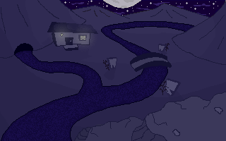
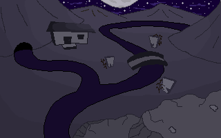
All of your backgrounds carry that feel, i hope that was your intention.

I wanted to say that the second picture is looking great, but i hadn't realised it was sand for a while, it looked more like strange stairs to me, maybe because of the straight lines and (too)dark areas between curves. Just my opinion.

I hope you'll finish that game soon!
#8
I really like enchanted forests and cartoony backgrounds but i prefer haunted mansions, foggy graveyards etc... so i came up with this idea:

Subject : Creepy Night
Size : 320x200
Colours : Hand drawn bg, pixel artists and photoshop-ers are welcome so no colours limit.

I hope you'll get inspired by the subject, please let me know if you'd like to change it.

Good luck :)
#9
Critics' Lounge / Re: Alley background
Tue 12/07/2005 21:09:59
I just wanted to say the roof is lacking some depth imo, here's a quick paint over just to give you some ideas.
I know this isn't located in US but i thought the poster could look more like this:


I hope it helps.
#10
Glad you liked it. Sorry nobody else entered because I think the topic was quite intresting and we could have seen some funny things...thanks anyway.

Well, i guess I'm supposed to find a good topic and post a new thread with a similar deadline :-[
#11
Exsecratus: is this the infamous Hiram Wesley Evans, also known as the imperial wizard ?
#12
Nobody entered this competition and the deadline was July 10 but anyway it was fun to do :P I'm at work and i didn't have much time to draw.


Forgive me for this :p
#13
Critics' Lounge / Re: Help My Super Hero
Fri 08/07/2005 23:48:06
They look great, but not pathetic nor comical imo, for the first one you could try to change the logo on his shirt for something funnier, also adding accesories, again something that would look a bit ridiculous for a super-hero like a brush in his left hand :p i dunno...
Also making it look like he only has his boxer shorts, (drawing skin over his pants) would be pretty comical i think.

They would look great in a game, i like super-hero comics.
Btw i did this quickly, is that what you were thinking about making him suitable for 640x400?( i just resized and pixelized it)


Sorry i'm not skilled enough to do a real paint-over but i hope it helps you somehow.
#14
Hey! I have to say you improved a lot on this one, great job!
It almost reminded me of that creepy Resident-Evil atmosphere(same instruments maybe).
If i had to comment on it i'd say you overdid it with the strange sounds in the middle of the song, a few notes are a bit too high and seems out of place.
I think the shamanistic voice you added is a good idea ;)

Edit: I'm sorry to say this but i hate your avatar, if this is supposed to describe you, i'd really like to know in which way!
#15
Critics' Lounge / Re: c&c character sprite
Fri 08/07/2005 10:39:50
I second that, and as i told you in PMs i'd really like you to keep the original style you had in the comic :)

It's a pretty good start but it looks like he's lost some of his style IMHO (maybe these thick black lines Vince Twelve mentioned).
I also don't think it would look good on the backgrounds you already have. (pixelly sprite on a flash BG?) but i can be wrong.

#16
I had to right-click it then it saved as .html,Ã,  renamed it to .ogg and was finally able to listen to it...I like the music although it doesn't really feel scary, it sounds more like a background music for a kind of temple.

I think maybe you could slow it down a bit, add some blanks and use drums only at a few moments to startle you, but this is just an idea.
#17
Critics' Lounge / Re: C&C for bg concept art
Wed 06/07/2005 05:25:44
Maybe i would add more details to the columns like signs engraved in it. I also think you could get rid of the dark outlines for the floor because it looks strange to me.
Other than that, great bg, and the de-blurred version of the back wall is a lot better.
Good work!
#18
Very cute, and this is a great idea for a game.
I think i wouldn't change anything, but i'd like to see it animated,really, nice art!
#19
Critics' Lounge / Re: Sprite needs improvement
Sun 03/07/2005 12:39:06
Wow, that paintover you did is so cool :D 
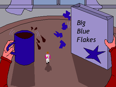
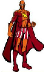
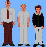
really close to the original and proportions are much better than the ones i used! Very stylish.
It seems i too overlooked him a bit... :P But you did an exellent job to correct this and i have to thank you a lot for the help SpacePirateCaine!

I'm glad to see there's another big fan of Akira here, i have the comics as well and i was really disapointed by the way they treated the Joker and lady Miyako in the movie! (even akira)

Well,I'm working on tetsuo's hospital clothes at the moment,but next will be his famous cape and all, with the special arm, i hope he will look good.

As you expected i wanted to make your edit a few pixels taller so here it is:


It is just perfect as it is, i just altered the eyes color because he seems kinda blind but maybe it's just me.I'll try to modify tetsuo's right eye too.

I really appreciate your comments and help, thanks again.

Edit: (i didn't want to bump the thread) here are some new characters i made:


I didn'work on the feet and i need to change the scientist's robe.
The third one is here to get an idea of the proportions.

#20
I'm programmer in c/c++/asm and the c-like aspect of the scripting language used for the ags engine makes it really easy for me.

I love the comic you did, it made me laugh a lot!! So if you need help for the scripting of your game, you can PM me anytime ;)
SMF spam blocked by CleanTalk