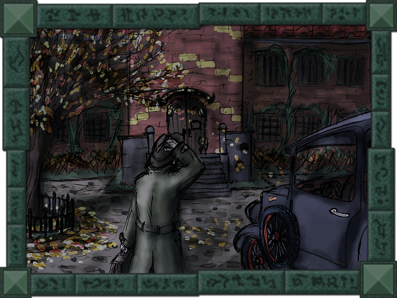
A bit of - rather irrelevant - preface. Being a fan of Cthulhu Mythos and Lovecraftian fiction in particular, I've been translating one of FFG Arkham Horror novels into Russian for my friends, and started to make illustrations for it just to feel some change of activity. And having some time ahead which I could invest into actual game-making, I decided to stretch my drawing muscles by turning one of the illustrations into a pixelated background.
Here it is (the illustration itself):
The sketch it's based upon:
[imgzoom]http://cave-progz.narod.ru/asylum_sketch.png[/imgzoom]
And now the background itself (black silhouette featuring in all the pictures has been added as the character base for reference - and for general creepiness as well ):
):
[imgzoom]http://cave-progz.narod.ru/asylum01.png[/imgzoom]
flat colours
[imgzoom]http://cave-progz.narod.ru/asylum02.png[/imgzoom]
textures and basic shading
[imgzoom]http://cave-progz.narod.ru/asylum03.png[/imgzoom]
global lighting
I do not consider the piece finished (only half-way, may be), so, I included earlier stages just to be able to return back to them in order to correct any issue. So, please. any pointers regarding what could be improved? Or just a direction?
Here it is (the illustration itself):
The sketch it's based upon:
[imgzoom]http://cave-progz.narod.ru/asylum_sketch.png[/imgzoom]
And now the background itself (black silhouette featuring in all the pictures has been added as the character base for reference - and for general creepiness as well
):[imgzoom]http://cave-progz.narod.ru/asylum01.png[/imgzoom]
flat colours
[imgzoom]http://cave-progz.narod.ru/asylum02.png[/imgzoom]
textures and basic shading
[imgzoom]http://cave-progz.narod.ru/asylum03.png[/imgzoom]
global lighting
I do not consider the piece finished (only half-way, may be), so, I included earlier stages just to be able to return back to them in order to correct any issue. So, please. any pointers regarding what could be improved? Or just a direction?